Slowvember WIP
-
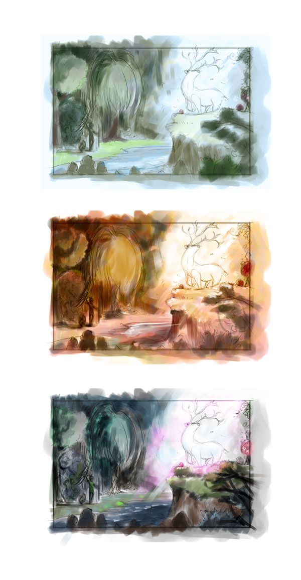
A few quick color thumbs - looking at something like more traditional forest colors, or maybe something more in the reds/oranges/autumn spectrum, and the bottom one I was messing with is something with mostly blues and then adding in pinks.
-
@jdubz awesome work! I like the last colour thumbnail the best .. I think it has a more magic vibe if that makes sense
-
@mads Thanks for the feedback on this and confirming the one I thought had the better feel also.
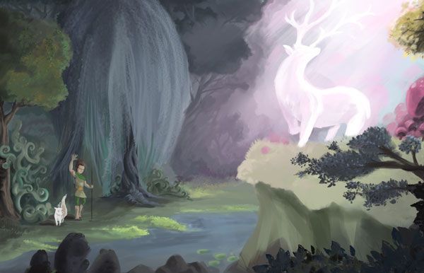
Starting to render out some of the details in a slightly larger canvas. Here's where it's at now.
-
I think I'm nearly done. I've been adding textures and details to the larger size, color correcting, and doing some swapping of the canvas to try and shore up some of the little issues I saw here and there.
Any feedback would be appreciated on how I can adjust this further to make it pop.
-
@jdubz looking really great, very magical. If you could piece more of the shadows on the deer. Also what if you brought some of the pink light down onto the ground in front of the girl. Most of that light would hit the cliff but some would go past the cliff and hit the lower ground. Do you know what I mean?
-
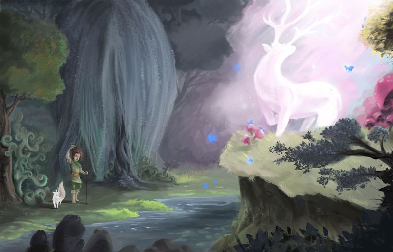
I think so - let me try it out and see how that feels.
On the deer I'm kind of torn. I think I accidentally painted myself into a corner a bit. The idea was that it was also generating a bunch of light, which then makes the beams of light less impactful. And if that were the case, it as an object wouldn't be shaded at all.
So I think you're right - if I keep the light coming into the scene from where it's at, the stag must be more shaded for it to make sense.
-
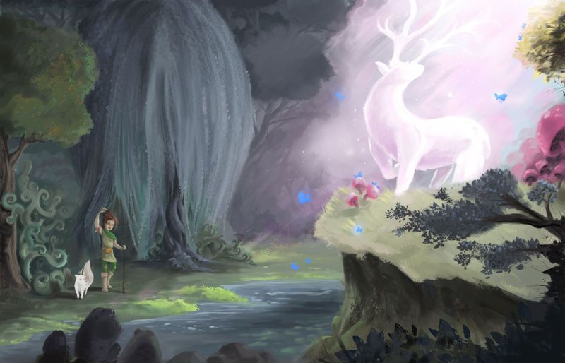
Here is the new version with those changes in mind - some of the pink light dappled and bouncing off the area in front of her, and I tried to add some rays leading down to help you see where it was coming from. Then the stag is mored shaded where the light would be coming from.
-
OK, so I did something that I wasn't supposed to do, but I did it anyway.
I ended up doing a totally different piece. I really like where I got with the original piece I was working on, but I just felt like I was sitting in my comfort zone. This is sort of where my style defaults to, so it just kinda felt like I took something I normally do and polished it up more and added more detail/elements.
So I started working on something that is outside of my normal comfort zone to try and push myself in a direction to work on some of my blindspots. I started with the intention of doing no linework at all - just straight paint, in colors that I hadn't normally worked with, and one thing I wanted to do was try and OVER simplify because I have a really bad habit of over illustrating my work and making it way too detailed.
The other thing I did was worked all on one layer, so it was pushing and pulling everything all at once without going layer to layer.
Here's where I landed:
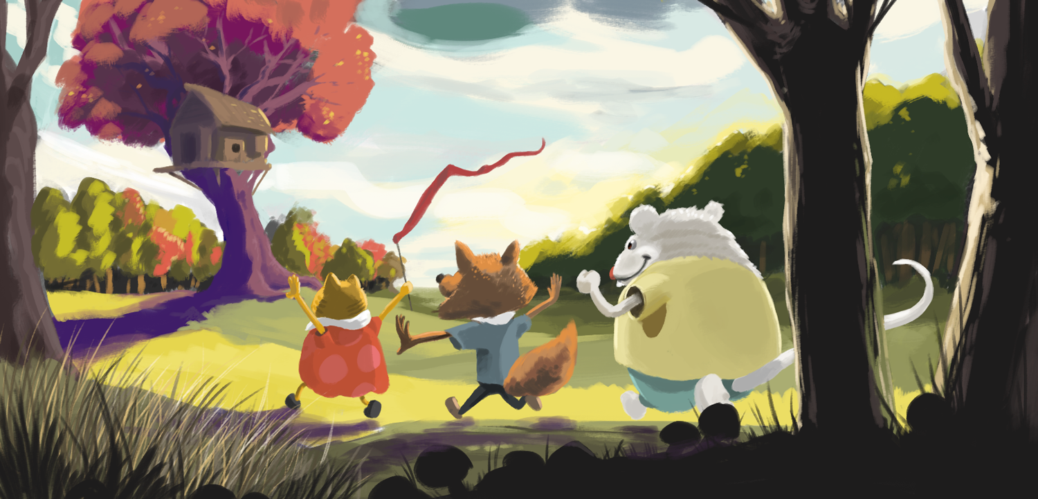
What do you guys think? Was the stronger piece the one I did originally, or the new one that went against the grain?
-
@jdubz I'm viewing on a smart phone, so there may be some details I miss, but I like the second piece a lot more. The composition and colors and values seem a lot more solid, plus the shapes look better thought out
-
@jdubz I feel your pain. I always wanna redo/do a different image near the end of these contests
")
I like the colours and composition of the first attempt, but I like the characters and use of foreground elements in the new piece.
-
@Braden-Hallett Ugh yeah. Impatience is a problem for me lol. I think the biggest initial challenge for me this month was actually spending the time on the piece - I probably put 5x the amount of overall time on the first one, but I'm feeling like maybe I over detailed it for what I was initially going for.
-
@jdubz I really like both! I think the second one is a stronger piece technically, but I really like the feeling of the first piece