Fresh compositions
-
I want to improve my compositions, they always feel a little stiff, I've done the composition class and that was great, can anyone recommend any other resources on this subject? And also example if artists that have great compositions for me to study would be great too!
-
Can you expand a bit more on what you mean by "stiff" for the compositions? Normally I'd be using that language for characters, so I think I just want to clarify what you're typically working on in reference to the composition of the types of things you're working on.
-
@jdubz I'm not sure exactly how to describe it, but I just feel like my compositions are stale or boring
-
@anya-macleod maybe if you'd show some examples of your work and examples of compositions you like to see in your own work it may help us.
-
@Heather-Boyd @jdubz
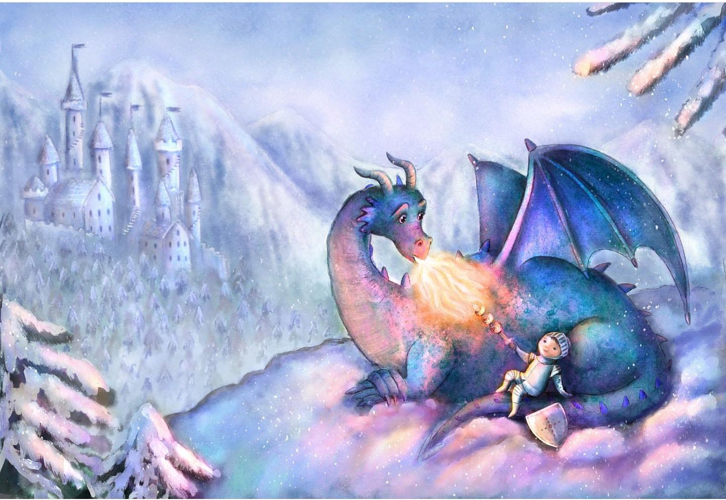
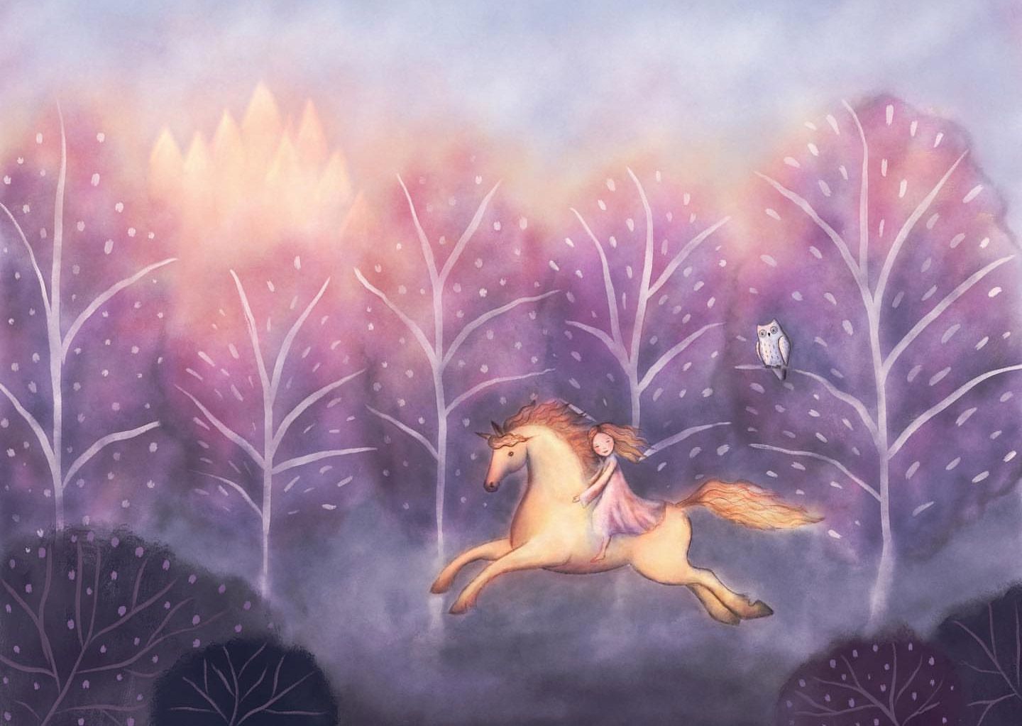
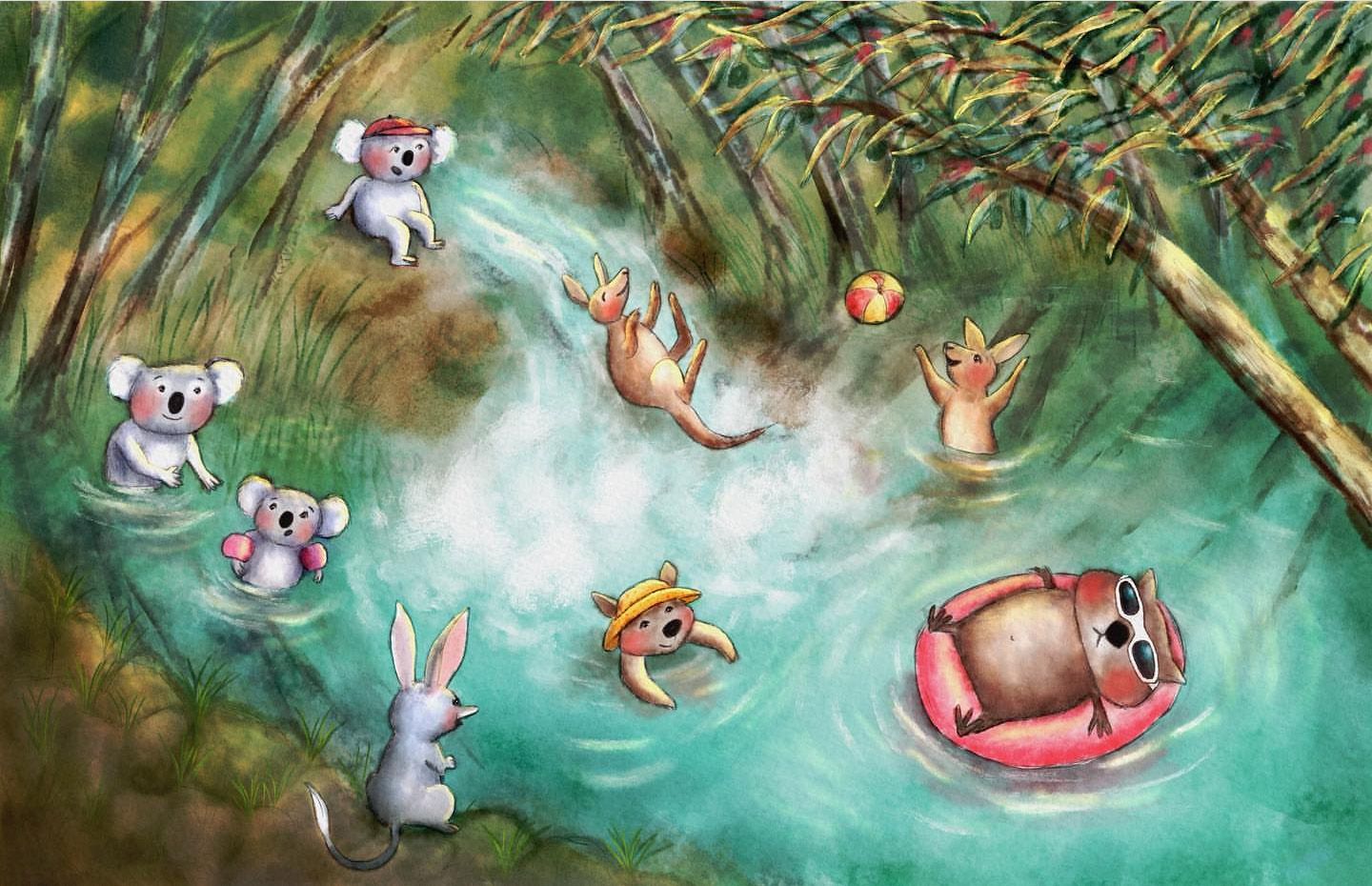
Here are a few examples of my work, I just feel like something is missing but I can't pick what it is, I can't think of the top of my head of artists who's compositions I aspire to, and I guess that's part of the problem, I'm not sure that I can recognise what makes a really good composition apart from the basic rules
-
@anya-macleod have you a collection of work (not specific to just composition that you like) -dream portfolio alluding to. And look at how they do compositions. The basic rules are good, don't underestimate them. That's where I would start. Also if your looking for work that has more depth vs flatter plane can adjust how we see and read composition - I think.
Instagram: www.instagram.com/heatherboyd.illustration/
Website: https://heatherboydillustration.ca
Shop: https://www.inprnt.com/search/products?q=HeatherBoydIllustration
Ko-Fi: https://ko-fi.com/heatherboydillustrationBe blessed,
-
@Heather-Boyd I'm going to do the dream portfolio assignment, maybe the more depth vs flatter plane is what I'm thinking of?
-
I think you have to deal with these separately because I'm not seeing anything that jumps out at me as a global problem. I'm thinking minor tweaks will go a long way. Take what I'm saying with a grain of salt - just one person's observations

Taking the first image, what's striking me the most I think is that the level of detail seems kind of inconsistent. We've got clean lines in on the castle and the dragon, and then blurry lines on the forest and the background mountains.
If you look at a mountain scene, the background details are not really blurry. The silhouettes are still crisp, but you start to lose detail as it fades into the environment.
If you convert that first image to grayscale, I'm seeing that most of the image is in the same range. So that might be a good indicator that the eye is having a hard time zeroing in on it's supposed to look at. The one on the left you can see a lot of it gets lost and everything more or less is the same. Going back through it to create a broader range so that the background/midground/foreground all have very clear definition I think will go a long way.
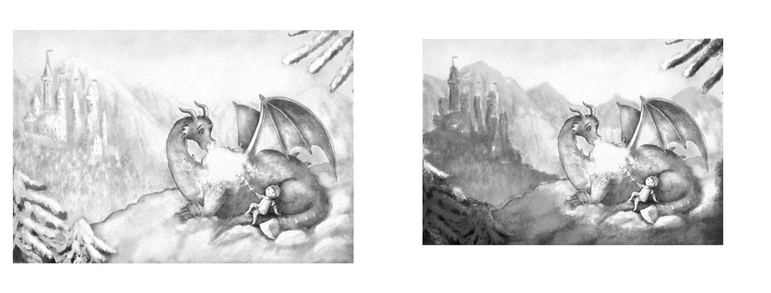
I'm definitely no expert, but my gut feeling is that you've got these different elements competing and looking off, so the eye is having a hard time zeroing in because the imbalance is subconsciously confusing.
Maybe what you might do is take that top image as a barometer and start messing with it until it feels the way you want, and then you can slowly adjust other images to get them to that spot and you'll naturally begin doing it from the beginning.
I think I'd take that first image and then separate the background so that it's a very clear value difference with the castle (meaning it's lighter than the castle for example). Then bring down the details. Then take the castle area and sharpen up that forest a bit, and bring the value range more into the mid area. Then on the foreground, maybe bump up the contrast a bit on those front trees and the ground, and make sure the most detail is there. I think that can push that foreground focus way up front and bring all those other details back so they don't compete.
-
@jdubz thankyou so much for replying, I hadn't even thought about the inconsistency in details and linework and it makes so much sense! The value separation is something I really struggle with, I tried to focus on it in the dragon piece but then the fact it was a snowy scene was really throwing me off! Good to know I was thinking along the right track at least in my head even though it didn't translate to the artwork

-
Here's a video I found this to be REALLY helpful to better understand how environments are made up: https://www.youtube.com/watch?v=xWMMo1v594Y
-
@jdubz this looks great thankyou!