Society of Visual Storytelling

    SVSLearn Forums

    • Register
    • Login
    • Search
    • Recent
    • Tags
    • Popular
    • Users
    • Groups
    • Search

    Red Riding Hood in the Arctic

    Projects
    4
    11
    691
    Loading More Posts
    • Oldest to Newest
    • Newest to Oldest
    • Most Votes
    Reply
    • Reply as topic
    Log in to reply
    This topic has been deleted. Only users with topic management privileges can see it.
    • E
      Emily Engh last edited by

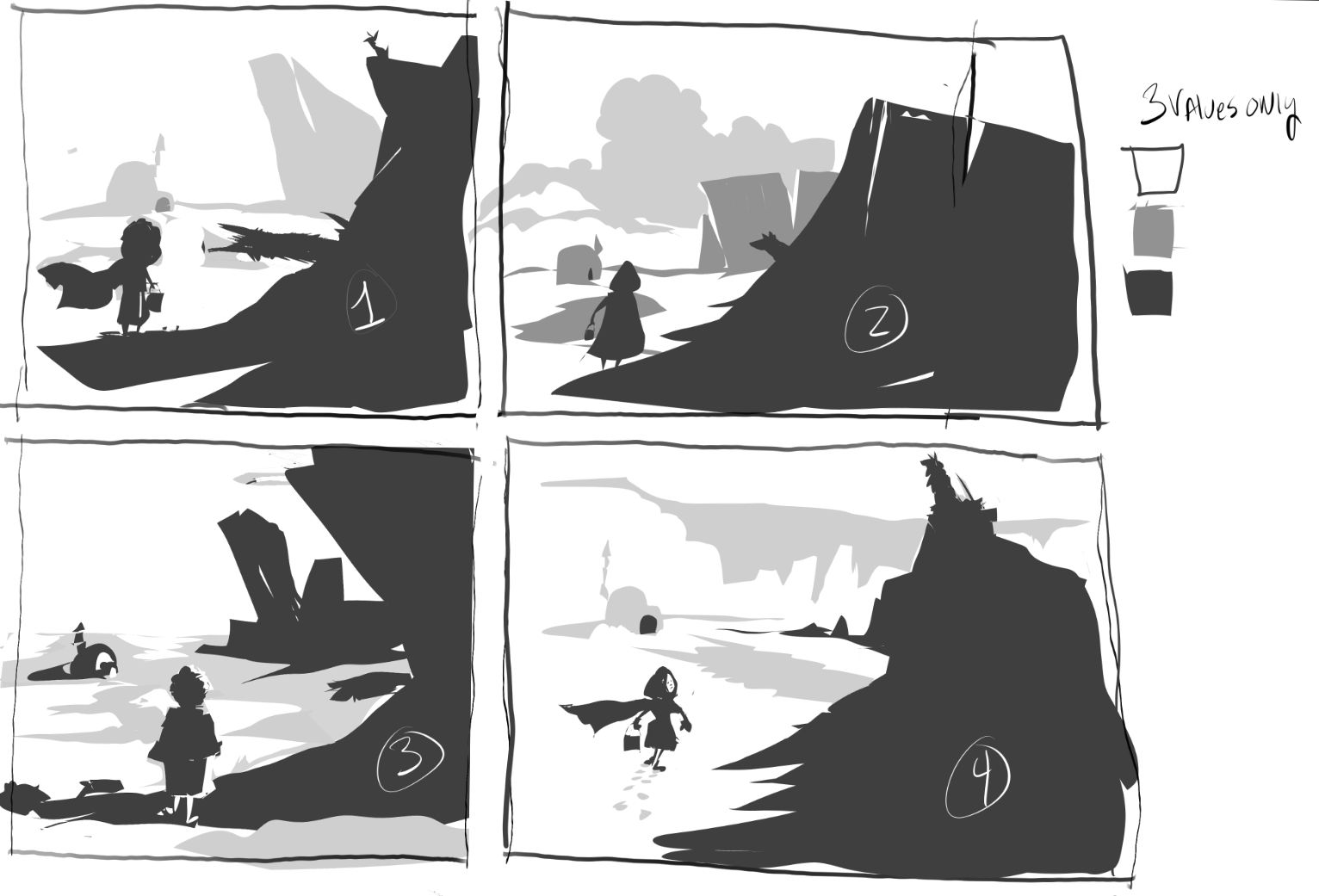
      Hey this is a composite and value study sketch for a illustration class I would love some feed back on it. I cant decided how I want red standing so she doesn’t look stiff a mid walk type of standing. Thank you.

      ![alt text](D4F1D701-7E93-48E9-9CCF-C0AF9EEB8D31.jpeg image url)

      1 Reply Last reply Reply Quote 2
      • romy
        romy last edited by

        Hi, a comment on the lighting - if the character is standing in the shadow of the mountain / iceberg, then she shouldn't be lit on the right half. Also, I think the mid- and background should decrease in contrast t go back and establish clearer middle and backgrounds, however the igloo is outlined and highlighted which brings it forward and the levels of distance aren't too clear to me. i'd try going smaller, using bigger shapes with few tone values to try different stuff out. Hope that helps 🙂

        E 1 Reply Last reply Reply Quote 0
        • E
          Emily Engh @romy last edited by

          @Finn Thank you for the feed back. 😊

          1 Reply Last reply Reply Quote 0
          • Braxton
            Braxton last edited by

            Right now we are seeing the character more or less straight on from behind. You might experiment with a more three quarters view. This could make it easier to depict the legs and communicate more movement as she walks. As we walk we're always transferring weight from one leg to the other, but that could be hard to show from this angle.

            E 1 Reply Last reply Reply Quote 0
            • jbleau
              jbleau last edited by

              You might simplify your values to 3 levels, and just play with shapes first. Experiment with thumbnails and the shapes of the ice, wolf and Red to see what works best together. I really love the wolf shadow you put in, there are so many fun things you can do with that. Here are a few very quick experiments. I find I can cover a lot of options this way until I find something I like... hope this helps...B5268432-D783-4418-9B49-5CE81C802E80.jpeg

              E 1 Reply Last reply Reply Quote 2
              • E
                Emily Engh @Braxton last edited by

                @Braxton Thank you for your feed back

                1 Reply Last reply Reply Quote 1
                • E
                  Emily Engh @jbleau last edited by

                  @jbleau Thank you, those drawings help a lot.

                  jbleau 1 Reply Last reply Reply Quote 1
                  • jbleau
                    jbleau @Emily Engh last edited by

                    @Emily-Engh so glad to help! Looking forward to more “little Red”!

                    1 Reply Last reply Reply Quote 0
                    • E
                      Emily Engh last edited by

                      This post is deleted!
                      1 Reply Last reply Reply Quote 0
                      • E
                        Emily Engh last edited by

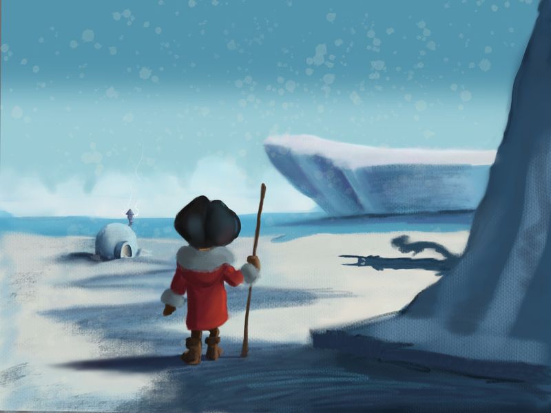
                        Thanks everyone for your help this is due at midnight tonight for class. I’m still learning digital painting but it’s better that what I was doing a year ago.

                        (B4226D9B-64BF-4741-9BEC-B0DBF5AF7D1E.jpeg

                        jbleau 1 Reply Last reply Reply Quote 3
                        • jbleau
                          jbleau @Emily Engh last edited by

                          @Emily-Engh Looking Good!

                          1 Reply Last reply Reply Quote 0
                          • First post
                            Last post