Society of Visual Storytelling

    SVSLearn Forums

    • Register
    • Login
    • Search
    • Recent
    • Tags
    • Popular
    • Users
    • Groups
    • Search

    Nightfall Roughs for feedback...

    Projects
    7
    8
    535
    Loading More Posts
    • Oldest to Newest
    • Newest to Oldest
    • Most Votes
    Reply
    • Reply as topic
    Log in to reply
    This topic has been deleted. Only users with topic management privileges can see it.
    • jbleau
      jbleau last edited by

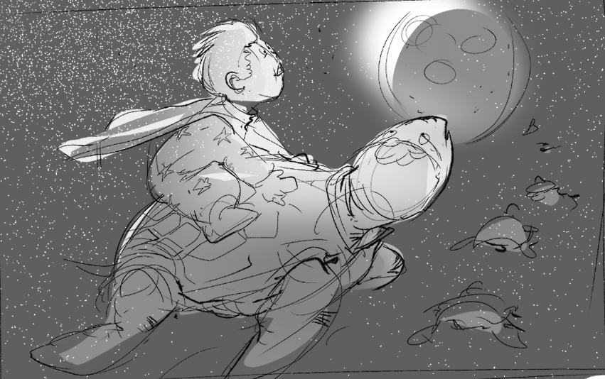
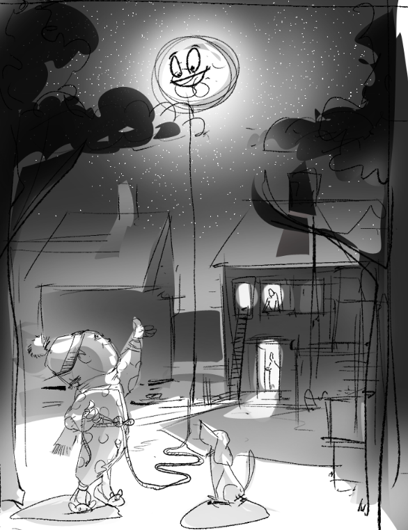
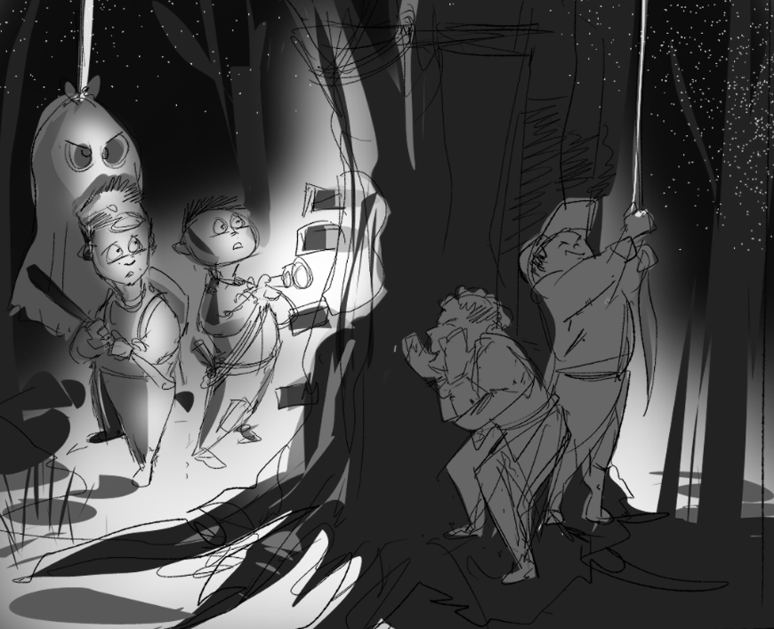
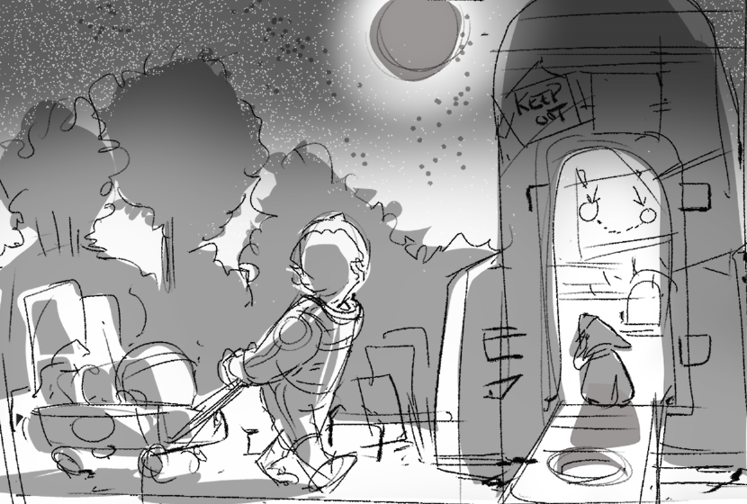
      First posting in a long while. I saw Lee White talking about the number of thumbnails, value studies, color comps prior to a final. So I thought I would post a few initial studies for the "Nightfall" challenge. After doing a series of thumbnails I have 4 favorites...they may be hard to read as they are rough but feedback likes/dislikes welcome. Wondering if they convey "story" or if there is a favorite to pursue. Thanks

      !space turtles.png
      ready Pull.png
      ghost on a string.png
      cardboard rocket ship.png

      Nyrryl  Cadiz 1 Reply Last reply Reply Quote 2
      • Melanie Ortins
        Melanie Ortins last edited by

        Hi, I think any of them could work but personally I find the 3rd one conveys more of a story then the others so it seems the most compelling to me

        http://www.melanieortins.com/
        https://www.instagram.com/melanieortins/

        1 Reply Last reply Reply Quote 1
        • Nyrryl  Cadiz
          Nyrryl Cadiz SVS OG @jbleau last edited by

          @jbleau I like all of them my favorite is 2 though 3 could be a contender given a few tweaks

          Portfolio: nyrrylcadiz.com
          Instagram: https://www.instagram.com/nyrryl_cadiz/
          YouTube: https://www.youtube.com/channel/UCbJCF1Im8ZO7hpGWTKOJMuA

          1 Reply Last reply Reply Quote 1
          • KaraDaniel
            KaraDaniel last edited by

            I think 2 has a unique story to it and is easily readable. I really love those slippers!

            instagram.com/sha_kara
            karadaniel.net

            1 Reply Last reply Reply Quote 1
            • xin li
              xin li last edited by

              I love no.2 as concept. I would play a bit more with the composition of that concept. right now the position of the moon and the string seems to divide the image equally.

              Web: www.lixin.no
              IG: www.instagram.com/lixin.illustration/

              1 Reply Last reply Reply Quote 0
              • jenithornhill
                jenithornhill last edited by

                I like the 3rd one.

                Jennifer Thornhill
                www.jenniferthornhill.ca
                www.instagram.com/jenniferthornhillillo
                https://www.facebook.com/jennifer.lockethornhill

                Laurel Aylesworth 1 Reply Last reply Reply Quote 0
                • Laurel Aylesworth
                  Laurel Aylesworth @jenithornhill last edited by

                  I am loving the second one.

                  www.laurelaylesworth.com
                  instagram.com/laurelaylesworth

                  1 Reply Last reply Reply Quote 0
                  • jbleau
                    jbleau last edited by

                    A refinement of the Lasso the Moon concept. Experimenting with composition and value refinement...not sure if the moon is working in this...
                    rev2 value .png 
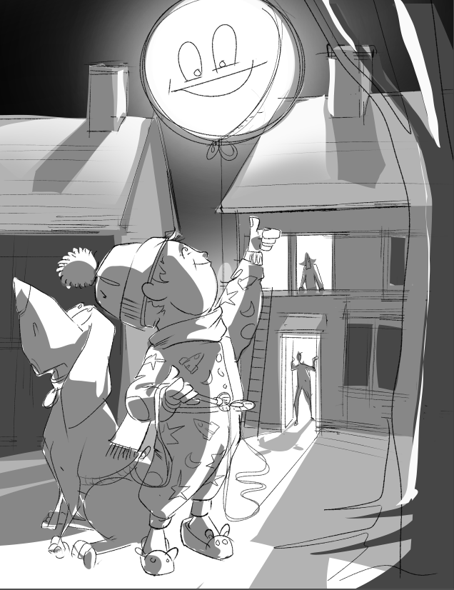
pushing the main characters as a more central focus...
                    rev2A value .png
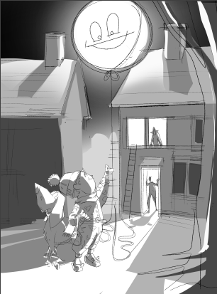
                    Closer to the original concept...

                    1 Reply Last reply Reply Quote 1
                    • First post
                      Last post