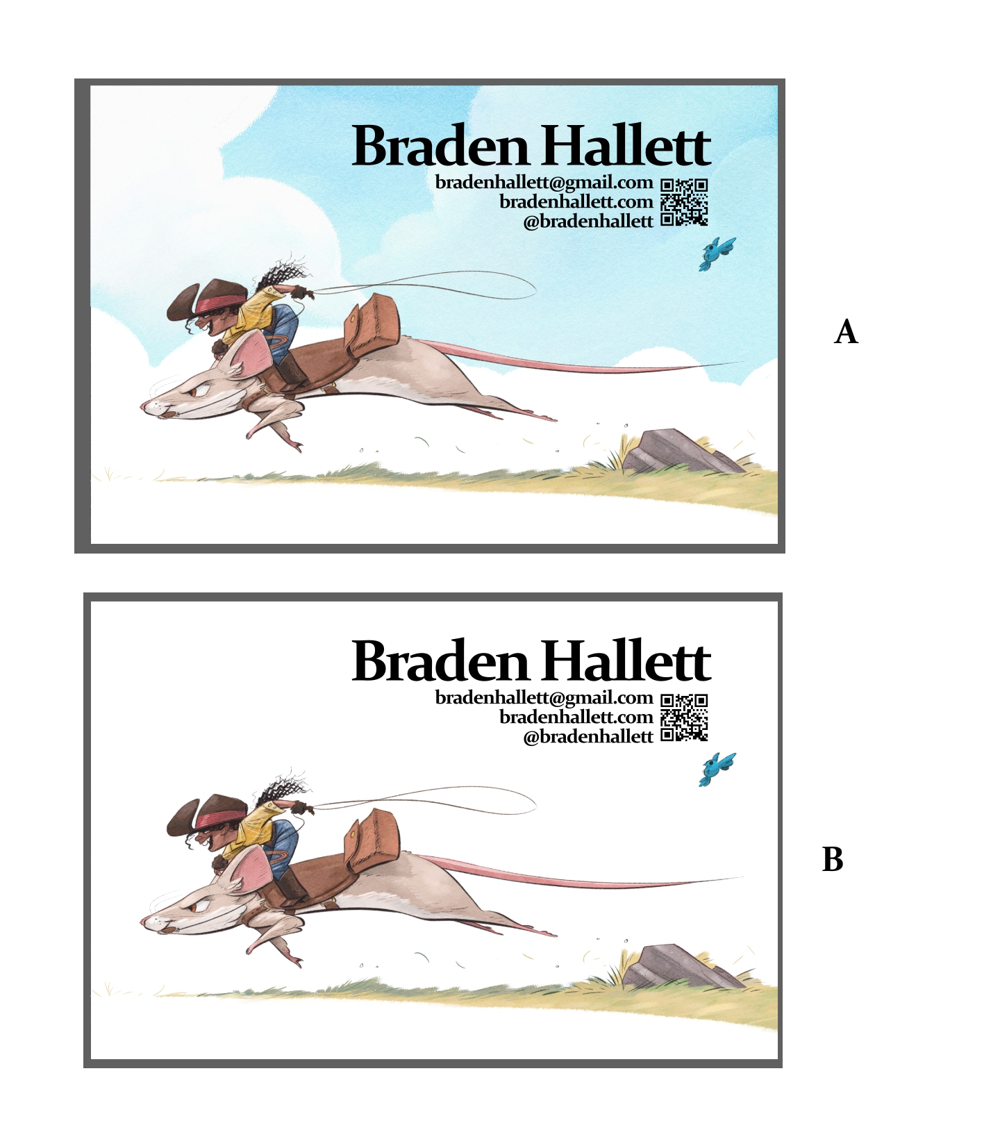
Workin' on a postcard! Which option do you prefer?
-
Hallo ladies and gents!
I'm working on a postcard and I'm going with something cleaner with a quick read this time. Which option do you prefer? A or B?
Also, if I'm committing any cardinal sins when it comes to postcards I'd love to know about it
")
-
A blue sky is so evocative of the west and ranching, that I think it works well here. It still reads very clean too. I just wonder about the placement of the bird so close to the text. For me they are competing visually. I wonder what it would look like if you lowered it slightly or took it out?
-
Totally A.
-
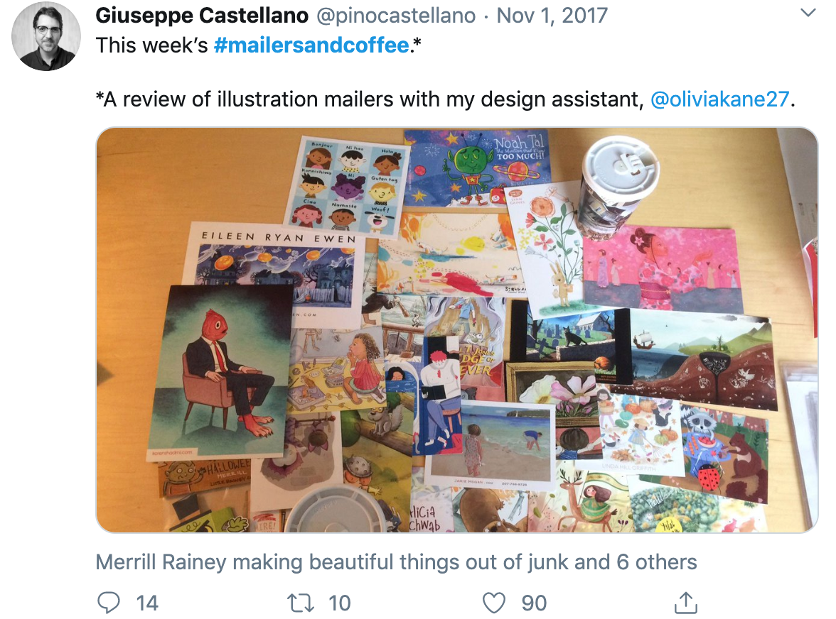 https://twitter.com/hashtag/mailersandcoffee?src=hashtag_click
Giuseppe used to post his favorite weekly postcards under this hashtag. I think the ones with more white really stand out in the pile! So I really like both options : ) these look great
-
@Braden-Hallett A is definately awesome!Love the subtle blue sky. letters read clearly and it gives a pretty warm feeling!
-
@Braden-Hallett I prefer A but i was wondering about the little bird, is it needed? It seems out of place.
-
I have really tried working my brain to draw and design going off to the right (people have said into the book) -that would be one critique that and I find the colours on the pale side overall (love the little blue bird <3) -which is why I voted A (bit more context and warmth working hand in hand with the clouds (someone said "the mid west" -"hot tempts").
-
This is a tough call. I could see either working. I did really like B. but, I really like the warm feeling of the blue in A. and would hope influences potential clients.
If I can call out a small nitpick. There is a tangent starting to for with the clouds around your characters mouth. Maybe there are some other ways to draw that main cloud line on the bottom, particularly the spot near their heads.
Killer post card!
-
@Katie-Kordesh said in Workin' on a postcard! Which option do you prefer?:
Giuseppe used to post his favorite weekly postcards under this hashtag.
Oh Cool! I'll check that out! Thanks

@TessaW said in Workin' on a postcard! Which option do you prefer?:
I just wonder about the placement of the bird
I think I shall move the birdy
Thanks!@Chip-Valecek said in Workin' on a postcard! Which option do you prefer?:
but i was wondering about the little bird, is it needed?
I like to have something (anything) reacting to moving characters given half a chance. The little guys also feature on the other illustrations I have with these characters
I'll see what it looks like without, though! Thanks!@Norman-Morana said in Workin' on a postcard! Which option do you prefer?:
If I can call out a small nitpick. There is a tangent starting to for with the clouds around your characters mouth. Maybe there are some other ways to draw that main cloud line on the bottom, particularly the spot near their heads.
Ah! Nice catch. I'll fix that