Final update on Drawing a portrait (Puck)
-
@Leontine you're right. Sometimes you need to idealize the symmetry to make it look right. It's a judgement call. I noticed in the reference image that the girl's right eye is lower than the other. This is not represented in your drawing. Personally I do not like portraits where the subject is staring back at the viewer. That is why I liked the one with the stuffed animal more. For interest try having her look down at the toy in her arms. adding a tilt to the head and showing more of her chest and arms would make this a stronger piece and give you options for composition.
-
@seanwelty The stuffed toy is going to have its return in the painting. Ill try a different pose aswel, maybe I can convince my client into that. (he asked for this pose). Thank you very much. Do you have experience in portraits? Who are your hero's for inspiration? I did follow some lessons, in the past I did more, but nowadays not very often although I like drawing portraits very much.
Leontine
"A picture is worth a thousand words."https://leontineillustrator.com
https://www.instagram.com/leontine.illustrator/
http://www.facebook.com/leontineillustration -
@Leontine the problem with using exact symmetrical measurements for portraiture is 1) no one is built like that, if there was, they'd be a Ken or Barbie doll. 2) it makes your likeness look cartoony and finally 3) it teaches you nothing but sameness.
This is not like drawing a generic cat, where we know they have whiskers, we know they have a triangular like nose. We're all built different.
What you should be studying are 3 things: the shapes of each feature. The color or how light is hitting your subject, and lastly what cannot be taught... the mood you want to convey. The last one depends on your medium, and the style you're going for... is this an ink drawing, a charcoal, a pencil, a painting? Each of those mediums sets a different mood entirely, and not all of them will fit your subject.
Most books will tell you that kids are drawn with less detail, this is only true if you are using harsh outlines to lock in your features. In an oil painting, there are no lines, you convey separation of features purely on color and dark and light tones. If you're mixing mediums, you could get away with light ink lines, and then either watercolor or over saturated markers, depends again on your style.
What you should try to chisel out first is which features you want to focus on, and then work on your muscle memory.
This can be done by tracing. Yes I know, the big taboo word, tracing! But by tracing your photo, as I did here lightly, you will teach your brain, the lines you want to give the most impact too, when you're doing your sketch in freehand. By doing this over a lowered opacity layer of your subject, which is what I did, then tracing on a new layer, the areas you want to commit to muscle memory, you teach your brain, just which lines make up your likeness.
If you were drawing from life, I would give you an entirely different approach. But since this photo is all I have to go on, I am using it in the last image to break down the areas of color I want to emphasize. Again, this is muscle memory because, when you start your final, you will remember these areas and where the light and dark is in your image.
But this is for an outline, colored painting done digitally. If you were working in traditional media, again my approach would be different. One of the best exercises to see the shapes is to draw a piece upside down, then you are forced to only see the shapes and not the likeness. The problem with this is, it takes away your ability to influence it with your style. Unless you're constantly flipping the image every 30 seconds... and I don't think anyone works that way.
After tracing I can redraw this entire image freehand, because I can pick and choose which lines I used to make the likeness. Yes you can make a safety net layer based on symmetry, but if you stick too close to that, other than using it for placement, your final will look mechanical and not organic.
When a caricature is made, features are exaggerated, color is used for mood, in the end you want to use some of that to make your portrait a piece created by you, and not a paint by number. Try several color tests with my outline to free you up from concentrating on the likeness, and feel free to redraw over my outline as well.
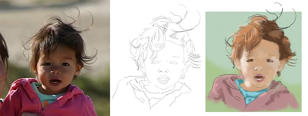
Here is a close up of the linework and color breakdown... I kept it unfinished on purpose, in the end it's all in the details you omit and emphasize... Anyway I hope this helps...
-
Oh I did forget one tip, if you're painting this all digital, make sure you're not working on a pure white background. Since nothing is really pure white, using a background will help establish your mood, and your brighter tones will pop more than on an all white blank page.
-
@Leontine I have only painted my own children and I am not a professional. The obvious are my inspirations: Zorn, Rembrandt, Sargent. Living artists I would have to go with Jeremy Lipking, Scott Burdick, and Michael Klein. As far as instruction, I think Stan Prokopenko's stuff on youtube is the best. He is Atelier trained and his videos are informative and entertaining. Search Proko on youtube. He has portrait and figure drawing videos that can be helpful.
I am not sure that tracing is going to get you where you want to go unless you want to be a slave to your reference. Tracing is a valid study method, but I would not suggest it for a final work.
-
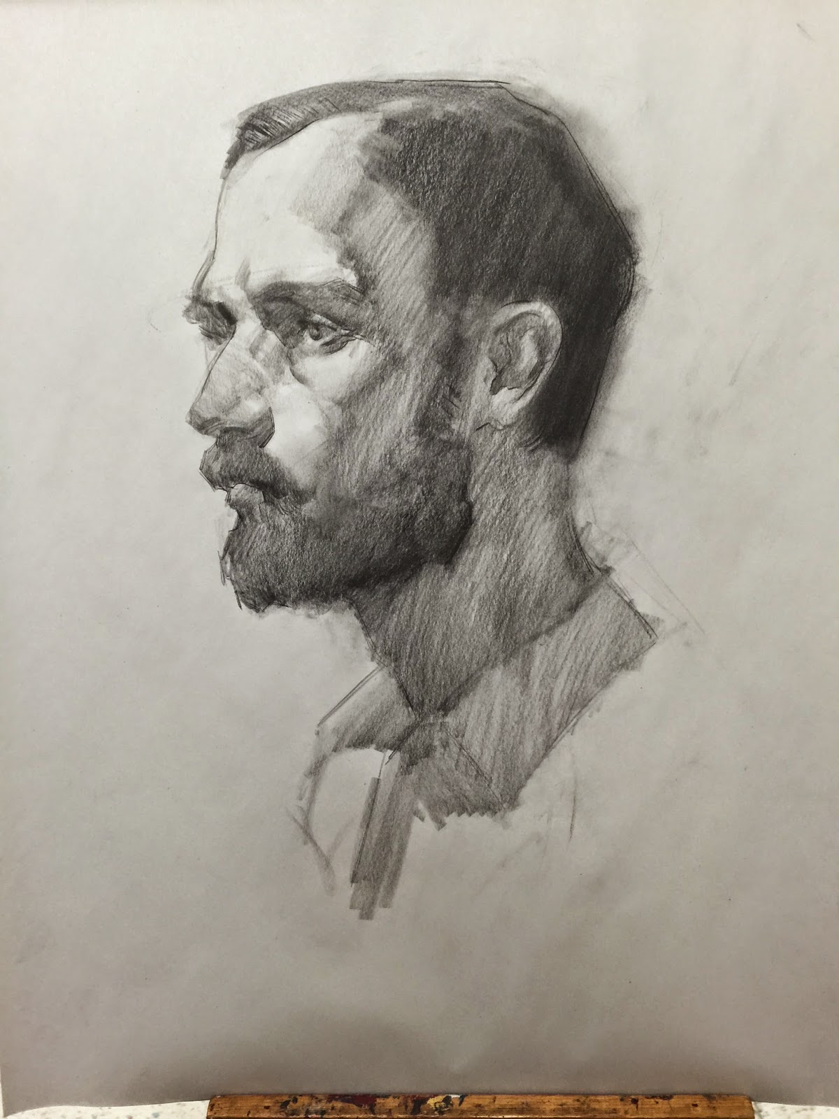
One other thing I'd like to mention here. Unless you are already very proficient at painting portraits, using this particular reference is going to be really tough. The reason I say this is that back lighting is the hardest to pull off out off all the lighting setups. I don't even give it to my students until they are at an advanced level. The thing you want in learning to do portraits is good lighting that casts very clear form shadows. Those shadows become easy shapes to see and add the light and dark value pattern that makes drawing someone easy. In this image, all the important details are completely in shadow, which is very tough to pull off.
If they are family and you can shoot more images, I'd recommend 3/4 lighting from the front (high angle lighting like the sun). That will make your life SO much easier. : )
Good luck!
-LSVS Faculty Instructor
www.leewhiteillustration.com -
Here's an example of good 3/4 lighting pattern. This creates an easy to see value pattern where the light meets the dark. Hope that helps some. : )
-
The purpose of that exercise isn't to trace, it's to teach your brain shapes and lines to define your subject. Stan Prokopenko is teaching the Andrew Loomis books of anatomy and portraiture, a great reference, but you should know his free videos are short, he sells a more thorough lesson for $39 as a download, or DVD sent by mail. I would pick up the Loomis books on portraiture from your local library or download that here. if you can find one.
Your photo is a hard reference, not just for the light, but for it size and resolution. If you could take better lighted references I would do it, or work from life. The advice I gave you was based just on your current photo, and earlier attempts. I'm not suggesting you use tracing as a replacement for drawing from life or a final piece. But one artist's study is another artist's masterpiece. How far you want your piece to go, I don't know...
I'm only trying to help based on the information you gave. I could rifle off artists I love to influence you, but that would only make you emulate them, and not yourself. It's your decision as to what you want your work to be. Good luck.
-
@Lee-White great drawing Lee! Is this one of yours? It has a Repin quality to it.
-
@Bobby-Aquitania Hi Bobby Thank you for your kind effort that you v'e put in to helping me out.I really like the idea of painting upside down! Ill try that!
-
@Lee-White Thank you Lee, I do have several references, but their all fronted. It is an assignment for an old classmate, who follows my work on Facebook. Social Media is so helpful for me in getting more assignments. (From the Last Hedgehog- critique painting I even got an invitation from a publisher. Yoehoee) Ill take your tips and go and nail this one!
@seanwelty I track your examples, and watch the youtube video! thanks for all the effort,Keep you guys posted!
-
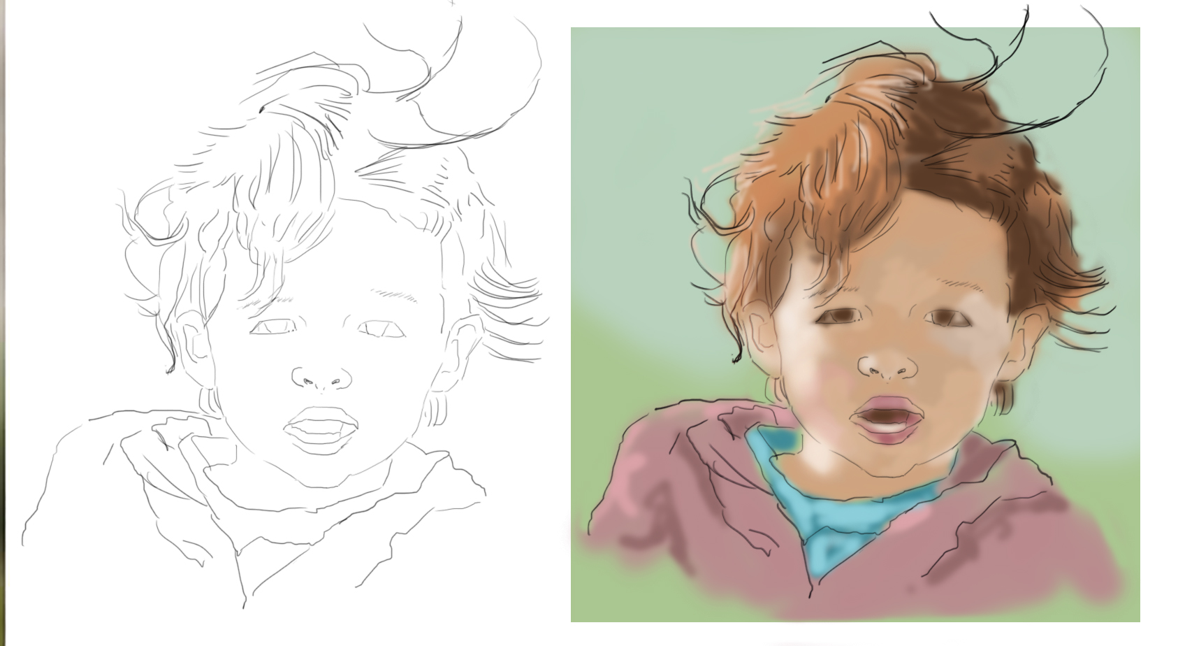
 This week i am in Brazil visiting my sis, and while doing that, still have some inspiration to work on this one! The client choose this comp. and now I started adding some colors... I want to give it a painterly look but want to complete the polished one as wel. so thats it for now, lets go outsidefor some mountainsketching...
 -
@Leontine This looks good. I'm assuming you are going to add some harder edges?
-
@Rob-Smith yes I will Rob!
-
Here's the final.
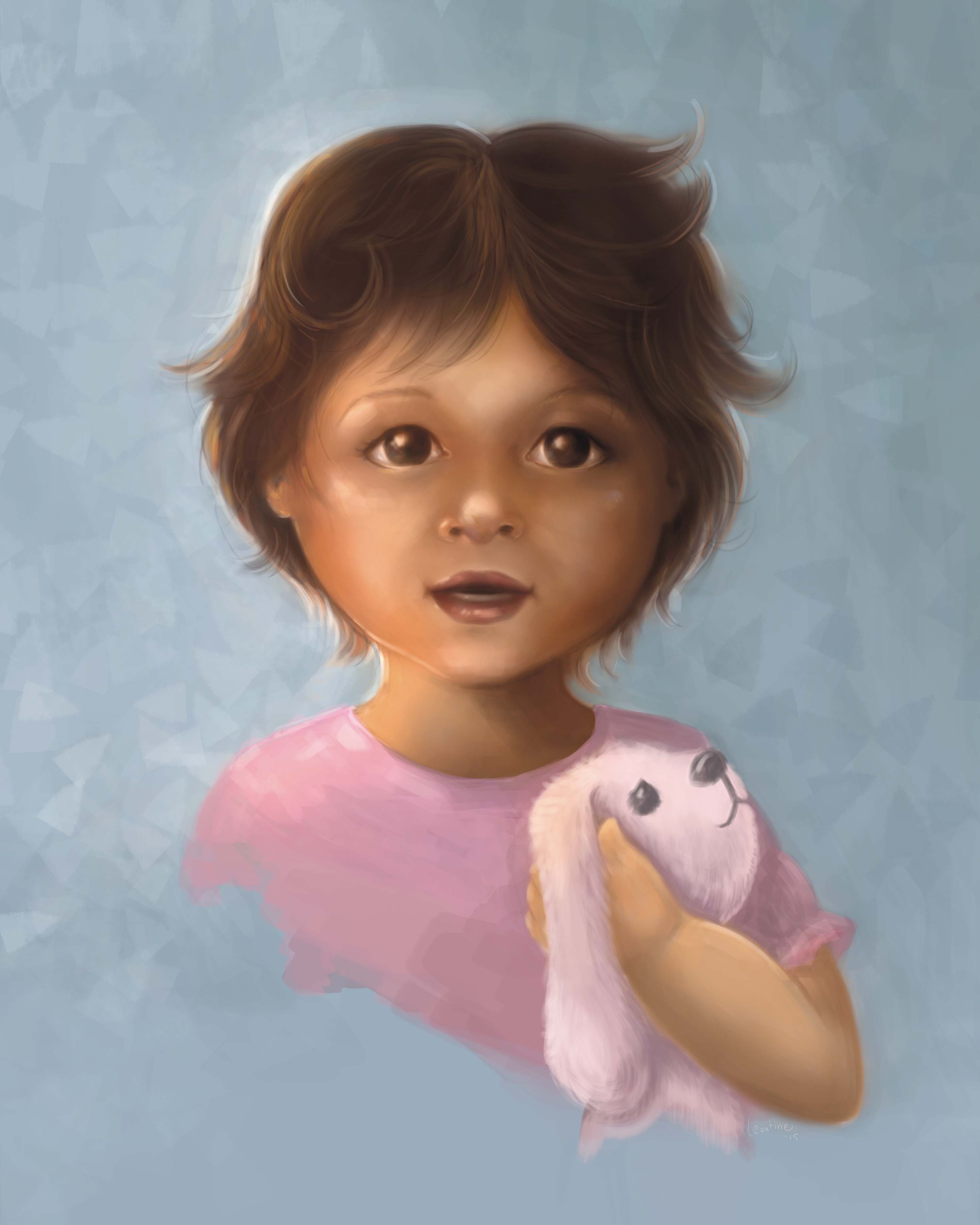 It looks a bit darker than it is in real life...
 -
@Leontine Really nice! I like your treatment of the hair and the other textures. The back lighting is very nice as well, subtle yet there. I'm missing the finish on the eyes. I think with an iris the eyes would really come alive and bring soul to the character.
-
Very sweet! Beautiful work, I know children's faces are tough, but you've done a great job. I agree with Rob that maybe the eyes would look better without so much softness there.
-
@Rob-Smith Yep, thats a good gesture, the thing is that in real life her eyes are really this dark, and the irises are not visible. But I could have given her a gesture of, it might work, ill try some! Thanks.