Society of Visual Storytelling

    SVSLearn Forums

    • Register
    • Login
    • Search
    • Recent
    • Tags
    • Popular
    • Users
    • Groups
    • Search

    3rd Thursday Naughty Children FINAL

    General Discussion
    21
    56
    17133
    Loading More Posts
    • Oldest to Newest
    • Newest to Oldest
    • Most Votes
    Reply
    • Reply as topic
    Log in to reply
    This topic has been deleted. Only users with topic management privileges can see it.
    • bharris
      bharris last edited by

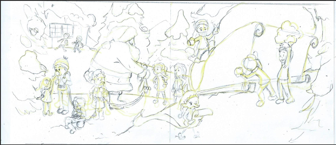
      Here is a different concept, doesn't feel as flat to me, but my husband liked the first better. What do you guys think?

      naughty children sketch 2.PNG

      www.brittanyharrisillustration.com/
      www.instagram.com/britillustration/

      Thrace 1 Reply Last reply Reply Quote 7
      • Chip Valecek
        Chip Valecek SVS Team SVS OG last edited by

        I prefer the second one. Looks like the children are more staggered. Some in the foreground, some in the mid and some in back. Hence not the flat of all in a line. Is the one child in back of Santa sticking is tongue out? If so I like it.


        https://www.instagram.com/chipvalecek/
        https://www.facebook.com/cvalecek
        http://www.cshellmedia.com/

        1 Reply Last reply Reply Quote 1
        • Lee White
          Lee White SVS Team SVS Instructor Pro SVS OG last edited by

          Second one for sure! Really nice!

          SVS Faculty Instructor
          www.leewhiteillustration.com

          1 Reply Last reply Reply Quote 0
          • Thrace
            Thrace @bharris last edited by

            @bharris The second one definitely!! What a wonderful image, I can't wait to see it finished!!

            1 Reply Last reply Reply Quote 0
            • bharris
              bharris last edited by

              Thanks everyone!

              www.brittanyharrisillustration.com/
              www.instagram.com/britillustration/

              1 Reply Last reply Reply Quote 0
              • Naroth Kean
                Naroth Kean last edited by

                like the second one for the obvious reason :D. Good job!

                http://narothkean.com
                https://twitter.com/narothkean
                https://www.instagram.com/narothkean

                1 Reply Last reply Reply Quote 1
                • bharris
                  bharris last edited by

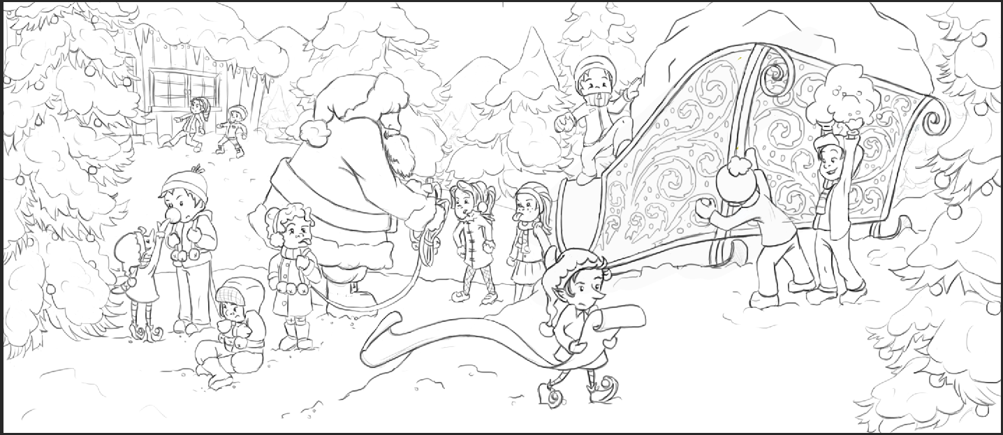
                  Still behind, but the line work is done! 🙂

                  naughty children sketch 2.PNG

                  www.brittanyharrisillustration.com/
                  www.instagram.com/britillustration/

                  Thrace 1 Reply Last reply Reply Quote 12
                  • Thrace
                    Thrace @bharris last edited by

                    @bharris So nice!! Get painting!!

                    1 Reply Last reply Reply Quote 0
                    • Chip Valecek
                      Chip Valecek SVS Team SVS OG last edited by

                      Looks great! Can't wait to see it painted.


                      https://www.instagram.com/chipvalecek/
                      https://www.facebook.com/cvalecek
                      http://www.cshellmedia.com/

                      1 Reply Last reply Reply Quote 0
                      • Dulcie
                        Dulcie SVS OG last edited by

                        @bharris Oh, this is so beautifully drawn and I'm sure it is going to be amazing!! Great work! 🙂 I am really looking forward to seeing the coloured version now.

                        The one thing I think...maybe it's too late to change....but I would just love to see some of those kids with little reindeer antler headbands! It would be so cute and IMO would help the storytelling part, that the kids are meant to be reindeer (and not just kids messing around in the snow).

                        www.dulciemascord.com
                        https://www.instagram.com/dulciemascord
                        https://twitter.com/dulciemascord
                        https://www.facebook.com/dulciemascord

                        1 Reply Last reply Reply Quote 1
                        • shinjifujioka
                          shinjifujioka SVS OG last edited by

                          Very lively image!

                          shinjifujioka.com
                          https://www.facebook.com/shinjifujiokaart
                          IG: @shinjifujiokastudio

                          1 Reply Last reply Reply Quote 0
                          • kai satoshi
                            kai satoshi last edited by

                            Very nice line work. Mine is never this clean.

                            https://www.facebook.com/kaisatoshiart
                            https://www.youtube.com/channel/UCt6tfoLEMU6uZkRzs2KUzVw

                            1 Reply Last reply Reply Quote 0
                            • Joy Heyer
                              Joy Heyer last edited by

                              The details in the line work is beautiful! I can't to wait to see color added!

                              Twitter: @Joy_Illustrated
                              Instagram: joy_illustrated
                              Website: joyheyer.com

                              1 Reply Last reply Reply Quote 0
                              • bharris
                                bharris last edited by

                                @Dulcie Thank you so much! I love that idea and I can see a few of the kids that would be excellent targets for antlers, also it'll add another holiday detail. 🙂

                                @Kris-Knight I'm a little OC with the lines... I tried so hard not to zoom in to clean them up perfectly, it can be a time waster!

                                @Joy-Heyer @shinjifujioka @Chip-Valecek @Thrace-Shirley-Mears Thank you so much everyone! I''ll post updates soon!

                                www.brittanyharrisillustration.com/
                                www.instagram.com/britillustration/

                                1 Reply Last reply Reply Quote 1
                                • Rob Smith
                                  Rob Smith last edited by

                                  @bharris Such great work. I really like the latest updates. Your line work is so great!

                                  1 Reply Last reply Reply Quote 1
                                  • MOO
                                    MOO SVS OG last edited by

                                    The second one is more interesting and active. But they both look really great , IMHO. Really nice work.

                                    Marsha Ottum Owen

                                    1 Reply Last reply Reply Quote 1
                                    • bharris
                                      bharris last edited by

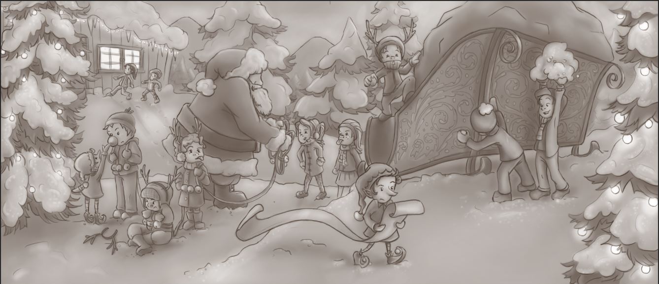
                                      Hey all, finished the tone and it was my first time working like this. I feel pretty good about it, but is there anything that is obviously wrong or that may need more lightening or darkening? Thanks for the feed back!

                                      naughty children sketch 4.JPG

                                      www.brittanyharrisillustration.com/
                                      www.instagram.com/britillustration/

                                      1 Reply Last reply Reply Quote 5
                                      • Rob Smith
                                        Rob Smith last edited by Rob Smith

                                        @bharris This is such a good drawing. Its so interesting to look at with only B/W tones added to it. The painting is sure to be great once some color has added to it.

                                        If I was being really critical I would say that there needs to be some stronger contrast between Santa and the kid standing right behind him. Also, there is a tangent formed between the one horn of the set that kid is wearing and the edge of Santa's belt. The middle ground and foreground all seem to be of the same contrast and value. That front tree on the right side needs to be a darker value to pull it forward and push the middle ground back. Overall there needs to be, in my opinion, some stronger areas of contrast and value to really punch out certain characters and props.

                                        This could be one of the winners!

                                        1 Reply Last reply Reply Quote 2
                                        • bharris
                                          bharris last edited by

                                          @Rob-Smith Thank you Rob! I didn't see that with the belt! I will work on that contrast, it looks kind of dull as is! I was struggling with that and wondering how the color would look when laid over something really dark. I usually work straight from color and not in gray scale, but I'm liking the effect more!

                                          www.brittanyharrisillustration.com/
                                          www.instagram.com/britillustration/

                                          1 Reply Last reply Reply Quote 0
                                          • Rob Smith
                                            Rob Smith last edited by

                                            @bharris @Will-Terry will add a multiply layer over the value layer to set the color of the image (see his digital painting video) and then paints opaque on top of that. You could also just use the value layer as a guide for your color. Don't be afraid to add some really strong values.

                                            1 Reply Last reply Reply Quote 3
                                            • First post
                                              Last post