Still time to redo this...now that I've been away from it a while.
-
Please give me feedback on this colored picture I did. I was going to leave it as is but now that I've gotten away from it for a while I'm ready for more suggestions on a possible redo...well, a fixing up redo-not a whole new composition
") One thing is that I would like to fix peter pan's shoulders and arms. Better color schemes? I know the drawings are primitive but I think that's kind of my style in this area. Anyway, I am ready to hear comments. I also cropped it down to 8 1/2 by 11 so I could scan it later. For now I am using my camera/facebook system again. Thanks!
One thing is that I would like to fix peter pan's shoulders and arms. Better color schemes? I know the drawings are primitive but I think that's kind of my style in this area. Anyway, I am ready to hear comments. I also cropped it down to 8 1/2 by 11 so I could scan it later. For now I am using my camera/facebook system again. Thanks!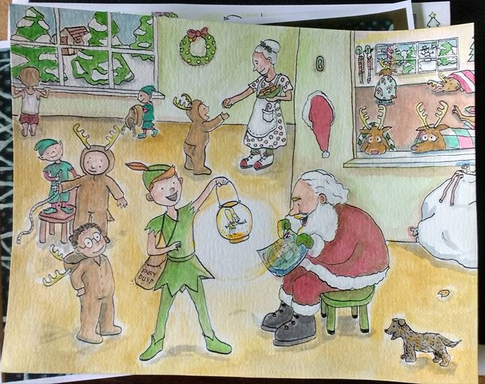
-
Hi Marsha! Its a very sweet style, so don't be down on yourself.
") I like the colors you have going on, my only suggestion would be to tone down outside the windows. Through the glass, things would be kind of lighter tones and having it be on the same color level as your foreground is taking away from it. Hope that helps!
I like the colors you have going on, my only suggestion would be to tone down outside the windows. Through the glass, things would be kind of lighter tones and having it be on the same color level as your foreground is taking away from it. Hope that helps! -
This style is so cute. It kinda reminds me of Arthur. The edge of the wall behind Santa is running right into his face so you should move the wall back.
-
@gimmehummus. I was thinking the same ting earlier but didn't want to redo the whole thing for that line, but, you're right. I really should move it. It's also pretty crooked so I could fix that too. Thanks!
-
@bharris . Good idea! I didn't really think about that. The reindeer are actually supposed o be behind a window too...hmmm...Thanks! Now I better do what I said I would do and redo it!
-
It is very sweet. My favorite part is the reindeer costume being fitted by the elf.
-
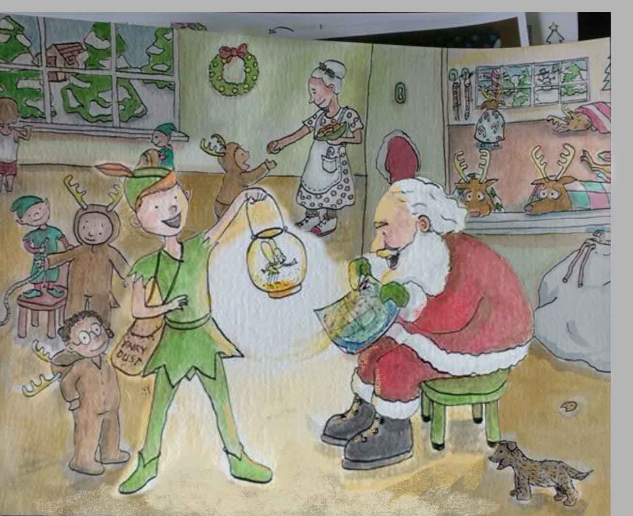
Marsha, this has so many beautiful elements! I know you aren't looking to redo the composition--especially since you are working traditionally (?), but I have some suggestions to incorporate next time... Give your main characters more and your lesser characters less. In this case, Peter and Santa would take up more of the page and Mrs. Claus,the lost boys, and the reindeer would take up less of the page. If you have photoshop, you could lasso and enlarge Peter and Santa. That alone would push the other characters into the background. Right now they are all of equal importance--both in value/color and in size. Here is a quick redo to show what I mean. I enlarged Peter and Santa and then darkened the back ground. I also added more light on Santa's front from tinker bell. You could probably make Peter and Santa even larger and push the values even more...but I didn't want to cover all your lovely background details. You really have a lot of talent! Can't wait to see more of your work!
-
@Joy-Heyer Oh, wow! Thanks. It's nice to have a visual. I see what you mean. The other one I did had Peter and Santa really big and some of the feedback then was that it was too much so.....maybe though, Peter Pan was the star and Santa was in the background then. Thank you for taking the time to do this. I still might be able to enlarge them a little as I haven't started inking my new one yet. We'll see how much time I have. Thanks again!
Marsha