May Prompt Critique
-
@carolinebautista Could you point me to where Lee White explains his process? I feel like I've heard bits and pieces of it but not the whole thing.
-
@Braxton Here's the video about the process he uses, where he outlines the steps: https://www.youtube.com/watch?v=h6u_g0RPiCA
He got questions about how to do thumbnails from that video so he did another one on thumbnails: https://www.youtube.com/watch?v=jghVE4V5FfU
-
@carolinebautista thanks! One thing I've been struggling with a bit, is when I make initial thumbnails it feels like I'm trying to work out the basic idea at the same time as figuring out the composition, and trying to do both things simultaneously is difficult for me.
-
@Braxton I do the same thing! I guess maybe I need to spend more time in the research phase. Maybe my “thumbnails” were actually just my way of exploring ideas, and once I narrow it down to a single idea, then that’s when I dive deeper with 50 thumbnails exploring that one idea.
Thank you @carolinebautista for explaining how you do it! I think I need to review Lee’s 50 thumbnails video, too. Thanks so much, everyone!
 ️
️ -
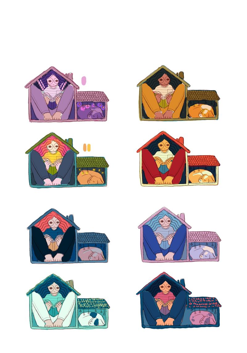
Okay, so I decided to work on #1 for now. I might end up working on all four this month. Here is my color study for the drawing. I picked colors from illustrations I liked by other artists, but it doesn't look nearly as great, and I'm not sure what I'm doing wrong. I did digress from my original value study because I got tired of putting the dark colors for the hair and pants every time, lol.
Does anyone see any glaring mistakes I'm making with color? Is there one that works better than the rest?
-
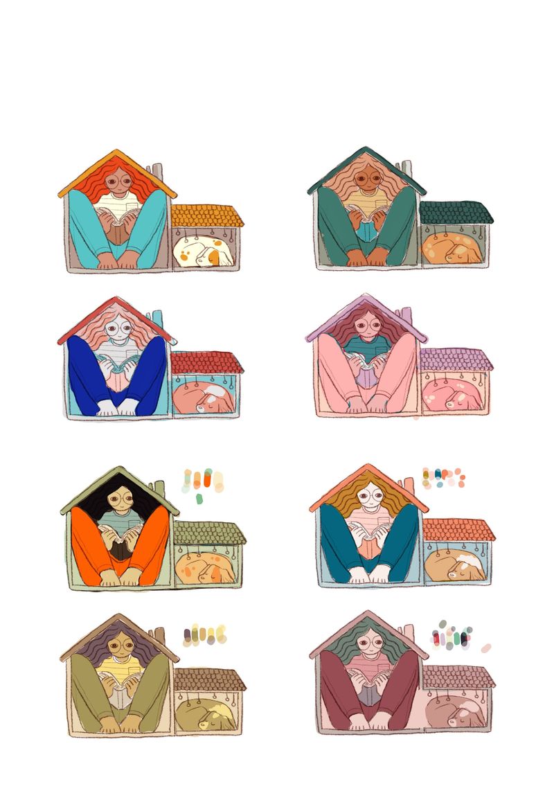
More color studies. I think the latter half of this round was more successful because I started mixing my own colors using opacity. It feels more unified to me and I think I'm getting closer to finding the perfect colors, haha.
I pulled the original colors from a website: coolors.co if anyone is looking for color palette generators. It's pretty easy to use!
-
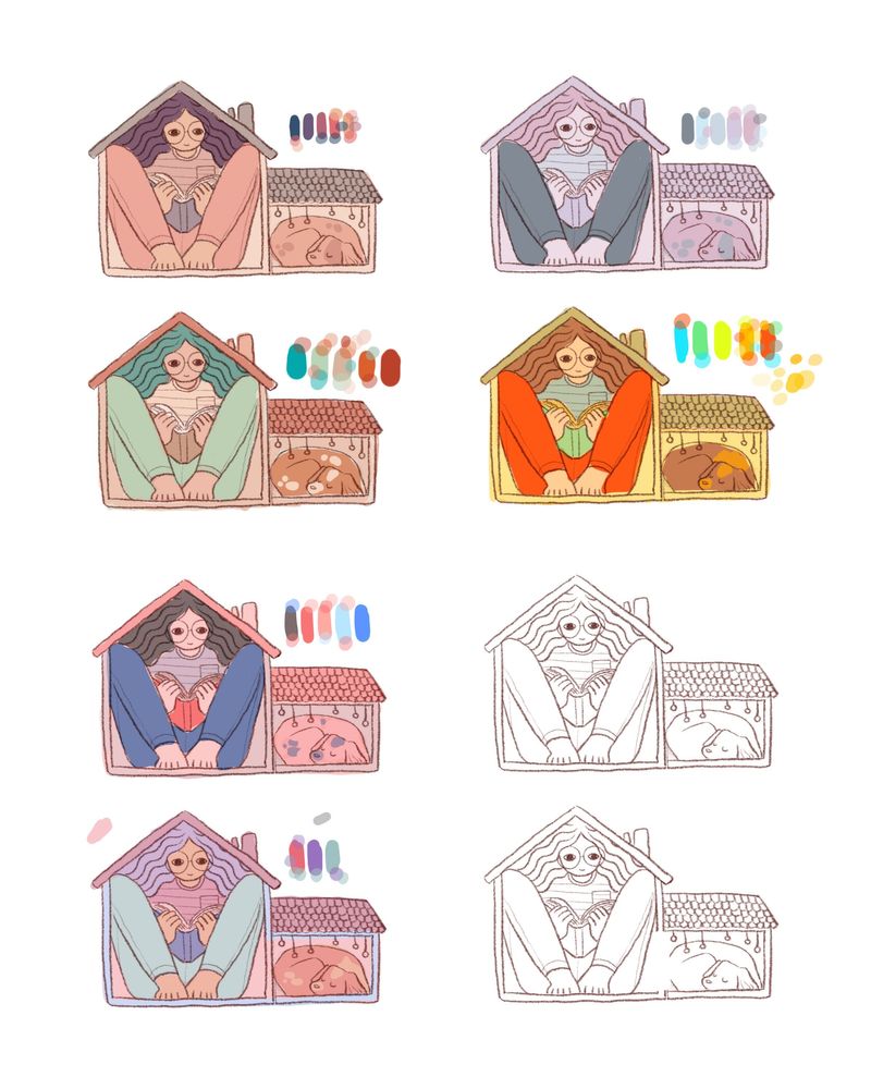
Third round of color studies. I think what I didn't like about the 1st color study was that it was too dark/saturated. I know I'm starting to get less contrast, but maybe the contrast doesn't have to be so dramatic? I think I'm going to go with one from the previous set, though.
My next step is to make a clean sketch and then onto the final painting! I don't think I've ever put this much work into even a simple drawing like this, but I think the result will be much better than if I hadn't taken all the steps.
Any and all critiques are always welcome. Thank you!
-
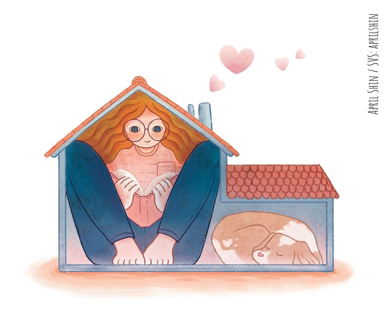
I ended up going with this color scheme. Here's the basic color. I'm thinking of having ambient light coming from the floor and the book.
I also did more brainstorming today regarding the other thumbnails and how I can make them better, i.e. more storytelling. Thankful for the feedback!
")

-
Here is the finished version for #1. Onto the next!
-
@aprilshin Hey April! I was about to comment on your previous post where you asked about which colour palette is more appealing and this was the exact palette I was going to choose. But then I figured out that you had already finished your piece. This looks great!
-
@Elisheba Oh yay! Thanks for your input, Elisheba!