Dec. 3rd thursday sketch
-
@DanetteDraws
WOW!!! just looked up Lisa Frank. HOLY MOLY lol. That is absolutely an assault on my eyeballs haha. you are right about that. lol I don't think my eyes could handle even attempting to replicate those colors like that haha.Maybe there is hope for me yet. haha
-
Reminds me of Leroy Neiman... yes sometimes I looked at the art in Playboy, not just the umm articles.
-
@Kris-Knight said:
It's funny that Pixar does such highly rendered things and they are so popular... but when it comes to kids books the styles are so different. I wonder why that is.
In my opinion the reason why Pixar is so popular is nothing to do with the rendering...but the fact that they work so hard on the storytelling (8 times out of 10, anyway, they're not perfect...)...there are lots of beautifully rendered films out there but the ones we really remember are the ones with great stories and great characters.
I love the traditional look too, because by default it adds personality....but one thing that is so good with digital rendering is how you can more easily create a really believable world that takes you away from reality into fantasy. The style you choose should be based on what makes you excited to draw and what makes you want to create those other worlds. If you're excited about it, it will be better and then it's more likely that other people will want to read/be involved in/commission you to make these stories/worlds. So I think generally you should mostly follow what inspires you most, while still trying out lots of techniques to broaden your ability...
PS Googled Lisa Frank too. Oh my eyes!!
-
I go back and forth. I absolutely love the high rendered stuff but I very much am in love with the loose painterly style. There is just something magical about it to me. I think I need to find me a teacher. lol.
-
WIP
Hi guys.
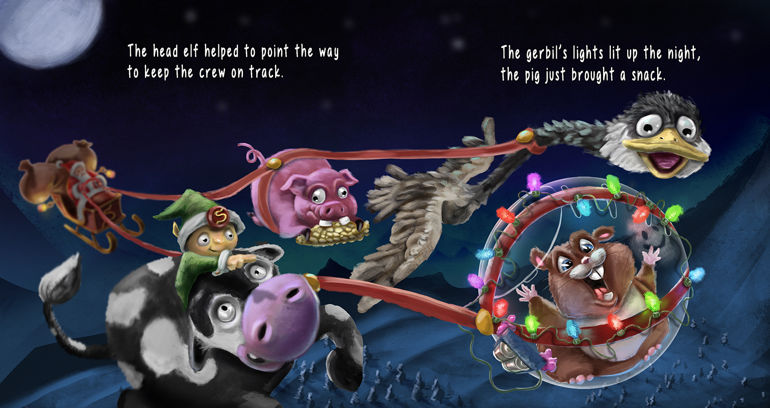
So I went back to my original style but I tried to make the image more loose and not so "smooth" and blended. I changed the chicken to a goose, redesigned the cow a little, the elf and a redesign on the pig. I decided to put Santa more into the background because I figure it is less about him and more about the characters pulling the sleigh. I changed the rhyme as well to work with the changes.
-
@Kris-Knight I love that you are really pushing and experimenting to find a way of painting that suits you...this is looking great. I like the expression on the cow, the way the reins stretch forward in a natural line, and the way you painted the feathers on the bird.
Things I personally like better about your original highly rendered piece that you could work in...the moonlit feel with the blues and pale light on the hills was really nice. At the moment your latest piece is looking quite dark all over. The text says that the gerbil's lights lit up the night, so maybe it would be nice to really make those fairy lights shine bright! I know that means two light sources at opposite ends of the piece, so maybe given the text the gerbil's lights should be the brightest. (could have clouds covering part of the moon to explain why it's a bit darker back there...) ...Anyway great work

-
@Dulcie
Thanks Dulcie.
I'll definitely play with the background a bit. I darkened this one to try to push the characters to be easily viewed. Perhaps I did it too much :). Yeah, I had dimmed the lights down a bit in this one. I give it a "glow-over" and see if I can get a good look without pushing too far. Good points. Thank you. -
@Kris-Knight I agree with @Dulcie that this got a little too dark, but looks like you're on that! I seriously love these characters and your rhyme is just too funny! Great job, keep posting!
-
Hey guys, So here is my final I'll be turning in.
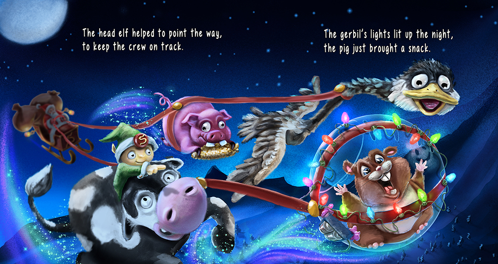
Changes I made - Made a custom texture brush and used it to help brighten the background as well as go over various parts. Stars added. Magic Sparkles added. A few other here and there things and thats it.
-
I think you've found a nice balance now between having the background dark but still very much moonlit and magical - love the added sparkles and the fairy lights look great!
-
@Dulcie Thanks Dulcie
