JULY CONTEST: Design a book cover for the Wizard of Oz
-
This is exciting, going to try really hard to participate in this one

-
Is this book cover specifically for the first book by Baum in the Oz series ("The Wonderful Wizard of Oz") or can it cover the whole Ozzian timeline?
-
@austinmdiamond I just re-read the prompt and it said AN edition of 'The Wizard of Oz' and doesn't specify which one. Personally I'm using the 1956 edition, which is quite different than the movie, which many of us probaly have etched in our brain
 !
! -
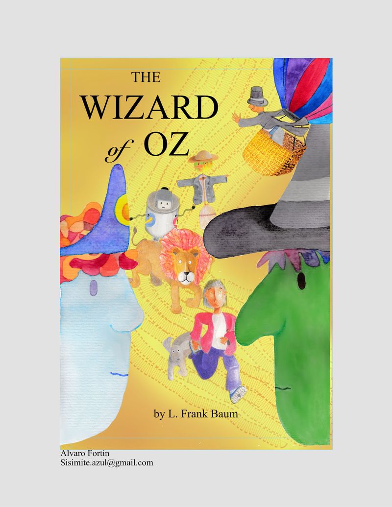
@sisimite-azul hi, you've deleted the z from wizard
-
@carrieannebrown Oh! Thanks! I´ll fixt it.
-

-

-
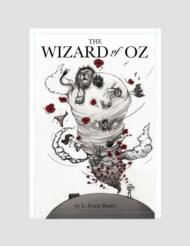
@lucillustrations you finally got it to post, that's great - but you can go back and delete one because you've posted two copies. I'd keep the one that has more likes.

-
@Heather-Boyd - Thanks. yes I’ve tried - having a few technical difficulties.
-

DK Ryland
DanielleRyland@gmail.com -

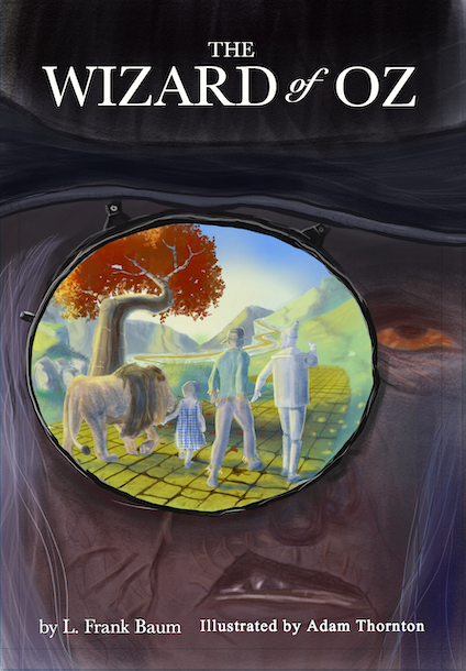
Hi everyone! My first ever contest entry. After feeling intimidated by the high standard of illustrations being posted by my fellow SVSers, I've decided to join in after realising this is a great way to encourage yourself to improve. I hope others do the same. As ever, I'm looking forward to seeing everyone else's work.
Adam.
UK. -
@Adam-Thornton We had the same idea. My picture is in a circle, but very diifferent, I also have my trees extending outside the circle. I think I'll wait to submit it though so they aren't right together.
-
@Chip-Valecek this is such a fun prompt! I just have one sort of technical question - I know there is a template a very specific size requirements/print specs, but there isn't anything in the prompt regarding web size, and already the final work posted in the thread varies greatly. Could you add specifications for the uploaded image size? thanks!
-
@deborah-Haagenson Hey Deborah, yes, I'd imagine that it's easy to have similar ideas. The circle on my picture is supposed to represent the witch's telescopic eye watching Dorothy et al. before she sends out the wolves. I'm looking forward to seeing yours.
-
@Lucky-Platt The original email for this contest says the image size must be no more than 500kb. Hope that helps

-
@Adam-Thornton thanks! I was wondering if there could be a pixel-width specification so that when everyone uploads their work it looks the same, but maybe that's too techie

-
@Lucky-Platt I'd say that's asking too much from us beginners!

-
@Lucky-Platt We have specifics in inches. Pixels are just another measurement. Am I missing something? I checked before I started and if I remember correctly the size limit made sense when reducing a 300 dpi 8 x 10 or 8.5 x 11 to 72 dpi. Has anybody else checked this out?
-
@deborah-Haagenson so sorry for the confusion, I'm going to try to explain why I was asking about image size.
By image size I meant the size of the image as it appears on a laptop or tablet screen, which is totally variable depending on how the image is saved and uploaded for web viewing. The specs that we were given (5.4" x 8" with .25" bleed) are for print - meaning, if you're working digitally, your document or image size would be 300dpi and 5.4" x 8" plus a .25" bleed. If you're working traditionally, you are creating a drawing/painting/whatever that is 5.4" x 8" with at least 1/4" additional border art on each edge that would cover the bleed and then scanning the artwork at 300dpi. (Of course either way you could work larger than 5.4" x 8", but your work would have to be scalable - proportionally larger, so that when the art was reduced for print, it would meet the specs.) Anyway, I was just hoping that we could see the cover submissions at a uniform size - the ones that have been uploaded so far are many different sizes.
-
@Lucky-Platt Thank you for the information! I didn't realize that the sizing was for print. I'm not very knowledge when it comes to file sizing beyond what we normally submit for this contest.