Thumbnail Composition and Color Tips/Critique
-
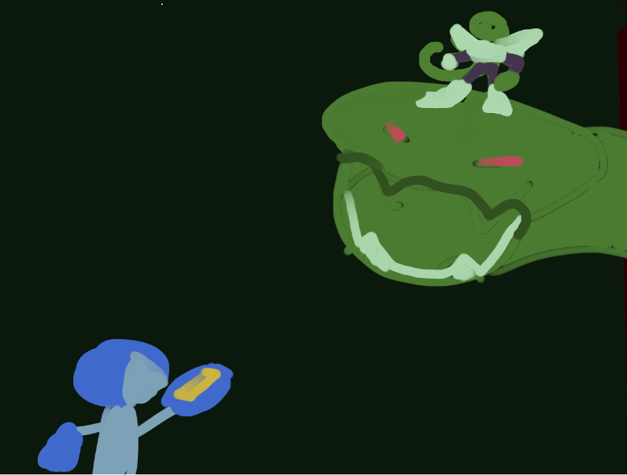
Hello! I'm new to these forums and I'd like some tips/critique on the composition and color choices for these thumbnails.
I have 3 thumbnails, 2 of which share the same color scheme. I want to know if they read well, tips on thinking through composition in thumbnails, and anything that may seem obvious but I'm missing.
I still have a lot to learn, and I'm looking forward to learning from all of you.
")
Thanks in advance!