September contest ideas
-
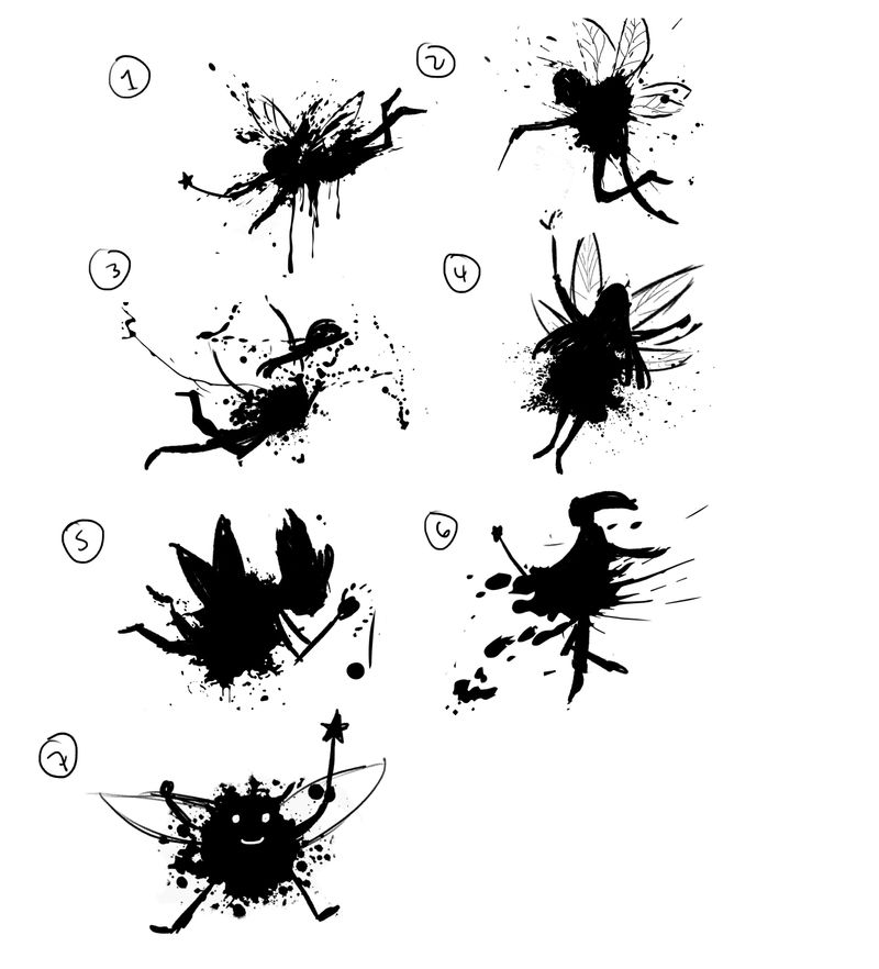
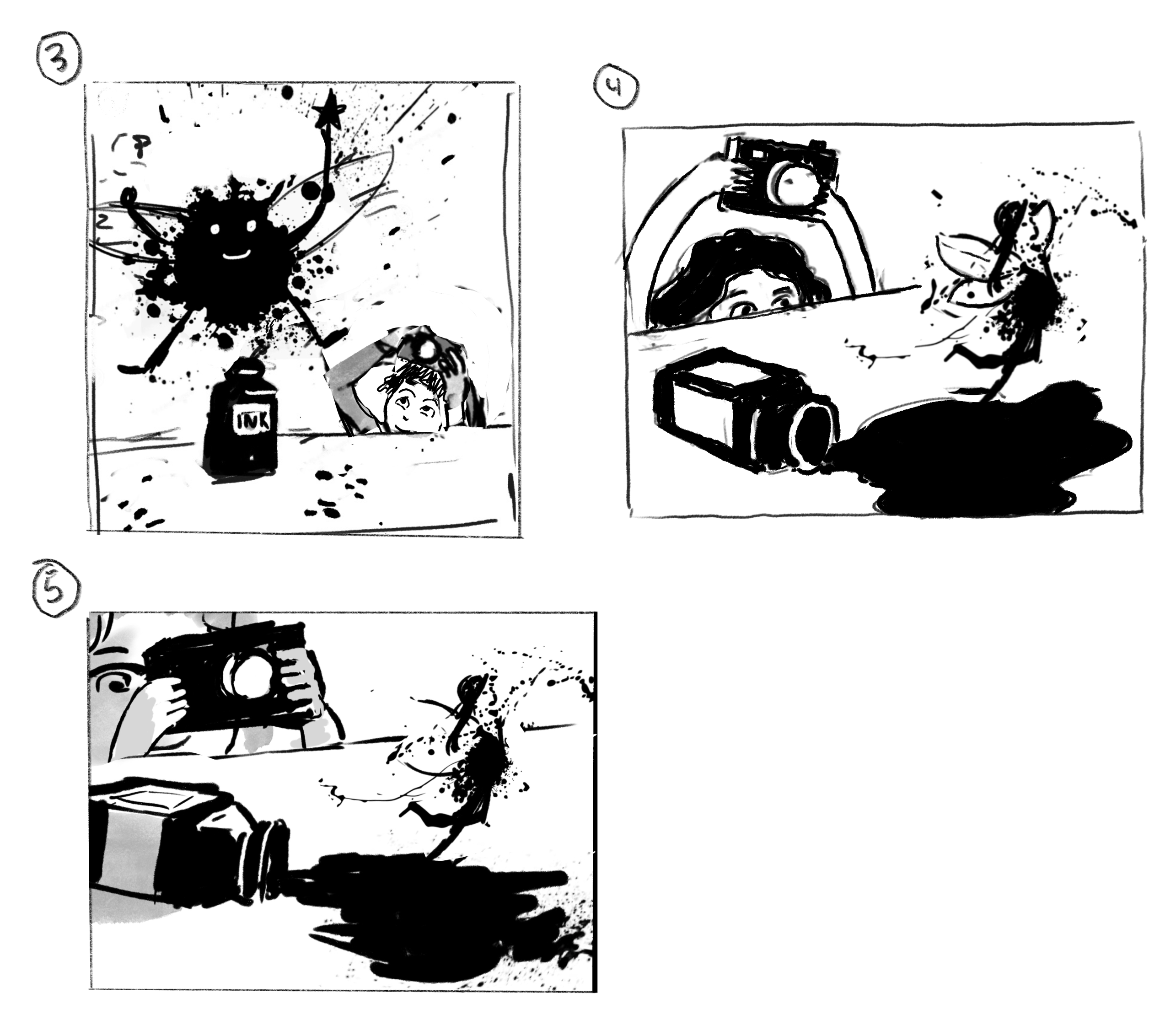
I’ve been playing with idea of drawing the ink fairy based on an ink splatter pattern. Here are a few attempts, I wonder if one stands out to people?
I’ve also been exploring a couple of thumbnails, any feedback would be greatly appreciated!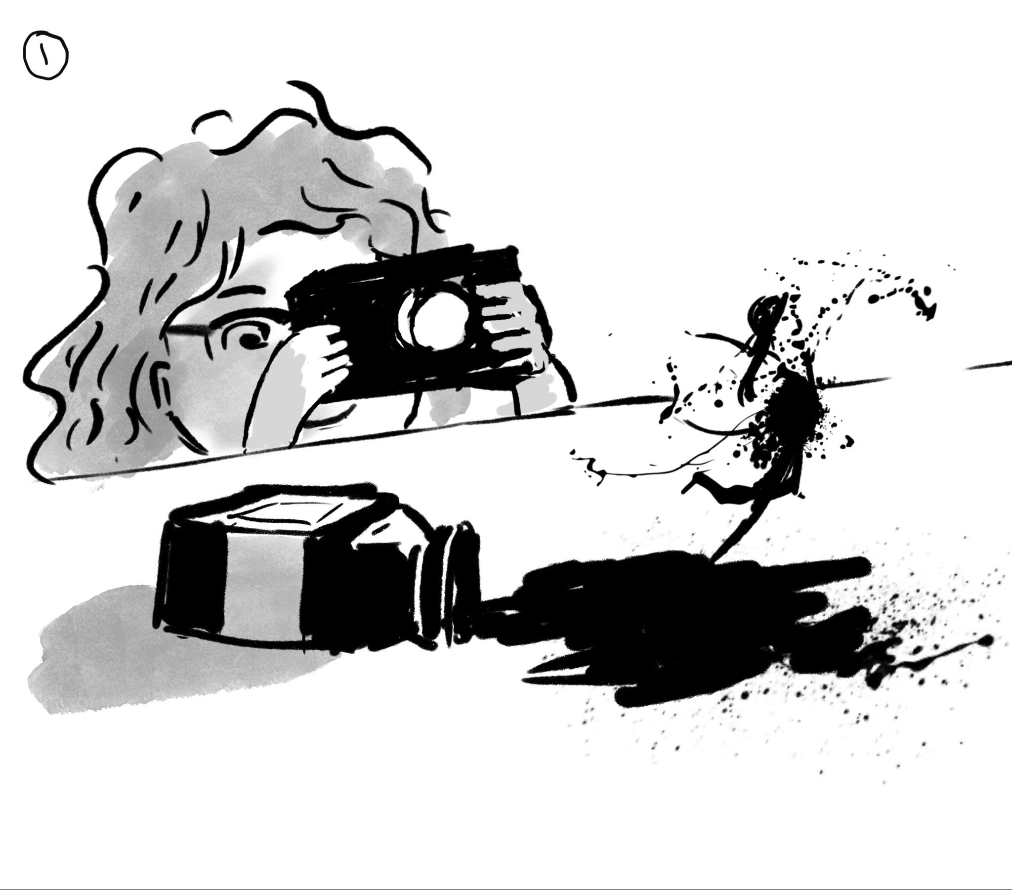
-
Really fun concepts for the fairy! I’m more drawn to thumbnail 1 because my eye is drawn to the fairy first. In the second thumbnail I notice the child first.
-
@Braxton I really like the silhouettes of fairies 4 and 7.
Your thumbnail ideas are looking nice but you could probably pull out a bit more story/emotion. I definitely gravitate more towards composition #1 because you can see Ellie’s face. -
it's hard to choose! i like numbers 1 and 3 the best but #7 is hilarious lol I like the ink splatter idea!
-
@Braxton Hi. Of the first set I like number 2, it shows more clearly the fairy wings and in the second set I like the first one again because of clarity.
-
@Braxton I really like fairy number 7! It's very cute.
")
As far as the thumbnails go, I like number 1 more. It feels like there is a lot of clarity in the composition.
-
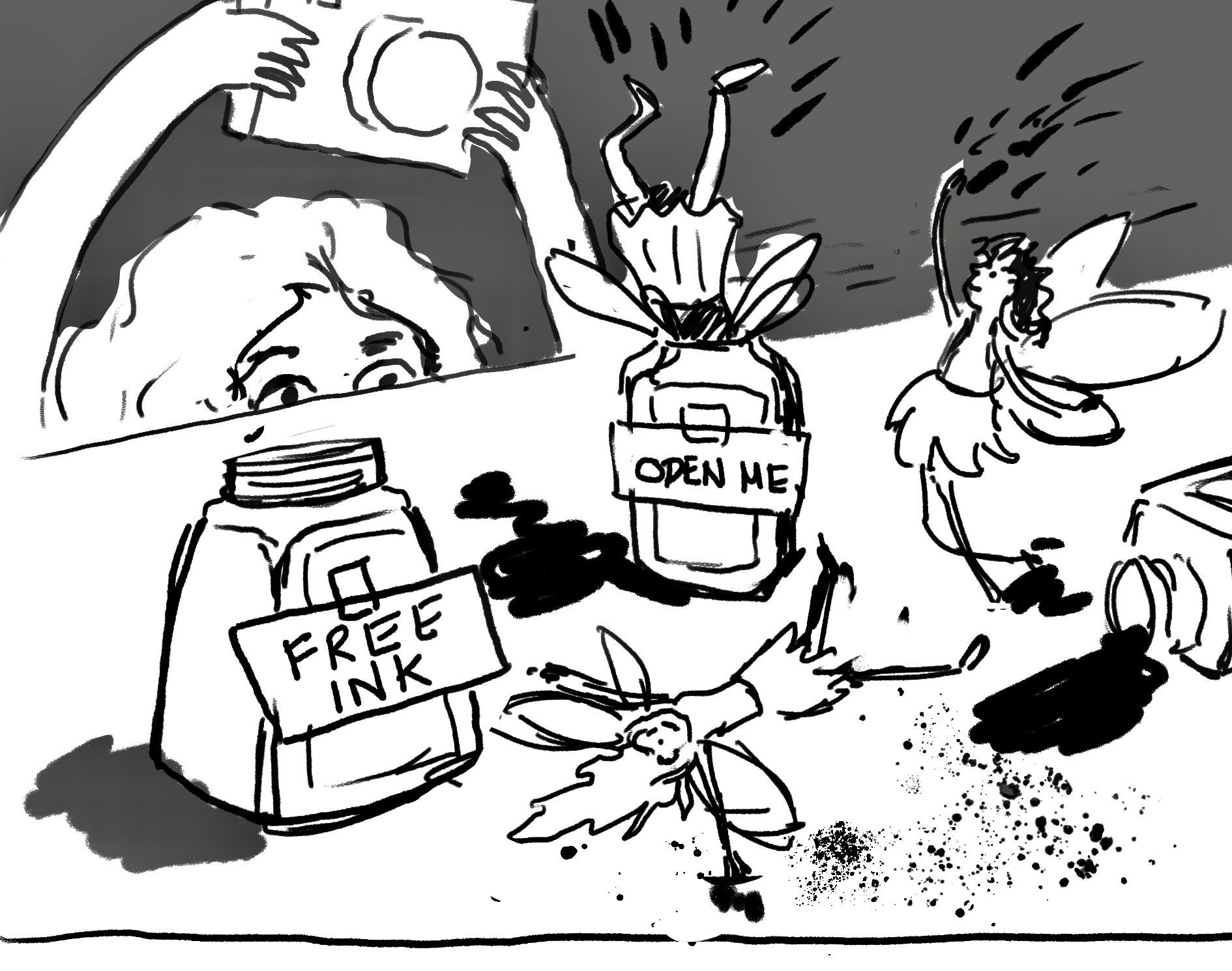
Thanks @Elliot @Lovsey @Mary-Toth @Heather-Boyd @Jacy13! For the first thumbnail, if you had to guess what was going on in terms of story, what would you say? I know it needs more clarify, but I'm curious what your first impression is?
-
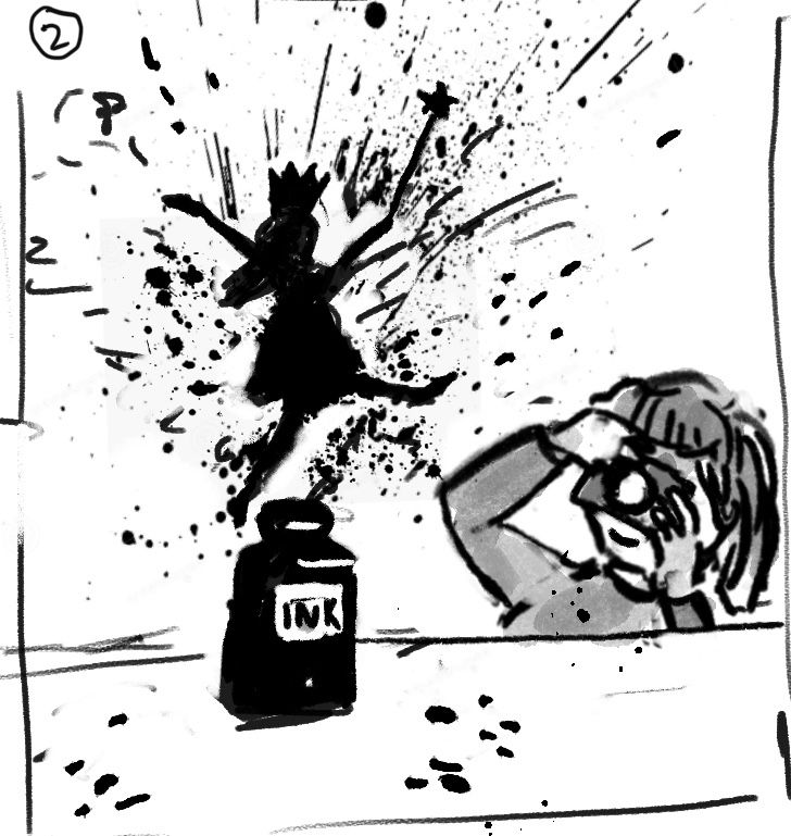
I love your fairy ink splatters! I actually prefer your second composition. It has so much more life and energy, and there is more focus on the fairy exploding from the ink bottle, where as in your first composition it feels a bit less dynamic as the girl and the ink fairy are of a similar size and take up a similar amount of space and (in my opinion) is a little less interesting to look at
-
@Braxton fairy is either playing in the ink in the air or using the ink to sprinkle and make a mess while the young girl is taking a picture.
Instagram: www.instagram.com/heatherboyd.illustration/
Website: https://heatherboydillustration.ca
Shop: https://www.inprnt.com/search/products?q=HeatherBoydIllustration
Ko-Fi: https://ko-fi.com/heatherboydillustrationBe blessed,
-
@Heather-Boyd Thanks for the feedback! That's basically what I was going for, although my original idea was that the fairy would be kind of be emerging/coalescing from the ink pool (I'm not exactly sure how I would show that though).
-
The #2 fairy is definitely my favorite. And I like the idea of the fairy dancing across the table. It's more playful to me. Really great ideas!
-
@Braxton emerging maybe have no ink splattered to the right of her, so that it looks like the ink is lifting off of the ground and forming her. Does that make sense? I did a really poor draw over (touch pad mouse) and also added a bit of ink drop to the right side. If you go the route of 'emerging' maybe other things emerge also, or even the ink fairy can create other things with the ink in hand. I don't know, lols but I like the emerging, that's different -I would think about how the ink fairy might have gotten trapped in the ink jar like a genie in a lamp, maybe the ink jar is more than a standard store bought one? You can have that idea if you'd like -I just mean push the story more.
I hope this helps.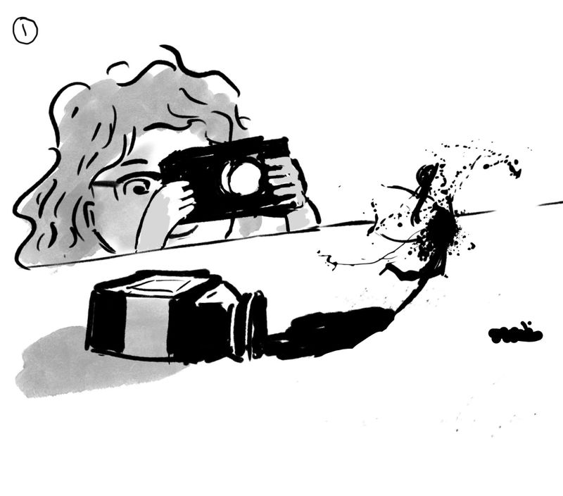
Instagram: www.instagram.com/heatherboyd.illustration/
Website: https://heatherboydillustration.ca
Shop: https://www.inprnt.com/search/products?q=HeatherBoydIllustration
Ko-Fi: https://ko-fi.com/heatherboydillustrationBe blessed,
-
Ooh, I really love the play of positive and negative space in fairy design #3. And I am more drawn to the composition of thumbnail #1 but you may want to check your rule-of-thirds on that one because it looks as though the table edge may be slicing the image in half vertically. You may want to favor one side or the other a little more dramatically so Will, Jake, and Lee don't sass you
-
@Heather-Boyd thanks, that definitely help. I think I’ll have to play around with it a bit
-
I like the 1st fairy, I feel like it reads the most as both a fairy and an ink splatter to me. And I also like the 1st thumbnail for layout
-
@Melanie-Ortins thanks! I like fairy 1 also because the drips feel particularly “inky” to me, if that makes sense. It seems like mostly people respond more to the composition of thumbnail 1, but I’m wondering if it’s lacking from a story-telling point of view? Not that other one has much of a story either. Idk sometimes l like to keep things simple, but I also want it to be interesting
-
I’ve been playing around with my composition, I’m wondering if any of these thumbnails feels like an improvement on my earlier ones?
-
@Braxton I like all of these compositions for different reasons

#5 has the best sense of scale
#3 is the most dynamic, best at leading my eye around
#4 has the more the most interesting character gesture (as a note, the ink bottle reads more as paint or medicine bottle to me in this one) -
@Braxton I'm really liking number 3! I like how Ellie is holding the camera above her head to take the picture, and I really enjoy the fairy design
-
@gavpartridge I think that’s a valid criticism. I guess I’ve been having a hard time coming up with a good story. Does this feel any better? It might be a bit silly, but maybe there’s just enough story to be fun?