My Journey of Creating a Book
-
@Gary-Wilkinson love your illustrations. The character design, the lighting, and the color are so lovely.
I too wonder about your layout design choice. The current layout reminded me of some classical children's storybooks. If your story has the same kind of vibe and aiming for a timeless, classical feel, this layout may work perfectly. If you are looking for a more dynamic feel, this layout solution may not be ideal.
I look forward to reading your book. The illustrations look so fun :-).
-
This is fantastic! Your characters and colors are delightful. I especially love seeing all the process work and alternate directions along the way.
I work as a designer professionally and agree the typography has a classic look. I don't think that is a bad thing at all given the amount of text you have on each page. I have seen some children's books that try to get too cutesy with the typography and end up making the words harder to follow and identify for early readers.
One thought on the cooking/mixing bowl illustration: There are a lot of ingredients floating in the margins, but not a lot of motion in the composition. Maybe the ingredients form more of a spiral, swirling out of the bowl? Nothing extreme, just a bit more dynamic, and give the eye an obvious path through the illustration.
Nice work! I look forward to following your progress on this!
-
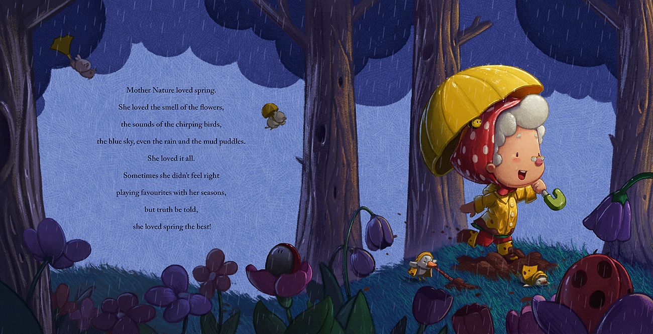
Another thread back from the dead. So I recently finished a project and have some time on my hands before the next, so I wanted to see where I could go with this book and to further practice a more traditional media look. I agree that the layout seemed quite dull in the earlier versions and although I want to keep with a single page for text and a page for the main image I felt like it could be done a bit better. This is the first spread and although I don't have all of the book planned out yet i'm hoping I can keep this style throughout without it becoming boring.
-
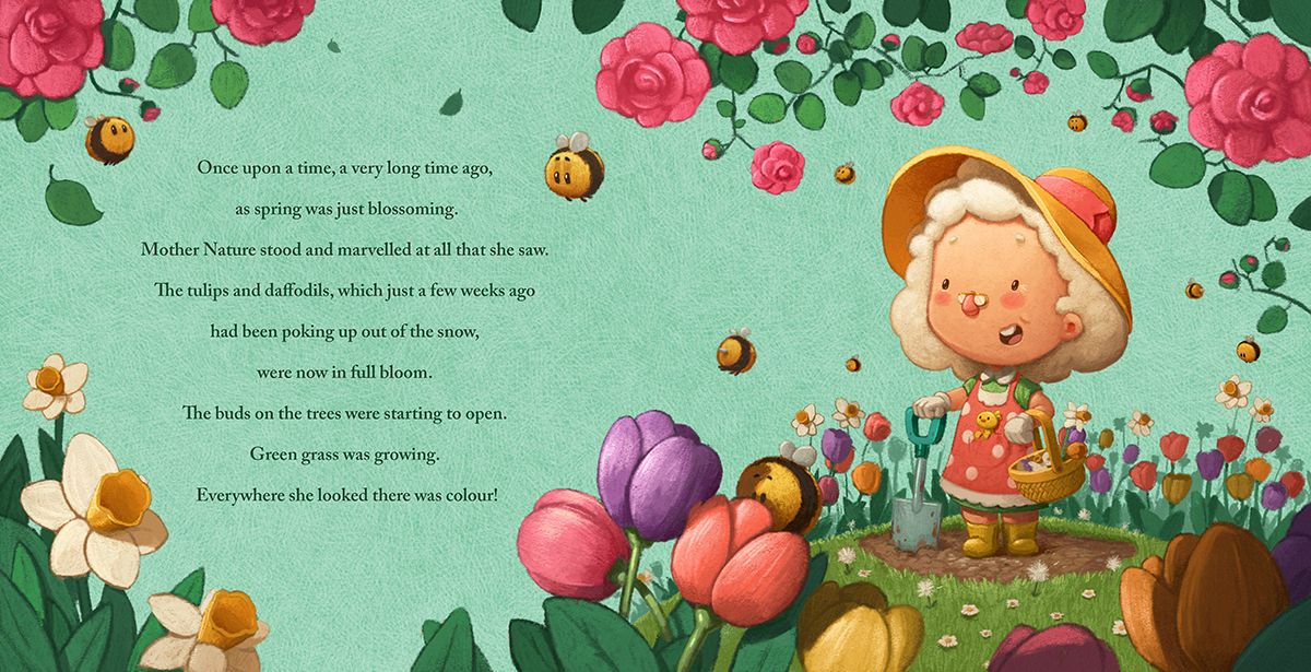
@Gary-Wilkinson turning it into a two page is definitely an improvement in the composition. Also the bees are very cute! Having some pages be two-page and other pages having spots/vignettes will help give variety for the story but also for your portfolio to show how you incorporate text on the pages.
-
How did you do the texture for the background?
-
@kayleenartlover the texture is a layer I made by cross-hatching and is just set to screen mode over a flat color. I kept the layer as it's own file so I can use it for multiple images.
-
@Gary-Wilkinson cool thanks
-
Still some detail to add here and there, but starting to take shape. Will be looking at adding vignette/spot illustation in some of the next pages.

-
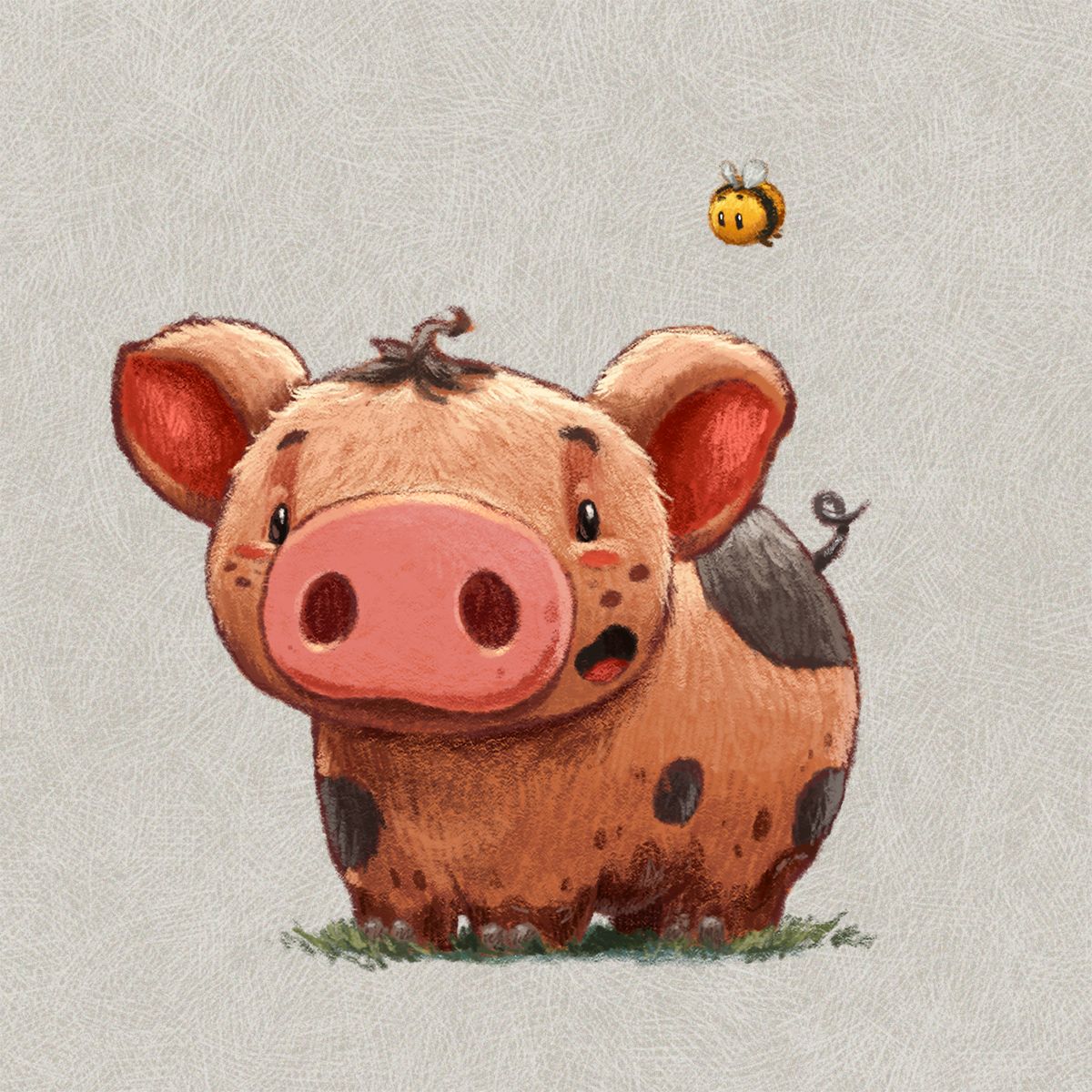
Also redesigned the pig somewhat to fit with the new style

-
@Gary-Wilkinson Adorable character sketches, so expressive.
