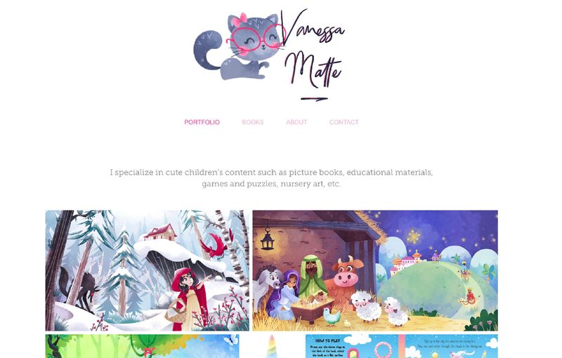
Portfolio update
-
@NessIllustration I look at other's works for ideas of monsters, aliens, robots etc. But I understand.

-
@NessIllustration Love your site, the content is very well organized, and I can really get a sense of who you are as an artist right way.
My only nitpicking would be: consider change "books and projects" to simply "books".
It seems that the only project that is not a published book is the Harry Potter one. Even though it is a personal project, it is a book (not published one yet, but nonetheless, a book project :-).As for what to take out or include in your portfolio: I do not think you have too many pieces at all. The Asian people piece did stand out for me, only because the subject matter is very different from the rest of the portfolio. I think it would work better if you have 2-3 pieces from the same projects.
-
@xin-li That's a good idea, Xin! This section used to contain more personal projects from before I was published. Now that I have actual books to showcase, it might be time to rename the section and remove the Harry Potter project from it as well. I mean the pieces are already in my main portfolio anyway!
For the Master Painter piece it seems to be a consensus! Then I guess I will remove it. You're right it is a bit different from my usual stuff (it was a prompt for a reading cards gig). I will put on my to-do list to make a new piece with Asian characters in it though, I feel it would be lacking from my portfolio!
Thank you very much for sharing your thoughts
-
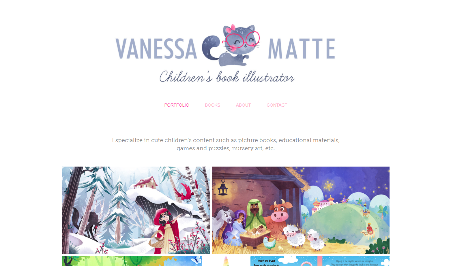
@NessIllustration Can you get "Vanessa Matte" and "Children's Illustrator" on separate lines in the header? If not, you can try including this text as part of the kitty logo (this way you can customise the font and color as well).
-
@Neha-Rawat Right now the whole thing "Vanessa Matte, children illustrator" is set as my website subtitle, so the whole thing shows under the logo
 I could put it inside the logo to go around that and be able to customize/put on 2 lines, but I guess I never really thought about it being a big deal before... Do you think its necessary?
vanessastoilova.com
instagram.com/vanessa.stoilova/Check out my Youtube channel for tips on how to start your career in illustration! www.youtube.com/c/ArtBusinesswithNess
-
Hi @NessIllustration, portfolio and website looks sharp! I like that you added the testimonials on your about page. I was thinking you might want to add a client page to highlight all the great clients you’ve worked with, and perhaps move the testimonials there?
Don’t take this wrong, but I feel your name could be integrated into your logo a little more. Right now, it looks like an after thought. I would remove “Children’s Illustrator” since your work and book page speaks for themselves.
I did a rough mockup below, but hope it doesn’t offend.
-
@Jeremy-Ross That does look nice, I'll think about it! Thanks Jeremy! I'm mostly keeping the "children illustrator" part, all in text, for SEO purposes but it might not be necessary.. As you said, it's the work that's important! Most people get to my portfolio from the direct link.
-
@NessIllustration I personally think it's 100% necessary since it's your branding and visible on every page, so it should be visually appealing. For me that's the weakest part of the website.
If you're worried about SEO, I think there are other ways to get around it like adding the text in your "alt text" of the logo etc. Maybe someone with more SEO understanding can help with that.
-
@Neha-Rawat You make some great points, Neha! I went back and figured out some fonts and colors. What a difference it makes! Thank you @Jeremy-Ross and @Neha-Rawat, y'all we're absolutely right!
vanessastoilova.com
instagram.com/vanessa.stoilova/Check out my Youtube channel for tips on how to start your career in illustration! www.youtube.com/c/ArtBusinesswithNess
-
Looks great @NessIllustration! Personally, I would use caps for Book and Illustrator since it’s a title.
-
@NessIllustration Ooo! So much prettier! Looks lovely!

-
Looks perfect to me!
If I may point out 2 typos in your ''About'' page, they might even not be typos, but someone who is a native English speaker would probably know better:-
Paragraph 1, Line 1: ''Hi! My name is Vanessa and I'm a children illustrator - should it be ''children's illustrator''?
-
Paragraph 3, Line 4: ''...along with a variety of other work in educational and editorial.'' - I feel there is a word missing after ''educational and editorial'', maybe market? As in ''educational and editorial market''.
I hope it's okay to mention these, the whole page is absolutely perfect, but these two little things just caught my eye.
-
-
@TamaraDomuzin No no thank you Tamara!! I,m not a native English speaker so I really appreciate the help with this, I need it!
Thank you! -
I love your website! It looks neat, professional, has great portfolio pieces. I also like the stylistic choice (pink writing, but subbtle) matching the portfolio.
In the About section, the photo is also well thought of (natural light, studio environment) and you're lovely on it. However I would take another one : if you place yourself a little bit on the right, you show more of your screen and hide the computer tower. If you take it a bit closer, the picture won't show the cables on the floor. I know it is really about details at this stage - yet I see all the care brought to the website and it is nearly perfect everywhere, so I thought you would like to bring the little improvements to the photo as well.
-
@Julia I know just what you mean ^^''' My work space is ugly, cluttered and there's wires everywhere.. It's so hard to take a good photo of it! I wish I had the cute Pinterest looking office space...
vanessastoilova.com
instagram.com/vanessa.stoilova/Check out my Youtube channel for tips on how to start your career in illustration! www.youtube.com/c/ArtBusinesswithNess
-
@NessIllustration your workspace is very decent! For the photo, think of an illustration.
No tangeant near the head (the space around the head needs to be clear of objects that distract the attention of the viewer from the face), maybe put a plant on the table between the screen and computer desktop to hide the plugs, put yourself a bit on the right to show more of the screen and reframe the photo to show less body (1/2 is enough) (and the wires on the floor will disappear as they'll be out of the frame).
Really, it is like building a picture for your portfolio")
That said, the photo is pretty. You can leave it like that as well. The important stuff is your portfolio!