Mystery: A B C
-
-
I'm sure i'm not the only one that keeps checking to see if the next letter is done and posted! Love it! - Reminds me of Edward Gorey's " Gashlycrumb Tinies" - wonderfully creepy!
-
Loved the style ( I did learn 3 new words also
 )
)I feel that the cat is too small. I think the hat will note lose prominence if you make him a bit bigger.
Cheers
-
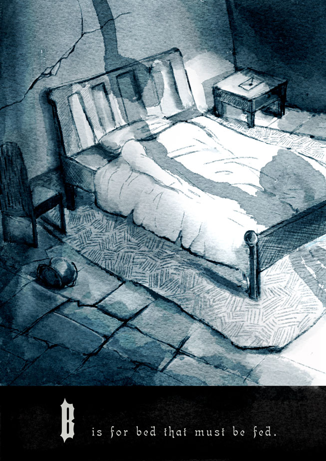
Love these! the thought of a bed that must be fed is quite terrifying hehe
-
@Kevin-Longueil Thanks Kevin! yes I'm trying to go for Edward Gorey feel
@sergio Thank you! for the suggestion. I'll try to change it up a bit and see what happen!
@Lynn-Larson Thanks Lynn I'm glad you find that creepy haha. -
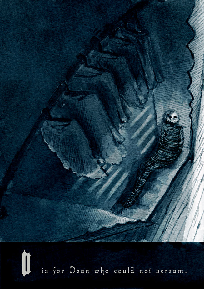
B and D have been my favorite so far!
-
Beautiful and dark. Good job.
-
These are all amazing! I can't pick a favorite!!!
-
@Naroth-Kean These are great so great- i thought i would mention that one thing that draws my attention in these excellent illustrations is the black box with the nearly white lettering - it really tugs at my attention - just wondering if you have tried putting the lettering directly on the image? - not saying that would be better - i tried greying the black box but i'm not sure that is better also - if it were in a book each illustration could be on the right side of the 2 page spread with your text on the left page ...does that make sense - i think for me the hard straight line of the letter box and the high contrast of the lettering may be too attention grabbing - sorry no real help here but i thought it might be worth sharing
")
-
@linsayraecarr Thank you!
@Thrace Thanks Thrace!
@Kevin-Longueil Thanks a lot for sharing the idea, and I think it's great! Maybe i should give it the black bar and illustration borders to disguise their attention. I have not totally decided what font or design yet, I just threw something in there haha. I actually find the Cap very distracting. I'll go do something and I think should design the layout before I continue. Thanks again