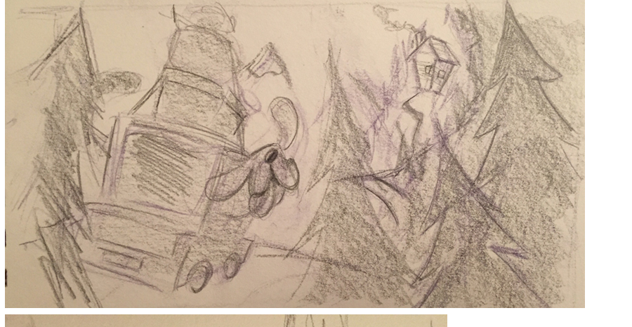
Illustration thumbnail et preliminary sketches
-
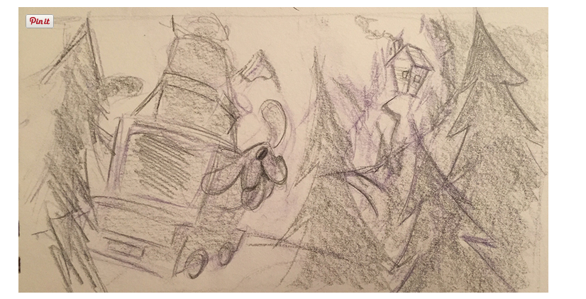
I like the middle one, it sort of reminds me of Denis Zilber's piece of the animals coming from the circus. Check out his site for the example http://www.deniszilber.com/. He is also preparing a class for SVS which I can not wait for.
-
I like the middle one two but I like the feel of the vertical look better as well. Could you change the middle one and make it vertical? I love the little crooked cottage!!
-
This one drew my eye... lots of motion in the vehicle and the crooked trees, plus it sets up a story more. Plus you have more room for text if you decide to create a story around this. I couldn't tell but above his ear are there articles that are falling off the car? That certainly adds to the movement/liveliness of your work as well. Looking forward to your progression, thanks for sharing!
")
-
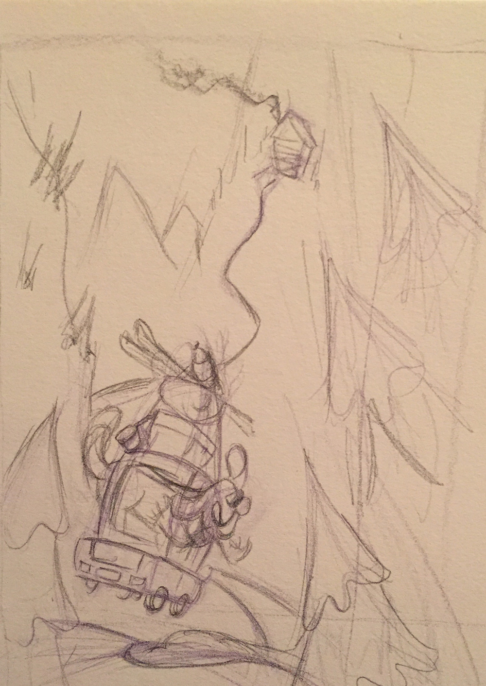
I did a new one trying to combine the motion of the car and perspective from the middle drawing with the vertical composition that I like. I also changed it to a winter scene. Let me know what you think! (once again this was a really quick sketch, just to figure out composition mostly)
noemiegionetlandry.squarespace.com
noemie_illustration on Instagram -
@NoWayMe I like it better but use the crooked road and little cottage from the middle sketch too. I love that part!
-
I like the 2nd to the last one best.
-
@Stephanie-Hider I am not sure which one you mean haha! Could you take a printscreen ?
Thanks!
-
Sure sorry about that. He looks like he is having so much fun and I like the house in the distance.
-
Mmmm... It seems like everyone keeps going to the horizontal one... is it because the composition is better or because the separate elements (dog, car, house) are better ?? I kind of like the vertical composition better, but now I'm confused!
-
Probably the reading from left to right that we dont consciously think about. The vertical one lets me see the house first which may change after you put in value and color.