Feedback/critiques Please!
-
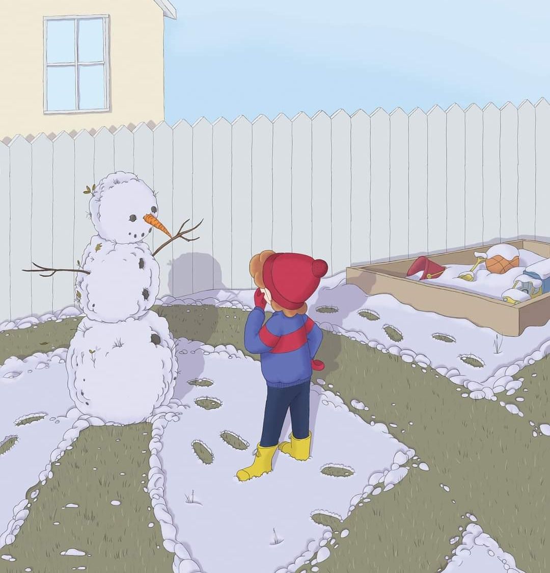
This is the first page of a new book project. I am hoping some of you wonderful people can share a bit of expertise on it before I continue with the rest of the book.
-
@jenithornhill Hi, from this one page your style looks very clean and I love how you have the snow on the grass, that's my favorite part and the grass in the snowman; my snowman tend to come out this way.
If you could, would you tell us about your book project? What will the book be about? I haven't made a book but am currently interested in layout designs and how to tell or set up a story throughout the pages.
Have you made thumbnails and sketches of the other pages, how each one will work together to create your final project?
")
-
Thank you Heather.
The book is called 'William's Winter Stew'. It is about a boy who feels bad for the skinny, raggedy looking snowman he builds. Thinking the snowman is hungry, he makes the snowman a bucket of "Winter Stew". Through the story more and more snowmen show up at Williams house, and he tries to feed them all. This is the first page, where William has just made his first snowman, and is noticing something doesn't look right. -
@jenithornhill Hi, I am not sure if you are also looking for critique on this specific piece. If yes, please read on. I think it is lovely over all, just realised that the edge go the fence, the sandbox (don't know how you call it in english) would need some snow. and the footprints are almost to clean, in my opinion.
-
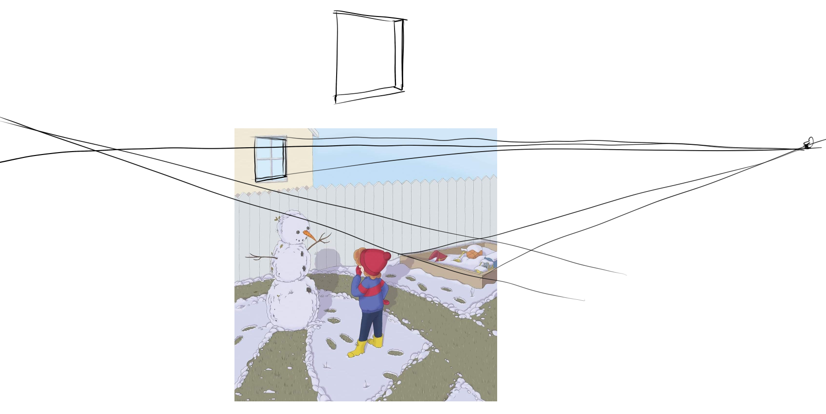
@jenithornhill the figure and snowman look good. I would check the perspective on the background, mainly the horizon should be around the level of the window, so we should see some land back there above the fence. The window looks a little lacking in perspective too, compared to the sandbox. I dont think we would see the shadow of the fence since the light is from above. All easy stuff to fix.
-
Lovely piece, I think the footsteps in the snow are great and the subtle texture of the grass is nice. Love the snowman. The top of the image lets it down a bit. You could crop the image below the top of the fence, so you don't see the house or sky, as has already been said you should possibly see more back ground behind the fence and the shadow of the fence on the house is not coming off well. But as I said you could get around this by loosing the top of your image. Nice work though!
-
Thanks everyone. I see now that the window perspective is off. I struggled a lot with the sandbox... so it may be that perspective that is off... I am not sure. I played with taking the sandbox out all together, but the things in it are used later in the book, so I was trying to establish their existence earlier on.
I was trying to leave detail out of the top of the page because that is where the text will go, but now that I realize it looks weird, I am thinking maybe I can add more neighboring houses and put the text over the fence area. -
@jenithornhill I think the sandbox looks good. you can use those lines as a guide to make the window converge to the same vanishing point.
-
I like the style! I wonder if it would help the composition to move the sandbox under the window and move the snowman and child to the right, then crop the right to eliminate empty space. I might even increase the height of the snowmsn then to rise a little above the fence. I know that might be too much to change at this point.