WIP advice needed - Final product not living up to my hopes/expectations... Opinions/Discussion Welcome :)
-
Hi everyone,
I find that I have a bad habit of being very unsatisfied with my work at times. I can't pinpoint if it is simply because I'm creating an image that I'm not passionate about or because the image is actually not very good. I'm creating this painting for a book cover for someone I've worked with multiple times. They always like what I produce but there are definitely times where I feel the work is not good enough to be on a book cover and I kind of feel bad about being paid for it by the end. Does anyone else ever feel this way?
I've been moving more towards digital art lately because I find the process smoother/easier/cheaper/quicker than traditional. But I had already made one cover for a client in watercolor so they wanted this next book to be in the same media/style.
Anyways, I created a sketch which I liked but now that I'm creating the final painting there is something I just don't like about it and I can't put my finger on it. This often happens with traditional paintings for me since they are so much harder to edit and change colors once they're on the paper. I'm not sure if it's just that I don't have as good of a handle on the media or if my color choices are off/not meshing as well as they did in my head. It makes me wonder if the traditional paintings that I create and end up liking are just a fluke. It shakes my confidence in my work for sure and I just am wondering at what stage of your careers did you face this challenge (or maybe you never faced this)? Do you have any constructive tips, feedback, or advice?
Constructive criticism for the painting itself is also welcome. I'm a little embarrassed to be sharing it at all but I figure this can only help me improve. I'm probably 90% finished with it.
Thank you all! This community is the best

-
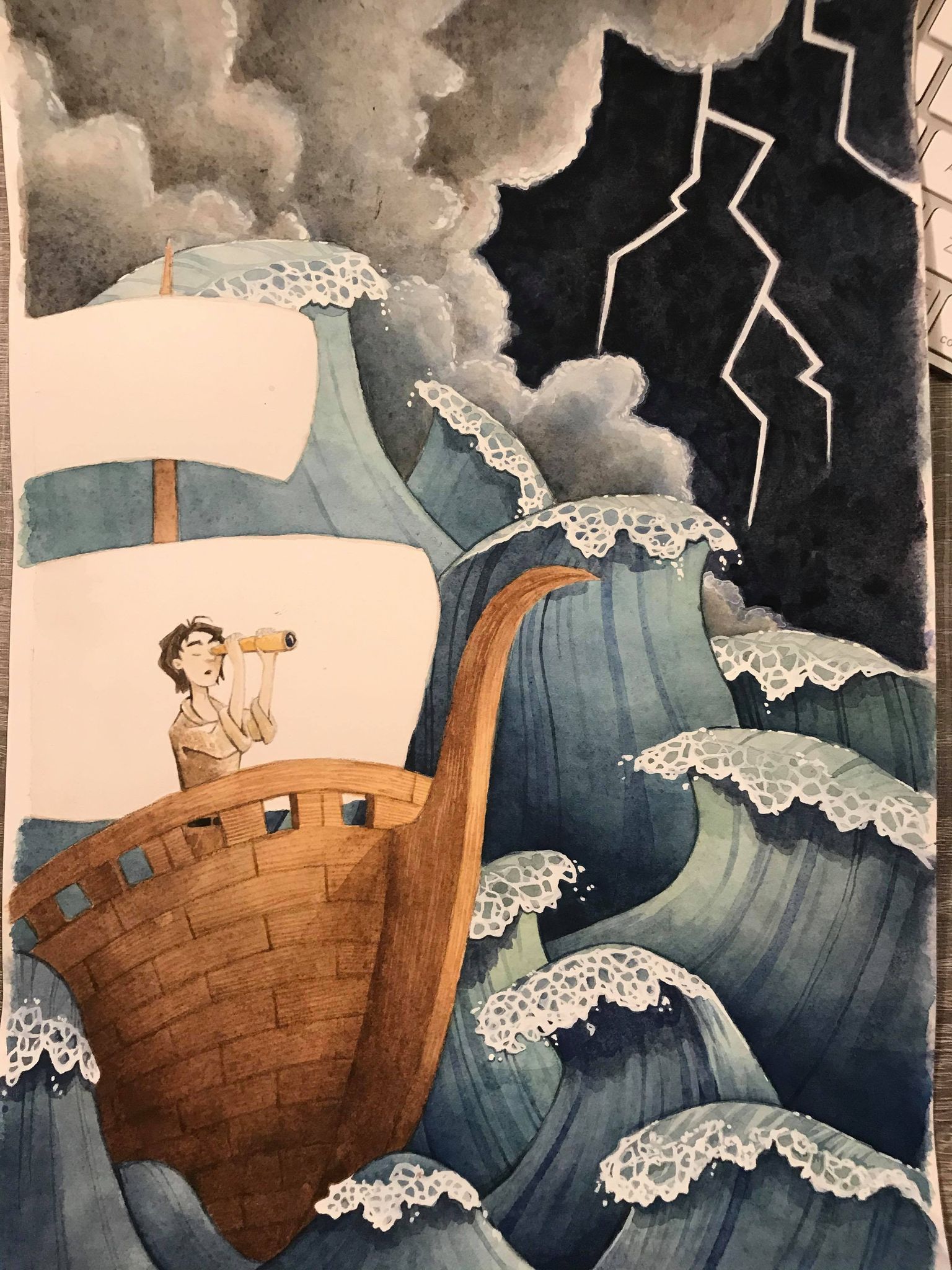
@Mary-Toth I think the waves look great and the composition is very good. For me, the shading on the ship is not turning with the form quite right. I would have that shadow edge follow the contour of the ship more.
-
@Matthew-Oberdier Oh true! good point - thank you!!
-
Those waves are absolutely stunning and I wouldn't change a thing about them!! I think the bright white behind the character is a bit distracting though. Maybe try painting in folds or details of the sail clothy thing to give it more movement. I don't know if you already planned on doing that but I think it might help give it the form you're looking for. Also, often times I feel the same about my work while I am sitting there looking at the physical version, but since you are familiar with working digitally some, you can always touch it up in photoshop or on a drawing app to play with colors, lighting, brightness, ect. I hope this helps! It is a really great composition and I can't wait to see the final product! Good luck!
-
@Mary-Toth First off, I think you're being a bit too hard on yourself :). It probably looks better than you think it does (considering we're always our own worst critics). I think it looks quite nice as well.
I do agree, traditional media is a lot tougher to change. I think that's especially true with water color. That's one of the reasons I've gravitated towards acrylic when I paint traditionally; if I don't like it, I can literally paint over the entire canvas or the section I want to completely redo lol. The only reason I hate working with oils is I have no patience for it to dry

I think on this piece here, if I were to say something is bothering me, I think it's the stark black against the clouds. It's really abrupt and it sort of tears away from how that kind of environment would react. Assuming this is a stormy night, I think the entire background would be significantly darker where the lightning was illuminating the edges of the clouds it could light up.
One of the best tips I remember getting for general purpose on back/middle/foreground was keep your value ranges tight. So for example the back range would be dark, and vary slightly, but be dark all around. Your mid would a narrow window of varying mid-range values and your character/focal point would your highest contrast ratio.
The waves and the boat are super great. They look really nice and stylized. I just think the background needs some way separate into it's own value range.
One thing I do with my acrylic paintings is I take a picture of it on my iPad, then pull the photo into Procreate and I'll paint over the areas I'm not happy with a hard brush to get a sense of what feels better. You could do that or just pull this scan into a painting program and try it (if you haven't bought anything yet, just use Autodesk Sketch even which is free and pretty dang good for a free app).
-
@Mary-Toth Honestly this looks wonderful! You're being a bit hard on yourself. I feel like maybe the clouds are too light considering the black sky? But overall, this looks stunning!
-
It’s gorgeous don’t fret my pet!