CRITIQUE NEEDED
-
Hey all. I am working on a personal project with tight deadline. I set a goal to publish a small children's book before Xmas just to challenge myself.
") So, I came up with this sketch for the cover, which I want to ask you to critique before I start colouring it. Please don't spare me anything. :}
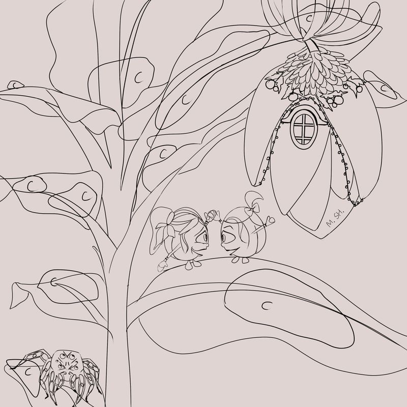
So, I came up with this sketch for the cover, which I want to ask you to critique before I start colouring it. Please don't spare me anything. :}Short background of the story. It is about two best friends (small creatures) who are told that they might not have Xmas as they know it. A spider who is known for destroying houses like theirs (banana plants) is wandering in town. Therefore everybody must stay inside their houses (including Santa) in order to stay safe.
PS: The "c" letter you see here and there is a placeholder for snow.
Thank you all in advance!
-
Where do you plan on having the cover text? Also it’s very clear that the spider is a spider but I’m a little confused by the other critters they don’t really seem buggish to me also their expressions should show maybe some fear or worry if they’re concerned about the spider but otherwise it looks good.
-
Thank you so much for this feedback @powsupermum These are all valid points.
I was planing to figure out the position of the text when I colour everything else first. But I guess that it is not the best approach.The other creatures are imaginary and weren't supposed to be bugs. But after your thoughts on it I am considering to turn them into bugs.
I guess it will make more sense.Also, the expression of the creatures was supposed to show their happy personality and the fact that they are still not aware of what it is to come.
Once again BIG thank you!
-
Go for it! Not sure if tight deadlines are the best way to learn though
As you refine the picture, I would advise you to improve on the composition by making sure you have a good focal point that draws attention to itself - those should be the "critters". I find that my eyes are drawn to the house (because of the higher level of detail and what feel like darker lines) rather than the "bugs".
Maybe you were thinking of enhancing the focal point during the colouring phase? However that may be a bit too late to change your drawing if you find that something doesn't work.
One thing that will help you (it does help me) is to do quick thumbnails (including an indication of value - lights/darks) - less detailed, but a few of them - to come up with a better composition. Maybe you can make the critters larger, less in the center of the image, and the house may be "cut off" (don't need to show all of it, just part of it going off the top right corner?).
-
so grateful for this feedback @txels I gave myself this tight deadline because I have only 1 hour a day while my baby is sleeping. It is very easy to just say that I will use it for sleep and not draw anything at all. Therefore I put some goals to keep me doing what I love doing and get somewhere with this at some point.
I must confess that I am pretty bad at having good focal points. For sure I am counting on the colouring phase to enhance the focal point. In my mind the critters are very small, but if I do them that small I fear that they can't be focal points anymore. I am not sure how to illustrate this and still have an interesting cover where the main characters don't disappear into everything else.
I am going to definitely follow your advice and do some thumbnails. Might even post the improved version here as well, just to hear your opinion if it worked out better.
-
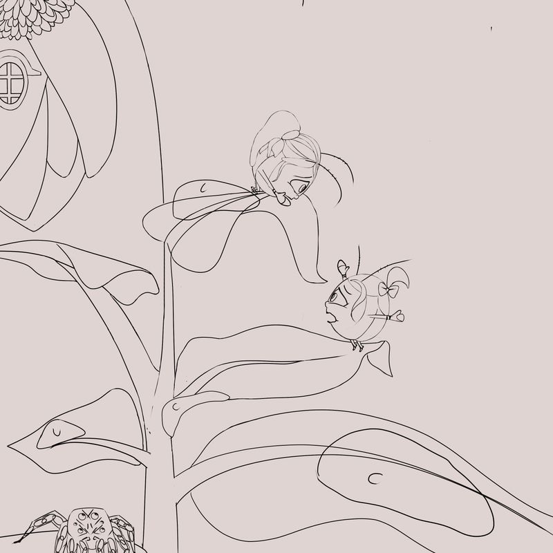
hey both @powsupermum @txels does this one look like an improvement to you?
-
@Maggie-Shahanska I think you got the right idea right with cropping the house off-frame, but the location before was better in my opinion: you had a nice diagonal going from the spider to the bugs to the house. Now the composition feels unbalanced to the left...
 - I think you should keep the house on the top right corner as it was, with the current cropping.
Maybe you are trying to make space for the cover text? It would help to add the text early on, so the we can see the overall effect.
Also I'm not sure cropping the spider is a good idea (I personally liked it better before), but TBH I'm not very experienced with composition - other students can give you better advice here.
As an aside, a course I really liked for composition is Will Terry's creative composition 2.0 - it's one of the best I've watched in SVS - it will give you a lot of ideas on improving this illustration.
Now the feeling of the piece has changed a lot from "we are unaware of the spider" to "we are escaping the spider"... is this intentional, is this what you are trying to convey?
-
hey there!
i love the design of this and the concept too, it's a good composition and a beautiful scene
I'd love to see the spider as bigger maybe? just to re establish the idea that it's a threat and also maybe show some movement in the spider ?
to me it looks as though he's standing stilltake what you can from my feedback, I'm not a professional and I'm new here
great work! -
Hey guys, thank you so much for the feedback. You are right @txels I was trying to make some space for the cover text and indeed I changed the face expressions because I thought it will make it more interesting. I took your suggestions and @krish-iyer 's into account and made the changes. But I still feel like I didn't get it perfect so I am definitely going to watch the course you recommended. If you guys aren't sick of it already, would you please share your final thoughts?
Thanks for the kind words @krish-iyer!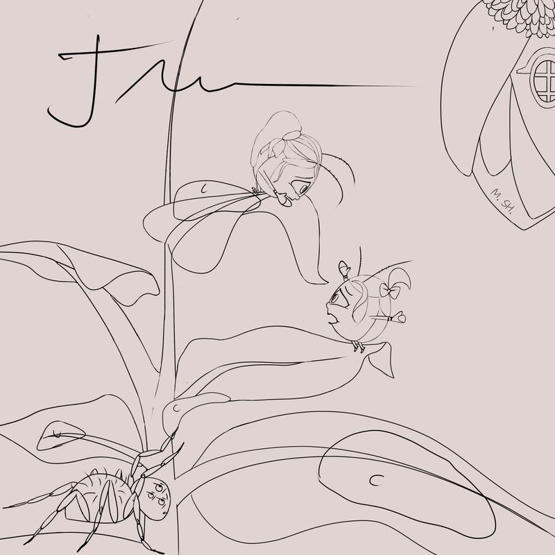
PS. The book title is supposed to be where the signature is. (maybe ) -
Looking great! I think the illustration's really shaping up, the scene is more tense, the spider is more prominent and overall I think it looks great!
Cant wait to see some color on it! -
@Maggie-Shahanska good work! This has clearly improved. I agree, the scene now has much more tension, also you made the spider look more threatening

-
@krish-iyer @txels thank you so much for the help you guys! I couldn't go to the right direction without your feedback.