Color is hard!
-
I am still trying to figure out colors. My daughter was giving me some great pointers of how she decides on a palette. She plays around with themes, for example "night" and then asks herself what colors does she think of when she thinks of night. She plays around with the colors using different shades and tones, etc. She's had a lot of classes that have taught her about color-costume design, art, film so she is very helpful to me. I never knew that they used color to connect people in movies until today.
I've been watching the pictures go by up top and trying to notice the colors people have chosen. I see limited paletts, lots of blues and reds or browns......I've been doing lots of coloring and photocopying my dummy to color some more. People don't realize how truly challenging it can be to illustrate a book. I'm learning a lot. made ti through the layout process, now the color and fine tuning......I'm just going to keep pushing through and learning as I go.
Sorry to blather. If you made to this far, I'm impressed
") tomorrow I'll look at the courses again and watch. If you have a process or any helpful color sources, please let me know. Thanks!
tomorrow I'll look at the courses again and watch. If you have a process or any helpful color sources, please let me know. Thanks! -
Color is hard! Especially if you're working traditionally. I use Colour Lovers to search for palettes. There's also Coolor's. I did kinda what your daughter does and searched "nighttime". I found the palette below and that helped as a starting point. For this project I ended up using modified primary colors - red, yellow and blue. Working digitally is way easier for this because you just pick the color and can adjust it as needed.
When I did watercolors it helped to have a chart to reference for color. Plus, it's pretty. How to make a watercolor chart

-
Colours are less important than you'd think. Yes, warm and cold is important but if the values are right then there's no need to colour pick or use pre-made palettes.
When I colour I do tend to use a limited palette. I'll take a colour that I feel will be dominant in the piece, then fill the canvas with it's complimentary, then use the colour to the left and to the right of the complimentary.
The main colour and the 2 either side of the complimentary I put on my canvas and mix right on the screen. The only time I use the colour selection thing is to saturate or darken colours a little, everything else is mixed on the screen.
If you're using a limited palette and mixing colours from those colours (if you don't have a red but need one, then get as close as you can with an orange for example and it will appear red) and get your values right, it will work every time.
Hope that helps.
Ace -
I don't have any more advice on that but I feel your pain! I find color very challenging too
I dread every time I get to that stage and hope that this "fear" will ease eventually, cause I don;t fint it that much fun for the moment -
To clarify are you only looking for a digital palette? Because for traditional watercolors, I used this book but also found this video on making a portable palette...
I suppose you could scan the pages from the book, and the portable palette, if you wanted to go digital... mixing digitally however doesn't translate exactly, so always check your results. If you want just a digital palette, let me know and I'll see what else I can find.
-
If you were using Painter, it has a great feature where you can import a jpg of an image you like and create a palette from that image. Careful it makes A LOT of colors, depending how detailed your image is...
-
Does anyone know if there are any digital palettes that are "true to life" oil paint colors?
I was thinking about putting some of my oils on a palette and then photographing it but maybe someone did that already?
-
@mattramsey I can imagine that for ArtRage(if it actually can simulate oil paints which I am not sure), not for photoshop as all oil paints have different qualities. It is not enough to define them as RGB. You could probably create RGB palette from strokes with pure colours, but thats kind of pointless.
-
@Bobby-Aquitania I've always felt like colour picking and taking other people's palettes is cheating a bit. Maybe okay for research, but I feel learning about colour allows you to create for yourself and get more creative.
Ace
-
@Ace-Connell as @Lee-White said last night in the 3rd Thursday critique...there is no patent on color schemes. (Or something like that.) The more one uses other people's palettes (especially those who are expert at it) the more it will help one develop their own sense of color until the day comes when they can use their own from the start. In the meantime, you've got some illustrations with tried and true color schemes. Anyway, that's how I look at it...
Twitter: @Joy_Illustrated
Instagram: joy_illustrated
Website: joyheyer.com -
Using a pre-made color palette is just like using a photo as a reference. It's a starting point for an idea to grow. Trying to pull these things out of thin air doesn't always work. I took color theory in college so that's buried deep within my brain somewhere but I still look at what other people do for help. I can't recite out loud what I learned in color theory and then go "oh ok I'll use R91 G138 B243 right here!"
-
@Bobby-Aquitania I'm strictly traditional so far. I'm not quite ready to try digital. I think it would be more challenging for me to figure it out than color
Thanks for the links! -
@audrey-dowling Audrey, thanks for feeling my pain with me
-
@Bobby-Aquitania Thanks Bobby. That book looks useful (and cheap
I'm actually using prismacolor pencils right now. I'm going to google some tips on them. Might revert to watercolor though. -
@Joy-Heyer It's fine to have differing opinions. I guess if it helps, it helps, but it wouldn't be something I'd personally hold on to for more than getting an understanding.
Ace
-
I struggle with color too. A web page I turn to for color inspiration is design-seeds.com. In the past, I didn't plan my color scheme at all. Lately, I find myself enjoying spending some time playing with colors and trying this-and-that before coloring.
-
@Jiří-Kůs said:
@mattramsey I can imagine that for ArtRage(if it actually can simulate oil paints which I am not sure), not for photoshop as all oil paints have different qualities. It is not enough to define them as RGB. You could probably create RGB palette from strokes with pure colours, but thats kind of pointless.
Well I had an idea of trying out a style that mimicked traditional oil painting but I would like to first have a color starting point. So my blues would be like Ultramarine and Pathlo etc.
One awesomely huge advantage of digital is that you get EVERY COLOR EVER. This can also be a problem in some situations.
-
@Ace-Connell said:
@Bobby-Aquitania I've always felt like colour picking and taking other people's palettes is cheating a bit. Maybe okay for research, but I feel learning about colour allows you to create for yourself and get more creative.
Ace
As Lee mentioned "color isn't copywrited".
-
@Ace-Conell I'm actually surprised you think color isn't important. Value is going to affect the readability of a pieces, but color does so much to inform someone of what they're seeing - it creates balance, moves the eye through an image, sets the mood, brings focus to parts of the image, shows atmosphere and depth, informs lighting, and can have an emotional impact on a piece.
I absolutely love color, an enjoy working with it. Of course not all art has to have color: B&W pieces, line drawings, etc., can all be very successful. But if you're going to work with color, understand that it is important to a piece. In the last 3rd Thursday Lee White started to address that.
I know color theory can seem really confusing, I'm still studying it all the time, but I also think people assume it's more complicated than it really is. Start with the basics: primary, secondary and tertiary, warm vs cool, complementary colors, etc., saturation, then move on from there. Pieces can be very successful with simple, straightforward colors, or really out there pallets.
I haven't taken the courses yet, but SVS offers a couple if color classes. That would probably be a good place to start. I personally have these books: Better for beginners Color by Betty Edwards and Color in Contemporary Painting by Charles Le Clair. But I'll be honest in that I haven't read either of them all the way through. Most of what I've picked up from color I've gotten from lectures, classes, studying other people's work, and online resources. I know my post is getting really long and I haven't even talked at all about how to actually decide on and USE colors, but hopefully this will get people thinking. To finish off here are some pieces I think use color fantastically.
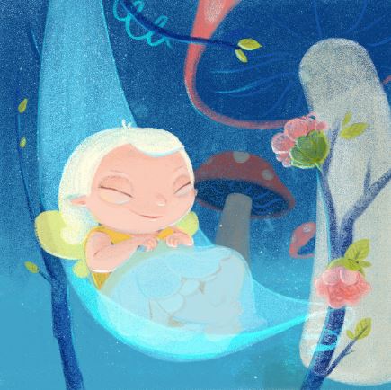
 Loish
Loish
 J. Dillon
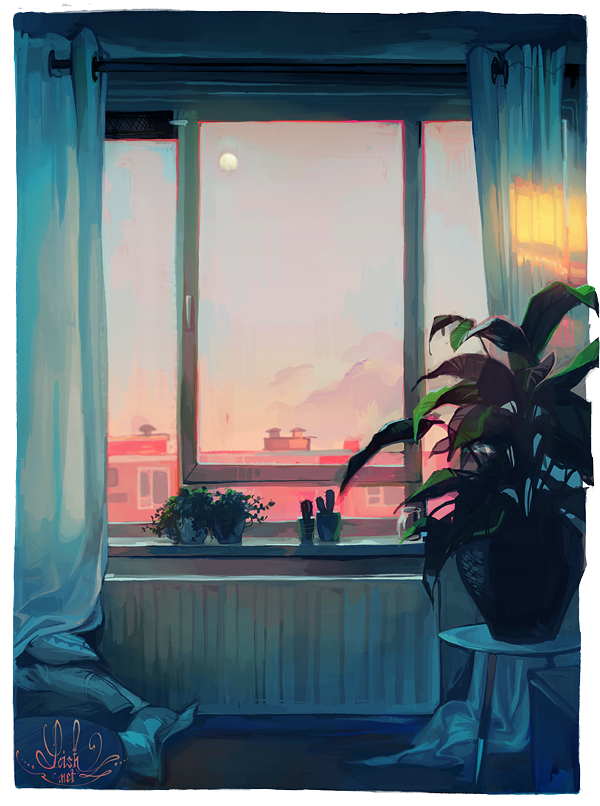
 70% EtOH
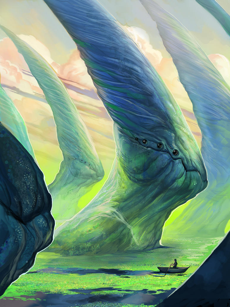
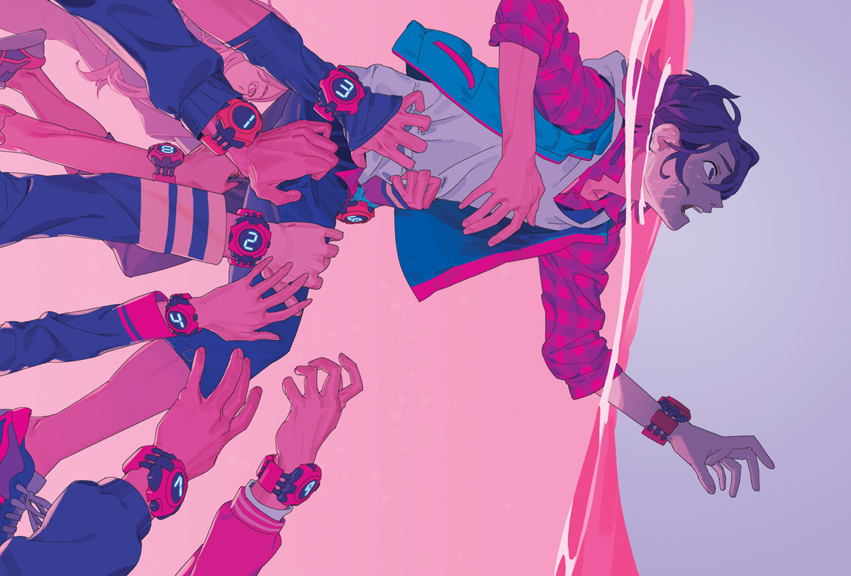 Vivian Ng
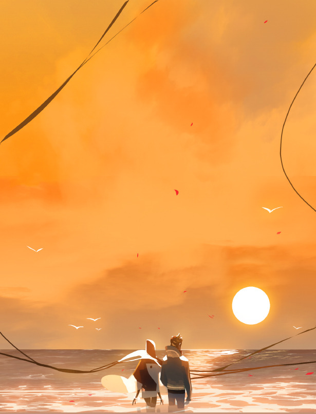
 Celine Kim
 -
@Shannon-Perkins I think colour is important, I just don't think I explained myself as well as I could. I meant more that if your values are correct, most colour schemes will work if they are mixed from a limited palette. I do feel that most people's colour problems stem from their lack of proper value study. Colour is important though, it's great.
@mattramsey I know that it's not copyrighted, but I feel that people's colouring would be far better if they fully studied it and understood colour and value rather than using someone else's understanding. I take quite an old fashioned traditional approach to my digital art though so it might be influenced by that.
Ace