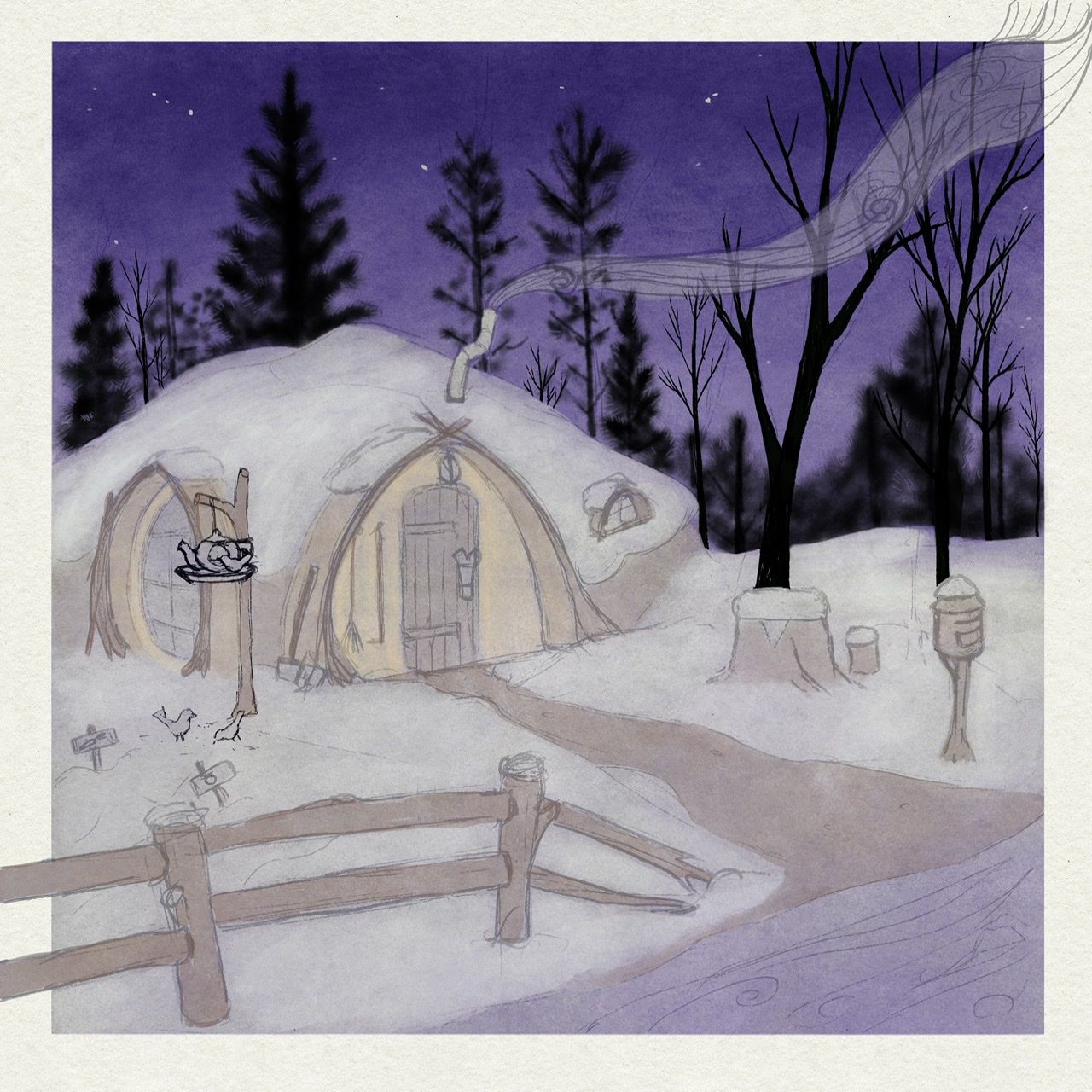
Society of Visual Storytelling

    SVSLearn Forums

    • Register
    • Login
    • Search
    • Recent
    • Tags
    • Popular
    • Users
    • Groups
    • Search

    Ye-tea Home WIP

    General Discussion
    8
    21
    1161
    Loading More Posts
    • Oldest to Newest
    • Newest to Oldest
    • Most Votes
    Reply
    • Reply as topic
    Log in to reply
    This topic has been deleted. Only users with topic management privileges can see it.
    • erinrew
      erinrew @Asyas_illos last edited by

      @Asyas_illos I like this idea. Thank you.

      erinrew.com
      Twitter: @rew_erin
      Facebook: @erinrewauthor
      instagram.com/erin_rew_author_illustrator

      1 Reply Last reply Reply Quote 0
      • erinrew
        erinrew @Cayleen last edited by

        @Cayleen Love you’re ideas! Thank you for the suggestions. 😊

        erinrew.com
        Twitter: @rew_erin
        Facebook: @erinrewauthor
        instagram.com/erin_rew_author_illustrator

        1 Reply Last reply Reply Quote 1
        • erinrew
          erinrew last edited by

          Does anyone else get nervous when you start to add color? I need to figure out a process to help me with my color anxiety.

          01C5FE14-80EB-40A9-9292-0B390CEAE51E.jpeg

          erinrew.com
          Twitter: @rew_erin
          Facebook: @erinrewauthor
          instagram.com/erin_rew_author_illustrator

          Asyas_illos Jacy13 2 Replies Last reply Reply Quote 3
          • Asyas_illos
            Asyas_illos @erinrew last edited by

            @erinrew yes! I actually made a comment to @Lee-White on Instagram earlier today about his book mobile, he had one in color and one just in value like sepia colored and I said I needed to do this because I love so many images in value before they even get color I hadn’t even thought to make duplicates keep one in sketch or value and then another in color! Or just duplicate to try different color schemes!

            Asyasewardillos@gmail.com
            www.Instagram.com/asyas_illos/
            https://asyasewardillos.wixsite.com/mysite

            erinrew 1 Reply Last reply Reply Quote 1
            • Jacy13
              Jacy13 @erinrew last edited by

              @erinrew It's looking great! I'm loving the purple in the sky. It looks peaceful 🙂

              Deviantart: https://www.deviantart.com/jacy13
              Instagram: https://www.instagram.com/jacy13draws/?hl=en
              Portfolio: https://jacy13.artstation.com/

              erinrew 1 Reply Last reply Reply Quote 1
              • erinrew
                erinrew @Asyas_illos last edited by

                @Asyas_illos Good idea... unfortunately I did not do that with this one, but so think I will start.

                erinrew.com
                Twitter: @rew_erin
                Facebook: @erinrewauthor
                instagram.com/erin_rew_author_illustrator

                1 Reply Last reply Reply Quote 0
                • erinrew
                  erinrew @Jacy13 last edited by

                  @Jacy13 Thank you Jacy. I work on it a little bit at a time to help cope with my nervousness in laying down color. Kind of like dipping your toe in a cold pool. 😂

                  erinrew.com
                  Twitter: @rew_erin
                  Facebook: @erinrewauthor
                  instagram.com/erin_rew_author_illustrator

                  1 Reply Last reply Reply Quote 1
                  • erinrew
                    erinrew last edited by

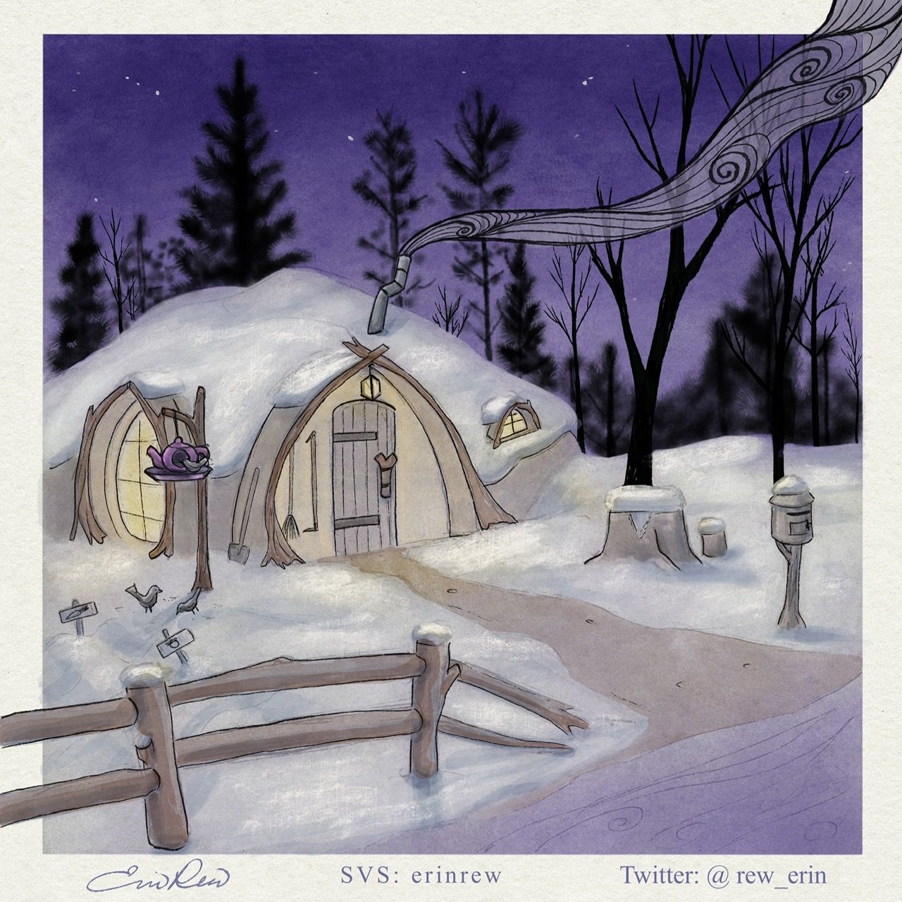
                    This is my latest version. What’s working, what’s not? Thanks in advance.

                    88EA8C03-A427-4283-A5C8-11917ED3B8A2.jpeg

                    erinrew.com
                    Twitter: @rew_erin
                    Facebook: @erinrewauthor
                    instagram.com/erin_rew_author_illustrator

                    ambiirae 1 Reply Last reply Reply Quote 1
                    • ambiirae
                      ambiirae @erinrew last edited by

                      @erinrew I really love the concept and the color of the sky plus the smoke but I feel the wood colors and house colors are too muted. I find I want to look at the sky and smoke more than the house

                      1 Reply Last reply Reply Quote 1
                      • Asyas_illos
                        Asyas_illos last edited by

                        I agree with @ambiirae there’s so much contrast in the background I feel like you should bring some of that darkness forward a little

                        Asyasewardillos@gmail.com
                        www.Instagram.com/asyas_illos/
                        https://asyasewardillos.wixsite.com/mysite

                        1 Reply Last reply Reply Quote 1
                        • K.Flagg
                          K.Flagg last edited by

                          I love the smoke design! I would lighten the background instead of darkening the foreground. If you darken the foreground it will be to saturated I think.

                          K.Flagg

                          Asyas_illos 1 Reply Last reply Reply Quote 1
                          • Asyas_illos
                            Asyas_illos @K.Flagg last edited by

                            @K-Flagg oh yah even better

                            Asyasewardillos@gmail.com
                            www.Instagram.com/asyas_illos/
                            https://asyasewardillos.wixsite.com/mysite

                            1 Reply Last reply Reply Quote 0
                            • erinrew
                              erinrew last edited by

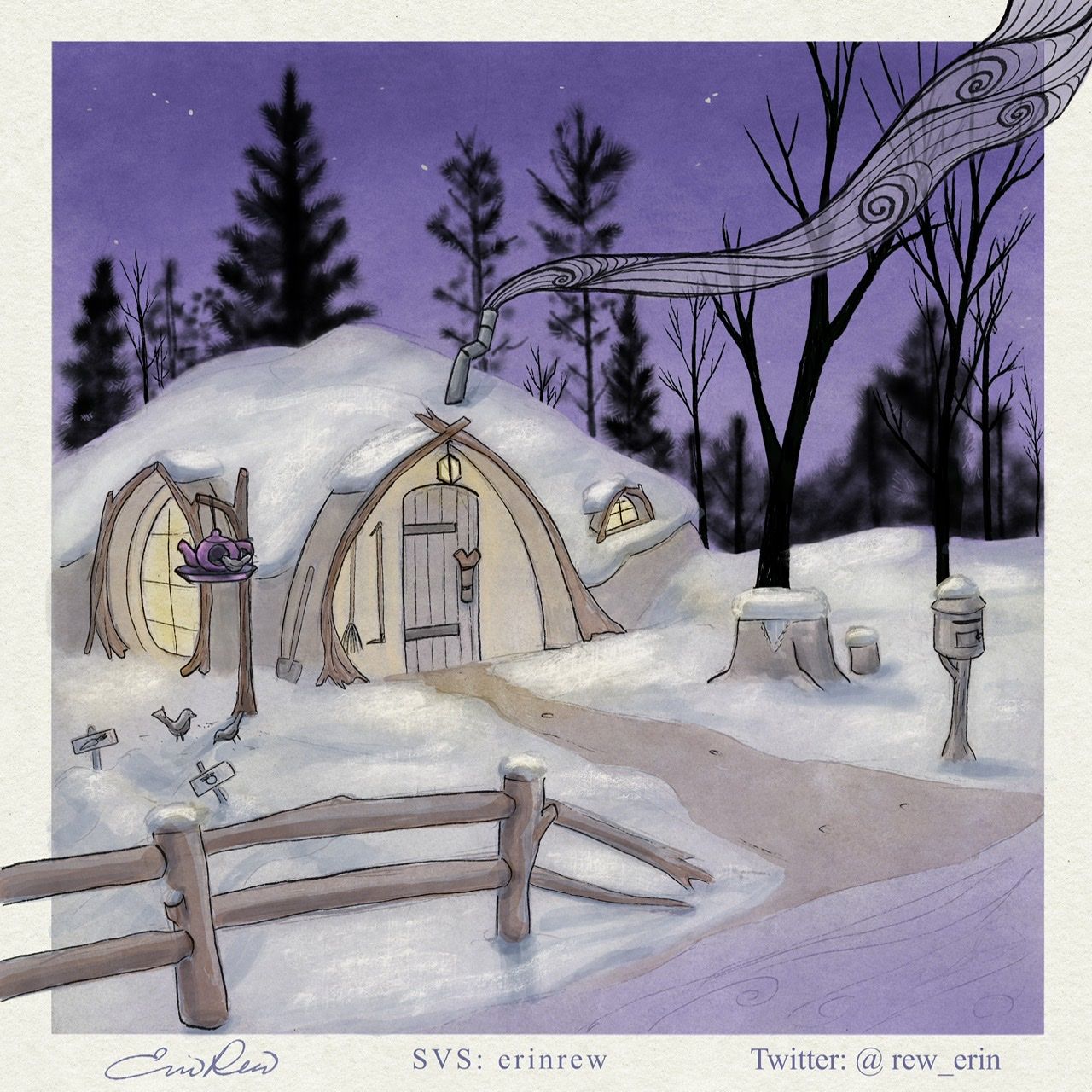
                              I lightened the sky a bit. I don’t want to go to light with it, but is this better?

                              3A2E17F5-1215-4387-B18E-44FE3F728093.jpeg

                              erinrew.com
                              Twitter: @rew_erin
                              Facebook: @erinrewauthor
                              instagram.com/erin_rew_author_illustrator

                              1 Reply Last reply Reply Quote 0
                              • Asyas_illos
                                Asyas_illos last edited by

                                Yes I think it looks better with that little difference!and I just love the smoke detail, beautiful.

                                Asyasewardillos@gmail.com
                                www.Instagram.com/asyas_illos/
                                https://asyasewardillos.wixsite.com/mysite

                                chrisaakins 1 Reply Last reply Reply Quote 1
                                • chrisaakins
                                  chrisaakins @Asyas_illos last edited by chrisaakins

                                  @erinrew I think the trees in the background and the snow rendering do not stylistically conform with your smoke and cabin rendering. They look painterly and the rest looks more patterned and line artist (which I like, BTW) I would be curious to see what would happen if you rendered them like your smoke and kept the values the same.

                                  Chris Akins
                                  www.chrisakinsart.com
                                  www.instagram.com/chrisakinsart/

                                  1 Reply Last reply Reply Quote 2
                                  • First post
                                    Last post