Noah's ark picture book cover design update!
-
@Leontine definitely go with a Noah's Ark theme for sure. Really looking forward to seeing what you come up with based on the input from Lee!
-
@Rich-Green Thanks Rich!
-
Hi Leontine. I'm asking the age because I'd like to learn more about perception, visual literacy and levels of meaning for childrens.
I think if we are going to illustrate for different levels, we must learn what children can recolet from images in diferent ages, No matter if the parents will support the reading of the images or not.
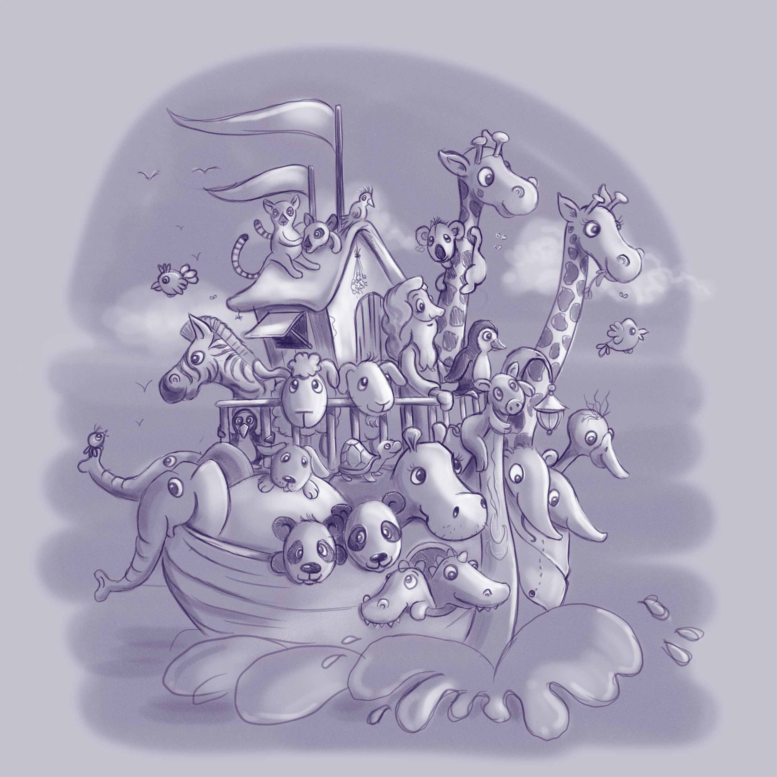
As an example, I think in your image is not easy to recognize the boat and the animals are too close, like a grape cluster. I guess it could confuse a 2 years old kid. We recognize immediately the boat because we know the story of Noah.
I'm not sure about that, so I'd like to get specilized answers to that matter.
I love your style. I'll paying attention to the upgrades.
Cheers.
-
@sergio Thank you Sergio! I've updated the first version. hopefully with color it will be readable for parents and for kids.
-
okay is it me, but somebody ate some of the pairs... oh and the alligators are smiling.
-
@Leontine, Great upgrade indeed! Everything looks more appealing. Loved the tonal scheme.
-
love the pig hanging onto the front of the boat!!! This piece is so much more dynamic now!
-
There ya go!! Nice!
-
@Leontine Its amazing, nice job!!!!
-
@Bobby-Aquitania Some of the half pairs are in the boat, sleeping ssssst don't wake em up! XD
-
Really nice @leontine
-
@Chip-Valecek Thanks. I also wondered how to reply to some!
-
This post is deleted! -
I'm agreeing with what others have already said, the animals are going to be a good draw for the age group. Lee White's comment it spot on. And as others have mentioned, the creative composition class is priceless, I learned a lot from it... Considering watching it a second time tbh.
Centered imaged tend to feel stiff, flat, and very staged. Asymetrical compositions are more appealing to the eye, have dynamic, and feel more natural (not much in nature is symetrical). Having varying sizes, length, shapes, etc. is visually stimulating to look at, and it moves the eye around an image. When everything is the same it turns more into a pattern, and a pattern isn't meant to have any focus, which isn't what you want to tell a story.
Sent this from my phone so I apologize if it's not the most coherent.
-
I like the first as the cover one because it is easier to read as the well-known story of Noah's Ark. The other one would be better within the story pages, imo.. Really cute.
-
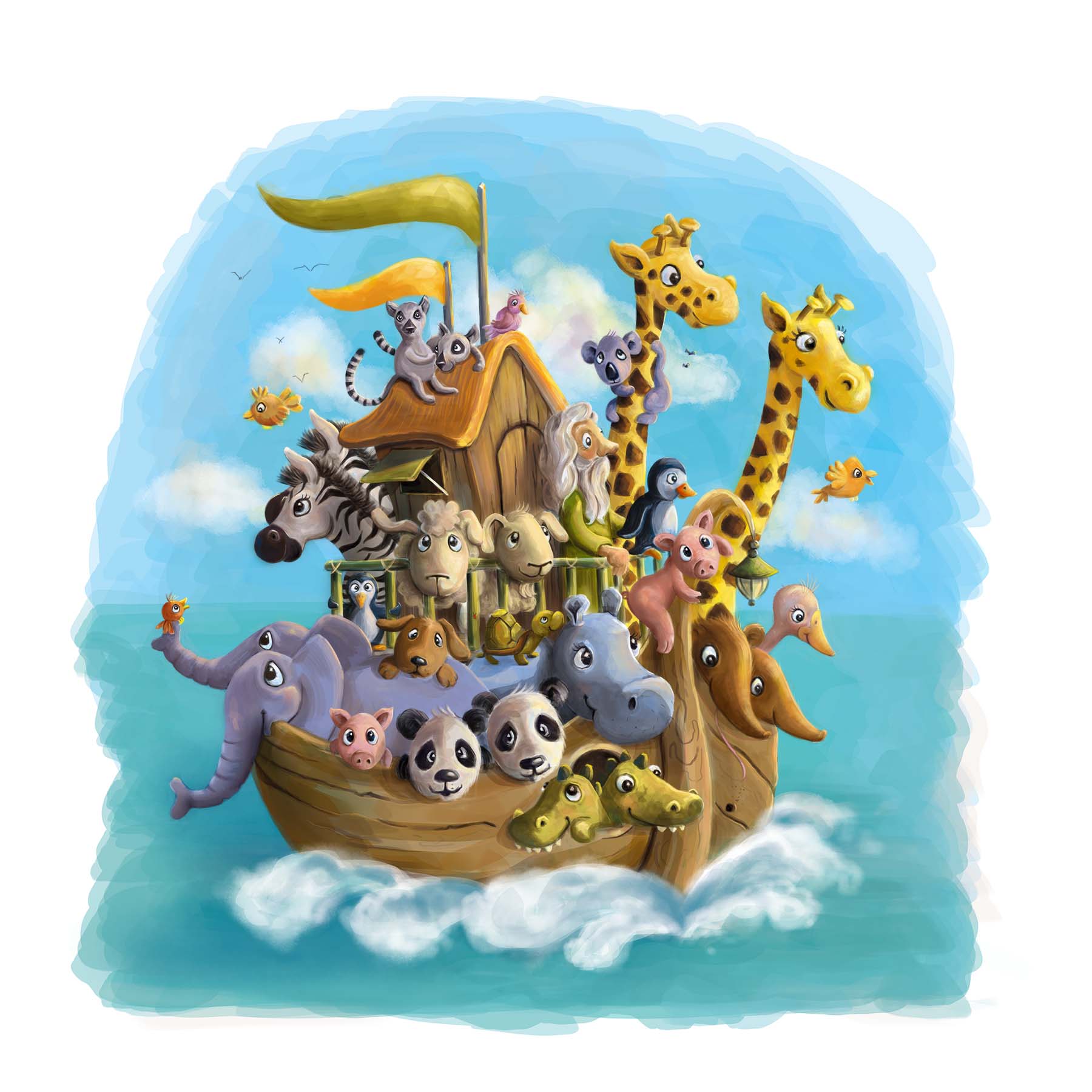 First colored version. no text added yet...
 -
Nice job so sweet and your colors are so balanced
-
Darling! Looks great.
-
@Leontine This is a very charming illustration. Love the painterly style you have been doing in all of your recent pieces!
-
There are so many good things going on in this illustration! I love it!
The only thing is that some of the animals seems "cut" by the side of the boat and the railing... I have circled them in red. I think it is especially true for the elephant, the panda on the left and the sheep on the left.
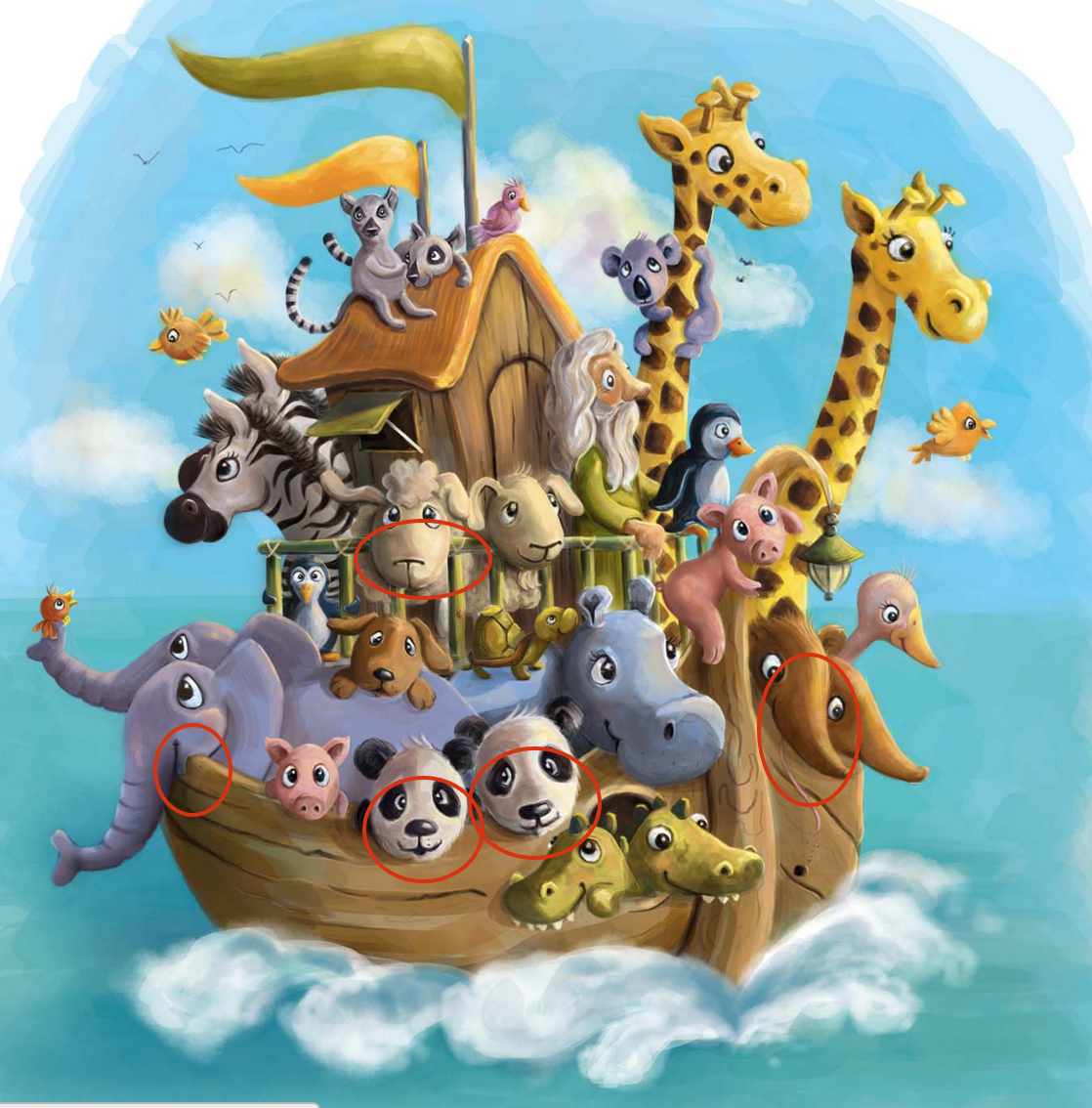
Also, I think the zebra that's farther from us is cut in a weird way by the other zebra. Maybe his head could be really facing the horizon? So we wouldn't see a part of the nose and it would read a little better.
I hope this helps, they are minor things in a otherwise spectacular image, but I think it would improve it a little!
")
noemiegionetlandry.squarespace.com
noemie_illustration on Instagram