Feedback
-
Hi, my name is Rita and I'm trying to improve my skills in digital painting wit the SVS courses.
Even though I've followed the steps from the "Painting in Photoshop" course, I still can't tell if my final illustration reached its full potential, specifically in the color palette.
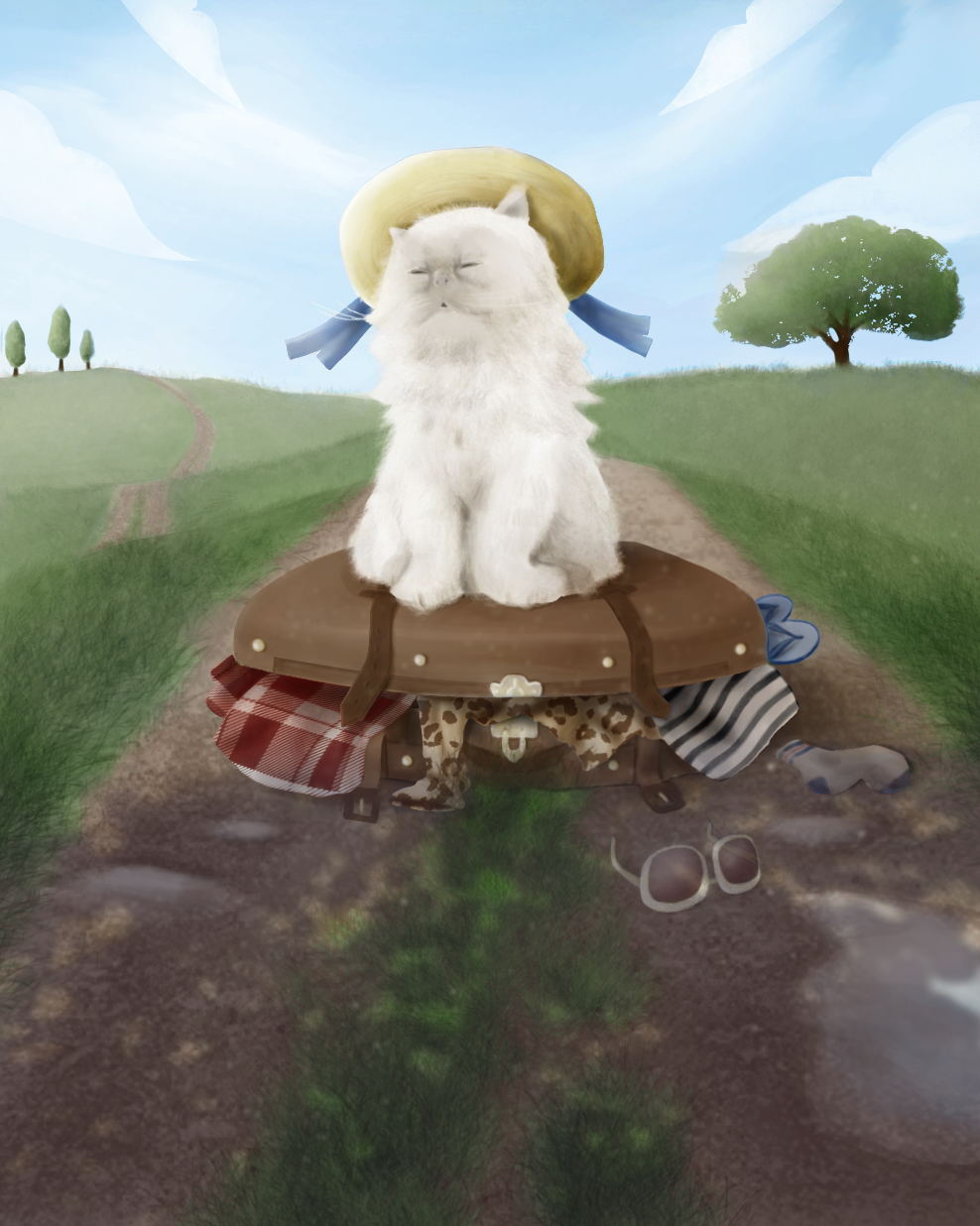
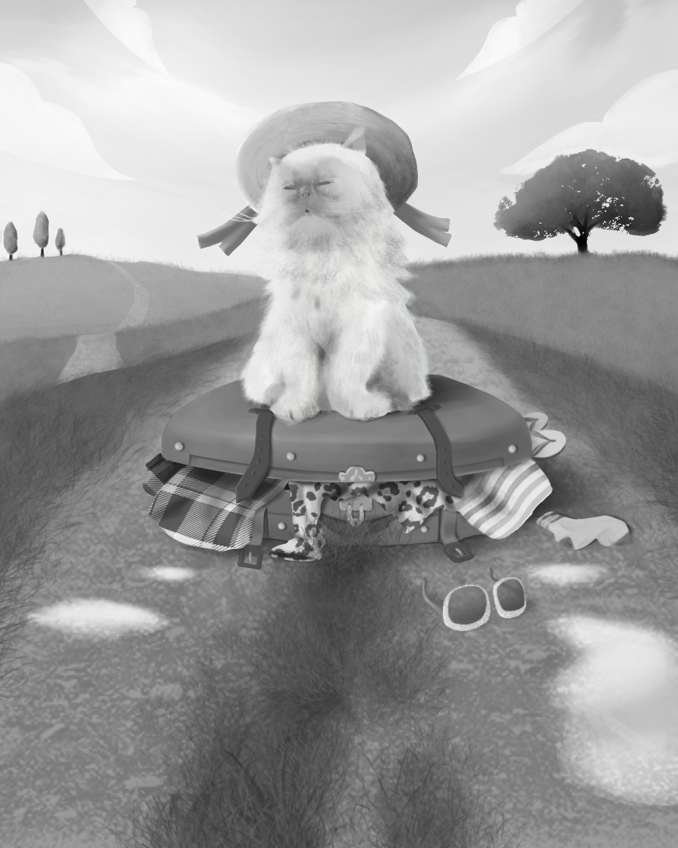
Should the illustration be more saturated, does it need more work on the rough values (image bellow), does the picture need more detail? These are a few of my question that came up after finishing the illustration, but I'm open for all the feedback I can get to improve myself.
Thank you!
-
Wow! I think it is quite lovely. I think there could be color variety in the two distant hills- getting some warm oranges, at least in the second one might help pop the greens. I’d say with the distant trees- you could bring them to the level of your far away hill as far as clarity/contrast is concerned. I’m not sure why but I think kitty could use more defining. Also, she/he might have more color in her due to the light bouncing off the grass. But to be clear, you’ve done a really incredible job.
-
@KayPotter Thank you! I am a bit stuck on the colors, so that tip might help a lot.
-
@Reetaaaa I hope it does! Give like, Monet a quick search and check out all the colors he uses in his hills/greens. Not that you have to go that far or be him, but might spark some ideas. Excited to see next steps!
-
@KayPotter Hi!
I took your advice and added a bit of sunlight and detail to the Illustration.
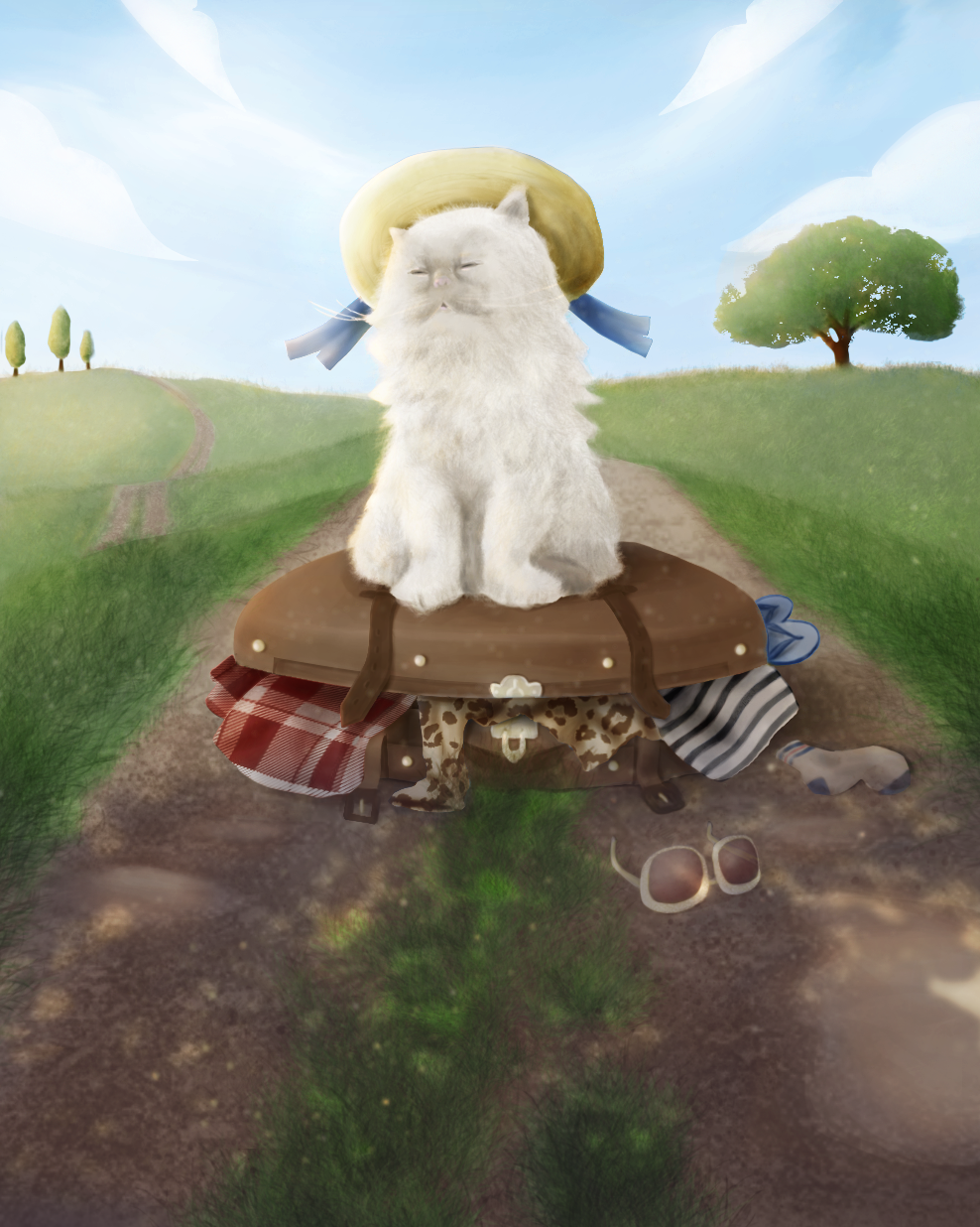
Once again, thank you for your Feedback.