Society of Visual Storytelling

    SVSLearn Forums

    • Register
    • Login
    • Search
    • Recent
    • Tags
    • Popular
    • Users
    • Groups
    • Search

    1 Year Later - Ways to Improve?

    Projects
    10
    19
    908
    Loading More Posts
    • Oldest to Newest
    • Newest to Oldest
    • Most Votes
    Reply
    • Reply as topic
    Log in to reply
    This topic has been deleted. Only users with topic management privileges can see it.
    • carlianne
      carlianne @jdubz last edited by carlianne

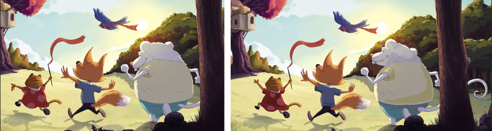
      @jdubz Yeah I actually don't mind the lines so much as that it feels like you're relying on the lines there to definre the form, more so than you are anywhere else, which is why I was wondering if you felt less comfortable with characters than with the bgs.

      Again, being super nitpicky, and I hope you don't mind, but as an example, the folds of the clothing could have shadow shapes there, or you could more show more texture on the back of the mouse's head. Also, I'm wondering if you could improve their gestures a bit, giving the cat an arch to her back so it's like she's leaping, or lifting the mouse's head up so he's looking at the house. Very. Very minor stuff, but to me that's the area that felt a little weaker than the rest.

      Very super rough example of what I mean, yours is on the left my edit on the right.

      3551ca4c-6720-49f8-bb5e-5d268058ce3d-image.png

      Check out my art and tutorials :)

      Instagram: www.instagram.com/carliannecreates/

      Youtube:
      https://youtube.com/c/CarlianneCreates

      Shop: www.carliannecreates.com

      1 Reply Last reply Reply Quote 1
      • J
        jdubz last edited by

        @carlianne yeah I totally see what you're saying there... I was already working on the cat in a similar way when I saw your post and I definitely agree the mouse needed to be looking up.

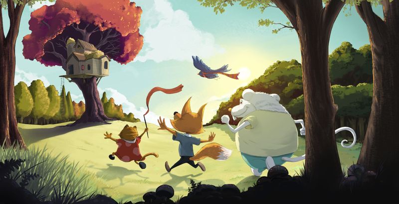
        I made a cumulative change with all the feedback. Hopefully this solves the majority of what people were seeing.

        thekids-2021-v3.jpg

        Josh White
        https://www.instagram.com/joshwhiteillustration/

        Melissa_Bailey E 2 Replies Last reply Reply Quote 2
        • carlianne
          carlianne last edited by

          What a great edit, that feels more cohesive to me. Do you want to adjust the pupil on the mouse to be looking up at the tree as well, or did you want him looking off to the side?

          Check out my art and tutorials :)

          Instagram: www.instagram.com/carliannecreates/

          Youtube:
          https://youtube.com/c/CarlianneCreates

          Shop: www.carliannecreates.com

          J 1 Reply Last reply Reply Quote 0
          • J
            jdubz @carlianne last edited by

            @carlianne I moved the iris/pupil up... does it look like he's looking below the tree? It looks to me like hes looking at it, but maybe I need to move it further up??

            Josh White
            https://www.instagram.com/joshwhiteillustration/

            carlianne 1 Reply Last reply Reply Quote 0
            • carlianne
              carlianne @jdubz last edited by carlianne

              @jdubz I took a closer look, and I think it's just the highlights on his eyes are actually making it look like his eye is lower down? And you might need to hide more of the pupil on the edge.

              971b017d-1624-4df2-a586-1aadc2f4552f-image.png

              Check out my art and tutorials :)

              Instagram: www.instagram.com/carliannecreates/

              Youtube:
              https://youtube.com/c/CarlianneCreates

              Shop: www.carliannecreates.com

              1 Reply Last reply Reply Quote 1
              • Melissa_Bailey
                Melissa_Bailey @jdubz last edited by

                @jdubz it’s even better! 👍👍

                illustrator - author - smiley person
                mbaileyart.com
                instagram.com/mbaileyart/

                1 Reply Last reply Reply Quote 0
                • Nyrryl  Cadiz
                  Nyrryl Cadiz SVS OG @jdubz last edited by

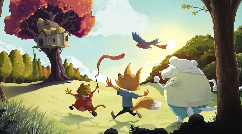
                  @jdubz hi! You made great improvements. Well done. This is just my personal opinion, but I prefer the your more vibrant colors in your earlier piece.

                  Portfolio: nyrrylcadiz.com
                  Instagram: https://www.instagram.com/nyrryl_cadiz/
                  YouTube: https://www.youtube.com/channel/UCbJCF1Im8ZO7hpGWTKOJMuA

                  J 1 Reply Last reply Reply Quote 0
                  • hayleyannececil
                    hayleyannececil last edited by

                    Amazing! Gives me hope hahaha.

                    https://www.instagram.com/hayleyannececil

                    1 Reply Last reply Reply Quote 0
                    • J
                      jdubz @Nyrryl Cadiz last edited by jdubz

                      @Nyrryl-Cadiz yeah I gotta say I struggled a bit there. The original one was something I submitted to critique arena, and the comments when it got eliminated were that the colors were too garish. So I kinda backed off a bit. I personally preferred it as well, and I think I might go back that direction. It started that way but there's a vibrancy filter layer sitting on top of it bringing that back quite a bit 😛 so at least it's an easy fix heh.

                      @hayleyannececil said in 1 Year Later - Ways to Improve?:

                      Amazing! Gives me hope hahaha.

                      Don't sell yourself short 🙂 Your stuff is great. This all here is mainly just processes applied in a certain order.

                      @carlianne Ahhh yeah I see what you mean... I do have the eye pinlight pretty large in there.

                      Josh White
                      https://www.instagram.com/joshwhiteillustration/

                      Nyrryl  Cadiz 1 Reply Last reply Reply Quote 3
                      • Nyrryl  Cadiz
                        Nyrryl Cadiz SVS OG @jdubz last edited by Nyrryl Cadiz

                        @jdubz yeah, I kinda see what they mean but I think it’s because you used vibrant colors even on the background. Due to atmospheric perspective, your colors should look more desaturated or even bluer as it goes further into the distance. If the vibrant colors were focused more on your characters/focal point, you’ll be fine.

                        Portfolio: nyrrylcadiz.com
                        Instagram: https://www.instagram.com/nyrryl_cadiz/
                        YouTube: https://www.youtube.com/channel/UCbJCF1Im8ZO7hpGWTKOJMuA

                        1 Reply Last reply Reply Quote 1
                        • E
                          Emma Echter @jdubz last edited by

                          @jdubz This looks fantastic - personally I think the colour looks great on this one. Not too saturated, not too light. With the pink tree and low sun, they are basked in a golden glow, so the little bit more on the grass looks great.

                          It's great to see old works re-visited... It's a really good way to test out what you've learned!

                          www.instagram.com/bold_archer

                          1 Reply Last reply Reply Quote 0
                          • First post
                            Last post