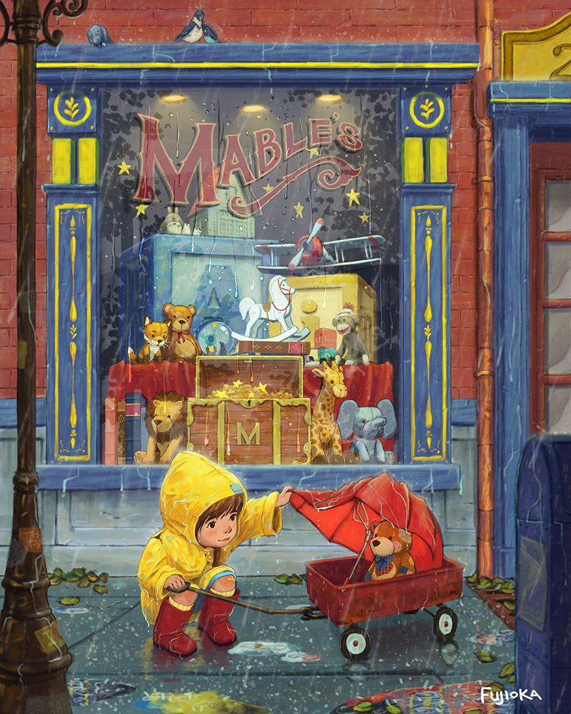
February 3rd Thursday. Love is a teddy bear.
-
This post is deleted! -
@Renduin there is definitely a lot of power in subtlety.
-
This post is deleted! -
This is awesome. Also, love the Totoro in the window.
-
I know you already had a lot of input on this piece, but I wanted to say how incredibly wonderful it is! There is just so many good things about this, I wouldn't know where to start!
I do however like @mattramsey added reflections in the window. It also serves to diminish the contrast of the background so that your focal point read more clearly.
I have another suggestion, but keep in mind that your skills are years more advanced than mine, so I might be wrong. I just think that you have a lot of very saturated colors (especially the yellow) on the window/door in the background. Applying @mattramsey suggestion will help with this, but maybe you could try desaturating the rest of the background a little bit to increase the focus on your main characters in the foreground.
As for the raincoat "debate", I am PRO raincoat lol! However, I think this is a grey zone where it's mostly a matter of opinion, and there is not a good or bad answer!
Once again, very inspiring work!
-
I just love this illustration. Love the water on the hood of the raincoat, the rocking horse, giraffe, the crooked umbrella, the teddy bear, the little girl, the whole window. Charming, charming, charming.
-
@mattramsey Looks great! I had suggested just taking off the hood. Thanks for doing it.
-
@Steff Lol, not sure what a Totoro is doing in the toy store.
@NoWayMe before I submit it for 3rd Thursday, I'll revisit it. I think you're right and I'll probably end up toning down the saturation a tad. That along with @mattramsey 's reflection suggestion should help to kick the image up a notch. Thanks for the input!
@Beatriz-"Bett" You're right, I was rushing a bit when I typed up my last post and forgot that you had mentioned it! It was definitely an idea I considered at length.
-
I am pro Hoody , there is just one thing, as I feel it she isn't really looking into the teddybears eyes. Maybe a small adjustment there? For me you've already won this one! Its a great portfolio piece, I presume you're going to Bologna? You'll probably take some work home!
-
Beautiful, and inspiring; I can see your perspective planning in the lines-so good cant wait to see it painted
-
Personally I think this is lovely. I would suggest maybe the raincoat being held over the bear instead of the umbrella would be even more heart warming but, that is simply my opinion. It still works as it is and the broken umbrella is a very nice touch.
Great work.
-
@shinjifujioka Again you have crafted a really nice piece. There are always so many things to look at inside one of your images. I have to agree with @Leontine. The girl doesn't seem to be looking at the bear.
-
@Leontine I don't have any plans to go to Bologna. I don't think I'll be able to attend too many conferences this year other than ones that may happen near me. It would be awesome to go though. Are you attending any conferences?
@Leontine @Rob-Smith you're right on the eyes I'll need to make an adjustment there. I find eyes to be a little tricky...
-
Revisions. I think it's stronger. Thanks @mattramsey for the help with the reflection and @NoWayMe for the suggestion about toning down the background.
@Leontine @Rob-SmithI tried tinkering with the eyes, but I kept on losing something in the girl so I think I might leave it for now.

-
Simply amazing! I think I will change my 3rd thursday submission for an illustration of myself, in love with your painting!
 By the way, I showed your work to my wife and she was in awe!
 -
@shinjifujioka I' d love to go to Bologna.
-
@shinjifujioka This is just gorgeous! the colors, the critters! I'm glad you left the hood on, adds so much to the little girl! She already gave up her umbrella hehe. Totoro!! I love the reflections in the puddles too! maybe tone the front two down a little? i thought they were wrappers or bags at first, the red one mostly. Its so good that is just a nitpick

-
I need an oxigen cylinder!!! I was waiting a gorgeous illustration. It's much better than the expected result!!!
Besides the little girl... There's something I can't realize what is it. A reflection? A patch? A painting on the paviment? Seems that can be a the third option. Possibly i'm being a victim of cultural issues. Here, a shop can't invade public areas like paviments. Anyway, I dont urdenstand that patch.
Thanks for shairing. It's very inspiring.
-
Wow just beautiful. I always destroy my drawings in the painting phase-you are a pro!
-
@shinjifujioka I like it better with the hood too!! So sweet!!