"Pushin' Up Tulips" Progress and Feedback?
-
Heyhey SVS Pals
") Hope y'all are keeping warm and stayin' busy! I've really enjoyed all of the Yeti illustrations! Very fun to see!
Hope y'all are keeping warm and stayin' busy! I've really enjoyed all of the Yeti illustrations! Very fun to see!
I'm working on a new illustration for my "Plot Twist" Holiday Card line. Lovin' this project so far!
I'd really appreciate your thoughts (and votes) on the compositional thumbnail options. Is there a thumbnail that absolutely jives with you (or otherwise?)
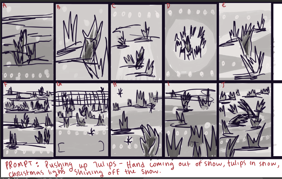
PROMT: The tips of tulip leaves spear through a layer of freshly fallen snow, aglow with holiday lights. Within the mass of tulips, a skeletal hand bursts from the soil and snow, awakened.Thanks so much! I can't wait to hear what y'all think about it!
Best!
Shani -
Hi! I have a hard time deciding but compositon wise I’m split between E and H.
I’m a sucker for classic compostion and I like the triangle shape created in E. The diagonal lines also create a bit of tension, I am assuming that the hand coming out of the snow and ‘pushing up tulips’ is a pun on the classic zombie hand rising from a grave right?
Picture H gives more room for the light effect and the falling snow though, which adds to the winter feeling. I am guessing the hand is in the lower right corner, but I would advise to move it to the middle left (position of the dark figure) to take advantage of the ‘rising through the snow’ part. -
E. No contest for me. Especially if it's going to be a smaller piece. The others seem too crowded to me. There are enough tulip sprouts to create a pattern, but not so many that the hand is lost.
-
That's two votes for E~! Thanks y'all! E wasn't my choice, I was partial to G and F, but I can see how those would come off as too busy and crowded - thanks for pointing that out @story-paint! If I want the focus to be on the hand, then I should just focus on it, hahaha. It reminds me of that lesson that the instructors keep bringing up - "How little can you get away with while still maintaining the image" or something like that.
So I've gone with E. I've attached my current work in progress below.
I agree @Niels - the diagonals and triangle shape does give tension, and make for fun eye movements. And absolutely, playing on the idea that the person has been buried, with an idyllic scene above them. Zombie out of the grave, for sure.
I'm going to include some falling snow and the holiday lights, so hopefully E will retain the same feeling that H has in that regard.Thank you both so much! I'm looking forward to progressing with this piece! I'm going sort of comic book style with it
I'd appreciate feedback, but of course, no pressure. It's still getting worked on and may not be ready for feedback yet, but I'll keep adding progress shots here, so feel free to comment on the progress (or not, hahaha)Thank you! Keep warm and healthy and stay busy~ Happy drawing
Shani
-
@TheArtBard Glad to help!
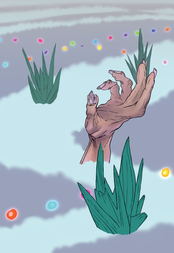
 Loving your line art so far. I would maybe move the hand so the grass isn’t coming out of the fingers.
 -
@story-paint said in "Pushin' Up Tulips" Progress and Feedback?:
... I would maybe move the hand so the grass isn’t coming out of the fingers.
Definitely agree with this. Probably best to move the hand toward the center of the frame.
-T
-
Great notes @story-paint and @Casual-T, that sounds like a consensus
Hand has been moved to the center!I did a bunch of work on this piece over the last 30 somethin hours~ Here's an updated progress shot!
Sooo, I like the "Reach for your dreams" quote, but it doesn't scream "holiday" to me, it screams "encouragement card". Thoughts?
I'll be adding some highlighted glitter effects on the snow closest to the viewer, give it some texture. I'm thinking about adding Christmas light blushes on the tulip blades and hand.
Does the hand look like it's coming out of the ground? That's the effect I was going for with the soil falling from the fingers. Does the skin look dirty? Is that coming across?I'd appreciate your thoughts, but of course no pressure! And heeeey, thanks for the compliments on the line art! I had a lot of fun with that part~
Also... so, this piece looks very different on the Cyntiq than it does on the computer screen. It's more vibrant on the Cyntiq. Any thoughts on that? Lemme know if you know!Thanks so much y'all!
All the best,
Shani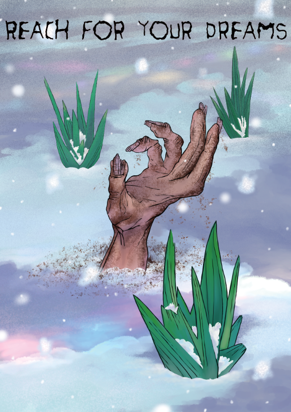
-
Moving the hand to the center looks a lot better. At the risk of getting a bit nit-picky, I would suggest moving the top right bunch of grass just a smidgen further to the right. As it stands, you have a little bit of a tangent, right where the tip of the fingernail touches the blade of grass. Other than that you could, if you want to, make the hole in the ground where the arm sticks out, a bit larger. I'm thinking that the whole hand had to fit through, but right now the hole seems to be "arm sized" rather than hand/fist sized.
-T
-
I ditto the tangent comment. I know you mentioned the Christmas lights, but it seems more encouragement card than anything. Why is it linked to Christmas? Narratively it doesn’t have any reason to yet.
As for the dirt, the hand looks dirty, but maybe some clumps stuck in the creases of the hand? To me, it feels like the hand has been there a while.
And as for colors... yeah, going from screen to screen messes with things. Just make sure your colors work well together, and you should be fine.
Loving the progress! -
About the colors looking different on different screens... Are you screens color calibrated? I used a Datacolor Spyder 5 to get mine to look the same.
-
Thanks so much y'all! I appreciate the feedback (nitpicky stuff included
)The colors work on the Cyntiq, so I hope it translates onto the products. I've never heard of Datacolor Spyder 5 - I'll look into that, thanks @Casual-T! I've tried getting the screens to calibrate, but maybe I need to look online for a tutorial...
I've removed some of the grass to remove the tangent. I was hoping for overlap to show depth, but it seems that's not going to work out. Sounds like a consensus ~
I've made the hole "fist size" - good note.
I've added caked on dirt in the hand creases, another good note. Thoughts? Thanks @story-paint!
I'm a little worried wayward minds might see it in a more... ehhhh, perverted light? I can absolutely see a bunch of poop/anal jokes here, so I was trying hard to avoid that. But maybe I'm overthinking it? Folks who buy the holiday cards won't be seeing it in that light, ( I hope)Yeah, I suppose this card could work both for the holidays and as encouragement, I can alternate the layers accordingly.
What do y'all think is a good holiday caption?
“Hold tight to the holiday cheer”
“Reach for the spirit of the season”
“Seize the holiday cheer”
“Rise up for the holidays”
“Uncover the festivities”
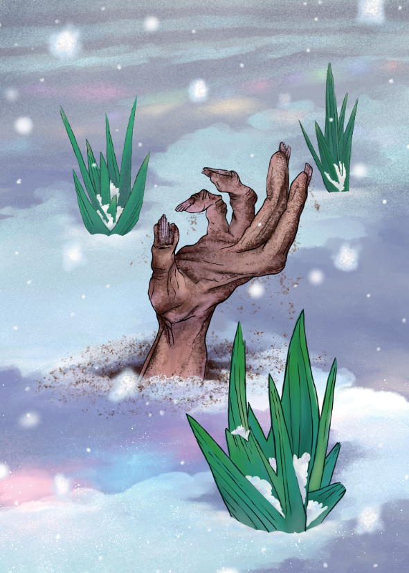
“Cultivate the seasonal spirit”Thanks so much y'all! I really appreciate the time and feedback! Here's an updated version~ Looking forward to hearing your thoughts on it, but of course no pressure
All the best!
Shani
-
Sorry for the delay. I like it!
MY head doesn’t go poop jokes, but that’s me. That’s always a good thing to keep in mind though.
I like all the captions with “unearth” or “uncover” I like the word play there.
You have such strong values and contrast in the hand, I think I would try to sneak some in to the grass/ground. But not too much, because you want to keep the focal point being the hand. Maybe some warmer tones in the grass??
I do REALLY like it though.