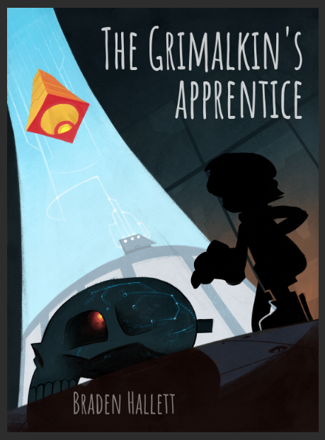
I'd love some feedback on this cover design :)
-
@Braden-Hallett Awesome as usual - only thing i am wondering is if there is a moment of resolve that occurs after the trepidation? I think resolve might be more appealing for a book cover - just throwing out a random thought here: is there a companion? the expression on the boys face would be perfect for a companion behind him?? might muck up the composition though... i guess even if he is a reluctant hero he should still read as being a bit more heroic on the cover - could be way off of course
")
-
@NessIllustration said in I'd love some feedback on this cover design
:@Braden-Hallett I really love this cover design / layout! Very strong! I'm not loving this font though. To be honest I thought it was placeholder. I'd suggest looking at books in your target market to see what are the title/font trends. I find that less is more, and classic understated fonts always work great. For titles, a hand-drawn word art is always attractive
Thanks for the honesty on the font! I always always always go for a font that turns off most people. It's a talent
I hadn't thought about hand lettering! I think in the back of my head I simply didn't think I could do a sci-fi kind of font, but maybe I should try!
-
@Matthew-Oberdier Iiiiinteresting! Thank you I'll try and fiddle with the pose
-
@Kevin-Longueil said in I'd love some feedback on this cover design
:the expression on the boys face would be perfect for a companion behind him?? might muck up the composition though...
lol, that's exactly what I had before, but axed the companion since he was, indeed mucking up the composition
I think that's a good idea, though! Heroic or at the very least some kind of sense of 'dutiful resolve' may be better than trepidation.Maybe I'll try and have the other character kind of peeking out from the around the skull.
As for the moment of resolve it's an awful scene with screaming, tearing, gnashing of teeth and puking. Followed by miraculous escape, of course, but definitely not on my top ten for the book cover, lol.
-
Looks great the text was just a little hard to read other than that awesome!
-
Hey that looks rad.
Yeah I think @Matthew-Oberdier has a good point on the pose. It looks weird until I figured out they were kneeling down. Everything else looks like its in this dynamic perspective except the character.
instagram and twitter: @artofaleksey
alekseyillustration.com -
@Asyas_illos said in I'd love some feedback on this cover design
:Looks great the text was just a little hard to read other than that awesome!
Yup. Definitely gonna change that font

-
@ArtofAleksey said in I'd love some feedback on this cover design
:Everything else looks like its in this dynamic perspective except the character.
It's very true! He does look like he's in a very straight perspective compared to the skull and the rest. Thanks man
-
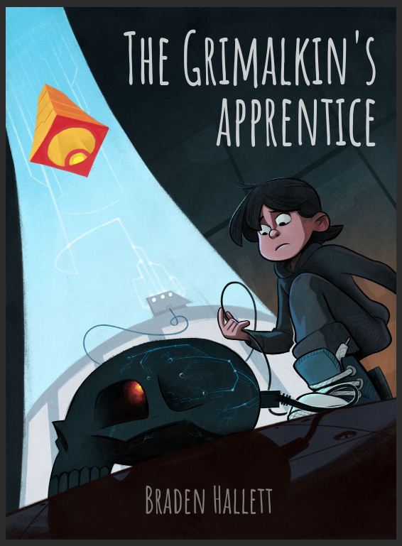
Took some feedback from here and aroond and aboot other places. I think it's much improved!
I'm still not happy with the font and I think I'll post some different option later on.
Thanks everyone for all the feedback!
-
@Braden-Hallett I think this one is a great improvement! I love the composition! It looks much more finished and the new font is so much easier to read and seems to fit the style of the art.
-
@Braden-Hallett looks awesome! I have a quick thought - I did a quick draw over to see and I think if the boy is reaching for the jack with his left hand and is looking at the skull instead of the cable in his hand it is much more dramatic and has more of a boy vs. skull vibe and may show more what is about to happen in the story- also making the cool blue lines on the skull pop out slightly more looks good too - feel free to ignore
-
@Braden-Hallett
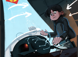
right now the most important thing in the image is the orange thing due to the saturation of the orange despite your design itself seems to focus more on the foreground.i made a lil color mock which leads the eye first to the things happening in the foreground

-
@Kevin-Longueil said in I'd love some feedback on this cover design
:@Braden-Hallett looks awesome! I have a quick thought - I did a quick draw over to see and I think if the boy is reaching for the jack with his left hand and is looking at the skull instead of the cable in his hand it is much more dramatic and has more of a boy vs. skull vibe and may show more what is about to happen in the story- also making the cool blue lines on the skull pop out slightly more looks good too - feel free to ignore
Post it! Lemme see
 Because honestly that's a much better idea that what I have!
 -
@Molambo I like! My plan was for the orange thing to be the first read, but this works well too! I like the way the skull pops.
I've gotta learn to be less afraid of colour, lol.
-
@Braden-Hallett ha! I never know if folks cringe at getting a draw over from me or not! This is all I have left of it - there are other things going on that I did not mention .... I was thinking of getting as many lines leading to the face as possible within the composition by adding random panels behind him and also continuing the curves in the energy column to point at him too... that’s what those arrows are ..the weird white line below his foot is just a mistake
-
@Molambo also, thank you so much for taking the time to do a drawover
-
@Kevin-Longueil Nice! I really like the idea of reaching toward the skull with the other hand! Thanks for taking the time to drawover, it's much appreciated
-
@Braden-Hallett Great improvement with the cover! I also have some suggestions based on all the wonderful feedback you've already received.
I really like adding the other hand reaching for the skull. It seems more interactive. But if you're going for that, I'd also suggest trying to switch the legs so that you can see both the legs clearly and also the torso.I think you need a sharp font to match all the sharp lines of the supercomputer. Maybe more in the lines of the first font you used but something with more width and kerning so that it's easier to read.
Also, try playing around with the scale of "THE" and see if it looks any better?
-
@Neha-Rawat thank you for the feedback! I'll try and open up the pose. At the very least make it so that the silhouette reads better!
and that some awesome advice on the font. I had to look up what Kerning was, lol.
-
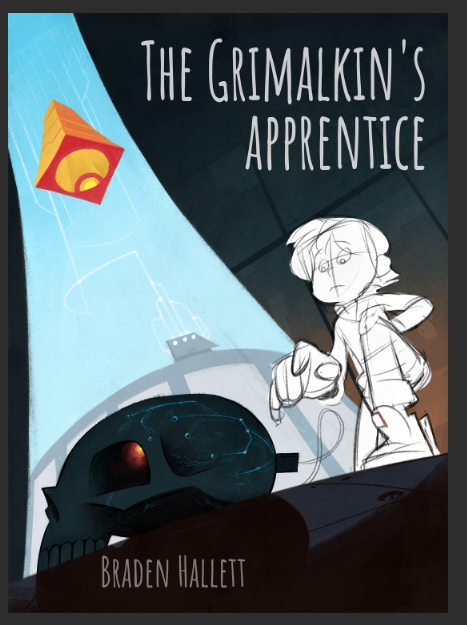
MAJOR SURGERY TIME!
I HATE making these kinds of changes once a piece is at this stage, but in this case the feedback was so good I kinda have to try
First step is the pose. Next step is the colour alterations. last step is the font fiddlin'.
I think this pose is more open and the silhouette reads clearer at the very least. And story telling-wise reaching for the skull is so much better than lookin' at the cord!
Let me know what you think! I'll be implementing the colour suggestions next
and just the silhouette.