Society of Visual Storytelling

    SVSLearn Forums

    • Register
    • Login
    • Search
    • Recent
    • Tags
    • Popular
    • Users
    • Groups
    • Search

    Creative Environment Design

    Projects
    9
    17
    5834
    Loading More Posts
    • Oldest to Newest
    • Newest to Oldest
    • Most Votes
    Reply
    • Reply as topic
    Log in to reply
    This topic has been deleted. Only users with topic management privileges can see it.
    • bharris
      bharris last edited by

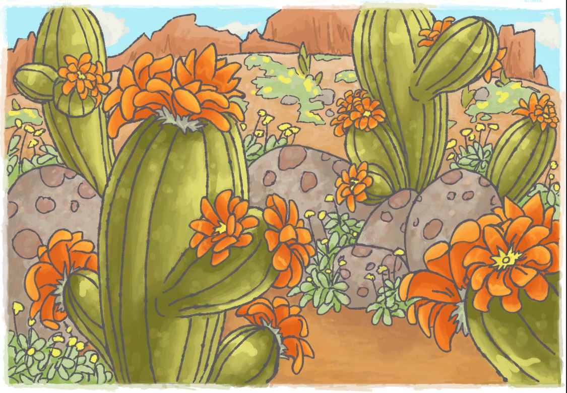
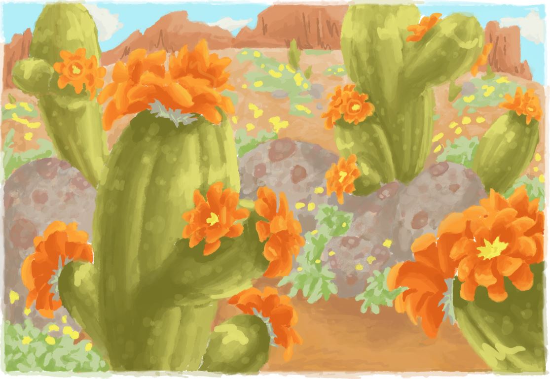
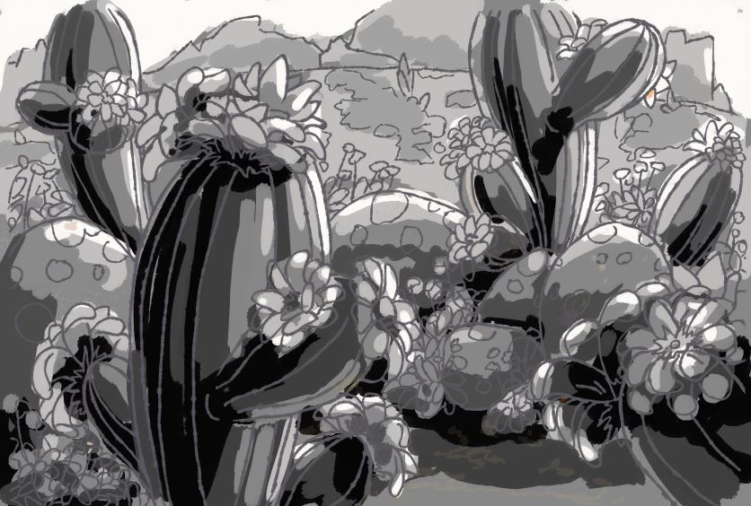
      I recently finished the Creative Environment class and wanted to get some feedback. I played with using more rounded shapes for this one and did some quick painting, because you can't resist desert color! I feel like the composition may be off, maybe too zoomed in? I'd like to know how to fix it for next time. Also should I keep the line work or render it out fully? Thank you!

      Desert.JPG Desert painting.JPG

      www.brittanyharrisillustration.com/
      www.instagram.com/britillustration/

      1 Reply Last reply Reply Quote 7
      • B
        Biscuits last edited by Biscuits

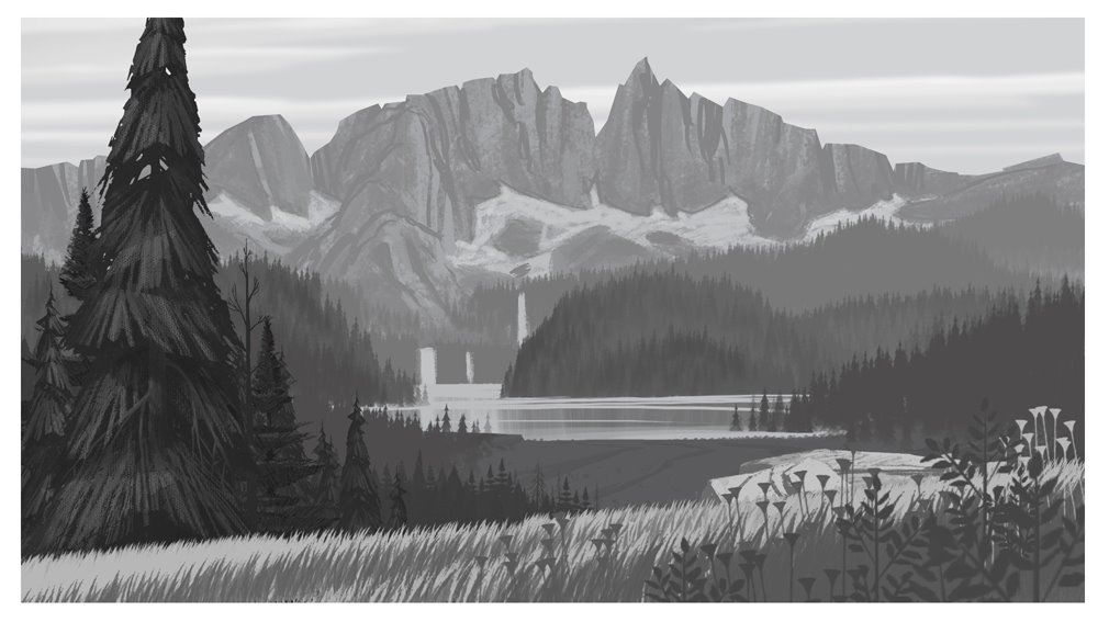
        I like the version with the linework! The no-linework version would work better if you cleaned up and sharpen some of the edges. In response to your composition question, it does seem a bit too close-up due to similarities in scale. I think you could really push back those background elements and scale them down while keeping a few foreground elements bigger. You can also try playing around with some atmospheric perspective where foreground start out dark and gets lighter as it fades into the background. Like this photo for example

        atmospheric-perspective-1.jpg

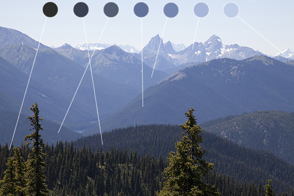
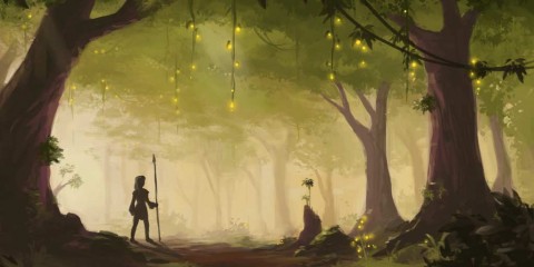
        Maybe not quite as dark as these two but they're good examples..
        Forest-Concept-Art-by-Alrynnas-1-480x240.jpg tumblr_inline_nk1o42JLzM1t9loxs.png

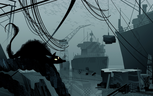
        Nice work though! I like how you chose to use grey lines instead of black, gives a nice contrast without being too distracting.

        1 Reply Last reply Reply Quote 4
        • bharris
          bharris last edited by

          I will try the lighting, you're right it will look better! Thank you!

          www.brittanyharrisillustration.com/
          www.instagram.com/britillustration/

          1 Reply Last reply Reply Quote 0
          • amberwingart
            amberwingart last edited by

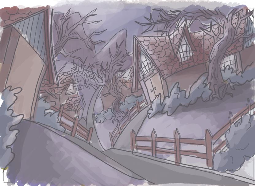
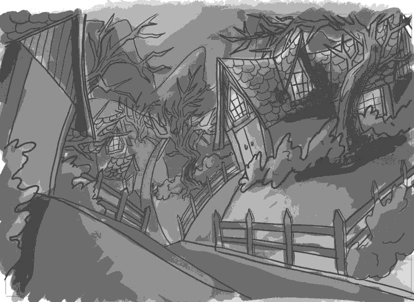
            Ooh, both styles look completely different but both are really pretty!

            Facebook Page: http://www.facebook.com/amberwingart
            Instagram: @savinafranciscoart
            YouTube: http://www.youtube.com/amberwingart
            Website: http://www.amberwingart.com
            SVS Sketchbook: http://forum.svslearn.com/topic/915/savina-s-sketchbook-updated-2-13-16

            1 Reply Last reply Reply Quote 1
            • Carrie
              Carrie last edited by

              I really like with the line work.

              1 Reply Last reply Reply Quote 1
              • Rob Smith
                Rob Smith last edited by

                @bharris I like the one with the line work.

                1 Reply Last reply Reply Quote 1
                • sergio
                  sergio last edited by sergio

                  The first one is a colored drawing and the second is a painting. Second one requires more skills to get a good result so it's a better challenge if you want to improve your painting.

                  Anyway, I like the the visual "proposal" in both images.

                  Thanks for sharing.

                  1 Reply Last reply Reply Quote 1
                  • bharris
                    bharris last edited by

                    Thank you all for the feedback, I'll continue to work on it! Since it's less effort for practice, I'll be going with the line drawing.

                    Here is my next practice piece and I'm curious to know what you all think of the color scheme. The lines aren't done fully, and there will be more contrast as I render it out. 🙂

                    Neighborhood.JPG

                    www.brittanyharrisillustration.com/
                    www.instagram.com/britillustration/

                    1 Reply Last reply Reply Quote 0
                    • Lee White
                      Lee White SVS Team SVS Instructor Pro SVS OG last edited by

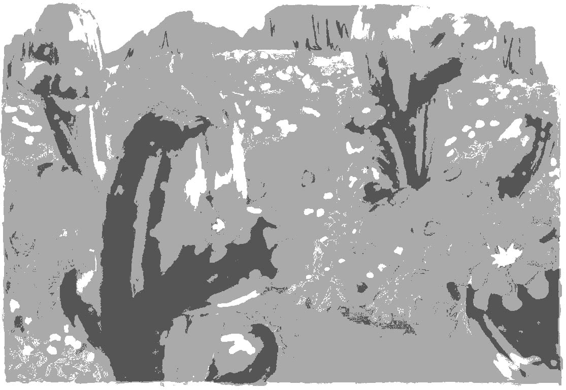
                      I think both of your layouts are really interesting. I would suggest you take some time and do more value studies. Limit yourself to 5 tones ranging from white, 25%, 50%, 75%, and black. You will get so much further that way.

                      I took your image and converted it to greyscale and added a 5 value posterization to show you what I mean. It almost all goes to middle grey. I'd say that is your problem in the first one as well. Your drawing and color are fine. If you get your value under control these will be rockin'!

                      1454695553768-neighborhood.jpg 1454354078890-desert-painting.jpg

                      SVS Faculty Instructor
                      www.leewhiteillustration.com

                      1 Reply Last reply Reply Quote 1
                      • bharris
                        bharris last edited by

                        Thanks Lee! I'll work on it!

                        www.brittanyharrisillustration.com/
                        www.instagram.com/britillustration/

                        1 Reply Last reply Reply Quote 0
                        • bharris
                          bharris last edited by

                          Desert value study.JPG

                          Super quick/messy, but is this better?

                          www.brittanyharrisillustration.com/
                          www.instagram.com/britillustration/

                          1 Reply Last reply Reply Quote 0
                          • lmrush
                            lmrush Pro SVS OG last edited by

                            Your line drawings are beautiful, thank you for sharing

                            Lisa Rush
                            www.lisarushgallery.com
                            www.facebook.com/ArtbyLisaRush/
                            www.instagram.com/lisarush11/

                            1 Reply Last reply Reply Quote 1
                            • BradAYoo
                              BradAYoo last edited by

                              I really like your dessert painting. I think that the top with the line is stronger as it makes everything more clear visually. You could use the art without line but it would require more refining and as Lee mentioned more contrast would help parts pop and be more defined.

                              As for composition, I like it. I read it like we're getting closer to a grander yet smaller scene. Almost as if there was a small mouse town just around the next cacti.

                              http://geobrd.com - https://www.instagram.com/geobrd/ - https://twitter.com/bradayoo

                              1 Reply Last reply Reply Quote 1
                              • Lee White
                                Lee White SVS Team SVS Instructor Pro SVS OG last edited by Lee White

                                That's getting there. The problem is that you are thinking in terms of lighting before thinking in terms of local value (local color). A dark green cactus, even when lit wont go nearly as bright as a light flower. And a lighter flower will never go to black in terms of the shadow tone. Of course, saturation plays a part in all this, so it's not totally cut and dry. But for ease of teaching, just think of each thing as a flat tone and as yourself "Is this local value light or dark". Then add the lighting on top of that, but try to keep the items separate and make sure they still read when the image is small.

                                Does that make sense? Here's a quick way to check that idea. Notice that if you make the image very small or squint at it, the cactus shapes stay intact and then there is the darker rocks, and then the flowers and lighter background items. They all stay separate. That's the easy way to remember this and it will really make image making a lot easier. To put it another way, most people over light the scene and then the values are really hard to control.

                                1454699085103-desert-value-study.jpg

                                SVS Faculty Instructor
                                www.leewhiteillustration.com

                                1 Reply Last reply Reply Quote 1
                                • Lee White
                                  Lee White SVS Team SVS Instructor Pro SVS OG last edited by Lee White

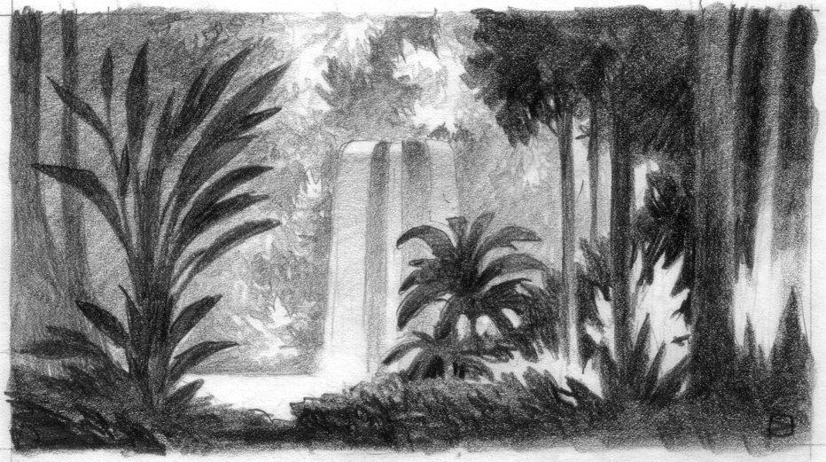
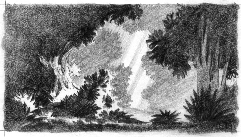
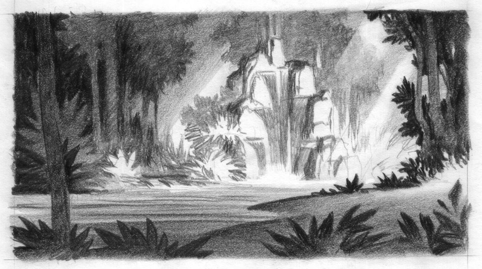
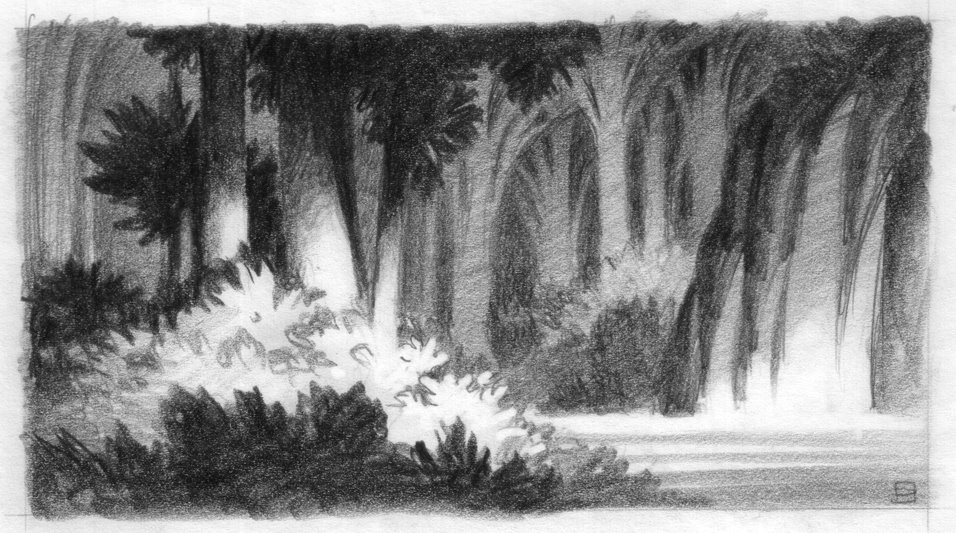
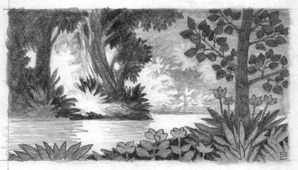
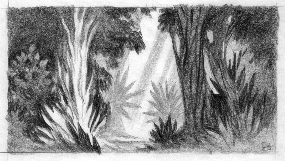
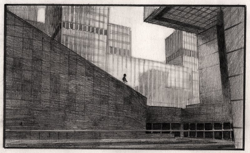
                                  Here's some wonderful examples of controlling value (dreamworks artist Luc Desmarchelier) :

                                  locations171Web-1.jpg locations170Web.jpg 150sc01_v2Web.jpg BedouinsWeb.jpg ChocoJungleSketch2Web.jpg ChocoJungleSketch1Web.jpg ChocoJungleSketch4Web.jpg ChocoJungleSketch3Web.jpg ChocoJungleSketch6Web.jpg ChocoJungleSketch5Web.jpg sketch1Web.jpg

                                  SVS Faculty Instructor
                                  www.leewhiteillustration.com

                                  1 Reply Last reply Reply Quote 2
                                  • bharris
                                    bharris last edited by

                                    Lee, the way you put it makes sense. I see your draw over is a lot better, I just have a difficult time determining how much to think about the lighting when doing a value study. Is it better to start with everything in in local value and then figure out the lighting/shadow situation?

                                    www.brittanyharrisillustration.com/
                                    www.instagram.com/britillustration/

                                    1 Reply Last reply Reply Quote 0
                                    • Lee White
                                      Lee White SVS Team SVS Instructor Pro SVS OG last edited by

                                      Unless the lighting is really exaggerated in some way, I'd think about local tones first and add the light on top of that.

                                      SVS Faculty Instructor
                                      www.leewhiteillustration.com

                                      1 Reply Last reply Reply Quote 1
                                      • First post
                                        Last post