APRIL CONTEST: Design A Fairy-Tale Inn
-
My entry finally complete !!
https://www.artstation.com/brett_billingham
https://www.instagram.com/brettb_illustration/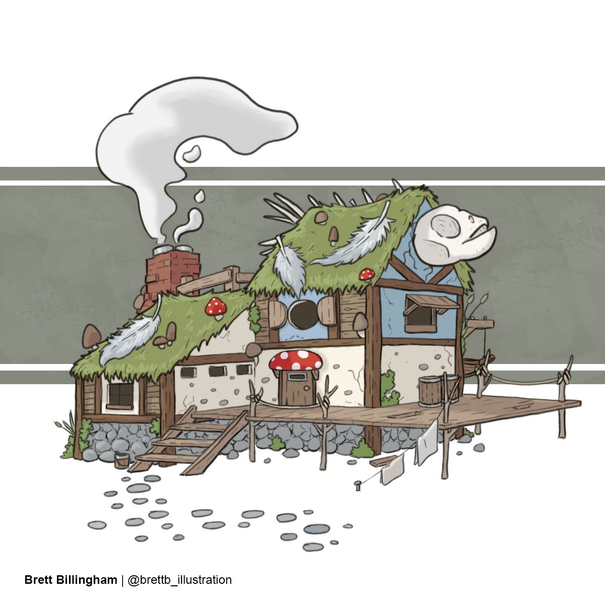
-
So glad I’m not the only one finding issues with the template!
-
@Tiffany-Thomas @Asyas_illos Thank you so much!!
-
@Asyas_illos thanks so much!! Kinda went with an old cartoon vibe like Ed Edd and Eddy or something. : )
-
@artofdavey hahaha I like it!
-
Something a bit different than the classic Fairy Tale.
https://nanohour.weebly.com/
https://www.instagram.com/nanohour_art/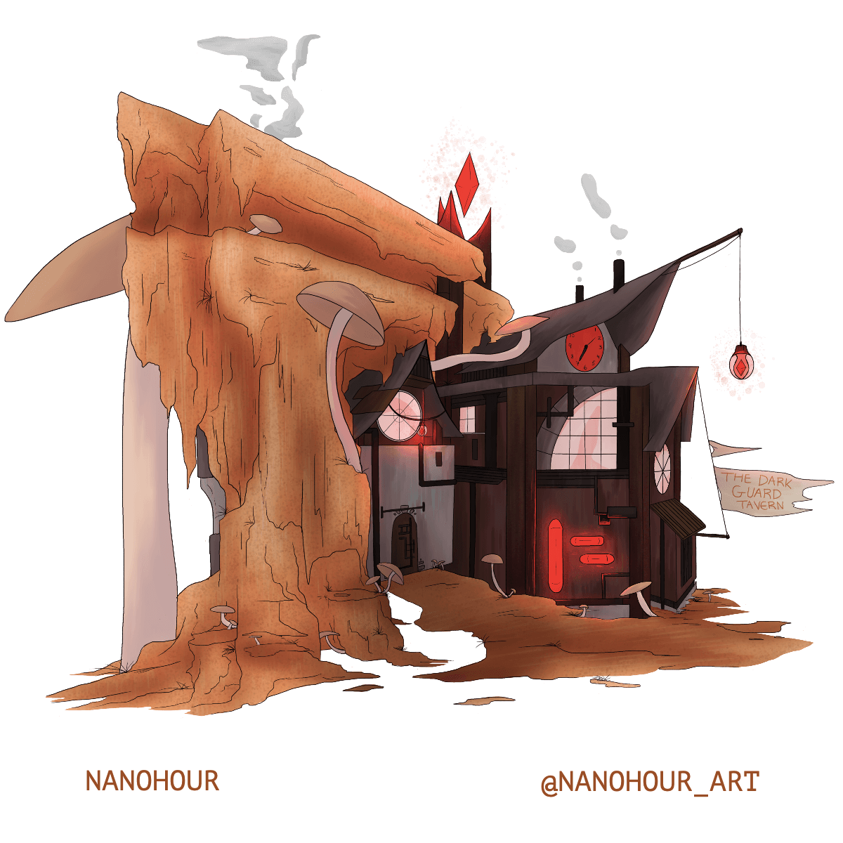
-
-
Float on into the Float On Inn and spend a night among the clouds. Be advised, though, it's not recommended to try to walk out on your cabin's cloud.
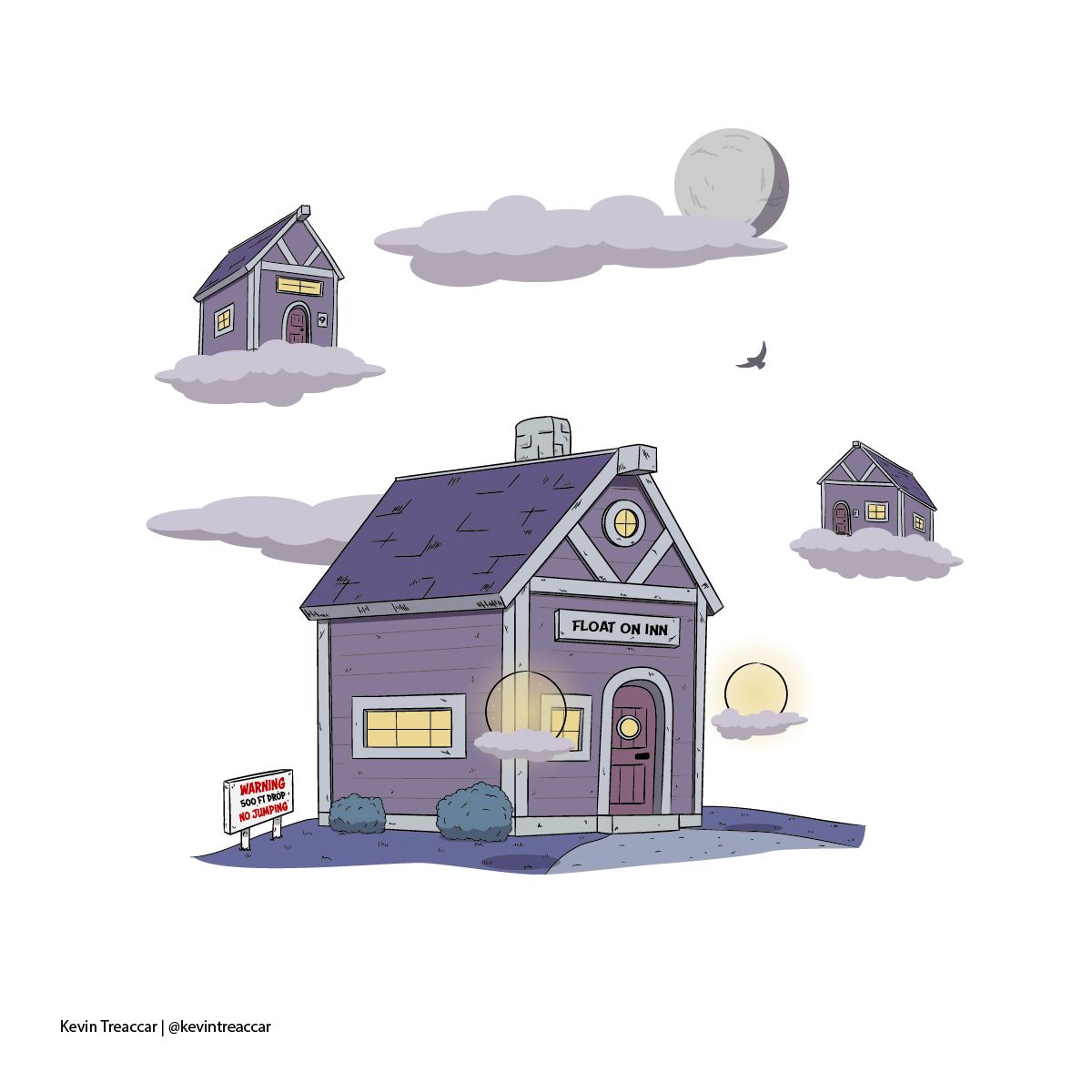
Good luck, everyone!
-
@Joel-Cockrell Lovely lighting and color palette.
-
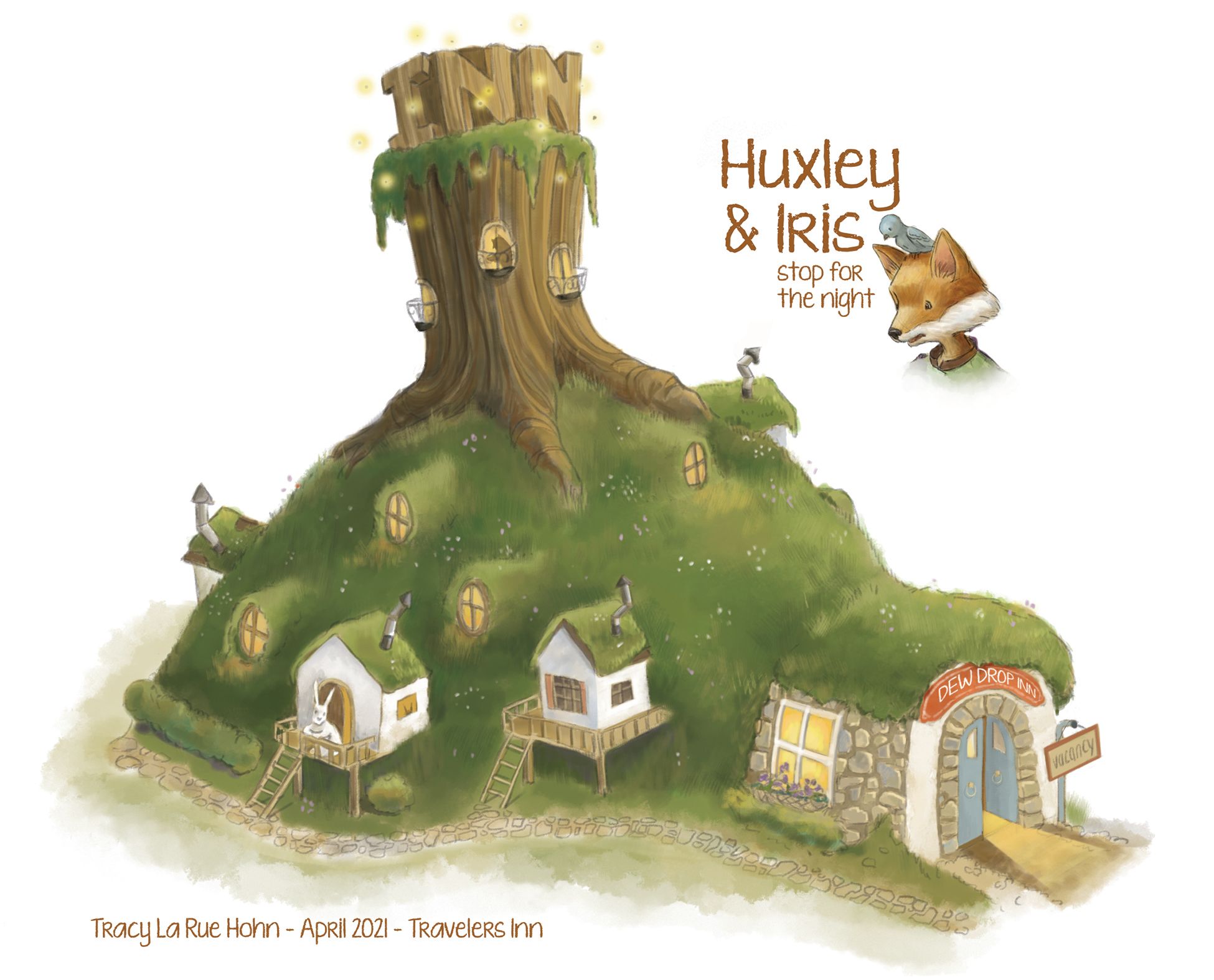
I know I posted this sometime last week but I don't see it here in this thread so I'm uploading it again. Sorry if it's repeat! I've scrolled through everything (I think ) and can't see it:\
-
@Valerie-Light It's an interesting blend for sure. At what point did you stop traditional and move into digital?
-
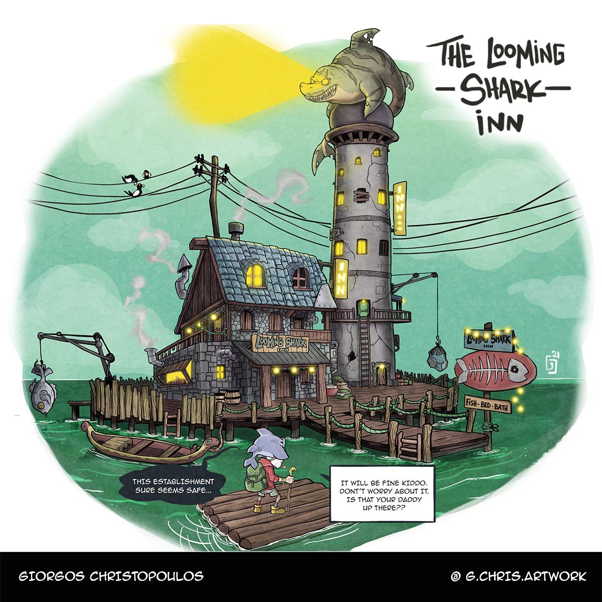
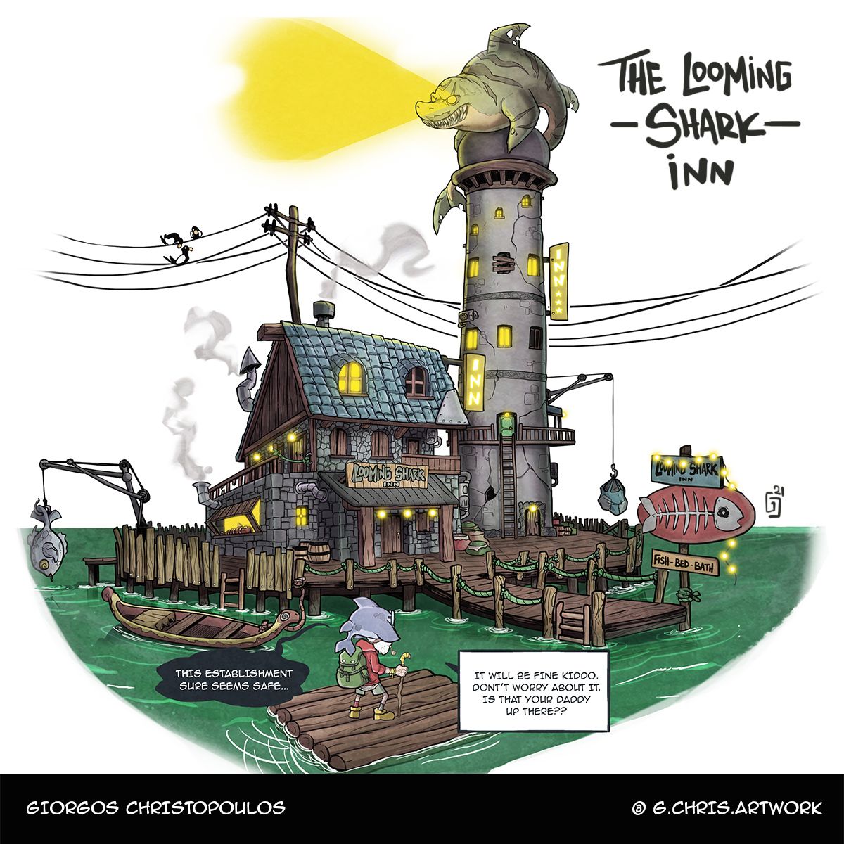
Welcome to the Loomisng Shark Inn!
This was intense.I did not know if I could make the deadline or not.
But here it goes!
Joseph and Dominic from the previous months challenge made it to this suspicious establishment..
Now they need to find a safe room in there..I am uploading both the pieces because I don't know if the one with sky counts as a background or not.We will see!!
Good luck everyone!
-
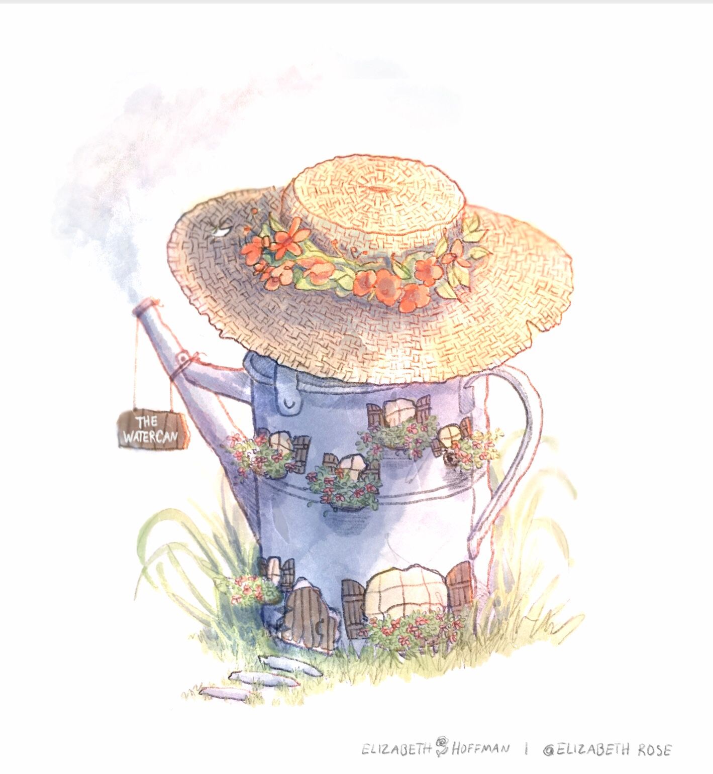
Really enjoyed seeing everyone’s unique take on the fairy Inn prompt! This one is inspired from all the gardening I’ve been doing this month.
-
@Georgios-Christopoulos Really nice piece ! I love the amount of details you've put into this, makes it really fun to look at
-
@s1h0k I really like this ! The colours are relaxing to look at and the lifework is really clean. Just noticed the cat daring itself to go for the fish

-
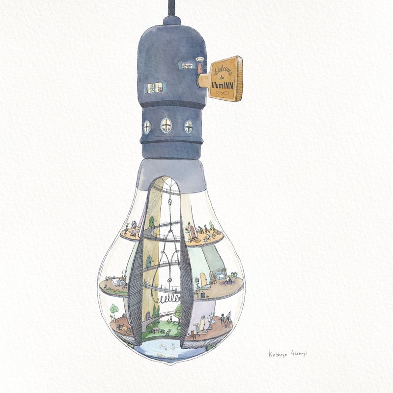
@jdubz I started with thumbnails on paper, and then worked out the line drawing & perspective digitally on top of one of those. I printed the line drawing out and put it under a sheet of watercolor paper on my lightbox and did 90% of the color with watercolor. Then scanned back in to Procreate and adjusted color and shadow in multiply layers, and fixed up detail and lettering. I'm not super happy with the brush texture I used for that, and I'm wondering if it looks as awkward to other people as it does to me.
-
Hello there, thank you to those who commented to help me with my original prompt idea. This new idea popped up recently, so here’s a different take on an inn. Posting without the template, since it looks a bit blurry to me with the template (using Procreate). Everyone designed so many amazing and inspiring buildings this month.

-
@brettb_draws thanks a lot! Glad you like the it!
-
So many great entries! But my hat is off to you guys who are able to cram in sooo much detail! I used get lost in my detailing and and get overwhelmed or bored and ultimately give up, so good on you too keep at it!
-
@Valerie-Light bravo!