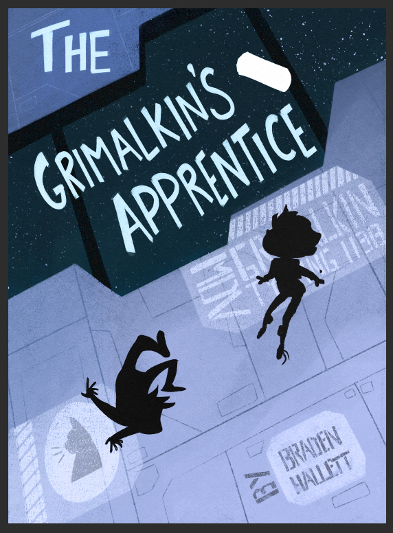
How's this vertical title look?
-
I would say no. It is hard to read. Is there a way to put it on an angle towards the top?
-
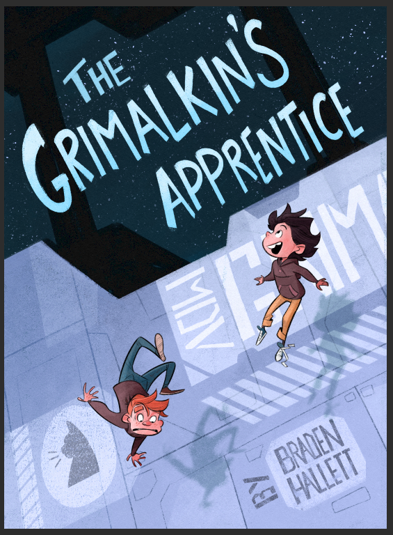
I really love how you did the author credit on this one, that feels like amazing typography work that's really nicely built into the image!
But I'm not sure about the vertical title.
I find those pretty hard to read at a quick glance, which might already be enough to turn some people away. The cover looks super cool, but I think that's a risk, and I'm not sure it's worth taking.
Or if you are into it, I'd say the "The" is currently drawing all my attention text wise because my brain can interpret it immediately, and then it doesn't smoothly connect to the rest of the title (And I already know what the title is from previous versions!)
-
@Mandy-Forte said in How's this vertical title look?:
Also is that white spot going to become something because it is definitely catching my eye but I can’t tell what it is?
It's just a silhouette right now for placement, but once finished it's going to be a cubical brain floating in a cylindrical jar
")
-
@MirkaH said in How's this vertical title look?:
I would say no
Cool cool. I agree! I mocked up a version with a normal title placement and it works much better
-
@Nathalie-Kranich said in How's this vertical title look?:
I find those pretty hard to read at a quick glance, which might already be enough to turn some people away. The cover looks super cool, but I think that's a risk, and I'm not sure it's worth taking.
Cool cool! I agree with you. I like the way the illustration is nicely vertical with the bar behind the title, but it's really not readable
@Nathalie-Kranich said in How's this vertical title look?:
I really love how you did the author credit on this one, that feels like amazing typography work that's really nicely built into the image!
Oh that's good! I don't often do hand lettered fonts so I'm glad it looks cool!
-
yeah, definitely looks better with a normal title. Thanks everyone

-
Looks like an awesome title card (not in a bad way.). Reminds me of the aesthetics for Batman: TAS
-
@Braden-Hallett that looks great! The book looks really intriguing.
-
Very dynamic now. I like how its integrated into the cover this way.
-
@jaepereira said in How's this vertical title look?:
Reminds me of the aesthetics for Batman: TAS
I hadn't considered that, but that's pretty cool! Thank you
-
@Cole-Rts said in How's this vertical title look?:
The book looks really intriguing.
Intriguing is good! Thank you
@BradAYoo said in How's this vertical title look?:
Very dynamic now. I like how its integrated into the cover this way.
I definitely prefer this to the old one. I guess there's a reason a lot of covers do this kinda of integration
-
That's really cool, I love this new version. Really amazing how the title is incorporated!
-
@Nathalie-Kranich said in How's this vertical title look?:
That's really cool, I love this new version. Really amazing how the title is incorporated!
That's good! Thank you
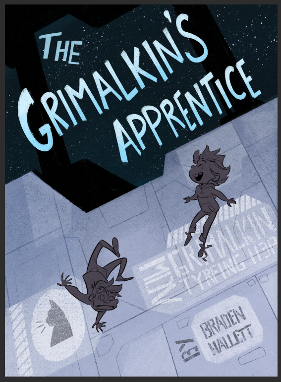
I think it's gonna turn out at this point (thank goodness, lol) -
I figured i may as well post some WIP as it progresses
-
@Braden-Hallett I love the evolution of this cover! I'd definitely pick up this book off the shelf.
Carrie Copa
https://carriecopadraws.com/ -
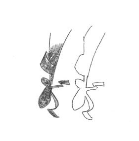
I would pick up a book with this cover! It has a dark interstellar yet open feel to it with a side of mystery! During the characters silhouette phase, at first I thought the child close to the title had elongated shoes until the line details were drawn in. This is such a small detail and can be dismissed, but at first glance the absence of the heel on his left leg makes the cuff of his pants come across as the heel and in previous versions the heel was present.
-
@carriecopadraws said in How's this vertical title look?:
@Braden-Hallett I love the evolution of this cover! I'd definitely pick up this book off the shelf.
Awesome! That's good
@Fay said in How's this vertical title look?:
During the characters silhouette phase, at first I thought the child close to the title had elongated shoes until the line details were drawn in. This is such a small detail and can be dismissed, but at first glance the absence of the heel on his left leg makes the cuff of his pants come across as the heel and in previous versions the heel was present.
So it works better now the details are filled in, yes?
-
@Braden-Hallett looking really good!
One cover design suggestion: tilt the “the” to line up with the rest of the title. Offsetting it like that draws too much attention to it.
Nice work, as always!
-
@Braden-Hallett Yes and no...I’m having a case of rabbit-duck illusion. I see what you’ve drawn and also see a ballerina leg, the shoe’s tongue looks like the heel...
Will you be adding colour or monochromatic? Will the other shoe have loose shoe laces?
-
@Fay Definitely adding colour to the characters. I always leave it til last
Maybe with colour it'll read a bit better, but I can always tone down the tongue a tad!