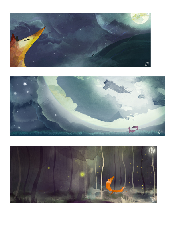
To the moon
-
-
I don't have any suggestions, but these are lovely!
-
wow I love the mood!
-
That's the way to go with color/light contrast for narratives, you doing great.
-
Thanks guys
-
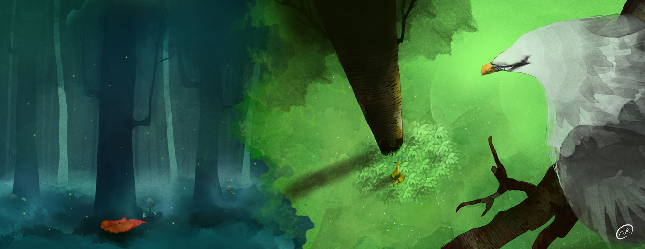
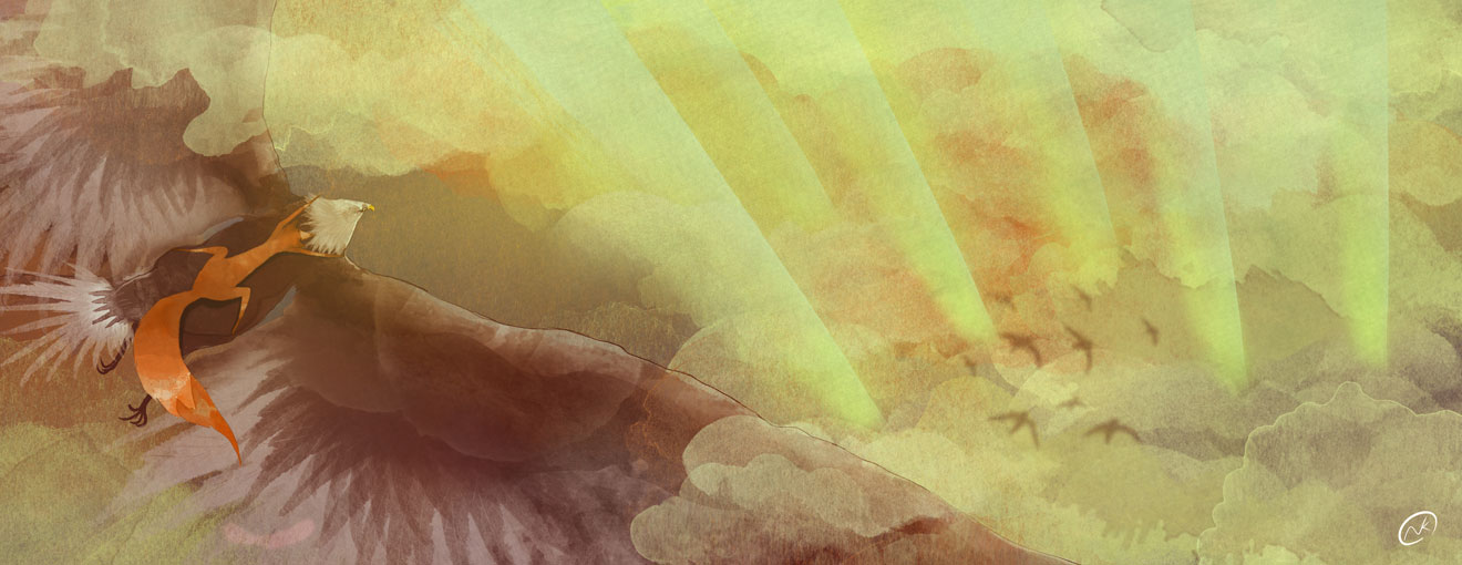
Really nice "whimsical" style. Would these be intended as double page spreads? If so I wonder if the fox silhouette in top one could be moved over a tad to avoid getting lost in the page fold?
-
@Naroth-Cow Stunning!
-
Thanks @Rowan-Ferguson for the tip, I do need to move that tiny silhouette fox a bit to the right to avoid the gutter fold.
Thanks @Charlie-Eve-Ryan -
I think the composition looks great! There's a nice flow going on as well. At first glance the design could come across as simplistic, but after a moment longer of viewing you can see many layers that create a stunning look of depth and lighting. Nicely done!
-
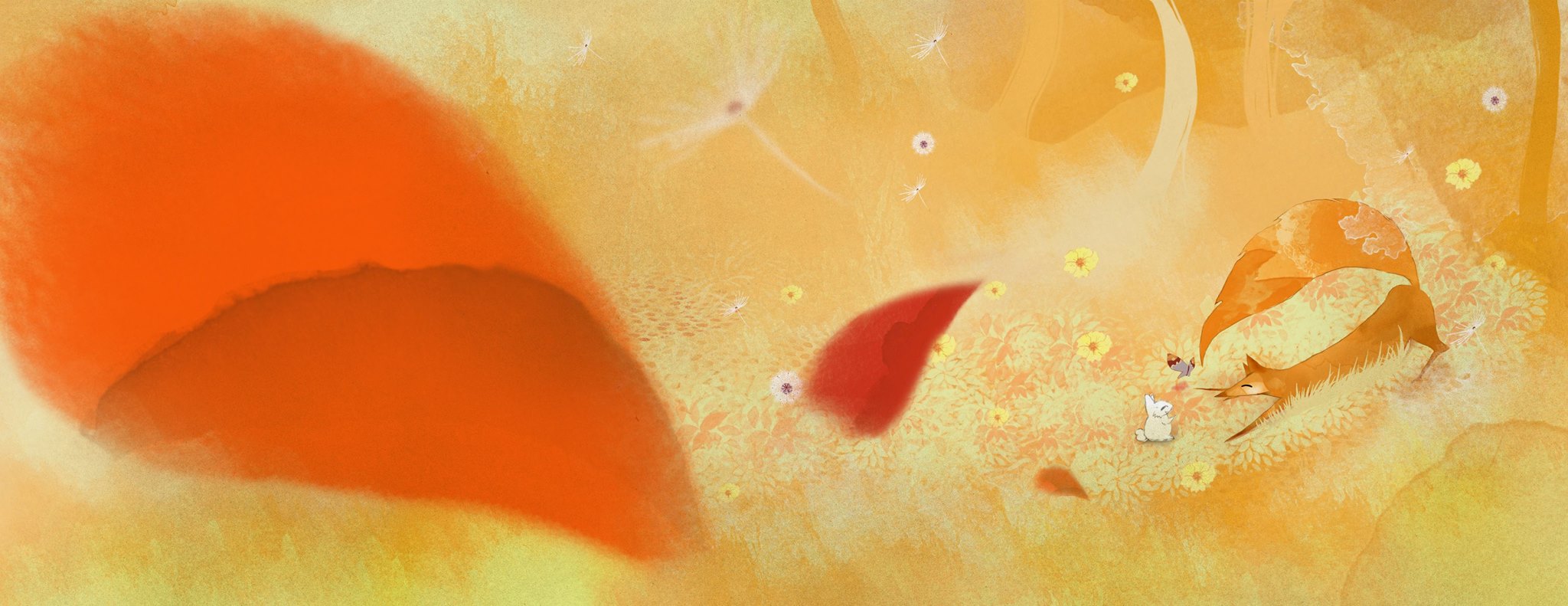
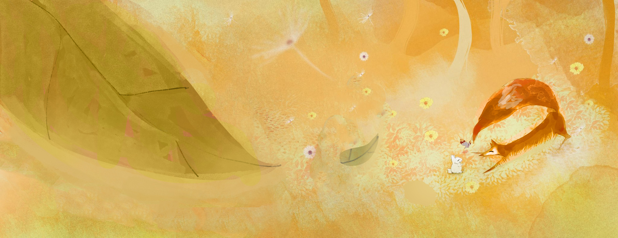
intro page, it took me the longest and yet still not happen the way it turned out.
-
@Naroth Cow; Hi Naroth, I Love it, its so lively and sweet. The only thing thats grabing a bit to much attention from me is the orange leaf on the left, although the shape is great, and I love the watercolor effect.
-
Thanks Leontine, I'll look into working on that leaf, I wonder if adding text would help. Appreciate the tip!
-
These are really great! You have a natural sensibility that is simply awesome!
The big leaf shape is dominating the scene due to three things, Color, size, and edge quality. We will always notice something bright red in an image. Our brains are hard wired for that. Our brain registers dangerous things in nature being red and we can't avoid that response. I would make the fox have the brightest splash of color on the page so the leaves don't have that dominance.
Having a big leaf is awesome to show the height, but I would think about making it a bit smaller because it's just so big now that we are left wondering what it is.
I LOVE all your mark making, but that hard edge running through the leaf is calling a lot of attention to it, so be careful.
I absolutely LOVE your work and think that if you aren't already published, you soon will be.
Here's a quick paint over if needed. : )
-
Thank a lot for the tips Lee, and time for showing me with the image. It really helps and now I see what I need to do to make the fox more of a focus point. Since i dropped out of graphic school I slowly picked up illustration in my free time, and it felt just right, Yes I'm hoping one day I can have something published. That was such encouragement from you. Thanks again everyone.
-
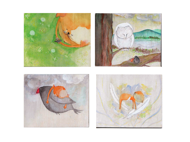
This is what my work used to look like before taking courses here. Acrylic, ink/pencil on wood.
composition/photoshop brushes courses probably has helped me the most.
-
@Naroth-Cow WOW--WHAT A DIFFERENCE!! These classes seem to really be helping out a lot. Thanks for sharing--and I like, no, I ABSOLUTELY LOVE these three drawing at the beginning of the thread. Stunning.
-
Terrific work...Bravo!
-
Chapeau! Practice does make perfect!
-
Any critiques would be awesome! Thanks a lot guys
-
Hi Naroth, just wanted to comment and say your latest are beautiful! I love the graphical yet painterly approach you have in these. The contrast of color on the fox in the dark woods pops, and the perspective shots are looking really good. The texture is pretty awesome too. Keep up the great work!