Society of Visual Storytelling

    SVSLearn Forums

    • Register
    • Login
    • Search
    • Recent
    • Tags
    • Popular
    • Users
    • Groups
    • Search

    To the moon

    Illustration
    18
    47
    17654
    Loading More Posts
    • Oldest to Newest
    • Newest to Oldest
    • Most Votes
    Reply
    • Reply as topic
    Log in to reply
    This topic has been deleted. Only users with topic management privileges can see it.
    • Leontine
      Leontine last edited by

      Chapeau! Practice does make perfect!

      Leontine
      "A picture is worth a thousand words."

      https://leontineillustrator.com
      https://www.instagram.com/leontine.illustrator/
      http://www.facebook.com/leontineillustration

      1 Reply Last reply Reply Quote 0
      • Naroth Kean
        Naroth Kean last edited by

        Any critiques would be awesome! Thanks a lot guys
        asking-the-eagle.jpg the-pilot.jpg

        http://narothkean.com
        https://twitter.com/narothkean
        https://www.instagram.com/narothkean

        1 Reply Last reply Reply Quote 0
        • S
          Sean Guzman last edited by

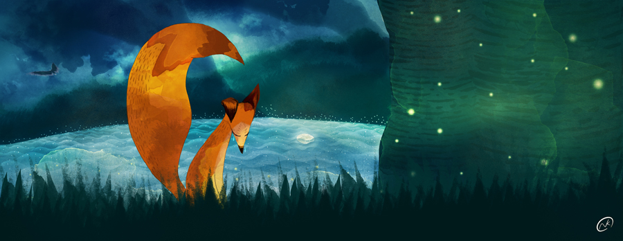
          Hi Naroth, just wanted to comment and say your latest are beautiful! I love the graphical yet painterly approach you have in these. The contrast of color on the fox in the dark woods pops, and the perspective shots are looking really good. The texture is pretty awesome too. Keep up the great work!

          http://spgarts.com/
          https://www.facebook.com/spgartist

          1 Reply Last reply Reply Quote 0
          • Naroth Kean
            Naroth Kean last edited by

            Thanks a lot Sean.

            http://narothkean.com
            https://twitter.com/narothkean
            https://www.instagram.com/narothkean

            1 Reply Last reply Reply Quote 0
            • Naroth Kean
              Naroth Kean last edited by

              These are in progress, I feel like my composition is getting redundant. What do you guys think?
              day-to-night.jpg
              snatching.JPG

              http://narothkean.com
              https://twitter.com/narothkean
              https://www.instagram.com/narothkean

              Maile McCarthy 1 Reply Last reply Reply Quote 0
              • Lynn Larson
                Lynn Larson SVS OG last edited by Lynn Larson

                I am so in love with this! I'm assuming the story will go in the open spots, so the composition is fine to me. I love the style, the color, and the fox just makes me happy! I really hope you pursue this, i know I want a copy on my bookshelf
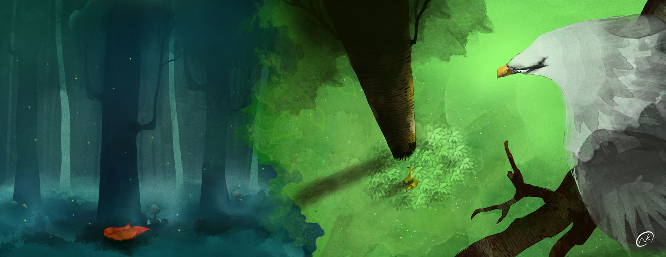
 🙂 I'm struggling with the first picture of the eagle though, and it is probably just me. I think it is the perspective change.

                https://instagram.com/lynnlarsonart/
                https://twitter.com/lynnlarsonart

                Kasey Snow 1 Reply Last reply Reply Quote 1
                • Kasey Snow
                  Kasey Snow @Lynn Larson last edited by

                  Your style is just lovely! Such graceful images.

                  http://kaseysnow.com ~ https://instagram.com/KaseySnowArt/ ~ https://twitter.com/KaseySnowArt ~ https://www.patreon.com/KaseySnow ~

                  SVS forum sketchbook: https://forum.svslearn.com/topic/9846/kasey-s-sketchbook ~
                  ~Kasey

                  1 Reply Last reply Reply Quote 0
                  • Maile McCarthy
                    Maile McCarthy @Naroth Kean last edited by

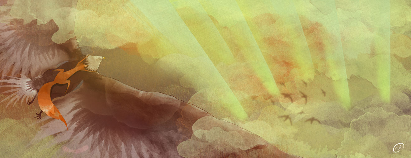
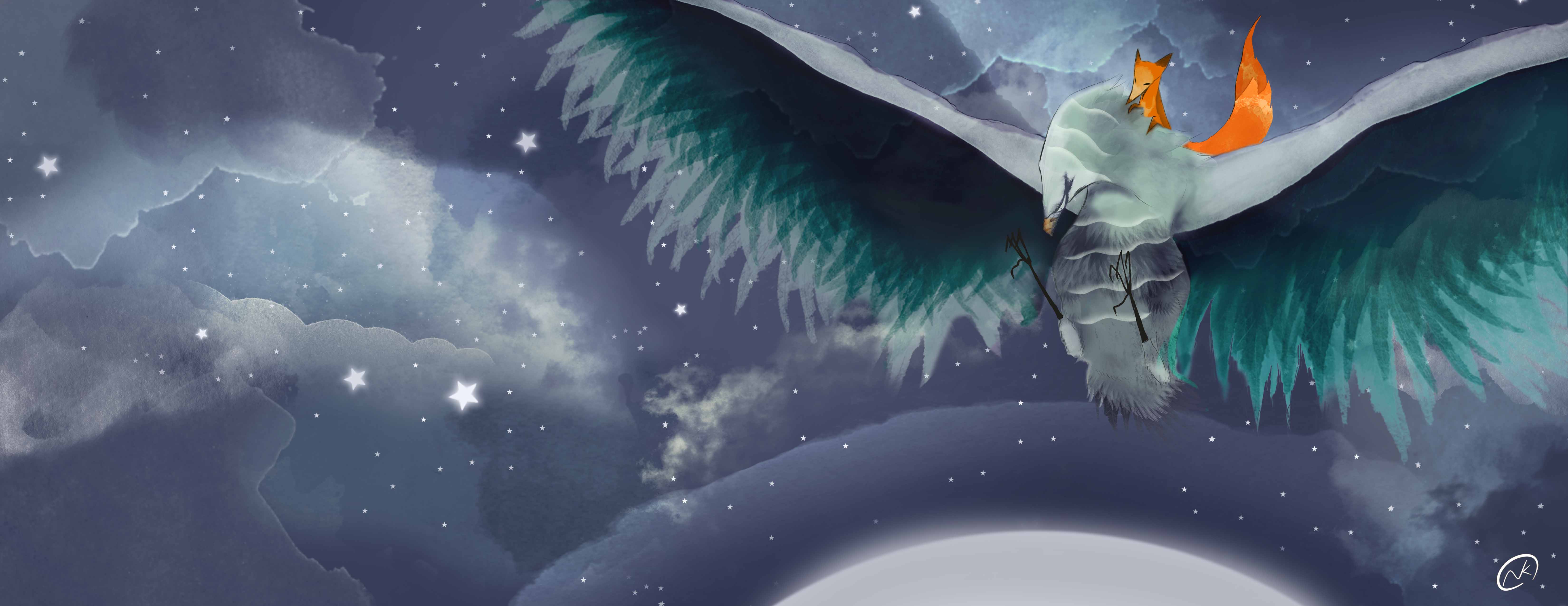
                    @Naroth-Cow Oh wow! Your work is absolutely stunning. The shapes, colors and texture come together to great such breathtaking floaty imagery. I really like how you create implied shape, especially in the skies, with large areas of color. And the fox speaks so clearly, with such simple gestures, especially in the second image of the first set.

                    The only think I could even think to add that might be useful to you is that on my first read of the third image (with the fox in the trees), I mistook his tail for his head, and it threw me off for a second.

                    But, wow. Breathtaking. Thank you for sharing these as well as the illustrations from before SVS. Very inspiring to me.

                    Twitter @MaileMcCarthy
                    www.mailemccarthyillustration.com

                    1 Reply Last reply Reply Quote 0
                    • Maile McCarthy
                      Maile McCarthy @Naroth Kean last edited by

                      @Naroth-Cow re: your question about redundant composition: Looking at your work, I'm seeing lots of different camera angles, close/far shots, etc.

                      But if you'd like to push it further-- Have you done a mock-up of the full book to see how one page flows into the next? This might help you see where/how/if to add variation. You might also try some illustrations that aren't full bleed spreads and see if anything comes of it.

                      Twitter @MaileMcCarthy
                      www.mailemccarthyillustration.com

                      1 Reply Last reply Reply Quote 1
                      • Naroth Kean
                        Naroth Kean last edited by

                        Wow thanks a lot guys! that has helped a lot.
                        @Maile McCarthy, thanks for the tips, I'm going to lay them down and see if they flow nicely.
                        This is exactly want I need to make them better.

                        http://narothkean.com
                        https://twitter.com/narothkean
                        https://www.instagram.com/narothkean

                        1 Reply Last reply Reply Quote 0
                        • Steve Young
                          Steve Young last edited by

                          They have turned out really well, love the colors.

                          Never give up, always push yourself two steps further than you believe you can go.

                          1 Reply Last reply Reply Quote 0
                          • Naroth Kean
                            Naroth Kean last edited by Naroth Kean

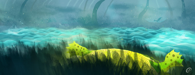
                            This time I gave my fox a bit fur stroke. I don't know I always give each scene a name It helps me when I sketch and put everything together.

                            "Losing Hope" (in progress)
                            giving up copy.JPG
                            "Help the shiny" (in progress)
                            struggling-shell.JPG

                            http://narothkean.com
                            https://twitter.com/narothkean
                            https://www.instagram.com/narothkean

                            Fabienne 1 Reply Last reply Reply Quote 0
                            • Fabienne
                              Fabienne @Naroth Kean last edited by

                              @Naroth-Cow Wonderful! I fall in love with your pictures! The colors suits the mood and you made the right choice with the fur texture.
                              The bird is a bit lost on the background (like the fox in the 2. picture). You can brighten up the sky to highlight the silhouette, respectively shade the trees and fox. But that's the only thing to point out.

                              1 Reply Last reply Reply Quote 0
                              • Naroth Kean
                                Naroth Kean last edited by

                                Thanks for the input @Fabienne, i'm going to make some change now 🙂
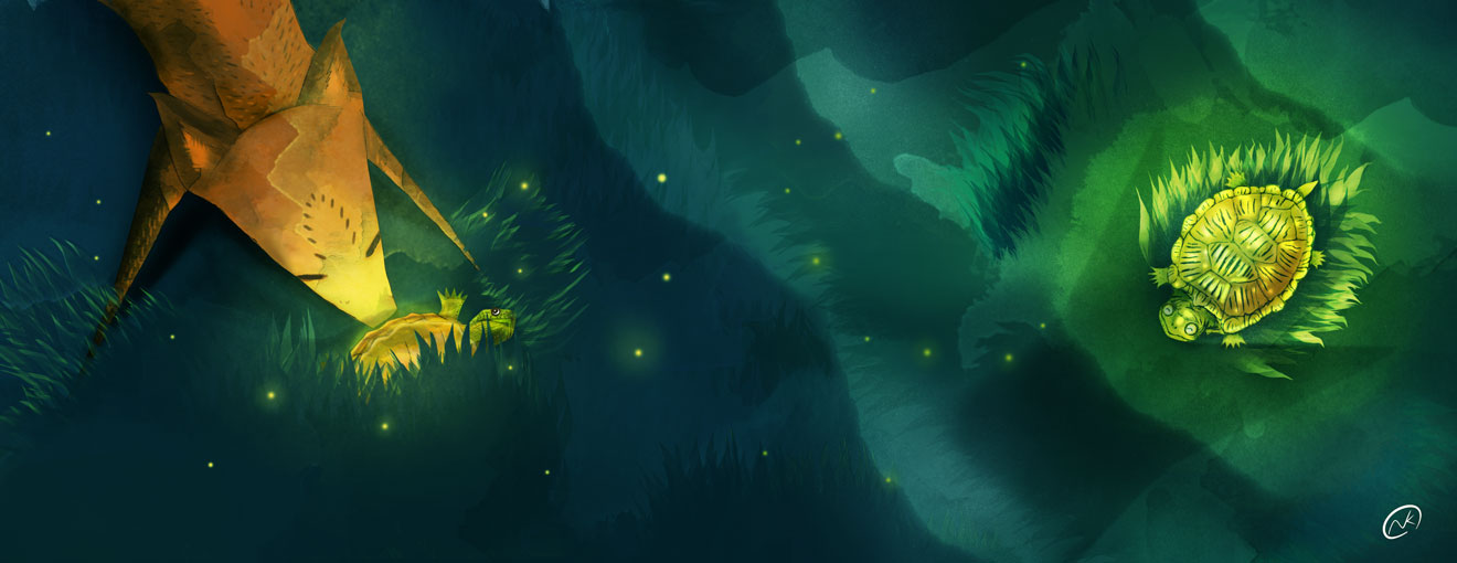
                                http://narothkean.com
                                https://twitter.com/narothkean
                                https://www.instagram.com/narothkean

                                1 Reply Last reply Reply Quote 0
                                • Naroth Kean
                                  Naroth Kean last edited by

                                  "Golden Shell"
                                  is my turtle too creepy? I have been told my illustration is a bit creepy back in graphic school before I dropped, and they wanted me to change it. I was so sad because I don't know how to change myself.
                                  flipping-the-shell.jpg

                                  http://narothkean.com
                                  https://twitter.com/narothkean
                                  https://www.instagram.com/narothkean

                                  Leontine Maile McCarthy 2 Replies Last reply Reply Quote 0
                                  • Leontine
                                    Leontine @Naroth Kean last edited by

                                    @Naroth-Cow Hi Naroth, The illustrations are so beautiful. I think that you have to many details in your turtle's shell, and the grass surrounding it. If you get rid of them, it brings the character out more. Is that helpful? Kepp up the good work!

                                    Leontine
                                    "A picture is worth a thousand words."

                                    https://leontineillustrator.com
                                    https://www.instagram.com/leontine.illustrator/
                                    http://www.facebook.com/leontineillustration

                                    1 Reply Last reply Reply Quote 0
                                    • Peter Jarvis
                                      Peter Jarvis @Naroth Kean last edited by

                                      @Naroth-Cow Just beautiful. They read extremely well. without any text you can see what the narrative of the piece is. Looking forward to seeing others. Have a great day.

                                      1 Reply Last reply Reply Quote 0
                                      • Naroth Kean
                                        Naroth Kean last edited by

                                        Thanks a lot @Leontine Gaasenbeek and @Peter Jarvis, I really appreciate the feedback.

                                        http://narothkean.com
                                        https://twitter.com/narothkean
                                        https://www.instagram.com/narothkean

                                        Leontine 1 Reply Last reply Reply Quote 0
                                        • Leontine
                                          Leontine @Naroth Kean last edited by

                                          @Naroth-Cow Your welcome!

                                          Leontine
                                          "A picture is worth a thousand words."

                                          https://leontineillustrator.com
                                          https://www.instagram.com/leontine.illustrator/
                                          http://www.facebook.com/leontineillustration

                                          1 Reply Last reply Reply Quote 0
                                          • Maile McCarthy
                                            Maile McCarthy @Naroth Kean last edited by

                                            @Naroth-Cow This work is gorgeous because your personality shines through. It would be such a loss if someone convinced you to take your personality out of it!

                                            I don't think the turtle is creepy, just less dreamy than the rest of the illustration. I agree with Leontine that it may just be too much attention on the turtle relative to the rest of the piece. I think you could keep the detail but dial back the contrast (more in line with the turtle detail in Help the Shiny).

                                            The turtle's gaze also might be making him look a little aggressive. Maybe you could soften him a bit by changing where he looks.

                                            Twitter @MaileMcCarthy
                                            www.mailemccarthyillustration.com

                                            1 Reply Last reply Reply Quote 1
                                            • First post
                                              Last post