Fairy Tale Full Page Illustration WIP
-
My vote is for number one as well! I like how the Dark Scout is leaning down towards him
") and definitely it shows the scale difference best!
and definitely it shows the scale difference best! -
@ajillustrates I like option 1 too. I like the dynamic pose of the enemy.
-
@ajillustrates The skeleton mount looks like a fun piece to illustrate and what about exploring an angle between #1 and #2.
-
@ajillustrates Number 1 looks exciting, I think having him quite small in the frame really helps to communicate the danger that he's in. Works well compositionally as well. Hope it goes well for you !
-
I'm going with number 1 also but can't tell if your character is hiding from the creature or confronting it. If he's hiding I'd show him with his back hugging the tree and eye looking in it's direction or if approaching then I'd like to see a 3/4 back view of him. Good luck, Looking forward to seeing this in color!
-
@Larue Good catch on the character's position. I think I'm going to pull his his stance more so from Option 2, so that the wand arm is crossed over his body, so that it's more clear that he's really trying not to be seen.
-
Thanks everyone for your feedback on the thumbnails! I processed all that tonight into the rough sketch:
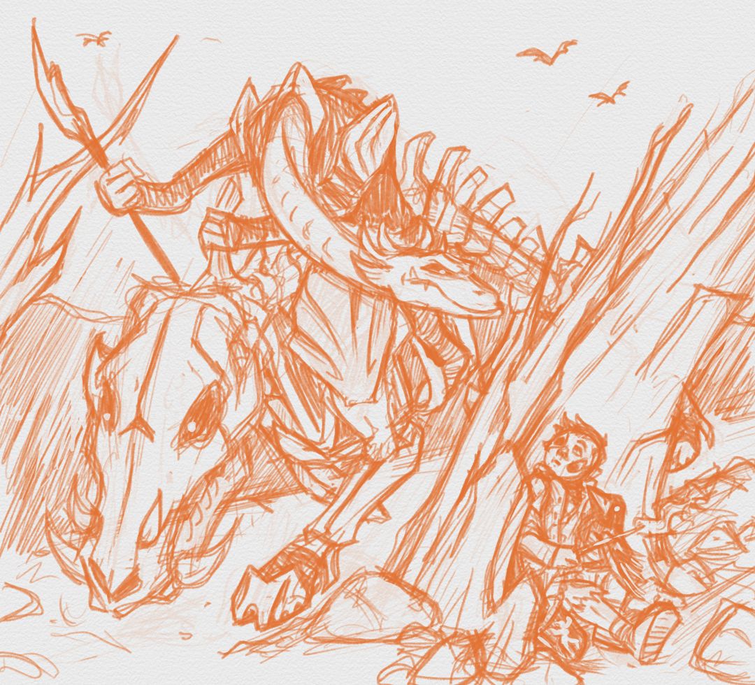
Next step is digital ink, which should be an interesting first time experience

-
After sleeping on it, I realize that the way I've designed the image and drawn the characters, that I obviously need to take Quentin's boot off his outstretched foot and put it in the road for the boar to be sniffing. I'll make that alteration this evening.
-
That’s a great idea! Gives the whole scene an even great sense of tension.
-
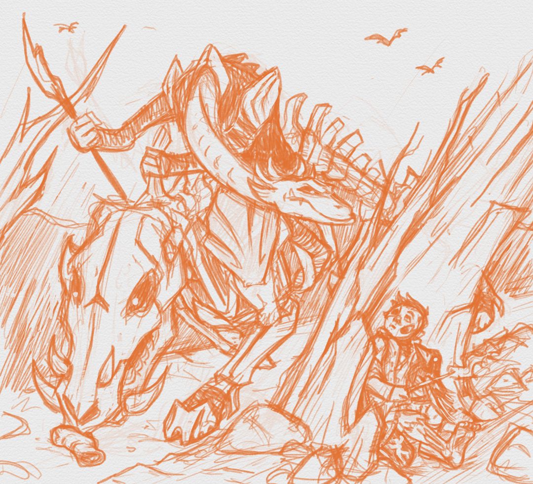
I've taken Quentin's boot off and flung it into the road.
-
Wow! This is really wonderfully composed. Can't wait to see where you take it.
-
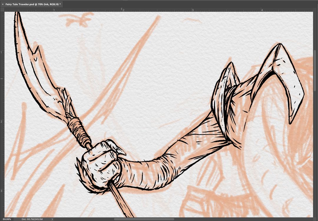
I just wanted share this process shot because I'm excited. Part of the reason why I put off creating most of my illustration work digitially was because I was worried that it would make my process look too clean. But after getting comfortable with my new pen display and referencing/matching with the linework of some of my handdrawn pieces, I was able to dial the Classic Cartoonist brush in Photoshop to match my Pentel Pocketbrush! The only downside so far is that it's a slower process for me than just putting the ink on paper, but I'm thinking that will improve in time.
-
it looks awesome! I'm Jealous, I have not mastered making my digital inking match my traditional yet.
-
@ajillustrates what a difference moving a shoe does! The suspense and tension is way up the scale now!
-
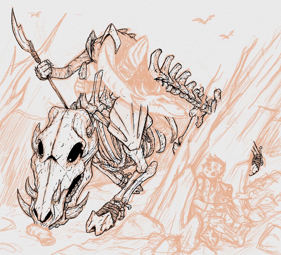
I've been mostly focused on CBPro the last couple weeks, but I was able to grab a few hours this weekend to finish the inking of the boar.
-
@ajillustrates I am LOVING your linework! It really does look like you did it with the Pentel pocket brush as you mentioned earlier! Good luck with CBPro, but I do hope to see more of this illustration! It's awesome
Sabrina Gosselin
Instagram: https://www.instagram.com/sabbygimagery/
Website (currently a WIP): https://sabbygimagery.com/ -
@Sabrina-Gosselin Thanks! I'm definitely going to be working on this one every chance I get
-
@ajillustrates This will be a really nice portfolio piece. excellent inking!
K.Flagg
-
@K-Flagg Thanks!
-
@ajillustrates It's looking soooooo good!!!! Can't wait to see it completed and the digital brush is perfect it looks so much like a traditional pen...very cool!!!!