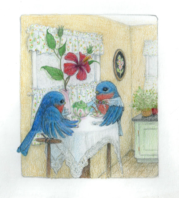
I'm trying to learn composition going through the SVS composition video. I made this before watching that, but I did try to push myself to actually design this picture. Any inputs?
-
-
@anthemsweet I'm really digging your use of colored pencils. And the way you handle fabric...it seems like I can feel the softness and delicateness of the table cloth and curtains. And at the same time, I feel like I could crack an egg open on that slab of granite countertop in the background.
Overall I really like the composition. That little hint of the bird's tail poking out of the frame is a nice touch. I have two suggestions. 1)Tilitng the teapot a little more. I think it would capture the pour action even more. 2) This is just my own personal taste, but I feel that the hibiscus flower, while beautifully depicted, feels a little overpowering. Maybe a flower with more delicate lines and softer/rounder petals would mesh a little more with the delicateness of the tablecloth and the softness of the birds' feathers.
Hope this helps, and be sure to take it with a grain of salt or two
")
shinjifujioka.com
https://www.facebook.com/shinjifujiokaart
IG: @shinjifujiokastudio -
This post is deleted! -
@anthemsweet said:
Thank you for your input. I totally agree about the teapot, especially. You might be right about the hibiscus. I am undecided on that one.
")
-
This is such a cute piece, and well executed. I agree about the teapot, having it at more of an angle would definitely communicate the action more clearly. As for the hibiscus, I think it may be the color that is overpowering, not the shape. If it were a more delicate pink or something more subdued, it wouldn't steal attention from the cute birds.
-
@Sarah-LuAnn That makes sense. Thank you. I have been attached to that red, but it looks like I need to rethink a bit.
-
@anthemsweet - I really like the piece and the overall peaceful feeling.
In regards to the flower - it stood out right away to me too. And while the bold color could be part of why, I kept wondering why it was so large? Everything else in the scene is scaled to the size of the birds world and yet that flower is huge and just does not make sense to me in this world/setting.
So I might consider making it smaller - which would also reduce its importance in the scene.
-
@anthemsweet - I just was looking at your blog and etsy shop - first of all I noticed you are in Aurora. I live in Joliet and there are a few others here from the area (Plainfield, New Lenox etc). So welcome!
Anyway - I saw your post about this piece on your blog and I noticed that you said you intentionally made the flower larger as you like illustrations where flowers are large in comparison to the characters. So on that note feel free to ignore my last comment about reducing the size since this was something specific you were going for. I wonder then if something else in the scene needs to be a bit out of scale as well in order to help drive that concept home as part of a stylistic choice?
-
@Rich-Green I was thinking about that. I think you're right about the scale. I was trying to keep all the "man-made" (i. e birdmade) objects to scale, but the hibiscus close to its actual size in proportion to real birds. But then I put the potted plant in the back ground with little leaves. My rationale was that it is an herb with small leaves like thyme--but honestly I think that was a lazy choice. I should have put something recognizable with big leaves in right proportion to birds--or just not put a plant there. And the flower's bold color that also clashes with the birds tummies was too much. I was super attached to that flower as it is, but I think everyone is onto something. SIgh. Actually, this input is amazing to have.
-
The Birds and flower contrast very well, so they read very clear. Like others have said, the flower, contrasts a bit too well. As it is on a white background, it has the strongest contrast of the entire picture and challenges the birds as the main focal point.
I would try changing the curtains to something that contrasts a little less with the flower, in order to bring more attention to the birds and make the flower a clear secondary focal point.
I really like the color choices, pencil texture and fabric details.
-
@NickA Change the curtains. That's an interesting solution. I'll have to think about that. Thank you!
-
No problem. Since its already a file, you could do a quick digital value edit to see if it looks better or worse and also keep a copy of the original.
-
I really like the composition of this piece, and your line work is so lovely. I also like that the birds are sitting on perches and not chairs. I agree with other comments, I think the hibiscus takes the focal point away from the birds having tea, so maybe put some of that lovely color into the teapot instead to draw the eye there. I struggle with composition myself and I have a long way to go, so you are farther along then I am for certain. Lovely piece.
-
@Rebecca-Hirsch The teapot! Absolutely! Intensifying the teapot and lightening the flower. I am kind of a shocked at myself for not realizing about the teapot.
-
You're a fan of the long titles of posts haha
Let me start by saying the birds and everything are absolutely gorgeous and appealing. If you're wanting a critique, here is what I see...
I've not read everyone's responses, but the big flower is a powerful red and red tends to dominate a piece. A rule of thumb compositionally is that important things generally fall on the intersection of thirds and that flower is also pretty much in the top-left intersection. That, along with the top of the bird's head slicing the page in half, where birds, teapot and everything of focus are on the bottom half and are quite busy, the top is left to breath and the flower is taking that focus up. There's also the biggest value difference of the image with the dark red on a white window so that draws the eye also. I'm tired and probably only half of that made sense, so basically... chill the flower down a bit haha.
Ace
-
@Ace-Connell "Chill the flower down" seems to be the consensus, and I think that's right. About the title, well, I kind of just figured out that the title is not actually the written post....Thanks for the input!