Feedback definitely needed, but kindly requested :-)
-
WIP, of course, and I'd be really grateful for some feedback before I continue working on this.
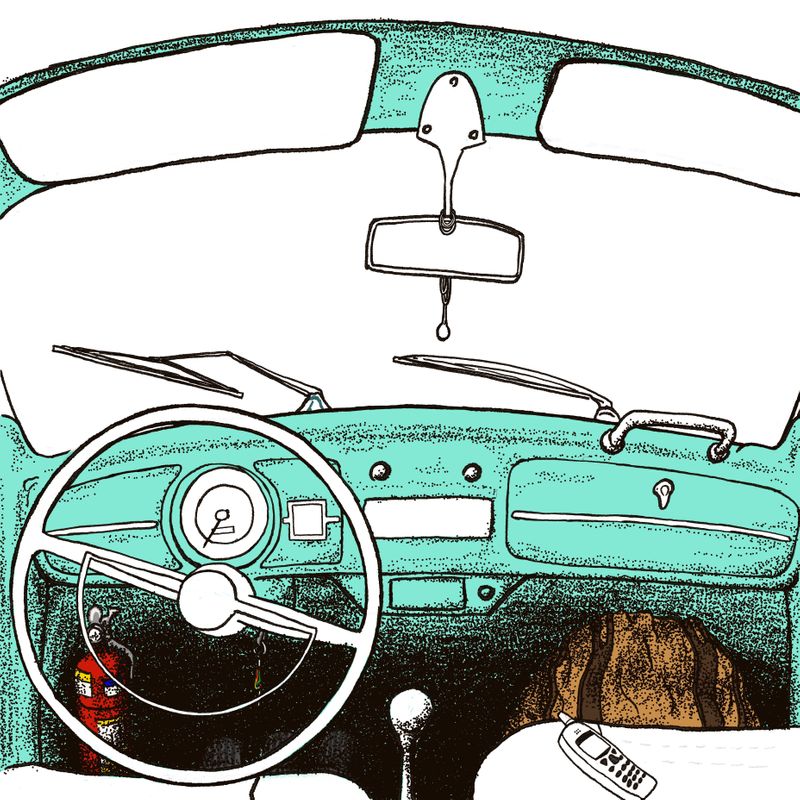
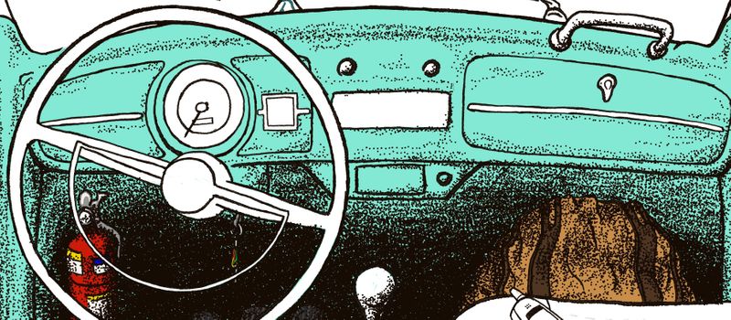
Let me try to explain what's going on here. My usual rendering style leans toward hatching and cross-hatching, but for this piece I wanted to try something different and I was in fact going for something that looked old, beaten and perhaps vintage and low brow (not entirely sure about these terms), so I thought that rendering using dots (I guess people call it stippling in English, don't they?) could be a good idea. The thing is that I'm getting the impression that it's just looking messy. Makes sense? What am I doing wrong? Conversely, I sometimes struggle using cross-hatching when I have these large, somewhat flat surfaces like the dashboard, as I tend to either over-render or leave them just blank with a large block of color.
Anyway, can someone help me with some opinions on how it's turning out and how I could improve it?
(Due to file size limit, I made a complete image with reduced quality and a smaller one with higher quality showing a crop of the dashboard)
Thank you very much!
-
@fmb Hi welcome!
I don't use this technique anymore, but I remember running into this same problem! Here are some things I noticed.
If you look at images like this you'll notice that to create value the dots both get more spread out and also lighter in value.
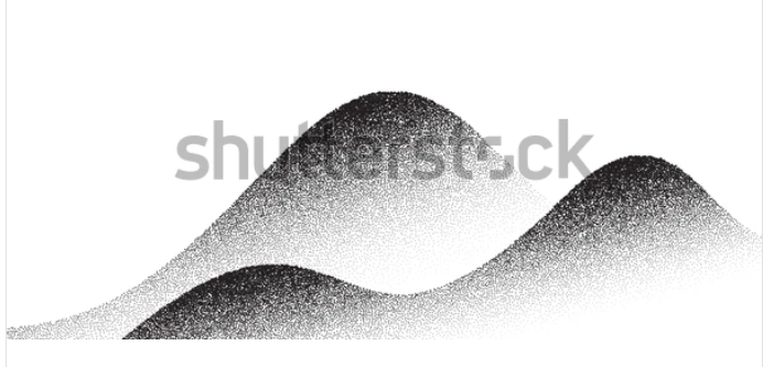 https://www.shutterstock.com/image-vector/set-stipple-gradient-shadow-paper-sheet-1830414173
If your'e going for more of a comic book style where the value stays pretty close together I've noticed that the dots form more of a pattern and are lined up instead of randomly placed
Check out my art and tutorials :)
Instagram: www.instagram.com/carliannecreates/
Youtube:
https://youtube.com/c/CarlianneCreatesShop: www.carliannecreates.com
-
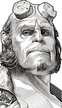
@carlianne, I'm sorry for taking so long to reply. Sometimes life gets in the way of art... What you said makes total sense and I actually learned from your comments. Thank you! I was going for something similar to this:
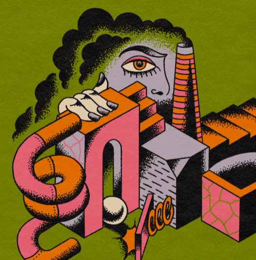
But thinking a bit further in light of your suggestions, I'm feeling that for it to work perhaps it would have to be an entirely other style, much more stylized and less detailed... Then I started thinking about going for something more in the style of record covers and sleeves--after all, this work is indeed a record cover--like this:
Feel free to chime in if you feel I got it all wrong and am going to make other further mistakes!
")
Once again, thank you!
-
@fmb yeah so I think when I first looked at images like this it felt like the dots are less organized than they actually are. But in the first image if you look close you can see that they clump together in the shadow and slowly get further apart as it transitions to a mid tone and then empty in the light areas. So although they aren’t lighter in value like the hills example I gave it’s pretty organized still. On the circular tubes you can especially see how it transitions to light and dark in a fairly even manner. I hope that makes sense?
Check out my art and tutorials :)
Instagram: www.instagram.com/carliannecreates/
Youtube:
https://youtube.com/c/CarlianneCreatesShop: www.carliannecreates.com
-
Good points. Thank you!
-
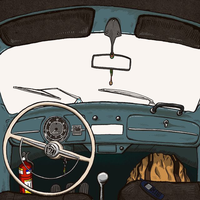
@carlianne, since I had posted it here in its early stages and you gave some great suggestions, I thought I'd post it now to show you where it's going. I ended up employing some different techniques and to be honest I'm sort of figuring them out along the way, so I'm not entirely sure if it's really working. I still have some things to finish inside the car and then there's the view of the outside, which is going to be an entirely new endeavor due to all the reference photos I am trying to collect to help me with this (there's some historical stuff that I want to draw there and it's being hard to find and to figure out correctly).
If you have any comments, please feel free to make them.
-
Hi @fmb, it’s a cool piece!
Just an observation, the fire extinguisher keeps grabbing my eye since it’s red and brightest item in the piece. Is that your intention to have the viewer focus on the extinguisher?
Then the yellow bag on the floor board has me scratching my head a little. Is it a bag or backpack? Any reason the passenger seat is more forward than the driver seat?
I love classic cars, so definitely think the piece is cool. Just sharing some observations for consideration.
-
@fmb I think that's a huge improvement!! The shading looks intentional and clean! Great work :):):)
-
@Jeremy-Ross, thank you for the compliments and for the remarks!
So, what you pointed out was very helpful. In general, my answer to your observations is that I tend to struggle a bit with the tension between good design/readability vs portraying reality as it is. The fire extinguisher is exactly the case, as it’s not supposed to be important and I agree it was calling too much attention (even if I have to admit that I like the presence of some more lively colors somewhere - but they will appear eventually in the scene, as it will portray a daybreak sunlight outside). I ended up putting the extinguisher all in the shade and I actually think it makes more sense regardless of the need for it to be more tame in the picture.
Now, the position of those seats, by its turn, taps into the concept of the image. I haven’t figured out yet how I will draw this, but the idea is that you’ll see a couple in the backseat reflected in the rearviewmirror. I don’t know how big they will appear and my idea is to make it visible to the bare minimum for the viewer to figure out what it is, but then the subtext is that they pushed the front seats as much as possible to make room for them to do their thing in the backseat - that’s why the driver’s seat stops as it touches the steering wheel and the other seat goes a bit further (I even thought about making the cushion in the driver’s seat a bit pressed down by the wheel, but got lazy and didn’t do it yet). Makes sense? Should I just ditch the idea in the name of better design/readability?
Finally, yes, it’s a backpack. A Jack Kerouac On the Road backpack, to be more precise. It’s looking a bit flat, isn’t it? I haven’t figured out yet how I’ll make it look more three-dimensional. If you have any suggestions, feel free to speak them as much as you want.Once again, thank you! And also thank you, @carlianne !