Struggling with Composition/Design
-
I notice that I'm really struggling with understanding how composition and design works, particularly when it comes to designing characters. I've read and watched quite a lot of tutorials/courses already on character designing and composition including the ones here, but I still feel like there are several unanswered questions that I've been trying to figure out for a long time. And I'm not sure if I am overthinking this too much, or that there is a lot more to design/composition that I just haven't learned yet.
Here are some of my attempts to design a squirrel based character, for instance.
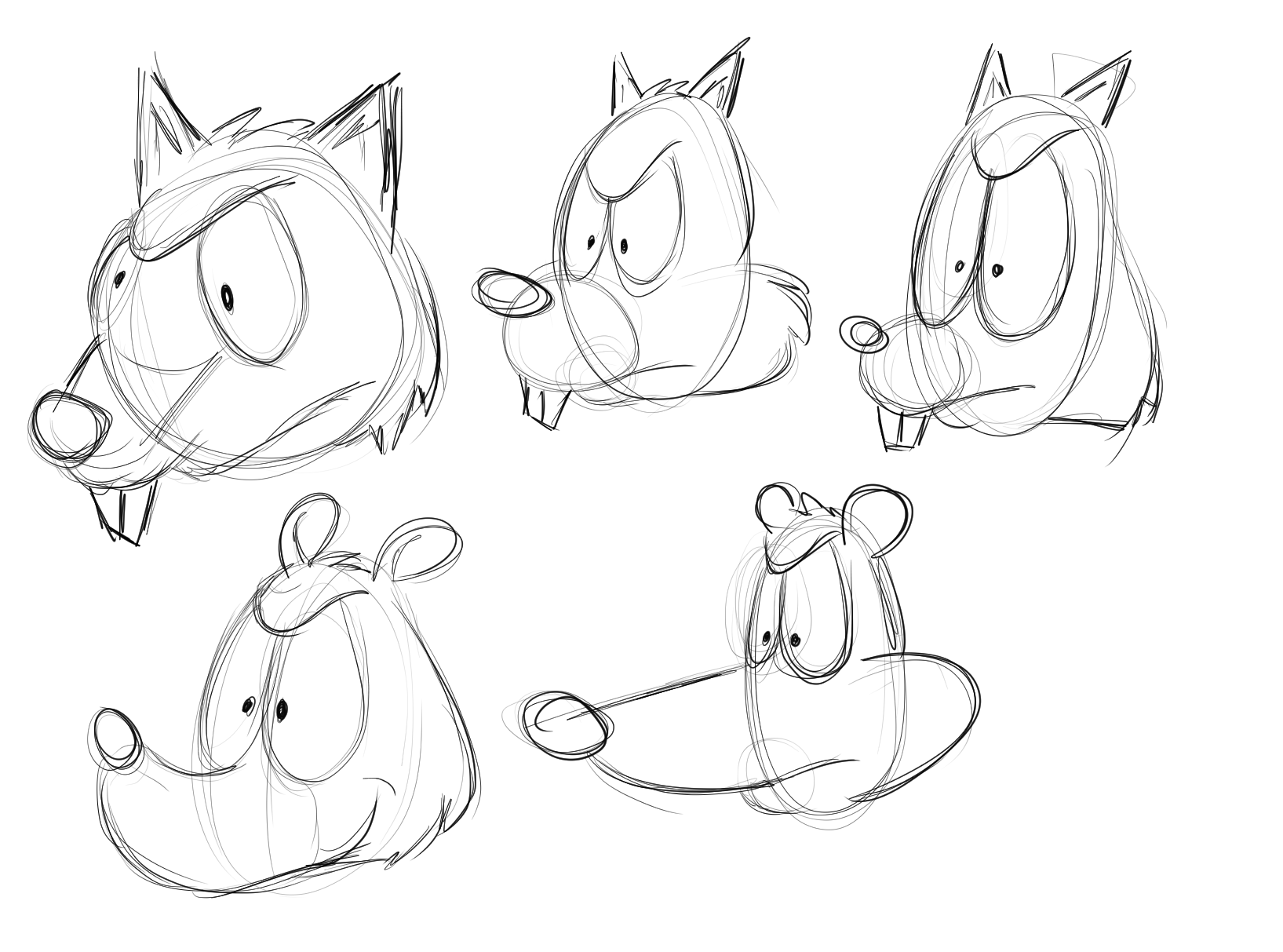
Although I don't feel too comfortable with sharing some of my bad art, I feel like it's necessary to share this one in order to show you what kind of difficulties I've been dealing with. These are rough sketches and they are not finished pieces; the focus is on the design aspect, and not so much on things like perspective. Regardless, I tried applying the concept of small, medium, and large to the facial features. In the top right corner, I've made the eyes large, the snout medium, and the ears small. Also, I've been trying to use similar circular shapes all over, as well as including some shape variety here and there such as angular ears and fur etc., since many character design tutorials say to use consistent shapes while including some variety. Yet, the design feels boring and the part that bothers me a lot is that I don't know why it looks boring, even though I try to apply as many of the design principles as I can to my art. Is anyone able to tell me what exactly is making it look unappealing on a more analytical level? I ask this because I want to work on making things look more appealing, and because I'm an analytical thinker, composition is something I believe difficult for me to grasp without having access to a more in-depth explanation. I have been having trouble with this for several months.
The main thing I have been wondering about is how exactly the design principles all connect to one another, and whether or not it is a rule to apply each of them in, say, cartoons to create appeal. A lot of the information out there I have seen so far in my experience has been people giving brief descriptive summaries on what the principles of design are such as balance, emphasis, unity, and so on. But something I still don't know is whether we are supposed to apply each one of those principles in our artwork. I also don't know how each of the principles of design can be achieved on a more technical aspect. For instance, if I wanted to achieve unity in an art piece and if it is only repetition and variety that contributes to unity, then how much repetition and variety should I use exactly? And what kind of them should I use, according to the elements of art? I know I might be thinking too analytically on this, but I feel like my understanding of design is not really substantial and could do with polishing up.
Are there further learning resources out there, whether online tutorials or books, that talk about composition in detail that is not biased-based but rather talks about it in the perspective of the psychology of why we see things the way we do, so that I can understand more about why certain composition "rules" work and when it is okay to break them? Sorry if this is the wrong place to be asking this.
-
@Toony-Days Hmmm... i feel like if we zoomed into the best composition in the world and the most successfully designed character that it would no longer read as being as being successful compositionally in the classic sense. I am thinking you could apply your small, medium, large, concept, and i think you are mentioning unity with variety in there too, to the whole drawing of the squirrel.. not just the head alone... i'm thinking the head does not need to follow All of the principles you mention. So maybe zoom out a bit before trying to get the composition to follow the rules.
I think in character design for a squirrel you would want to list the things that make a squirrel a squirrel to us... what is the squirrelness of the object. For me it is an egg shaped head with the small muzzle and that blackish shiny eye with the white around them (probably not universal)that makes a squirrel a squirrel. These would be the landmarks to work off for me i think ... just like with a successful abstract figure sculpture.. if you get the landmarks right it will really hold together whatever crazy abstractions you want to explore.
-
@Toony-Days I think we all struggle and have similar issues. Character design is definitely a skill that I have been trying to improve for years. Anna Daviscourt's SVS character design class is excellent if you haven't already watched it. I also like to do master copies of characters I find unique and interesting.
Looking at your squirrel I would suggest exaggerating the small, medium and large even more. Take it to the extreme. Also I would make sure to have some reference photos out when you're sketching. Maybe try designing the entire character instead of just the face. I think squirrels in particular get a lot of their character and charm from how big their tales are in proportion to their bodies. Try moving the position of the facial features...the eyes and noses on all of your sketches are about the same size and in the same position.
I think you're on the right track. You might just need to add some more variation between your sketches.
-
They’re not unappealing, I feel there’s just a bit more development needed. Have you tried pushing the shapes to the extreme? And adding a variety of shapes together to add more personality? I get that generally you want consistency of shapes but it’s also good to mix it up a bit to keep it interesting.
Varying the line weight even in early sketching can help give character, as well as playing with what the character’s expression and body language is like.
Have you thought about what kind of character it is? Happy-go-lucky, cautious, arrogant etc?
Website: designingahappierlife.com
Insta: instagram.com/dahl.illustrations
Tutorials: youtube.com/channel/UCHSK5WnhUVwtI5Nj6L1-DQg -
@Toony-Days This is my process.
Think of what the character is going to be personality wise, then find a movie with a character that is similar to that personality and screen shot poses/expressions that represent the personality you want. Then do gestures drawings of the screenshots, then put the reference away, and use my gesture drawing as reference to do another gesture of, trying to capture the essence of the character. Each time you do a gesture, try to exaggerate the poses or expressions. Once you've got something you like you can apply it to whatever animal character you've got. I would read up on anthropomorphism and maybe Cartoon Animation (really good book). At the end stage, when you have a sketch that captures the essence of the character, pose and expression wise, you should start refining it and start thinking about how you can make it more appealing by adding different design principles like colour theory, big medium small, 70/30, guiding lines, silhouette to name a few. Silhouette is probably the most important one for a clear character design I think. You shouldn't change your design too much just to get all these principles in but if you see an opportunity for one I would go for it. I would also gather a range of other artists' work to see how they solved the same problem, even renaissance painters looked at masters to study from. I would only do this at the end stages though so that you're not too influenced by them.
I could say so much more but there are so many great sources out there for this. The number one thing I would focus on while you're doing this is drawing as much as you can. The more you do it the better you'll get. Kim Jung Gi fills 5 sketchbooks a week. This seems impossible for most people but I think it's something everyone should aspire to achieve.
-
@gracewright How can I push my shapes exactly? Do you mean like making them bigger, or making more of them?
Haven't fully decided the kind of character yet, but I know he's supposed to be tough. So that's why I tried playing around with a few angular shapes. But I used mainly spherical shapes in order to try and retain a believable squirrel-like quality.
-
Would you mind explaining your first paragraph there? Are you saying that when I design a head for a character, I shouldn't think about composition at first?
About the squirrel landmarks, I think that could be one thing I'm struggling with. How can I find out exactly what makes it unique to different animals, when there are so many animals out there that share common physical characteristics? Or at least, how did you do it?
-
@Toony-Days What is the whatness of a squirrel seems like it should be the first step in designing a squirrel - i think for any animal that there are universal ideas of what makes it unique and recognizable - incorporating these things into whatever you do seem like it would be important. I think making a visual, mental, or written list would be a good starting point...and i'm sure iv'e seen this concept in a class or two on svs and schoolism....and artschool online too maybe? anyways... My first paragraph above was saying to apply the aesthetic rules you've mentioned to the whole character and then judge its wholeness. If i look at Sandy from Spongebob she does not look very squirrelly to me... her tail tells me that she is a squirrel though.. also i do not feel that the design of her head is more successful than your drawings above... i actually love talking about aesthetics ...but i am not very experienced with character design... you are way ahead of me ..so feel free to ignore my prattling
")
-
@Toony-Days If you feel your character designs are a bit ordinary for your liking I suggest picking your favourite design so far and pushing and pulling the current features to create variations. Stretch, squash, widen, reduce, reshape, exaggerate! You can do this in redraws or.. I like to start myself off by using the liquify tool to pinch and push to shape new designs like sculpting in clay to help quickly see what best suits the character’s personality.
I did this to one of your designs in a quick draw over as an example of the smaller alterations that I’m referring to:
Also when I am approaching animal character I look to what other illustrators/cartoonists are doing to depict the same animal and focus on identifying which characteristics are essential to making it read as that animal. For a squirrel I’d say it’s a short snout and its tail. It’s all experimental and it can be lots of fun!

-
I think what @Kevin-Longueil is saying is that character design and composition are two totally different things. Composition is simply the design layout of your image as a whole and your character is just an object in your composition, but it definitely plays a part of your composition too. I’m not sure a character in itself is read compostionally, if that makes sense, let alone parts of a sketch.
-
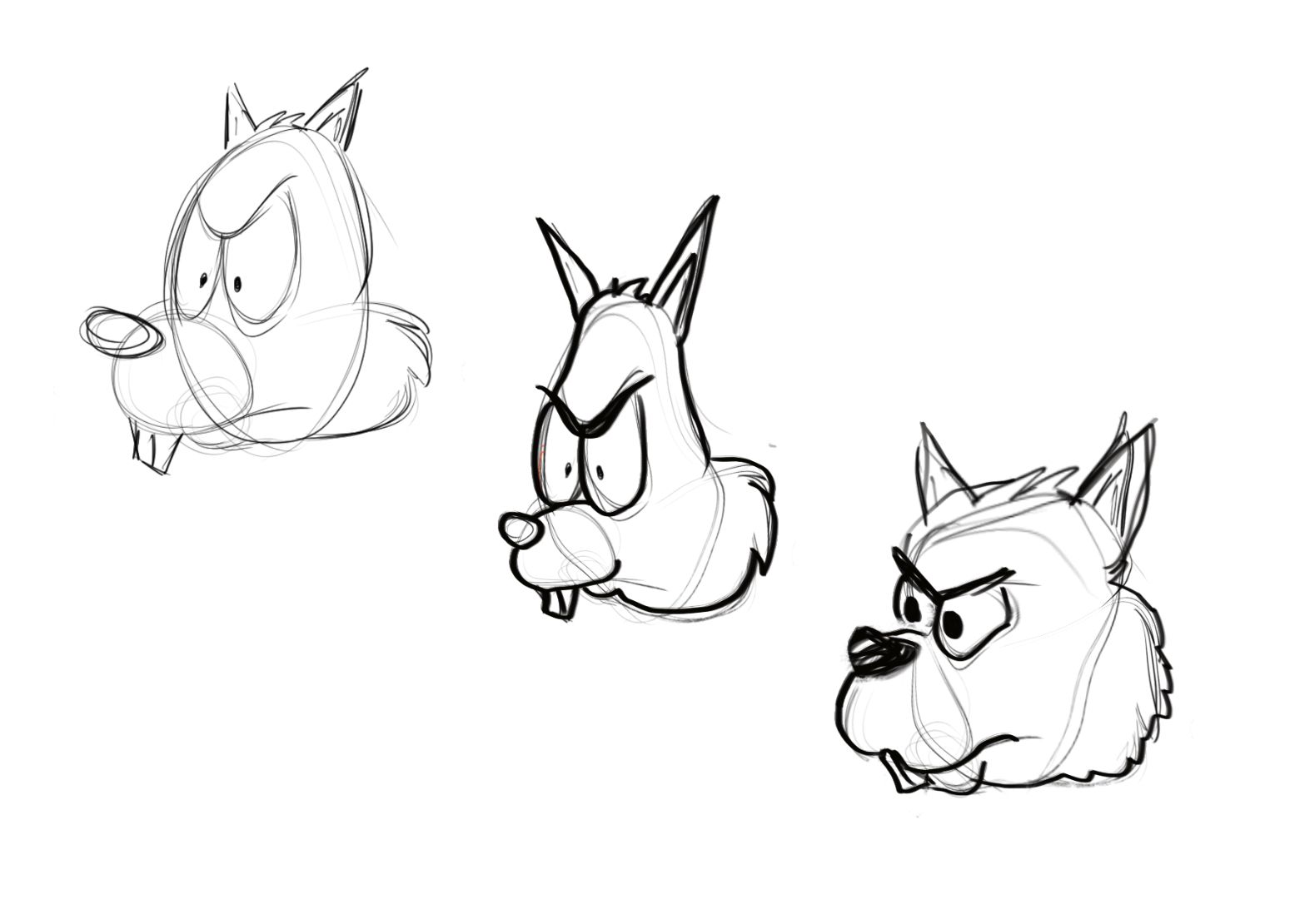
@Toony-Days so I'm thinking of a term I've learned before called 'edge craft'... in a nutshell it's push your concept right to its extremes.. so in the case of the squirrel I suppose you can execute that notion by using a more extreme range of shapes? I did a quick sketch using the 4 if the same sketch, and I used the resizing and liquify tools to exaggerate certain shapes
I think the idea is similar to 'draw 50 somethings' in that it forces you to the edge of your comfort zone.