Trying to improve on dummy composition. Feedback please!
-
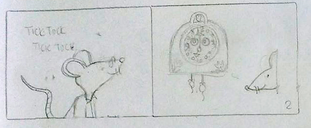
Thanks to feedback and watching the first three lessons of the Creative Composition class I have made some changes to some pages of my "dummy" book. I have gone forward and backward between thumbnails, dummy, comps, etc. The process is crazy but I have been learning
") Next time I will try the process following the design checklist Please check out this one page comparison on composition only, at this time, and let me know what you think. Thanks!!!!
Next time I will try the process following the design checklist Please check out this one page comparison on composition only, at this time, and let me know what you think. Thanks!!!!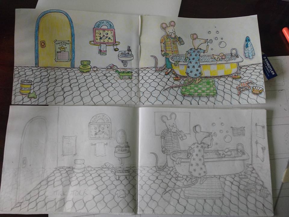
-
I'm not expert in stylising for children's books or that style, but from a solid drawing point of view, you've done far better with the composition. Well done. The characters are really cute as well.
The floor's pattern in a little unnecessarily distracting to me and I think it's a mix of the pattern itself with the fact there's a lot of floor. The floor takes up half the page. I'd personally aim for a third of the page as it frames it a little nicer and won't be as distracting.
As for the perspective... it's drawn in one-point perspective, which is fine, but with the horizon line being so high up, we are looking into the bathroom from above like it's a diorama. The only problem with that is that one-point perspective is usually best when the eye line is the same as the horizon line. When we get into tilting, three-point almost always gives a better, more dynamic feel to the piece. Keeping this in 3 point, the page on the left will get really distorted and look uneasy.
Even though we're looking down from above, to me it feels like the characters are drawn as if we're looking at them from a side. The tortoise looking stool thing is pretty much drawn from the side. A lot more of the top would be visible. The line down I've drawn is the point at which the floor tiles should be straight. Everything to the left of that line should be pointing right. The door is also wonky and throws the eye off a little.
Again, stylising children's books is not something I do on a daily basis, so certain style choices may have been made, but I do feel like that solid perspective will really tie the image together beautifully.
I hope that helps you out
Ace
-
To be truthful, the straight on view works for very detailed pieces like you tend to do. I am just wondering if it works from an actual " spin " of the room. IF you had a 3D model of it, you could turn it to suit any new angle and draw from there. I would make a rudimentary one if I were you. Get a large tray to set your objects on, a piece of cardboard or foam core will do. Place a wide sketch book with details for 2 walls on it.
In your case 1 wall could have the door, the clock, the sink, the other could have windows drawn on it, hung paintings, etc. But ONLY objects found on walls. Fold the sketchbook at a 90 degree L, and use that as your 3D walls connected at one corner.
Now find small objects to fill in for your figures and your main focus here, which is the bath tub. You could use a high plastic Tupperware filled with bubbled soap water. Put in a toy plastic figure for the kid. Use 2 other figures for the parents, they don't have to be animals, just something to represent where they stand, what their limbs are bending like, where the heads would be, etc.
Anything on the floor can be denoted by something of appropriate size proportion. If you wanna go crazy, got to a doll house section of Michaels, and buy bathroom items.
As for the tile on the floor, you can draw that separately on paper, and place in on the tray, and this way if you don't like the pattern, make a new one, then use the one you want. It should be large enough to fill under the folded sketchbook walls, so it look seamless. And you could use an actual pot holder as the rug the Mom is on.
NOW turn the whole " 3D model " to different angles, OR walk around it and redraw the view you like most. You can even light it with a lamp over head, or have someone hold a flash light, and take pictures with your phone, and draw those.
This way, you can see the view you want most. I kind of would like to see the tub facing us the long way, but short width, like a bed with the kid at the back of it, and the parents on either side. The object is not to get every object in the scene, just what suits your eye best. In your straight view I don't know where to look first, when the tub should be the focus, and yet it reads last because of the 2 page spread.
The idea here is to get a 1 page portrait angle, instead of the 2 landscape shots you have connected here.
Yes this is an elaborate set up, you could just try drawing it in your head from scratch. But the 3D model helps you get there faster. Hope that helps...
-
@Bobby-Aquitania said: But the 3D model helps you get there faster. Hope that helps...
Not one bit of that sounded fast to me. By the time the Tupperware was out the cupboard, a full book could have been drawn haha.
Ace
-
@Ace-Connell Well, I think I get what you're saying. I'm a bit rusty on three point perspective, for sure
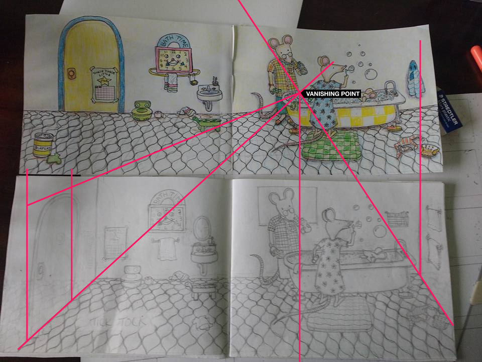
Also, with the drawn lines through both pictures, are you showing me that the vanishing point for the bottom layout is actually in the top picture? Definitely need to review perspective. It has always been a weak point for me and I tend to draw things almost from an aerial perspective, I think,-or , I mean, looking down from above as you say. Thanks for your input! I'll keep working on it and see if I can get what you're saying right Marsha Ottum Owen
-
@Bobby-Aquitania Well, a 3D model is a good idea since I don't seem to get the perspective just from my head. Thanks for your response and I will see if I can work that out and re-post. Thanks so much! It does look a little time consuming as I don't have the whole day to work on things but fortunately, I don't have any deadlines. I'm just learning. I can combine your and Ace's ideas and work things out, I hope! Thanks again!
-
@Marsha-Kay-Ottum-Owen oh, yeah... I should've said. In my draw over, completely ignore the top picture
It's all about the bottom one.
You'd only need 3 point if you kept the angle that the room suggests that you're looking into the room from above because of the high horizon. If it's more square-on, you'd be able to do one, or preferably 2 point.
Take care,
Ace -
Sorry to clarify, I meant taking the pictures of the set was faster than drawing it. You could go to a showroom in a decent department store, and if you like the layout for a background, do the same thing, and maybe have 2 friends stand in as the parents. Or strangers if you're charming enough, show them some work and say can you help me out for a second, it can be their backs, doesn't have to be an expression, you need them more for placement of size and height to the space than as actual models. But you could get lucky and find nice people who don't care, or want to be helpful.
-
@Ace-Connell good tips!
-
@Bobby-Aquitania said:
parents on either side. The object is not to get every object in the scene, just what suits your eye best. In your straight view I don't know where to look first, when the tub should be the focus, and yet it reads last because of the 2 page spread.
Thanks, Bobby. I was wondering if I really needed a two page spread here. Also, I do have so much stuff to look at. I think it started with the fact that my little lullabye is short and I'm trying to lengthen it with drawings
I'm learning a lot. I was reviewing a couple old books on perspective tonight to kind of refresh myself. This is such good practice! Still haven't had much time to redraw things but I will hopefully find some extra time tomorrow and this week end maybe. I keep reading it to my two year old grandson for his response. He likes it a lot so far..he says, "more, more" He doesn't know bad design from good yet so that helps. Also, it's short so he can sit through it. I better go to bed!!!!! Aaaaghgh! -
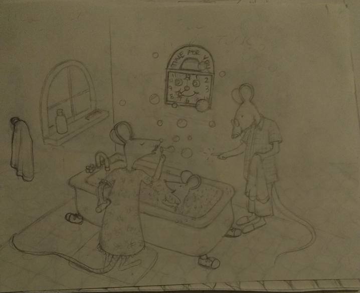
@Ace-Connell I've been playing around with this again. (not done-just playing) I realized I don't really need a two page spread. The other page really has nothing to do with the story. The wall seems a bit high but there is less floor
Maybe I can move the wall items-clock and window or mirror thingy up a little higher. What do you think? .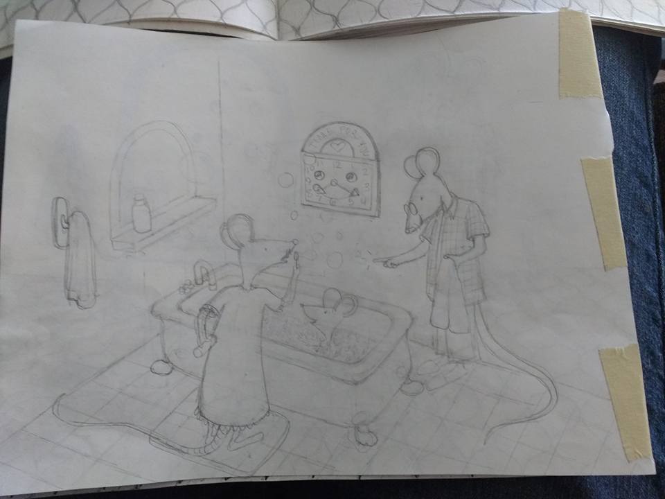
-
Also, I am just on the couch with a pencil-no ruler or anything so I suppose teh perspective might be a bit wonky too.
-
@Marsha-Kay-Ottum-Owen Yeah! That has a load more form to it.
Don't worry about rulers... the only really time perspective needs to be that perfect that you need a ruler is if you're doing architecture drawings or whatever. Rulers lose the heart of the piece. Just being conscious of the points is what makes it look natural, but believable.
Composition should always be your main focus and perspective should be there to compliment it.
Well done. As far as form and perspective is concerned, this piece looks like it was drawn years after the last one, not a couple of nights haha.The only real thing to be wary of is that with the towel rail and the clock, you really need to feel like you're looking down on them. You can see the underside of the towel hook and we're above, so we wouldn't see any of that.
Ace
-
Thanks
Ace, I redid thumbnails for all the pages and worked on the towel rack and clock. I'll have to post them later. -
Any time
Ace
-
Much better! I do think the clock could come up a bit more, any maybe a scattering of bath toys like in the first. Great re-do!
-
Thanks. I appreciate the feedback!
-
@Ace-Connell Okay, here is a picture of my "thumbnailish" drawings. I'm going backwards and trying to get the big picture. I've completely erased a couple of pages that weren't really necessary (in my opinion). These are light and pretty rough but, could you give me your opinion on the layout? Thanks!
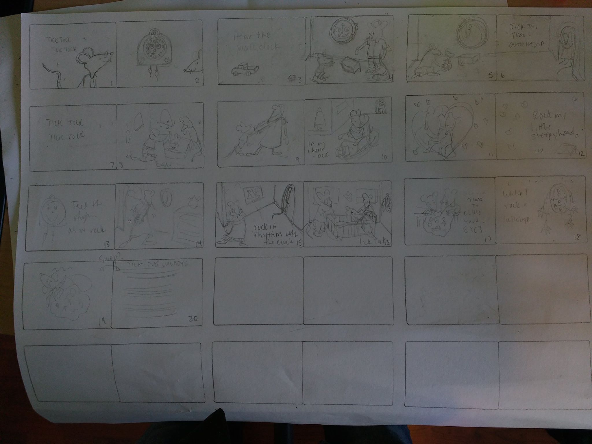
Also, I think I fixed up my other rough drawing a bit as far as the towel hook goes and raised the clock a bit.
 It's scruffy and dark because I'm erasing and redoing over and over again So, it will be better later when I redraw everything....aaahhh!!! I hope!
Marsha Ottum Owen
-
@Marsha-Kay-Ottum-Owen The clock in the bath is off a little. In two point perspective the verticals should be going straight down but they seem to be tilting to the right and I'd just add a bit more form to it to make it really feel like it's attached to the wall instead of painted on. If you want me to do a clock draw-over to show you what I mean, just let me know and I will
Thumbnailish Thoughts (by page):
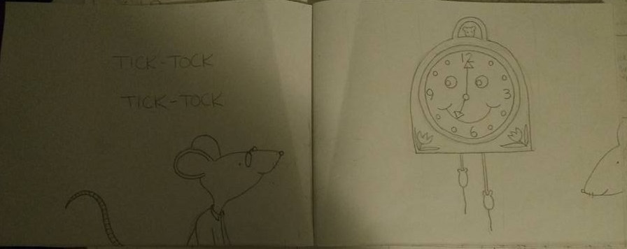
1 The mouse has a lovely gesture and is drawn well, you'll just need to be careful of the right hand side - it's a little close to the gutter and his nose will be all bent into where the pages join. He'll need to be pulled back. If you divide the page into thirds, then place his eyes on the right third line, that'll probably sort the gutter issue out and will make for a more appealing composition.
2 Again, with bleeds and the variation of image placement when they cut the pages, I'd just bring the mouse into the shot a bit more.
My daughter's just woke up, so I can't do any more at the moment, but the rest are looking good. Just when you take them from thubnailish to final sketches, just watch the perspective and be conscious of the gutter/bleed and bring your action in a little to compensate for it
It's all a process and it's slow at the start, but it'll be totally worth it when you draw over. The two most important things in an image are the composition and the construction and all of that is done at the sketch phase. The final image will totally be worth it in the end... I have faith in you - it's very, very nice work, I'm just pushing you hard haha
Ace
-
Thanks so much, Ace. I appreciate the push. You are seeing things I wouldn't have noticed on my own (though I did realize the clock was crooked and thought to fix it later, I would love for you to do a draw over if you have time. I hope you don't mind that I've glommed onto you as a mentor
I actually took pictures of the actual dummy pages that correspond with the thumbnails too. Here's the first one so yo can see a bit better view . I can do that for each page as we go along so you can see that too. This is my learning book