Trying to improve on dummy composition. Feedback please!
-
@Bobby-Aquitania said:
parents on either side. The object is not to get every object in the scene, just what suits your eye best. In your straight view I don't know where to look first, when the tub should be the focus, and yet it reads last because of the 2 page spread.
Thanks, Bobby. I was wondering if I really needed a two page spread here. Also, I do have so much stuff to look at. I think it started with the fact that my little lullabye is short and I'm trying to lengthen it with drawings
 I'm learning a lot. I was reviewing a couple old books on perspective tonight to kind of refresh myself. This is such good practice! Still haven't had much time to redraw things but I will hopefully find some extra time tomorrow and this week end maybe. I keep reading it to my two year old grandson for his response. He likes it a lot so far..he says, "more, more"
  He doesn't know bad design from good yet so that helps. Also, it's short so he can sit through it. I better go to bed!!!!! Aaaaghgh!
 -
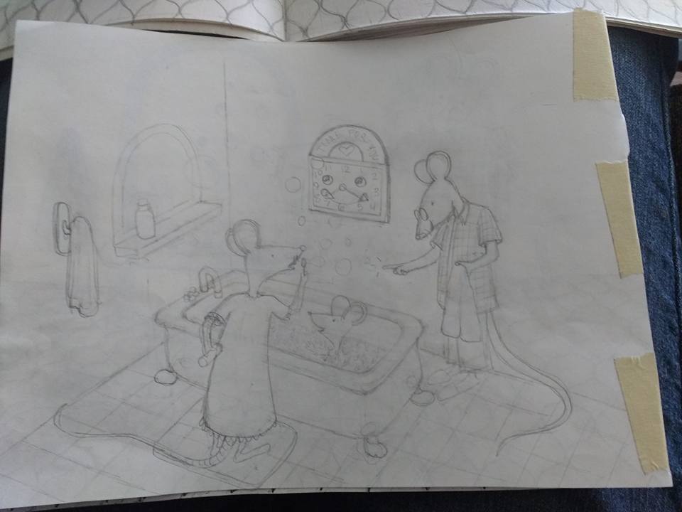
@Ace-Connell I've been playing around with this again. (not done-just playing) I realized I don't really need a two page spread. The other page really has nothing to do with the story. The wall seems a bit high but there is less floor
 Maybe I can move the wall items-clock and window or mirror thingy up a little higher. What do you think? .
-
Also, I am just on the couch with a pencil-no ruler or anything so I suppose teh perspective might be a bit wonky too.
-
@Marsha-Kay-Ottum-Owen Yeah! That has a load more form to it.
Don't worry about rulers... the only really time perspective needs to be that perfect that you need a ruler is if you're doing architecture drawings or whatever. Rulers lose the heart of the piece. Just being conscious of the points is what makes it look natural, but believable.
Composition should always be your main focus and perspective should be there to compliment it.
Well done. As far as form and perspective is concerned, this piece looks like it was drawn years after the last one, not a couple of nights haha.The only real thing to be wary of is that with the towel rail and the clock, you really need to feel like you're looking down on them. You can see the underside of the towel hook and we're above, so we wouldn't see any of that.
Ace
-
Thanks
 Ace, I redid thumbnails for all the pages and worked on the towel rack and clock. I'll have to post them later.
 -
Any time

Ace
-
Much better! I do think the clock could come up a bit more, any maybe a scattering of bath toys like in the first. Great re-do!
-
Thanks. I appreciate the feedback!
-
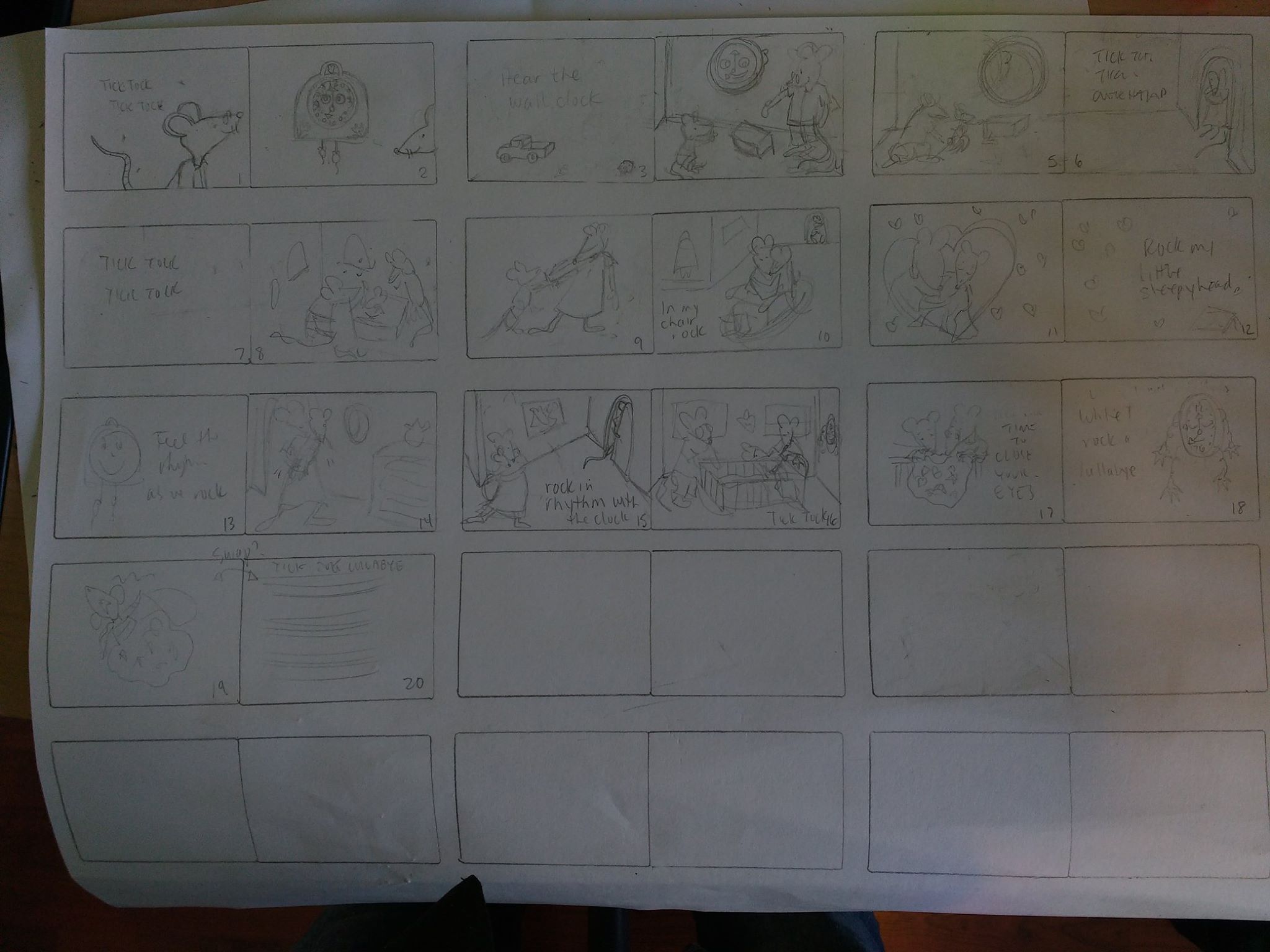
@Ace-Connell Okay, here is a picture of my "thumbnailish" drawings. I'm going backwards and trying to get the big picture. I've completely erased a couple of pages that weren't really necessary (in my opinion). These are light and pretty rough but, could you give me your opinion on the layout? Thanks!
Also, I think I fixed up my other rough drawing a bit as far as the towel hook goes and raised the clock a bit.
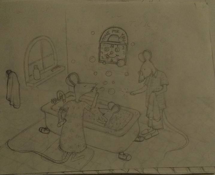 It's scruffy and dark because I'm erasing and redoing over and over again
  So, it will be better later when I redraw everything....aaahhh!!! I hope!
 -
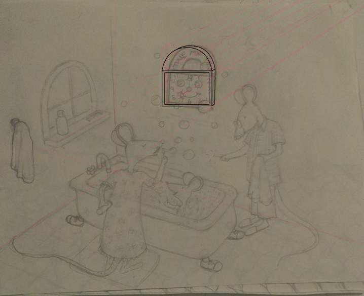
@Marsha-Kay-Ottum-Owen The clock in the bath is off a little. In two point perspective the verticals should be going straight down but they seem to be tilting to the right and I'd just add a bit more form to it to make it really feel like it's attached to the wall instead of painted on. If you want me to do a clock draw-over to show you what I mean, just let me know and I will

Thumbnailish Thoughts (by page):
1 The mouse has a lovely gesture and is drawn well, you'll just need to be careful of the right hand side - it's a little close to the gutter and his nose will be all bent into where the pages join. He'll need to be pulled back. If you divide the page into thirds, then place his eyes on the right third line, that'll probably sort the gutter issue out and will make for a more appealing composition.
2 Again, with bleeds and the variation of image placement when they cut the pages, I'd just bring the mouse into the shot a bit more.
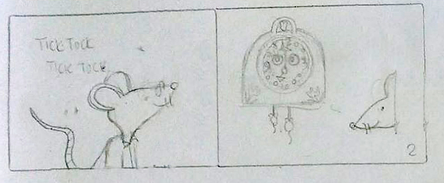
My daughter's just woke up, so I can't do any more at the moment, but the rest are looking good. Just when you take them from thubnailish to final sketches, just watch the perspective and be conscious of the gutter/bleed and bring your action in a little to compensate for it

It's all a process and it's slow at the start, but it'll be totally worth it when you draw over. The two most important things in an image are the composition and the construction and all of that is done at the sketch phase. The final image will totally be worth it in the end... I have faith in you - it's very, very nice work, I'm just pushing you hard haha

Ace
-
Thanks so much, Ace. I appreciate the push. You are seeing things I wouldn't have noticed on my own (though I did realize the clock was crooked and thought to fix it later, I would love for you to do a draw over if you have time. I hope you don't mind that I've glommed onto you as a mentor
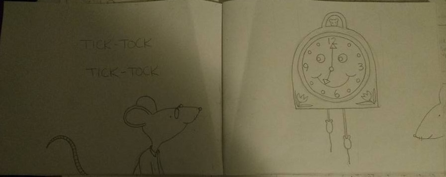
 I actually took pictures of the actual dummy pages that correspond with the thumbnails too. Here's the first one so yo can see a bit better view . I can do that for each page as we go along so you can see that too. This is my learning book
-
@Ace-Connell Thank you! I replied below instead of to you directly because I wasn't thinking but, now you will see it
 How old is your daughter? I have a 2 year old grandson.
 -
I'm not very good at composition, but the thing I notice right away is that the bathroom in the bottom picture makes much more sense as far as size goes. The bathroom in the top looks absolutely enormous (probaby because there are no wall in sight). But, the bottom looks like a much more realistic size. And, I think that's important. Obviously we all know that mice don't use bathrooms. This is a children's book so we expect to see fantastical things, but when the details like that are well thought out, its easier for me to buy the story. Its less distracting. Does that make sense?
Also, nice job, tackling a bathroom scene. It seems like and incredibly challenging thing to do. I remember a book called "The Amazing Voyage of Jackie Grace" I think, by Faulkner?? Its a kid in a tub and turns into pirates and and seas and all kinds of fun. It might be a good reference for bathroom and tub scenes. -
@Pamela-Fraley Thanks, Pamela! The creative composition class is responsible for the great changes made and feedback from others which I so appreciate!
-
@Marsha-Kay-Ottum-Owen I made the squares a bit too short horizontally in comparison to the pages I have in the dummy book.
-
It'd probably be something along these lines

My daughter's 4. She's awesome

-
@Ace-Connell Thanks Ace! I kind of did the same thing. I've gone through the whole dummy again and made changes as I go through the Craetive Composition class. I'll post again later when I have more improvement. I'm very happy for you having your awesome daughter. Kids are great. So glad I am a mom AND a grandma!! I'm going to leave you alone for awhile and take charge of my project until I feel I have more to share. Thanks again!!!!! BTW, I went to your website and loved seeing your caricatures:-) Do you have any other art posed somewhere?