Tone and Color Practice
-
This post is deleted! -
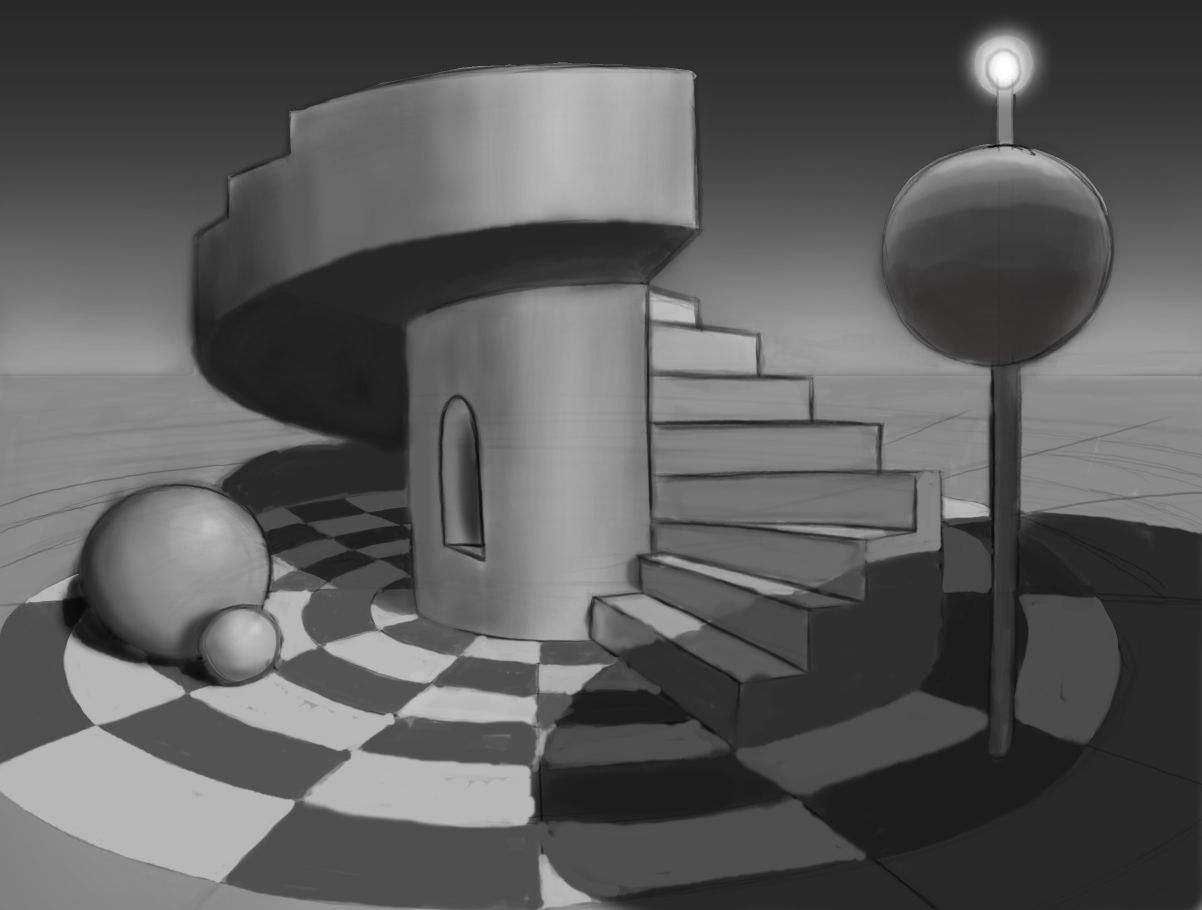
This is tricky:
-
Hi Nick, Really good work! It seems like your having fun here!
-
Hi. Nice work.
For me, the ideal in a tone study is to build the shapes using "patchs" of tones, not by outlining them. So, it woul be interesting to see how your tonal study looks without the outline. (I'm not saying you can't use tones and outlines together)
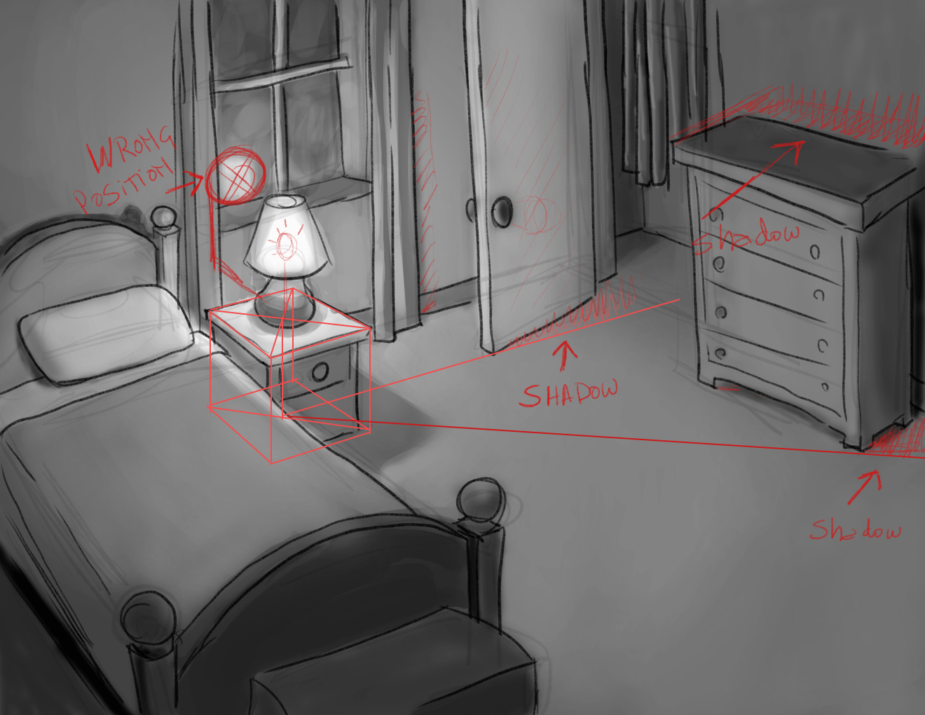
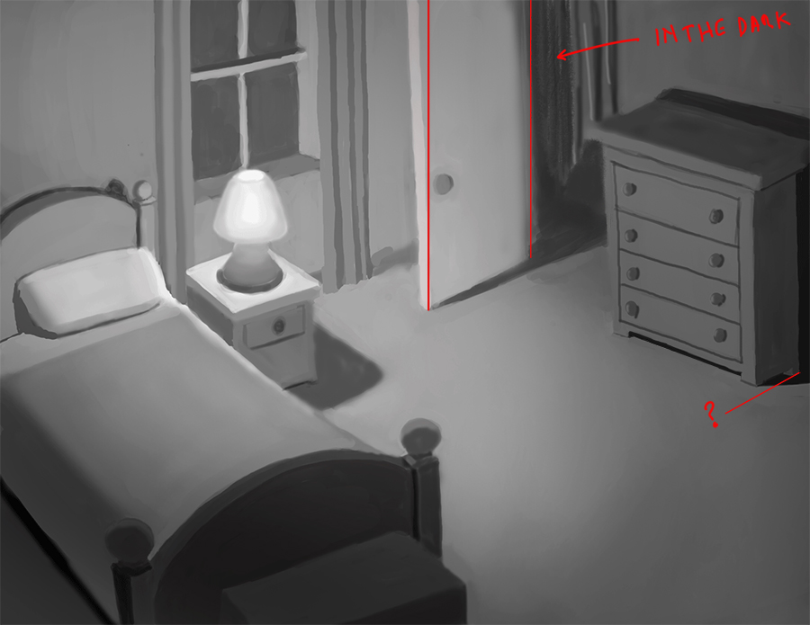
I think you did lose some features, like the oclussion of the door where it meets the floor (night version of the room). The general lightning of this evening version is apropriate for a more powerful bulb than a normal one for a bedside lamp. You have one light source dimmed by a lampshade, so the light will dicrease a lot in a couple of meters. Then, the bedspread, as an example, will have a more evident diffrence in the tonal range (lighter near the lamp and darker away it)
Our eyes adjust what they see so they make some zones look darker or lighter (opening or closing our pupils). The idea is to capture the difference between the tones in the scene avoiding the feigned tones created by the pupils adjustment.
In short: first, for me, the outline doesn't help to get a great tonal study. Second, it's important to capture each tone always in relation to other zones and not what our eyes see when are looking to a particular zone.
I hope you understand what I'm trying to say. My English is still too poor.

-
Interesting thoughts, thanks Sergio.
")
-
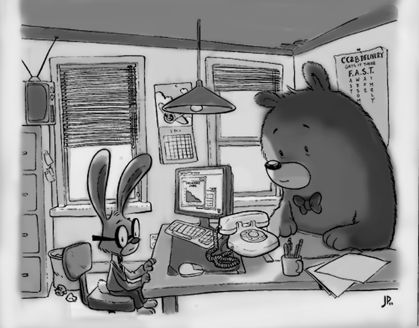
Trying my best to make the characters read:
-
I think you are trying to do something realistic in terms of lighting. If not, forget this comment
- The lamp is being reflected in the wrong position. In fact, seems that the reflection must be hidden from your point of view.
- Due to the position of the lamp, the door must project its shadow.
- Also, due to the position of the lamp (light source), the chest of drawers must project a shadow in the wall and the floor.
It only will be true if light still travels in a straight line.
-
Thanks again Sergio. I will have a go at correcting those soon.
Here's a block in I just did (I would say 'quick block in' but they take me a while, even when rough
") ).
).
-
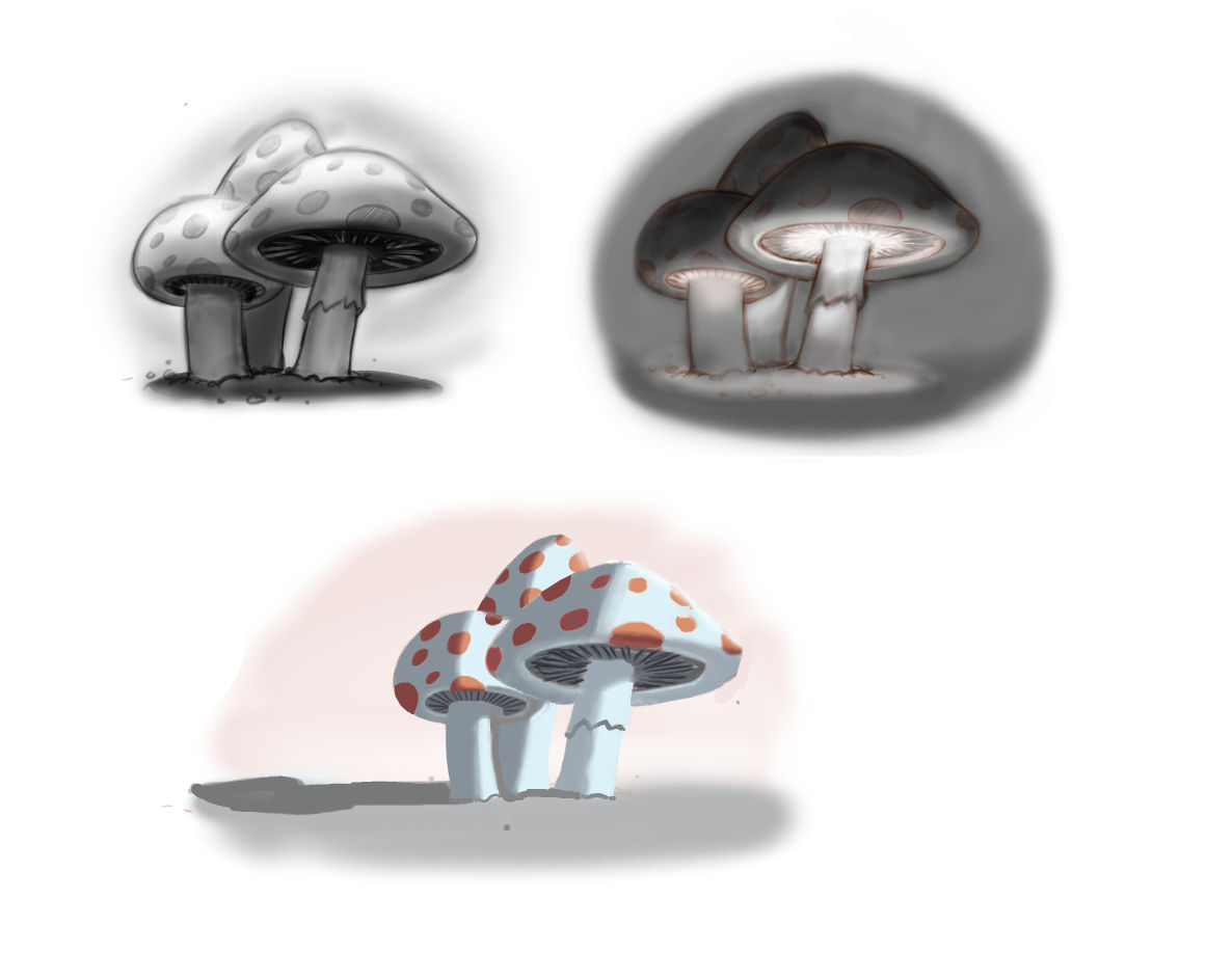
I've also been working on the simple mushrooms from the course, I'll post those later on.
-
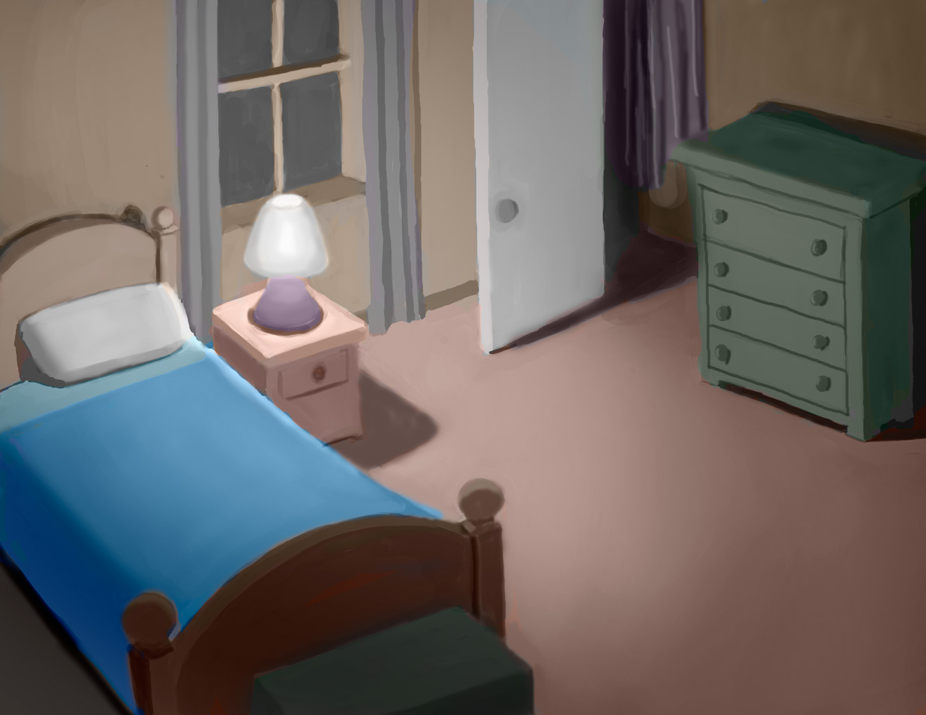
Another attempt at the bedroom with some of Sergio's Suggestions.
It takes more time without the linework, but the result is nice and painterly:

-
just looking now, the drawer shadow seems a bit out of place dark, but I'll leave it for now.
-
Really nice! I love the light coming in through the window and the the other light reflecting off the furniture.
-
Wow! I like it! I can see how you took the feedback and it makes a difference.
-
Some mushrooms (More work on these to come later):
-
Pretty much better to me. Now you can feel the shapes by the lighting (tones). I see a couple of details:
- Part of the clothes in the closet must be darker. They are receiving the shadow of the door and part of the closet "box".
- The door and the chest of drawers are a bit crooked.
- There is a problem with one of the legs of the chest of drawers.
Anyway, its a great improvement, I think you only need to tune a bit the intensity of the lights and shadows. The best way to me is by analizing some master pieces and, of course, practicing a lot. Just training your eyes.
-
Thank you Sergio.
-
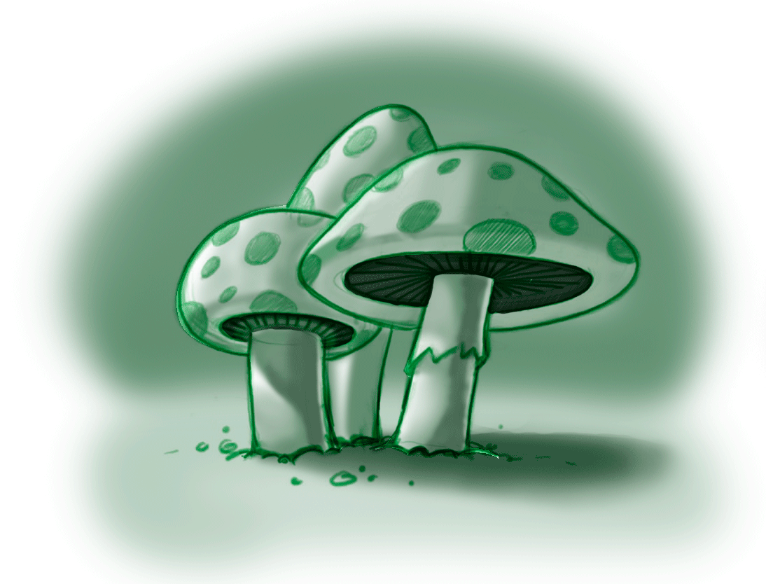
A copy (in monochromatic green) of Will Terry's first mushroom example:
-
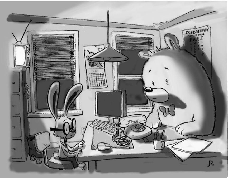
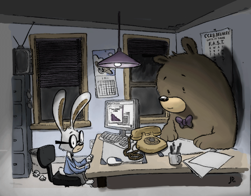
A color attempt of the first office scene I shaded:
-
Color added to the bedroom scene:
-
Nice job, these are great practice! I found it was so much easier to learn this stuff by using someone else's drawings so you can focus on the light and shadow and not what you want your drawing to look like.