Fun With Flags
-
Hi SVS Family,
This post is a long-term project. This “Fun With Flags” project holds several challenges for me. These 14 flags really existed at one time. They are the flags of the 12 Tribes of Israel, plus two flags of the sons of Joseph, Ephraim and Manasseh. I love history and these illustrations will be for a book to appeal to 8-12 year old boys especially. The standards really existed around the 1600s B.C. I think of them as standards, since flags did not exist back then. Even though the “flags”/standards have Biblical origins and are described in scriptural texts, I also want to stylize them and make them appealing to modern audiences. I need to figure out how to use the design principles I am learning here at SVS in not only designing the overall illustration, but how would they apply to the flags themselves? What if someone actually were to sew or produce the flags? I know I want to duplicate the images eventually, maybe in t-shirts, prints, etc.I think the “flags” are very cool. I have researched and done the basic sketches according to descriptions. Some sketches of animals are more based on medieval stained glass or heraldic images. For the Tribe of Judah there is this stylized lion called The Lion of Judah that is actually still used in Israel. I will use these images instead of more accurate lion and wolf references. There are variations in the descriptions, and also, at least one of the items is pretty unknown, so I have gone with the next best image. –I will need your creative advice when I get to certain flags and will really appreciate your help! I want to take into account what I am learning in classes at SVS, but it can also be confusing in translating those lessons to this project. I am very new at learning PhotoShop, but want to digitally illustrate these flags. The first one, Issacher, I did in Paint before I got my Cintiq, which I also need to learn how to use. So many challenges! Such good opportunities to learn!
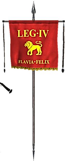
The overall illustration shows the flags in the positions the tribes occupied when they camped and had the Ark of the Covenant in the middle. If I can figure out how to do it, I would like the standards/flags to be on poles (think how the Roman standards looked). So this affects my horizon line/”camera angle”. I am making the flags 5 inches wide by 4 ½ inches tall. Here are some images. The first sketch, for the flag of Issacher was wrong so I revised it when it was painted. It needed a moon, not stars. Oh, to help, here are the 12 Tribes in order and then the other two. Reuben, Simeon, Levi, Judah, Issachar, Zebulon, Dan, Naphtali, Gad, Asher, Joseph, Benjamin, then Ephraim and Manasseh.
Reuben – Red flag, with mandrake flowers
Simeon – Green flag, with buildings of the city of Shechem
Levi – Red, white and black flag, with the High Priest’s breastplate (really the Urim and Thummin we only have vague idea of what this looks like)
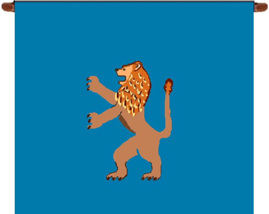
Judah – Sky blue flag, with the Lion of Judah
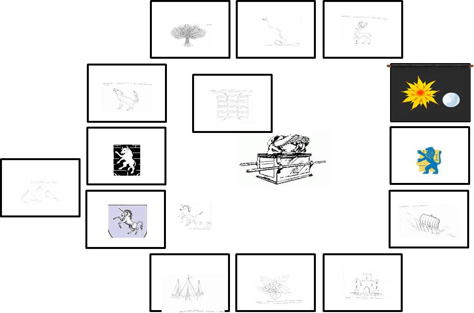
Issachar – Stygian (bluish black) black flag, with a sun and moon
Zebulon – White flag, with a ship
Dan – Blue flag, with a snake
Naphtali – Deep wine colored flag, with a deer
Gad – Black and white flag, with a tent camp
Asher – Pearlescent colored flag, with an olive tree
Joseph – Black flag, with Egypt depicted upon it (Since this tribe was divided into Joseph’s two sons, their flags were similar. However, Ephraim’s flag had a bull, while Manasseh’s had a wild ox [some say an oryx or a unicorn].)
Benjamin – Multicolored flag, with a wolf
-
Okay, here is the first flag I worked on, Issacher. I love the stygian black, which is a bluish black. I do think I got that right. I got some texture in the background, although I think some of it got lost when I painted. I will have to check when I get on PhotoShop. I have so many questions about the illustration. (1) Where is the point of view of the flag from? What could be the light source? I have the overall illustration of the camp, but if I hypothesize the poles of the standards are 8 feet high (8 inches), and the flag is what, 4 feet long by 3 ½ feet tall (4 inches by 3 ½ inches)—see Roman standard example. If the pole is stuck in the ground and someone is standing and looking at the camp, they would look slightly up to look at the flags.
(2) Issacher’s camp is at the top middle right side of the camp. Should the flag be at a slight angle?
(3) The flag itself. What do you think of the positions of the sun and the moon?
(4) The Sun. Should I do “vanishing points” of perspective? I did think of having the sun and moon “face” each other and be larger at the front then get smaller in back. Does this relate to symbols on a flag?
(5) What suggestions do you have about how the sun is painted?
(6) The Moon. I wondered about the size of the moon. Okay to be smaller? Should it be the same size as the sun? Should it have “vanishing points” of perspective? I know the moon needs lots of work, but I did try to have a core shadow, half-tones, and a highlight.All comments will be greatly appreciated!
-
Did I write too much? I really do need answers to the questions above folks. Can use your help.
-
You don't write too much... I think the issue is that other than Sheldon Cooper, people see flags and fall asleep haha.
So the birds-eye view you put of the layout wants to be in perspective? What kind of view-point do you want?
Ace
-
Hi Beatriz
I think maybe you should start doing thumbnails sketches for the first illustration and explore the different options you mentioned in your questions. Then you can submit the thumbnails and it would be a starting point so we can help you with composition!
Noémie
")
-
Thanks for responding Ace and NoWayMe. I will work on this. By the way, what does it mean when I get a notice that someone "upvoted" my post? Thanks!
-
It's just like a like on Facebook.
AKA fake gratification from people haha.
The biggest problem with this piece is going to be getting a camera angle in which you can see all the flags. You need to establish and draw out that camera angle before you worry about the angle of the finished flags because you don't know their final perspective yet.
Ace
-
Hi Beatriz,
I think its hard because Designing flags is so much more than illustration. Perhaps you can start by lose sketches, every flag its own prescription? That makes it more readable for people. Nice, but not an easy job because there is so much symbolism in designing flags. If it is for boys, make them very graphic, they read easy. Maybe using desaturated colors? Is this of any help? If you want I can give you some help with examples...just let me know. Have a great day! Leontine -
NoWay, Ace, and Leontine, you are right. I have been looking at landscapes and trying to figure out the camera angle. The thing is, this piece would be so huge if I were to sketch it out as an actual encampment. It is going to have to be a representation and not a realistic encampment to show the flags. ---Leontine, I have sketched most of the flags. They are in the rectangles above. Each flag is described in scriptural writings, so the basics of each flag is there as far as the animal or object, and color(s) of the flag. --- I am VERY new. I am learning PhotoShop from scratch and just won a Cintiq in an ebay auction that I have not finished hooking up. Ir was delivered a couple of days ago. I have never drawn on a tablet. I have studied a little graphic design, and have done some work in PowerPoint and Paint, but have a LOT to learn. I am so Excited and appreciative of this group. Leontine and All I will really appreciate your assistance and advice! Leontine, your piece for 3rd Thursday was wonderful. You are all so talented and give great advice.
-
Unless you use extreme perspective distortion (which is a valid compositional technique, but will look very distorted), there's no way of getting the full faces of the flags all in view unless they were all of different heights - whether that fits in with the lore of not, I don't know. You could do it like your plan, but most of the faces of the flags would be hidden. A lot of the time with composition, it's about making compromises with positioning to make it work as an appealing image.
Ace
-
This project is going to have a lot of phases. I have decided to straight on draw each flag. Later I will improve them. Eventually they will need to look like they are on fabric and on standard poles. For the overall scene. I think a "lower higher up view". Like maybe someone came through a low pass in the mountains and comes upon this scene of this encampment. Since the layout is dictated by scripture, it will have to be creative. I will stagger the flags in their own areas. The one thing that is going to have to look unreal is that since they are on four sides of the center area, some flags will have to face outward in order to be seen. So they will not just be seen from the back. Or maybe they will be seen from the back, so they will have to be backwards? Flags are printed on two sides. ---On a separate note, how can I "upvote" someone's post. Am I allowed to do that since I am new? Thanks All!
-
Judah
-
@Beatriz-"Bett" The shape and stylization of this lion exists. It is known as "The Lion of Israel" and is actually still used in Israel.