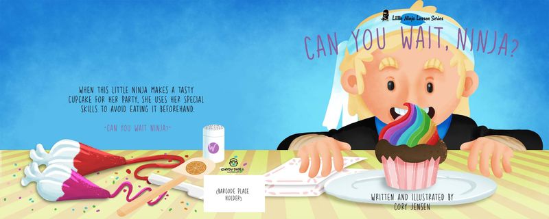
WIP Book Cover "Can You Wait, Ninja?"
-
@phoenix-yip every grain of salt is appreciated my friend lol. Im finding that a lot of people share the same concerns about the cupcake and background not reading well. Do you think a marble cupcake would be just as effective? As for the background, it's been communicated a few times lol. I'll change that up stay tuned.
-
Hi @Kori-Jensen, fun cover!
3 things I like:
- Color palette and washed background are very nice
- Big focus on character
- Nice cupcake design
3 things I think you can improve
- I’m not seeing a ninja. At first glance, I see a bearded man, possibly a dwarf?
- Her hands look very manly/masculine. Definitely not reading young girl hands
- Although the text is temporary, I’m not sure how final title will read if it covers her face. Also, suggest you center the back text and correct the spelling errors.
Can’t wait to see you final cover design!
-
@Jeremy-Ross thank you so much for the positive reinforcement. I have gotten the bearded man comment on more than one occasion now so I'll be working on that for sure. Thank you sooo much for your help.
-
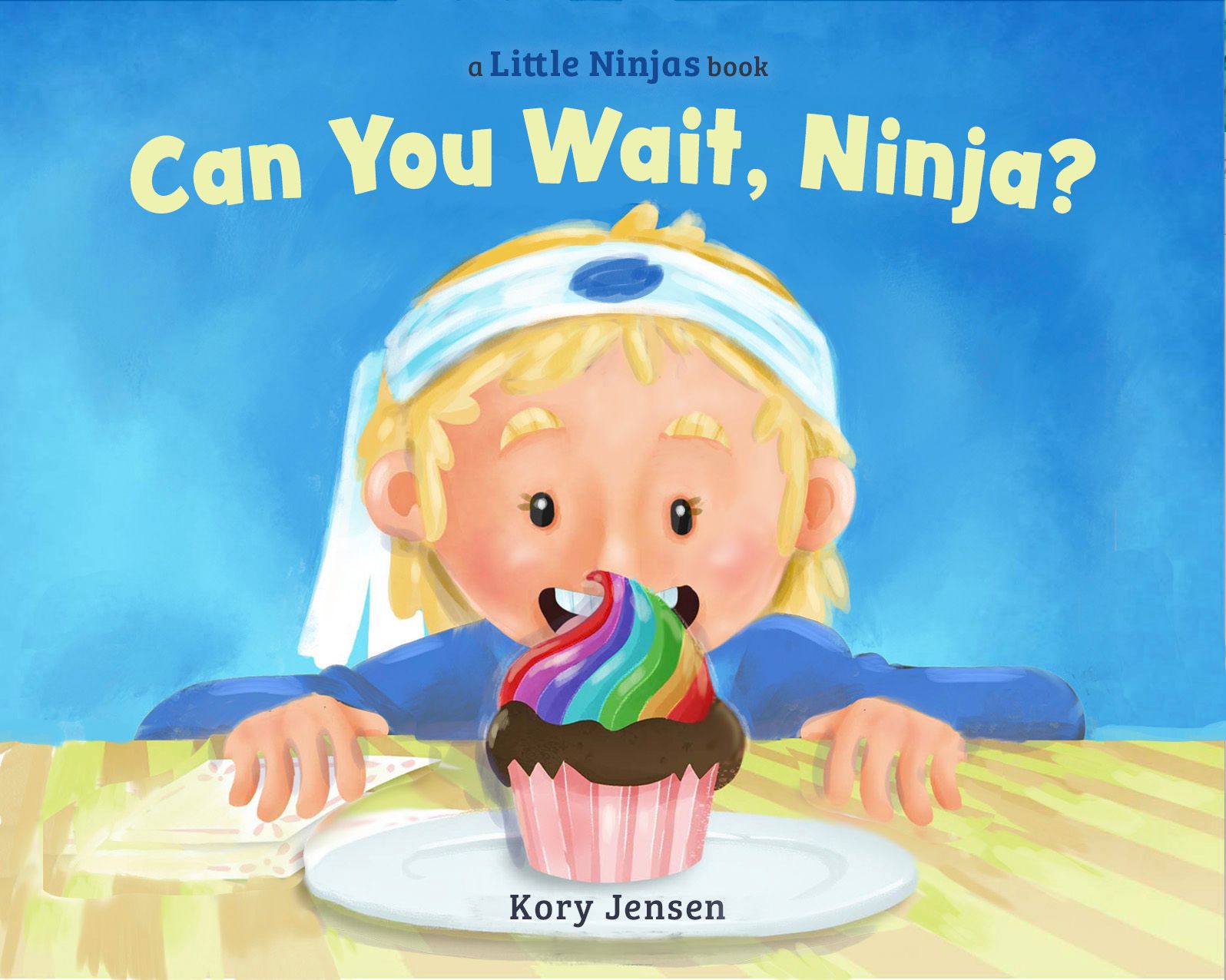
@Jeremy-Ross, @geekinm , @KathrynAdebayo , @phoenix-yip, @geekinm, Thank you so much for your awesome feedback. what do you think about the edits?
-
@Kori-Jensen a little late to this party, but wanted to give some feedback from a cover design perspective. Before the constructive criticism, the good:
- Great colors! Really eye-catching & will make your cover POP.
- A center-oriented cover design with a closeup of the main character has great impact.
- You've got a cute character. The cuter the character, the more books you'll sell!
As cute at your cover is, there is room for improvement. The edits you've made, for the most part, are solid! The one edit that isn't the best in terms of cover design is the black ninja outfit. While it's nice to see more of her face and body (though I question whether or not it's needed) and though black is the traditional ninja color, it doesn't work with your bright color palette. It draws the eye to an area that's not meant to be the focal point.
So if this cover design job came across my desk, what would I do? It's best to show rather than to tell, and please take my very rough draw over and design as just an example and suggestion:
Based on the above mockup, here is what I suggest:
- Establish visual hierarchy. What is the most important element (or elements) on the cover? Make that the focus -- use shape, hue, and value to draw the eye. For me, the most important things seem to be the cupcake and the girl's face, so I made sure they were the areas that contained the highest contrast in value. The title also needs to be given visual importance as well. Visual hierarchy is the reason for my adjusting the composition and placement of the title -- give it its own space.
- Make sure the cover is readable. A successful cover design is readable full size and as a thumbnail (or seen across the room on a crowded bookshelf). That's why the title has its own space -- placing the title over another important element (the girl's head) causes them to compete for attention, which ends up causing confusion. Another thing that increases readability is font choice. You want fonts that work with the art but also are easy to read. The title font should stand out. One more thing on the subject of readability: it should also be clear that your main character is a girl. When I first looked at the cover, I thought that the character was a boy -- this could confuse potential buyers. The cover needs to communicate what the story is about, and sometimes that includes being clear on gender.
- Pump up the volume on cuteness. Cute sells. Make the girl as cute as possible, even if she's a tomboy. Give her cute eyelashes. Give her a cuter expression -- raise the eyebrows and make them less thick, pinken her cheeks, put highlights/sparkles in her eyes and cheeks. Make her hands cute and kid-size.
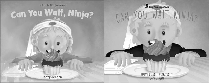
And one last thing when you're designing a cover: periodically test it out to see if it's working. Zoom in and out (or stand across the room and view it from a different perspective). View it black and white to see how the values are working. Print it out full size -- sometimes we see things when we view something physical rather than staring all the time at our computer screens.
And I'll leave you with one of these tests: a side by side comparison in b&w:
Hope you found this helpful. Looking forward to seeing more of this project!
P.S. Please excuse the typos! I just now realized I spelled your name wrong and got the series title wrong too!

 ️
️illustrator - author - smiley person
mbaileyart.com
instagram.com/mbaileyart/ -
@Melissa-Bailey-0 ooooh Boy! Thats a lot of good information. I get that the character looks a bit ambiguous so I am going to change that as much as possible. As for the character being really cute I think I need to work the most on it. I'll get back to you about contrasting colour and composition. I'll show you the update for sure. Thank you for such an amazing and extensive critique.
-
@Kori-Jensen you're so welcome! Glad you found it helpful.

illustrator - author - smiley person
mbaileyart.com
instagram.com/mbaileyart/ -
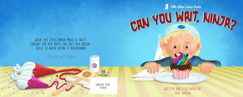
@Melissa-Bailey-0 Hey Melissa! Hows this?
-
Hi
I would separate the cake and face completely.
As grown ups our concepts of the shapes of things is very well established.
For a child the face and cake could 'melt' together."Is the cake coming out of the nose?"
Mic
-
@Kori-Jensen you’re headed in a good direction!
A few things:
- Check your values. The shirt feels like it could be too dark — the cupcake doesn’t pop because it’s still too similar in value. You can brighten your lighter colors even more. The character is in the mid tones, like the background, so you’ll need a finely-tuned balance to get her to stand out.
- Have you worked on making the character cuter? She still looks like a boy to me. Have you tried giving her longer hair? Eyelashes? Pinker cheeks? These are all shortcuts that instantly make a character look more feminine.
- The font is stylized but not very readable. In terms of font choice, it’s best to lean on the side of readability. Parents and teachers (your buyers) are more likely to pick up a book with a title that is fun and easy to read. They avoid complicated fonts and/or titles; if the cover is hard to read, what will the inside of the book be like? And be careful of the color — you might not want blood red.
You may want to check out your competition — what other ninja-themed books are out there? What do those covers look like? You may be surprised to find that the title fonts on most covers are very readable and kid-friendly — they don’t really scream “ninja”. For examples of effective cover design, check out these book covers on Amazon: Hello Ninja, Naughty Ninja Takes a Bath, The Three Ninja Pigs, Ninja Red Riding Hood, and Ninja! (by Arree Chung).
If it helps at all, here are the fonts I used in the draw over/mockup:
Title: Peachy Keen (included in the Adobe Creative Cloud membership)
Text (author name): Bree Serif (available free for commercial use from Google Fonts) -
@Kori-Jensen looking good!
Portfolio: nyrrylcadiz.com
Instagram: https://www.instagram.com/nyrryl_cadiz/
YouTube: https://www.youtube.com/channel/UCbJCF1Im8ZO7hpGWTKOJMuA -
@Nyrryl-Cadiz thank you very much but I feel like it's looking like a very straight forward portrait and hardly any composition what do you think?