Please help with character design improvement
-
So I don’t really enjoy character work because I’m not great at it and don’t practice enough but I really do want to improve at it. I have tried really hard with this character and had posted it to another group and got some feedback the I generally agree with but have no clue how to fix most of it. I have tried to fix some but please if any one could give me advice on how to fix the rest it would be greatly appreciated.
Here is the critique I received
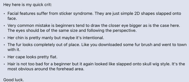
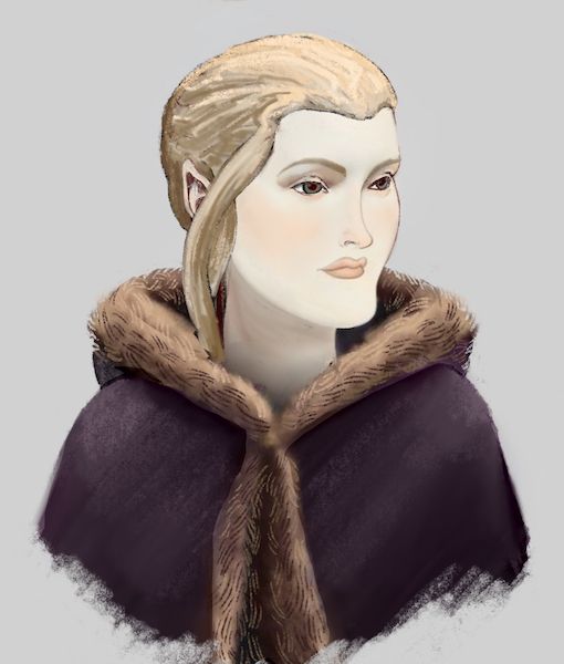
Here is original
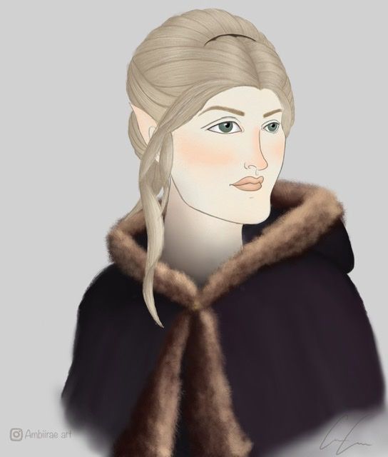
And here is revised so far.. I tried to fix the chin area and the eye size but I don’t know how to fix the hair to make it look less wig like as he put it.. and as for the fur it’s the one thing in this drawing I really love and don’t want to change if there is a way to make the rest match it I would rather go that route and honestly I’m not sure how else I would draw a fur lined cloak anyway.
Please help me to fix this I’m really not sure where to go from here

-
Hi Amber!
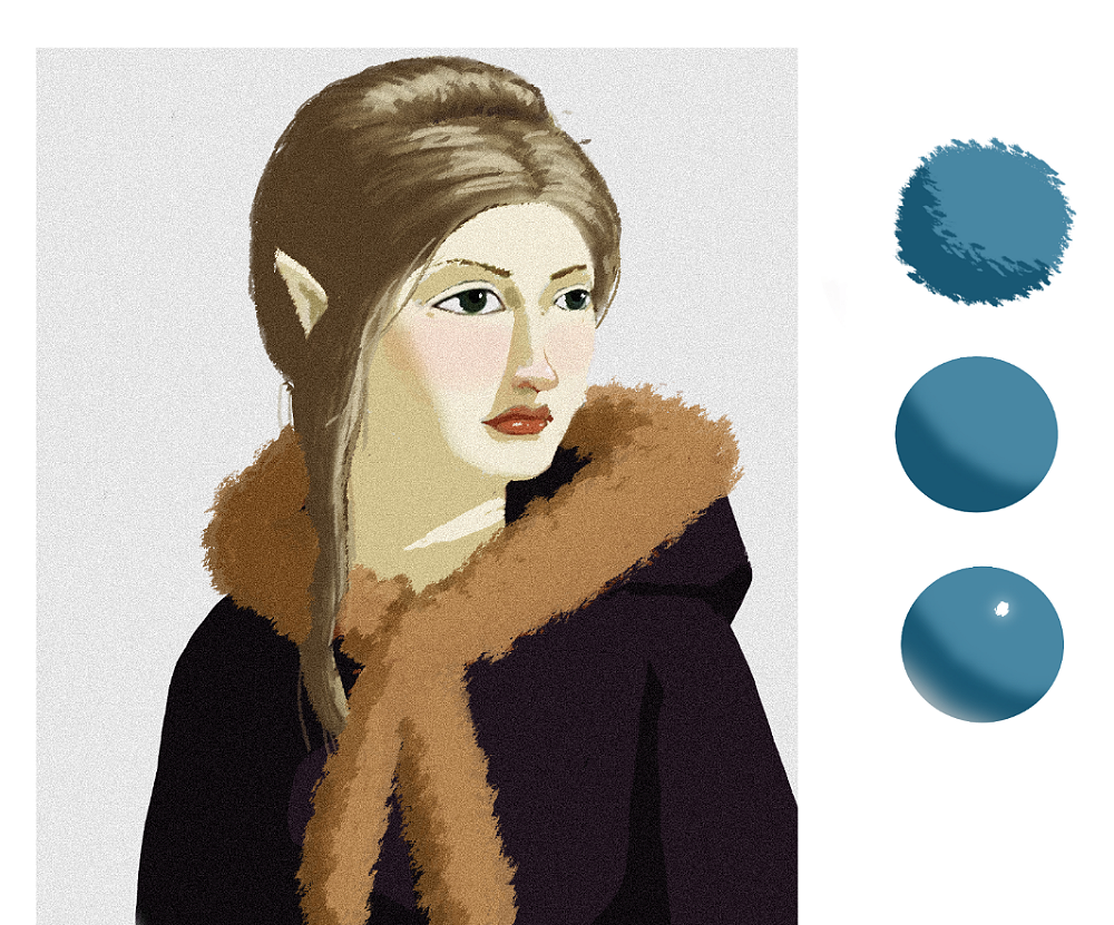
I love the design of the character and I especially love the design of the hair. It's gorgeous! I tried to tackle the hair, fur, and the cape problem as best I could. I'm also pretty terrible with textures, but this is my two cents.
-
I thought part of the issue with the hair looking like a wig was that her forehead was too short. So I gave her a larger forehead and then I had a few individual strands coming from her forehead into the rest of her hair to make it look more natural.
-
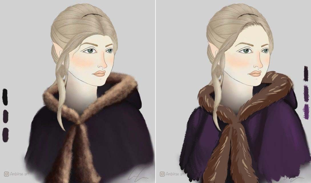
For the fur, I tried to make larger shapes (sorry, the color and lighting is just atrocious) and then just change the color depending on where the light hit the fur.
-
For the cape, I also tried to section it into larger shapes and then use more contrast to make the shapes stick out. As you can see from the color swatches, the colors you used on the cape seem very similar to each other.
I'm pretty sure I saw a class on fur in the SVS learn website if you're interested, and Bobby Chiu is also really great at drawing realistic fur and he has a ton of Youtube videos.
My biggest advice would be to use a lot of references. If you're drawing a character, try to find a picture of someone that's doing the same pose, or has similar hair, or even just pull up a picture of a fur coat. It will help you so much just to see what the real thing looks like as you're drawing it. It's also helpful to see how other artists tackle tough problems like fur and hair to see how they break it down.
I'm so happy that you're on this art journey. It's a tough one, but there are a ton of people who are rooting for you and going through the same struggles as you are. You're doing great!
-
-
@ambiirae Hi! I really appreciate your work. Here are my thoughts. I think her hair and the fur are too rendered while the skin, face, and cloak look too flat. I suggest deciding whether you want to go highly rendered or flat style and keeping it consistent. I hope this helps.
-
Thank you both for your wonderful advice

@aprilshin thank you for the draw over the hair line makes so much sense! Can't belive I didn't catch that sooner. Alos I struggled on the cape a bunch which is how it ended up being so dark. Thank you for the recolor to remind me of how the colors should have changed
@Nyrryl-Cadiz thank you
and yes I agree I knew the face was too flat in comparison and I had originally fully shaded and rendered it but didn't like my results. So I may just have to try again because I know it's what I want but just a matter of how to get there -
@ambiirae awesome! i'm excited to see your work!

-
@ambiirae I really like the chin! There is something uncommon about the face ...not formulaic maybe? She has a regal air about her. For critique i think making the eyes smaller to fit the scale of the head, increasing the forehead length, maybe give a bit of depth around the eyes, and volume and texture to the cape. I feel like the line work of the nose and mouth are very well done... i could not match your light hand in my quick draw over...so it looks kinda funny .. but i wanted to show the scale of the eyes in the way i was imagining them. You've gotten great feedback already but i wanted to give a vote for
keeping the chin")
-
Hi Amber! you already got a lot of good critique, i just want to add something, that might help you in the rendering process, to keep things evenly rendered (that might be the biggest issue of the image) and save some time as well:
the surface quality of objects can be described very well in two ways:
- the silhoulette. is the surface smooth, rough, furry etc.
- the terminator (where light area changes to shadow area). the same edge quality as on the silhoulette should tell enough information about the surface quality and the brain fills the rest.
rough paintover over your nice drawing to see what i mean (sorry for messing up with the likeness):
-
Looks like an interesting character, can you tell more about her? Tweaking things like the chin and eye size can make her look different ages, so it depends on what your goal is. Her ears look fantasy, and other factors like her environment, personality traits, etc could influence her design more.
Her features made me think of a Pre-Raphaelite portrait.
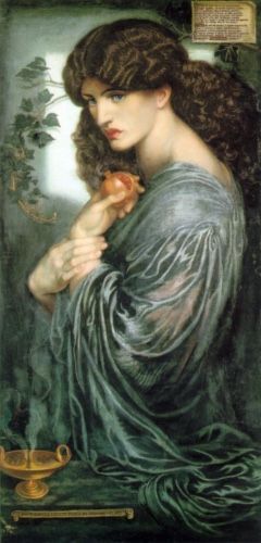
Proserpine by Dante Gabriel Rossetti 1874 -
@ambiirae You're really close to great piece. I tried to preserve your style and chin is untouched (we need more diversity in portraits).

For the face I..
- Moved the nose off center.
- Enlarged the left eye to match the right.
- Nudged the left eye a little to the right.
- Gave the left eye some more white.
- Moved the lips down.
- Shortened the left eyebrow.
I played around with shadows under the neck and blush on the face for rendering.
The fur texture looks good to me. All I recommend is to add line work to unify the piece. I just drew in the lines freehand; no method (I did a lazy execution, but you get the idea).
As for the hair, I think the bangs are too thick. Maybe make it a more stringy, add gaps. For the bun part, the lines need to less conformed and should follow the skull shape. Be conscious how hair can be light in some areas, weighted down in others.