Follow up question on podcast 84
-
Hi all, I’m the mysterious unknown 40 year old on one of the last questions on the podcast 84. Don’t remember why I chose to be anonymous but I wrote that question so long ago I can’t remember……I was away for the whole summer so didn’t get to hear this podcast till now. Anyhows to get to what I wanted to ask was after @Jake-Parker , @Lee-White and @Will-Terry took a look at my sketches on Instagram Will mentioned "You need to fix a viewer's direct eye-traffic with value and color." And "You want your picture to have one focus- one message" So how do I do that ? Is there a class I can learn this on svs ? I know Will mentioned it’s a easy fix and I agree but I need a refresh of so many things as I’ve went for a long time not drawing and I just need to get back in the game. Also to just answer the question weather this is a financial need or not the answer is it’s a bit of both. I need to succeed in this for me and for the love I have of this profession and it would help my family a lot to have an extra income that is true.
Thanks so much for your positive words @Jake-Parker @Will-Terry @Lee-White
Here’s a link to my Instagram if anyone wants to put a face to the message https://www.instagram.com/isabel_reyes_feeney/
-
Your style is really awesome! wow
I don't remember the podcast episode exactly, but it sounds like they were talking about having a focal point in composition.
-
I would recommend taking the creative composition class to tackle this. I think seeing the examples in the class will help you understand the concept of using value and colour to create a focal point a lot more than if I try to explain it here. You have a beautiful style, like they said on the podcast, learning more about focal points and composition would really take it to the next level. Good luck!
-
Recently i watched a lot of the old Episodes of "3rd Thursday" on Youtube and i guess you could learn something there too (if you didn't watch them recently), because they make a lot of draw overs to fix problems like focus or value.
Maybe its a good adition to the creative composition class @Annabishop talks about (I didnt take the class yet) -
Hiya! I would recommend the Creative composition 2.0 course, specifically the section on "Emphasis"
I think this image is a great example of where you could improve on this skill !!
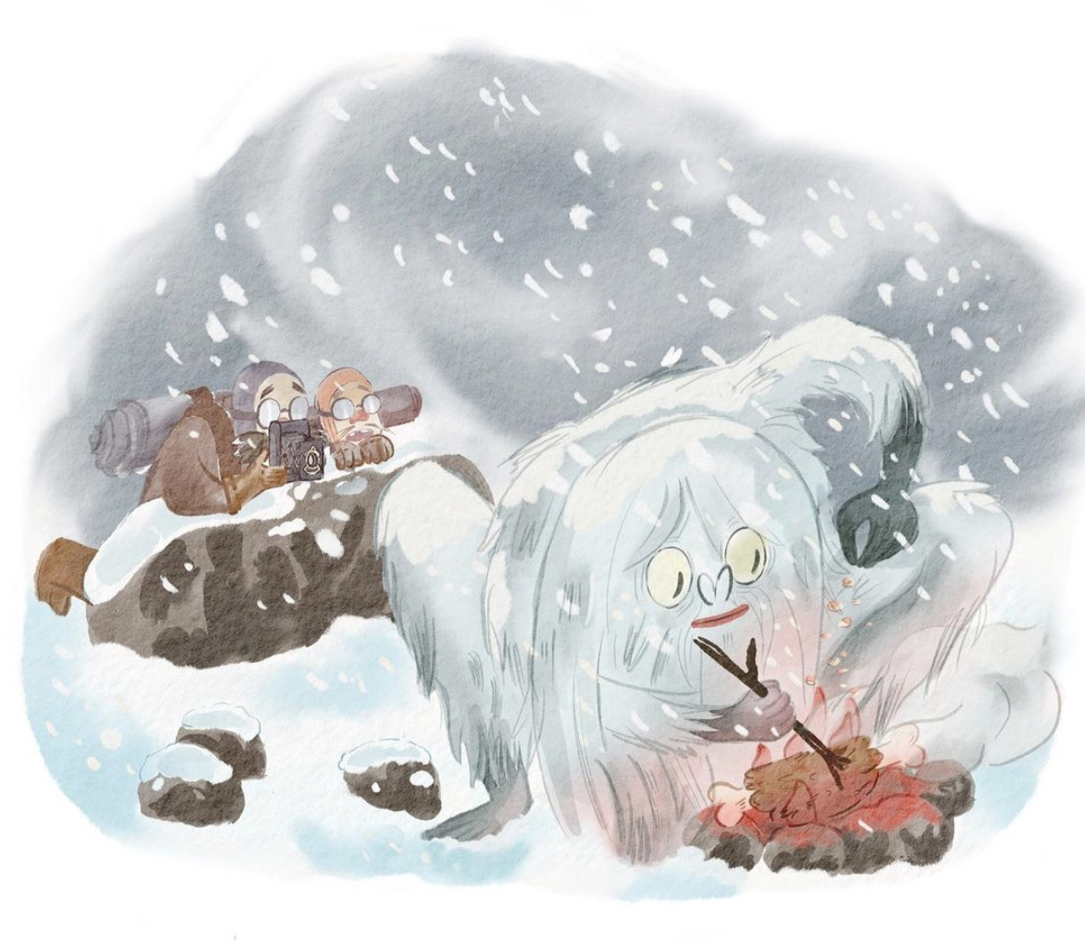
When I first saw this image I couldn't distinguish the yeti from the background because the values are so similar.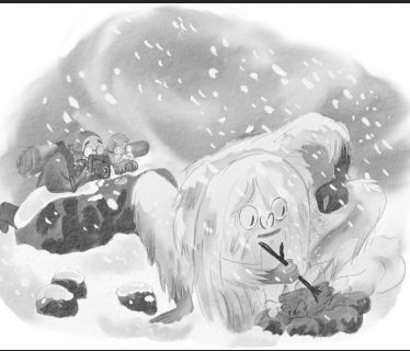
There is also more contrast in the background than the foreground, so it feels like the yeti should be the focal point since he is so big, but becuase of the value patterns it's unclear where to look.
The best trick it to look at the image really small, like thumbnail size and see if it all blends together or if you can still make out the basic shapes.
If we were to adjust the values, like this the yeti pops out as a focal point.
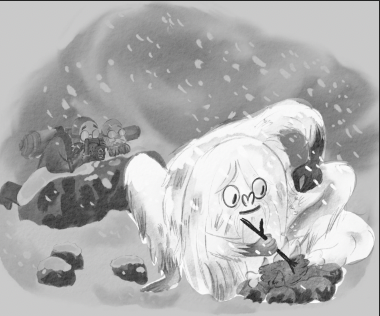
If I left the values alone, and just adjusted the colors, making the red a focal point and pushing the bright red colors in the back to a blue, now our eye is still directed towards the yeti who is the most saturated and has red in it.
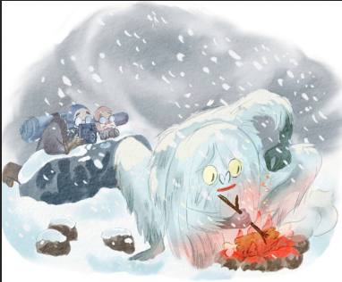
Of course you could also do value AND color to really make it pop
")
Your image on the left vs adjustments to color and value. This was quick chop job, but I think you can see how the yeti is now a focal point on the right vs the left.

I love your work btw! I actually got a similar bit of feedback from Will last year about improving my value range. It's challenging with a beautiful pastel style likes yours, but the composition course gives a lot of other methods like sillhouette, color, lines etc to create focal points.