Society of Visual Storytelling

    SVSLearn Forums

    • Register
    • Login
    • Search
    • Recent
    • Tags
    • Popular
    • Users
    • Groups
    • Search

    Need Help with Type - Book Cover - Personal Project

    Artwork
    15
    25
    1249
    Loading More Posts
    • Oldest to Newest
    • Newest to Oldest
    • Most Votes
    Reply
    • Reply as topic
    Log in to reply
    This topic has been deleted. Only users with topic management privileges can see it.
    • Nyrryl  Cadiz
      Nyrryl Cadiz SVS OG last edited by

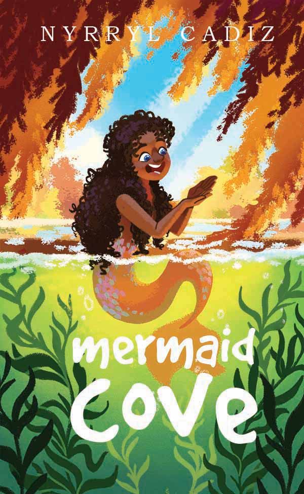
      Hi, folks! I've been working on this dtyis and decided to turn it into a book cover. the illustration is still not done but it's almost there. hehe😅

      Anyway, I need help with the type. I don't have any graphic design training and I am severely unsure with my work. Any suggestions?

      Thank you so much!!! 🧡

      sarah dtyis mermaid cover sample.jpg

      Portfolio: nyrrylcadiz.com
      Instagram: https://www.instagram.com/nyrryl_cadiz/
      YouTube: https://www.youtube.com/channel/UCbJCF1Im8ZO7hpGWTKOJMuA

      NessIllustration 1 Reply Last reply Reply Quote 1
      • NessIllustration
        NessIllustration Pro @Nyrryl Cadiz last edited by

        @Nyrryl-Cadiz Love the title! It's not quite centered though!
        I like the font you used for your name, but it's a bit big. I feel like it's fighting the title for attention. I'd maybe reduce it to half the size. It's also a bit hard to read on the many different colors of the background. I wonder if you can make that dark red area of the leaves a bit bigger and have the name on it?

        vanessastoilova.com
        instagram.com/vanessa.stoilova/

        Check out my Youtube channel for tips on how to start your career in illustration! www.youtube.com/c/ArtBusinesswithNess

        Nyrryl  Cadiz 1 Reply Last reply Reply Quote 1
        • Nyrryl  Cadiz
          Nyrryl Cadiz SVS OG @NessIllustration last edited by Nyrryl Cadiz

          @NessIllustration hi!!! Thank you! this very helpful feedback.

          Portfolio: nyrrylcadiz.com
          Instagram: https://www.instagram.com/nyrryl_cadiz/
          YouTube: https://www.youtube.com/channel/UCbJCF1Im8ZO7hpGWTKOJMuA

          1 Reply Last reply Reply Quote 1
          • Gabby Correia
            Gabby Correia last edited by

            Cover is great, and the title font is fun! An issue I see is that at first I was not sure if it read mermaid LOVE or mermaid COVE. 🧡

            https://linktr.ee/gabby_correia

            Nyrryl  Cadiz 1 Reply Last reply Reply Quote 1
            • krisblack
              krisblack last edited by

              Hi @Nyrryl-Cadiz The illustration is coming along great. I love the composition. Particularly the movement the hanging branches and the "seaweed" implies. Your title font fits well with your illustration style, but the style treatment of the lettering doesn't pop off the illustration like I think it should. I think the yellow to green fade of the water is visually brighter than the white of the title. If you can apply some styling to the title to address that I think it'll pop more. Also, I suggest adjusting the kerning (space between the letters) to be more consistent in the word "cove." The "ov" has less space between them than the "co" and "ve" spacing.

              Kris Black ... designer, author, illustrator
              krisblack.com ... studio@krisblack.com

              instagram.com/krisblackstudio ... twitter.com/krisblack ... facebook.com/krisblackstudio

              Nyrryl  Cadiz 1 Reply Last reply Reply Quote 1
              • Nyrryl  Cadiz
                Nyrryl Cadiz SVS OG @Gabby Correia last edited by

                @Gabby-Correia lolz I totally see what you mean. I'll change that for sure. Thank you so much for the feedback!

                Portfolio: nyrrylcadiz.com
                Instagram: https://www.instagram.com/nyrryl_cadiz/
                YouTube: https://www.youtube.com/channel/UCbJCF1Im8ZO7hpGWTKOJMuA

                1 Reply Last reply Reply Quote 1
                • Nyrryl  Cadiz
                  Nyrryl Cadiz SVS OG @krisblack last edited by

                  @krisblack Thank you so much! Kerning is definitely not something a noob like me thinks about. lolz Thank u!!!

                  Portfolio: nyrrylcadiz.com
                  Instagram: https://www.instagram.com/nyrryl_cadiz/
                  YouTube: https://www.youtube.com/channel/UCbJCF1Im8ZO7hpGWTKOJMuA

                  1 Reply Last reply Reply Quote 0
                  • Nyrryl  Cadiz
                    Nyrryl Cadiz SVS OG last edited by

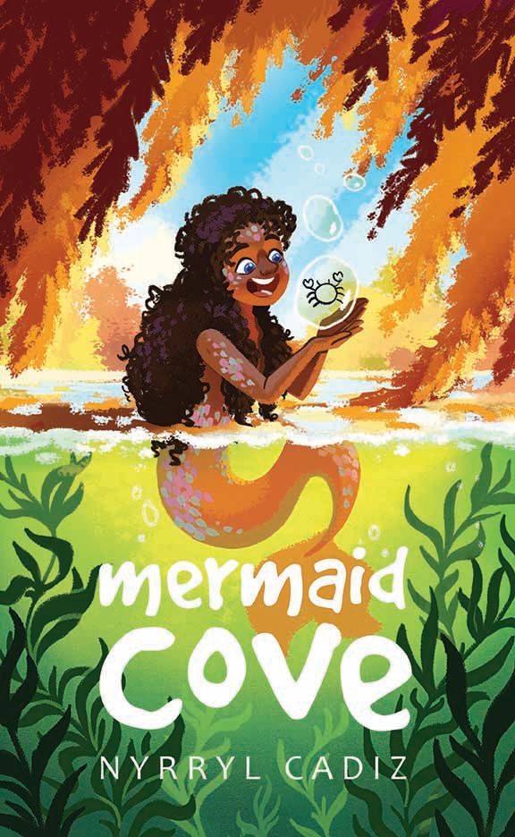
                    Hello, friends! Here's where I am for now. more to follow 🧡

                    sarah dtyis mermaid sample.jpg

                    Portfolio: nyrrylcadiz.com
                    Instagram: https://www.instagram.com/nyrryl_cadiz/
                    YouTube: https://www.youtube.com/channel/UCbJCF1Im8ZO7hpGWTKOJMuA

                    1 Reply Last reply Reply Quote 3
                    • Darian
                      Darian SVS OG last edited by

                      The composition is awsome @Nyrryl-Cadiz I just feel the mermaid's skinf color and the background leaves are of similar colors, making them compete with each other.

                      https://www.instagram.com/darian.pereira
                      https://www.behance.net/darianpereira-
                      https://www.facebook.com/darianpereiraart

                      Nyrryl  Cadiz 1 Reply Last reply Reply Quote 1
                      • Nyrryl  Cadiz
                        Nyrryl Cadiz SVS OG @Darian last edited by Nyrryl Cadiz

                        @Darian thanks Darian! I’ll think about it but I do think the composition and her human form are enough to draw the viewer’s eye to her.

                        Portfolio: nyrrylcadiz.com
                        Instagram: https://www.instagram.com/nyrryl_cadiz/
                        YouTube: https://www.youtube.com/channel/UCbJCF1Im8ZO7hpGWTKOJMuA

                        1 Reply Last reply Reply Quote 1
                        • Frost Drive
                          Frost Drive last edited by

                          Dang that looks really awesome. For the top, if you wanted to increase clarity on your name, you could put it higher and bring more red tree leaves in behind it, so it's mostly on all red leaves!

                          My Drawing Show: https://www.youtube.com/ArtParlor
                          Instagram: https://www.instagram.com/frostdrive/

                          1 Reply Last reply Reply Quote 1
                          • K.Flagg
                            K.Flagg last edited by

                            It looks good...but just for fun, what about making the V in cove into a fin

                            K.Flagg

                            1 Reply Last reply Reply Quote 2
                            • KathrynAdebayo
                              KathrynAdebayo last edited by

                              🙂 So nice! It looks like she could be looking at a reflection of herself in the bubble. I think the text tweaks have paid off and it looks more balanced and professional.

                              1 Reply Last reply Reply Quote 1
                              • B
                                bridgetbick last edited by

                                I think you nailed it. It looks beautiful!

                                1 Reply Last reply Reply Quote 1
                                • Nyrryl  Cadiz
                                  Nyrryl Cadiz SVS OG last edited by

                                  Almost there!

                                  sarah dtyis mermaid sample 2.jpg

                                  Portfolio: nyrrylcadiz.com
                                  Instagram: https://www.instagram.com/nyrryl_cadiz/
                                  YouTube: https://www.youtube.com/channel/UCbJCF1Im8ZO7hpGWTKOJMuA

                                  Nyrryl  Cadiz 1 Reply Last reply Reply Quote 2
                                  • Nyrryl  Cadiz
                                    Nyrryl Cadiz SVS OG @Nyrryl Cadiz last edited by Nyrryl Cadiz

                                    @bridgetbick @KathrynAdebayo @Frost-Drive @K-Flagg thanks guys!!!

                                    @K-Flagg i've been thinking of that too but with the letter 'O'. I'll do some experiments to see if it'll work. I'll post it soon

                                    Portfolio: nyrrylcadiz.com
                                    Instagram: https://www.instagram.com/nyrryl_cadiz/
                                    YouTube: https://www.youtube.com/channel/UCbJCF1Im8ZO7hpGWTKOJMuA

                                    1 Reply Last reply Reply Quote 0
                                    • Nyrryl  Cadiz
                                      Nyrryl Cadiz SVS OG last edited by

                                      Hi guys! I think this is finished for me.

                                      sarah dtyis mermaid 3.jpg

                                      Portfolio: nyrrylcadiz.com
                                      Instagram: https://www.instagram.com/nyrryl_cadiz/
                                      YouTube: https://www.youtube.com/channel/UCbJCF1Im8ZO7hpGWTKOJMuA

                                      1 Reply Last reply Reply Quote 1
                                      • Nyrryl  Cadiz
                                        Nyrryl Cadiz SVS OG last edited by

                                        Hi guys. Quick vote. which title do you prefer A or B?

                                        A

                                        sarah dtyis mermaid 5.jpg

                                        B

                                        sarah dtyis mermaid 4.jpg

                                        Portfolio: nyrrylcadiz.com
                                        Instagram: https://www.instagram.com/nyrryl_cadiz/
                                        YouTube: https://www.youtube.com/channel/UCbJCF1Im8ZO7hpGWTKOJMuA

                                        Kim Rosenlof Melissa_Bailey carlianne Jacy13 Tristan Lapetz 5 Replies Last reply Reply Quote 1
                                        • Kim Rosenlof
                                          Kim Rosenlof @Nyrryl Cadiz last edited by

                                          @Nyrryl-Cadiz I like the fish one. I saw the hook as the letter J. I like that you used an icon for the space in the O. I would face the fish the opposite way and looking up to the right more so that has a more positive feeling to it.

                                          Instagram: https://www.instagram.com/kiminyrose/

                                          1 Reply Last reply Reply Quote 1
                                          • Melissa_Bailey
                                            Melissa_Bailey @Nyrryl Cadiz last edited by

                                            @Nyrryl-Cadiz definitely B. More friendly, less ominous without the fishhook.

                                            illustrator - author - smiley person
                                            mbaileyart.com
                                            instagram.com/mbaileyart/

                                            1 Reply Last reply Reply Quote 0
                                            • First post
                                              Last post