Society of Visual Storytelling

    SVSLearn Forums

    • Register
    • Login
    • Search
    • Recent
    • Tags
    • Popular
    • Users
    • Groups
    • Search

    Need Help with Type - Book Cover - Personal Project

    Artwork
    15
    25
    1249
    Loading More Posts
    • Oldest to Newest
    • Newest to Oldest
    • Most Votes
    Reply
    • Reply as topic
    Log in to reply
    This topic has been deleted. Only users with topic management privileges can see it.
    • Nyrryl  Cadiz
      Nyrryl Cadiz SVS OG @Nyrryl Cadiz last edited by Nyrryl Cadiz

      @bridgetbick @KathrynAdebayo @Frost-Drive @K-Flagg thanks guys!!!

      @K-Flagg i've been thinking of that too but with the letter 'O'. I'll do some experiments to see if it'll work. I'll post it soon

      Portfolio: nyrrylcadiz.com
      Instagram: https://www.instagram.com/nyrryl_cadiz/
      YouTube: https://www.youtube.com/channel/UCbJCF1Im8ZO7hpGWTKOJMuA

      1 Reply Last reply Reply Quote 0
      • Nyrryl  Cadiz
        Nyrryl Cadiz SVS OG last edited by

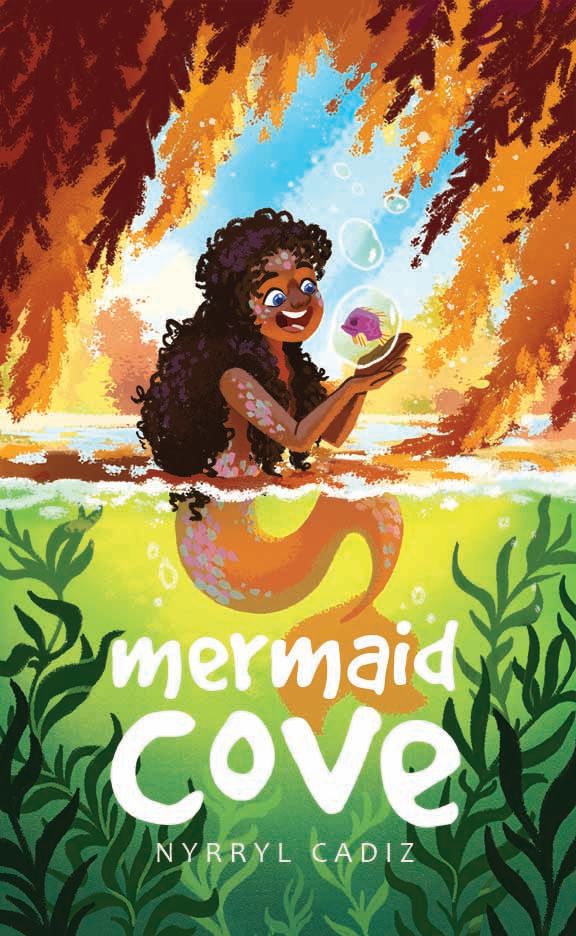
        Hi guys! I think this is finished for me.

        sarah dtyis mermaid 3.jpg

        Portfolio: nyrrylcadiz.com
        Instagram: https://www.instagram.com/nyrryl_cadiz/
        YouTube: https://www.youtube.com/channel/UCbJCF1Im8ZO7hpGWTKOJMuA

        1 Reply Last reply Reply Quote 1
        • Nyrryl  Cadiz
          Nyrryl Cadiz SVS OG last edited by

          Hi guys. Quick vote. which title do you prefer A or B?

          A

          sarah dtyis mermaid 5.jpg

          B

          sarah dtyis mermaid 4.jpg

          Portfolio: nyrrylcadiz.com
          Instagram: https://www.instagram.com/nyrryl_cadiz/
          YouTube: https://www.youtube.com/channel/UCbJCF1Im8ZO7hpGWTKOJMuA

          Kim Rosenlof Melissa_Bailey carlianne Jacy13 Tristan Lapetz 5 Replies Last reply Reply Quote 1
          • Kim Rosenlof
            Kim Rosenlof @Nyrryl Cadiz last edited by

            @Nyrryl-Cadiz I like the fish one. I saw the hook as the letter J. I like that you used an icon for the space in the O. I would face the fish the opposite way and looking up to the right more so that has a more positive feeling to it.

            Instagram: https://www.instagram.com/kiminyrose/

            1 Reply Last reply Reply Quote 1
            • Melissa_Bailey
              Melissa_Bailey @Nyrryl Cadiz last edited by

              @Nyrryl-Cadiz definitely B. More friendly, less ominous without the fishhook.

              illustrator - author - smiley person
              mbaileyart.com
              instagram.com/mbaileyart/

              1 Reply Last reply Reply Quote 0
              • demotlj
                demotlj SVS OG last edited by

                I agree that B is better. The fish hook is as @Melissa-Bailey-0 said, "ominous."

                Laurie DeMott
                instagram.com/demotlj

                1 Reply Last reply Reply Quote 0
                • carlianne
                  carlianne @Nyrryl Cadiz last edited by

                  @Nyrryl-Cadiz I like the fishy too!

                  For the font though I still find your name a little hard to read.

                  Since you're name isn't part of the title I think you can make it smaller / not the same width as the text above. It'll help it feel like it's own entity and The "nyr" part of your name is hard to read over the busy dark green leaves anyway.

                  Check out my art and tutorials :)

                  Instagram: www.instagram.com/carliannecreates/

                  Youtube:
                  https://youtube.com/c/CarlianneCreates

                  Shop: www.carliannecreates.com

                  1 Reply Last reply Reply Quote 0
                  • Jacy13
                    Jacy13 @Nyrryl Cadiz last edited by

                    @Nyrryl-Cadiz I also agree that B looks better to me! 🙂

                    Deviantart: https://www.deviantart.com/jacy13
                    Instagram: https://www.instagram.com/jacy13draws/?hl=en
                    Portfolio: https://jacy13.artstation.com/

                    1 Reply Last reply Reply Quote 0
                    • Tristan Lapetz
                      Tristan Lapetz @Nyrryl Cadiz last edited by

                      @Nyrryl-Cadiz I'm with B as well, A is a little too ominous for the joyful vibe of the rest of the scene.

                      Happy creating,
                      Tristan

                      IG: https://www.instagram.com/t_lapetz/

                      1 Reply Last reply Reply Quote 0
                      • Nyrryl  Cadiz
                        Nyrryl Cadiz SVS OG last edited by

                        @Kim-Rosenlof @Melissa-Bailey-0 @demotlj @carlianne @Jacy13 @Tristan-Lapetz Thank you so much for the feedback, everyone! I totally see what you mean, tho I must admit, 'ominous' is actually what I was going for. lolz

                        However, I gave it some thought and I've decided not to use either. I just feel that both are not up to snuff. I know I can come up with something better but I think I've just had it with this piece for now. I don't wanna work on it anymore. I just want it to be done. 😅

                        I hope y'all don't hate me for wasting your time. 😅✌

                        @carlianne Thank you so much for the note on my name. That's definitely something I'd never even think of. Here it is below. This is probably my last edit on this piece unless I deceide otherwise. lolzzz

                        Again Thank you so much, everyone!!!!

                        sarah dtyis mermaid 6.jpg

                        Portfolio: nyrrylcadiz.com
                        Instagram: https://www.instagram.com/nyrryl_cadiz/
                        YouTube: https://www.youtube.com/channel/UCbJCF1Im8ZO7hpGWTKOJMuA

                        1 Reply Last reply Reply Quote 1
                        • First post
                          Last post