Feedback on character design?
-
Hi everyone, congrats to those who won Critique Arena yesterday, there were some really great entries this month. I'm really looking forward to the next one.
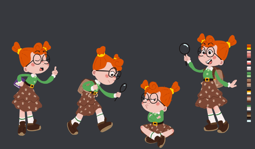
I've been working on this character design sheet and was wondering if I could get some feedback on how I could improve it. I'm going for a fairly flat, cut out kind of look with it.
-
@brettb_draws really cute character! I love how you've captured her inquisitive and spunky personality.
Some feedback:
- Have you played around with different color combinations? It feels like there is a different color palette for the top and bottom halves of the character. The top is very saturated and vibrant, the bottom more neutral and muted.
- Is the placement of her ears intentional? Because they're placed so far down on her head, the black frame of her glasses creates a strange angle and possible tangent with her hairline. A few possible solutions: make the glasses a different color, move her ears up higher, and/or get rid of the part of the frame that connects to her ears (do you really need it?).
- Have you explored other clothing options or figure proportions? The figure now is looking very balanced, and my guess is that it might be the skirt, because her figure is actually not balanced; she appears to have a very short torso and long legs, which I think works for this character. I think it's the skirt that's throwing it off. Perhaps eliminate a tier? Try a different skirt shape? Test out different lengths? Try out shorts or pants?
To sum up: great expressions and overall character design. Consider adjusting the color palette and playing with different shapes & silhouettes.
Please let us see where this character goes. Looking forward to seeing more from you!
P.S. - one more thing: the background color might also affect how your character is perceived and may hinder/help readability. Maybe test out the character sheet against different color backgrounds? My personal preference is to view a character design sheet with a white or very light colored background -- it's just easier for my eyes to see and read. Thought this feedback might be helpful -- or maybe it's just me!
illustrator - author - smiley person
mbaileyart.com
instagram.com/mbaileyart/ -
I think this character looks great, the only thing I could say is that the hair might be a bit too much of a focal point, bring the saturation down a smidge should fix this. This might also just be a preference thing because I tend to prefer low saturated colors.
@Melissa-Bailey-0 mentioned that the skirt feels odd for some reason. I think it’s because it’s at a halfway point. Always good to follow the rule of 3rds and 5ths for designing. In this case it should probably be 3rds and the skirt should either cover the top 2/3 or the top 1/3 of her legs. Hope this helps!
-
@melissa-bailey-0 Thank you! I really appreciate it. The glasses immediately look much better without the connection to the ears and it actually fits in with the style a bit better as I've already broken the eyebrows in the same way. I just need to play around with the proportions for the skirt I think in comparison to the legs, and maybe bring the saturation down a bit up top. I'll be sure to post the finished version here
")
@griffin Thanks! I originally broke the character into thirds but didn't consider how the skirt would effect it when placed on top. I agree I think I'm gonna try bringing the skirt up to the top third of the legs, and have the socks stretch up to cover the bottom 2/3 of the remaining skin between the skirt and shoes. Hopefully that will work. Funnily enough, the saturation is an adjustment layer, so I only needed to set it to 50% and it brought the attention closer to the face. Thank you !