Which color scheme should I go with?
-
Hi!
I'm working on a project, illustration of a dragon and his girl - and I got stuck with colors. I've done 3 different versions of a possible color schemes, but I cannot decide, which one should I use. Or should I try a totally different one? Does somebody have a suggestion or an advice? Any help will be much appreciated!
Thank you!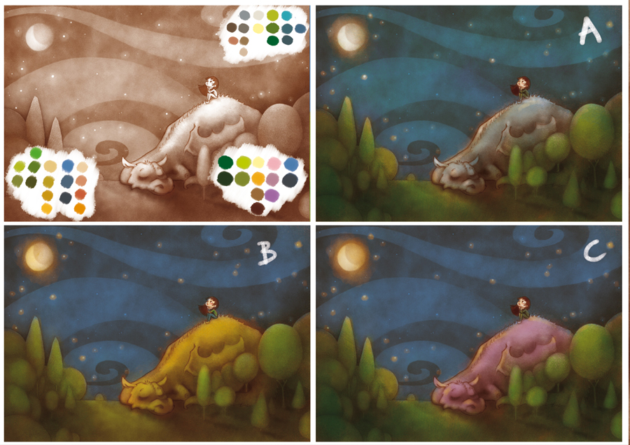
-
A is my favorite, C is nice as well. I'm not really going for the yellow dragon in B, it looks funny to me. Fun illustration, I love the swirly sky design. I'm excited to see the finish!
-
Love them all! So hard to decide!!
What if you would try B with a little more orange in the dragon to complement the blue sky ?
The design of this is great! I really like the idea too! I know you aren't asking for composition tips, but maybe the dragon's head is a little too centered... Maybe you could try shifting the dragon to the left a little ? But that being said, I am not a professionnal!Great work!
noemiegionetlandry.squarespace.com
noemie_illustration on Instagram -
@NoWayMe You're totally right about the composition! I will take a look at that and see what I can do. Thank you!
-
@Sarah-LuAnn Thank you
")
Here's the process of it, if anyone is interested:
https://www.youtube.com/watch?v=px1Cc8l-DcI
A is also my favorite when I look at the pictures now... I will give it a time, maybe I will think differently in a couple of days.
Is it just me, or do you also go through the experience of leaning towards a solution one day and absolutely hating it the day after? -
I like C the best and I really like your trees. Swirly sky is unique, too.
-
I immediately went to C! The warm purple of the dragon make it stand out better and brings our eye to the girl. Beautiful drawing, I adore that sky!
-
C I like the best.
-
@mag Looks good! - For me it is A - when I reduced the size quite a bit A stood out to me as being the best - C was very readable too but I like the cool grey for the dragon - for me the purple is hard to pull away from and seems to dominate the piece - there is more of a balance in A ...for me - I think possible a tiny bit more contrast though might be good - possibly a tiny bit lighter of a sky near the bottom and around the dragon...??? - not sure about that idea - anyways here is the miniature version - looking forward to seeing the next step!
-
A is nice, but you could mistake the dragon for a rock. So I vote C as it gives a little more focus to the dragon.
-
The scheme: A
To me, it has a better balance between the girl and the dragon. I'm shure nobody will have problems reading the dragon in the final version.
People already mentioned the composition...
-
A if I had to chose, B doesn't add much more than saturation to me, and c is too pink for my tastes... does it have to be 1 of these 3? Can the Dragon be blue or purple?
-
A or C. Either way... very nice image. nice process vid as well
-
Hi @mag! I like your Illustration, especially the graphic style for the forest and the sky.
Also the girl is very appealing.
For the color scheme, I would go with the coolest one, because you have a night scene with moonlight. Therefore it would be A. Personally, I would even push it further towards the blue range. For me, the trees are still a bit to green.
Hope this makes any sense. -
A is the sleepiest in my opinion. Great sketch!