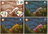
Which color scheme should I go with?
-
I like C the best and I really like your trees. Swirly sky is unique, too.
-
I immediately went to C! The warm purple of the dragon make it stand out better and brings our eye to the girl. Beautiful drawing, I adore that sky!
-
C I like the best.
-
@mag Looks good! - For me it is A - when I reduced the size quite a bit A stood out to me as being the best - C was very readable too but I like the cool grey for the dragon - for me the purple is hard to pull away from and seems to dominate the piece - there is more of a balance in A ...for me - I think possible a tiny bit more contrast though might be good - possibly a tiny bit lighter of a sky near the bottom and around the dragon...??? - not sure about that idea - anyways here is the miniature version - looking forward to seeing the next step!
-
A is nice, but you could mistake the dragon for a rock. So I vote C as it gives a little more focus to the dragon.
")
-
The scheme: A
To me, it has a better balance between the girl and the dragon. I'm shure nobody will have problems reading the dragon in the final version.
People already mentioned the composition...
-
A if I had to chose, B doesn't add much more than saturation to me, and c is too pink for my tastes... does it have to be 1 of these 3? Can the Dragon be blue or purple?
-
A or C. Either way... very nice image. nice process vid as well
-
Hi @mag! I like your Illustration, especially the graphic style for the forest and the sky.
Also the girl is very appealing.
For the color scheme, I would go with the coolest one, because you have a night scene with moonlight. Therefore it would be A. Personally, I would even push it further towards the blue range. For me, the trees are still a bit to green.
Hope this makes any sense. -
A is the sleepiest in my opinion. Great sketch!