Society of Visual Storytelling

    SVSLearn Forums

    • Register
    • Login
    • Search
    • Recent
    • Tags
    • Popular
    • Users
    • Groups
    • Search

    Wip tiger 22

    Contest
    9
    31
    2453
    Loading More Posts
    • Oldest to Newest
    • Newest to Oldest
    • Most Votes
    Reply
    • Reply as topic
    Log in to reply
    This topic has been deleted. Only users with topic management privileges can see it.
    • Asyas_illos
      Asyas_illos last edited by

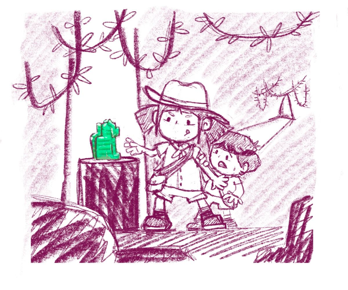
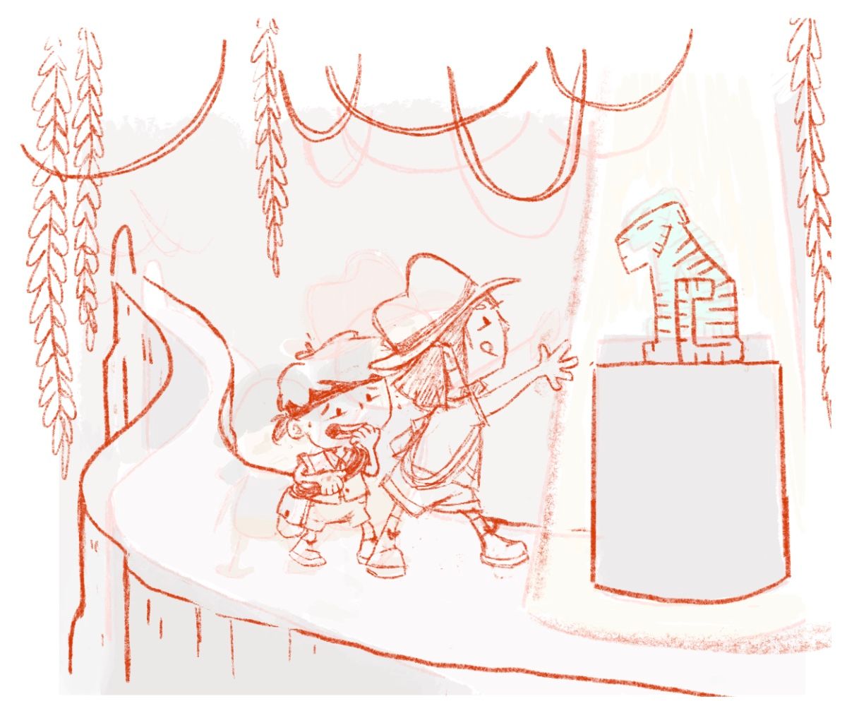
      I wanted to get some opinions on this piece before I go to color it. I've been kicking around this idea of a jade tiger, I had many concepts but landed with this one. Does it seem clear story-wise? Obviously I am going for an Indiana Jones type thing but worried its not enough for the prompt. Can you tell the "idol" is a tiger? I was also thinking I would make it like a book cover. Feedback welcome please. Thanks!
      2C65FDE5-4A01-4A33-BE99-C2857FB2D4A7.jpeg

      Asyasewardillos@gmail.com
      www.Instagram.com/asyas_illos/
      https://asyasewardillos.wixsite.com/mysite

      theprairiefox Melissa_Bailey 2 Replies Last reply Reply Quote 1
      • theprairiefox
        theprairiefox @Asyas_illos last edited by

        @asyas_illos A couple of thoughts.

        First, great idea. Could be lots of fun.

        But, when I first saw it, I couldn't determine what was the 'tiger'? I wonder if you changed the POV so that the tiger was closer to the reader/viewer you could add detail and show it more. Maybe even move the POV to be the character's. I would thumbnail a few to get a feel for what works.

        -The Prairie Fox
        https://www.instagram.com/theprairiefox
        https://www.theprairiefox.com

        1 Reply Last reply Reply Quote 1
        • Melissa_Bailey
          Melissa_Bailey @Asyas_illos last edited by

          @asyas_illos what if you put the jade tiger in the foreground instead of in the midground? What if you played a bit with perspective and the characters were in the midground reaching out to the tiger? Could be a more dynamic pose and composition.

          And yes, the jade tiger should look more like a tiger. With it being so small, and green, the prompt isn't immediately apparent.

          illustrator - author - smiley person
          mbaileyart.com
          instagram.com/mbaileyart/

          1 Reply Last reply Reply Quote 0
          • Asyas_illos
            Asyas_illos last edited by

            @Melissa-Bailey-0 @theprairiefox thanks guys I appreciate the the advice, I thought that might have been the case. It looks like I’ll need to work on repositioning things so the tiger is more clear. Thank you!

            Asyasewardillos@gmail.com
            www.Instagram.com/asyas_illos/
            https://asyasewardillos.wixsite.com/mysite

            1 Reply Last reply Reply Quote 1
            • Asyas_illos
              Asyas_illos last edited by Asyas_illos

              I tried a few more designs and liked these two the best. Would these better represent the prompt?E6B55A37-212B-4C26-AE0C-A11F7DF536D9.jpeg
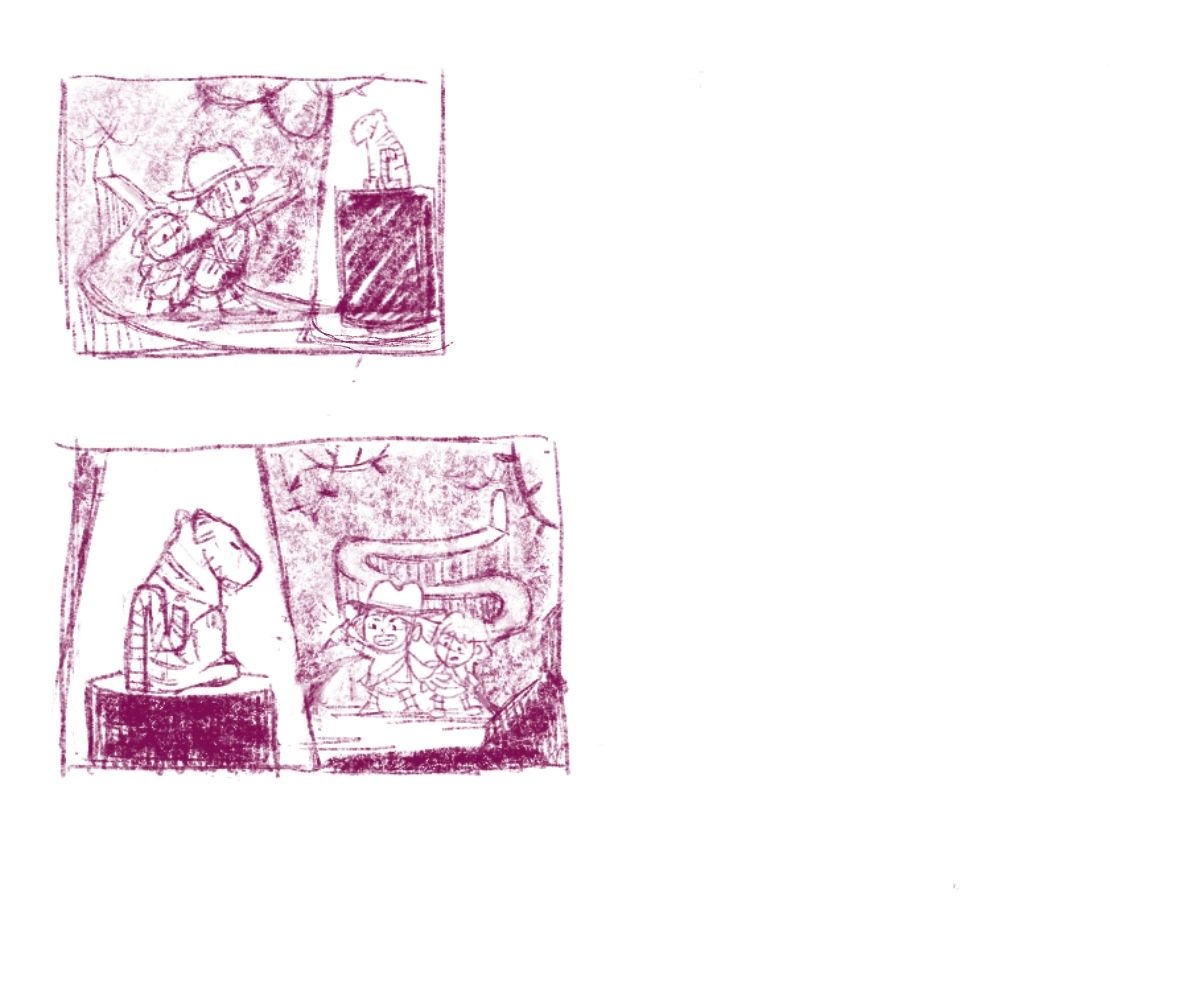
              This was another jade tiger concept thumbnail yay or nay?
              AF4960D5-003A-4BF9-9353-592338ED0788.jpeg

              Asyasewardillos@gmail.com
              www.Instagram.com/asyas_illos/
              https://asyasewardillos.wixsite.com/mysite

              1 Reply Last reply Reply Quote 0
              • von_Nimmermehr
                von_Nimmermehr last edited by

                The Second one is nice, you can recognize what it is and also the focus is on the Tiger.

                Nice to see how creative and productive you are...i already feel bad, not comig up with just one good idea.
                Lucky you!

                What a nice job you do!

                Website: www.von-Nimmermehr.com
                Instagram: https://www.instagram.com/von_nimmermehr_illustration/

                theprairiefox Asyas_illos 2 Replies Last reply Reply Quote 0
                • theprairiefox
                  theprairiefox @von_Nimmermehr last edited by

                  I have to agree with @von_nimmermehr, I like the second one for the same reasons.

                  -The Prairie Fox
                  https://www.instagram.com/theprairiefox
                  https://www.theprairiefox.com

                  1 Reply Last reply Reply Quote 1
                  • Asyas_illos
                    Asyas_illos @von_Nimmermehr last edited by

                    @von_nimmermehr thanks for your input! Also don’t feel bad I’m sure you’ll come up with some ideas! I just happen to have a lot of time at the moment so I’m trying to cram in as much as can!

                    Asyasewardillos@gmail.com
                    www.Instagram.com/asyas_illos/
                    https://asyasewardillos.wixsite.com/mysite

                    1 Reply Last reply Reply Quote 0
                    • Asyas_illos
                      Asyas_illos last edited by

                      Ok I enlarged both and tweaked a little I’ll most likely work them both but I’d like opinions on which people like more and if they both follow the prompt. Thanks
                      A86C7449-753C-4153-A400-90FBCC74A2AB.jpeg
                      01E95F8F-F48F-4A38-9E32-DAA4DB21B20D.jpeg

                      Asyasewardillos@gmail.com
                      www.Instagram.com/asyas_illos/
                      https://asyasewardillos.wixsite.com/mysite

                      theprairiefox Melissa_Bailey 2 Replies Last reply Reply Quote 1
                      • theprairiefox
                        theprairiefox @Asyas_illos last edited by

                        @asyas_illos I definitely like the first one more. Feels more dynamic to me.

                        -The Prairie Fox
                        https://www.instagram.com/theprairiefox
                        https://www.theprairiefox.com

                        Asyas_illos 1 Reply Last reply Reply Quote 1
                        • Asyas_illos
                          Asyas_illos @theprairiefox last edited by

                          @theprairiefox thank you for your thoughts

                          Asyasewardillos@gmail.com
                          www.Instagram.com/asyas_illos/
                          https://asyasewardillos.wixsite.com/mysite

                          1 Reply Last reply Reply Quote 0
                          • Melissa_Bailey
                            Melissa_Bailey @Asyas_illos last edited by

                            @asyas_illos the first one speaks to me more -- has a more dynamic composition. But what is that strong diagonal line that splits the illustration in two?

                            illustrator - author - smiley person
                            mbaileyart.com
                            instagram.com/mbaileyart/

                            Asyas_illos 1 Reply Last reply Reply Quote 1
                            • Asyas_illos
                              Asyas_illos @Melissa_Bailey last edited by

                              @melissa-bailey-0 thank you and that’s the light separation it won’t be there in the final😉

                              Asyasewardillos@gmail.com
                              www.Instagram.com/asyas_illos/
                              https://asyasewardillos.wixsite.com/mysite

                              1 Reply Last reply Reply Quote 1
                              • Asyas_illos
                                Asyas_illos last edited by

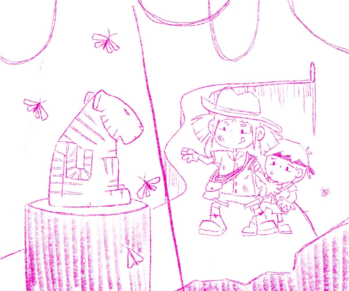
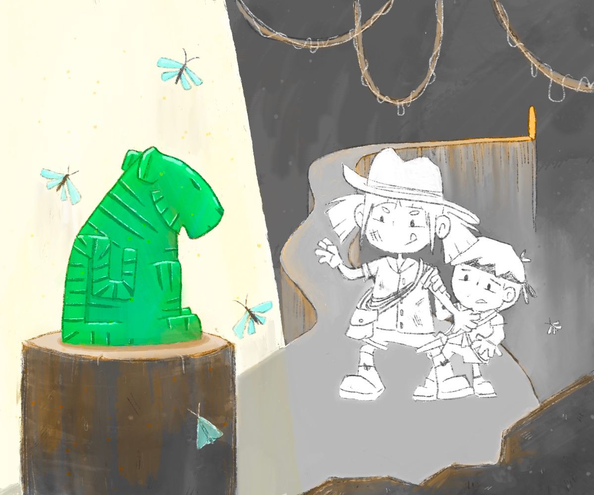
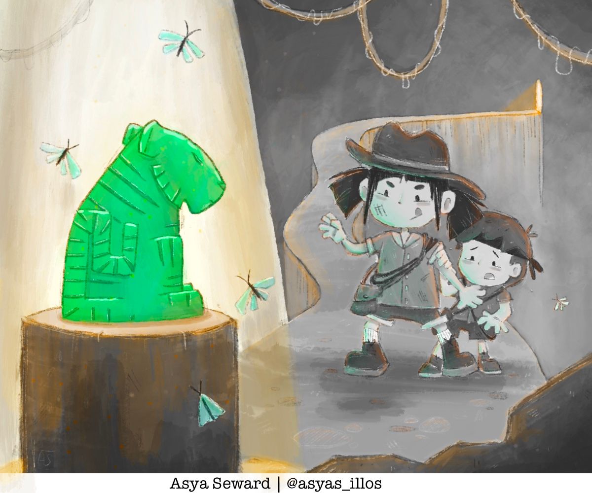
                                I wanted to do this one in sepia tones like my other entry but have only the jade tiger in green or the things that are under the light source. Would that be too weird? I’m thinking I could add a greenish glow reflecting on the explorers…E9BA8A71-D482-4266-8B84-49DC83E56DED.jpeg

                                Asyasewardillos@gmail.com
                                www.Instagram.com/asyas_illos/
                                https://asyasewardillos.wixsite.com/mysite

                                1 Reply Last reply Reply Quote 0
                                • Asyas_illos
                                  Asyas_illos last edited by

                                  I’m about to wrap this one up but I can’t decide if want to keep the green glow. Or if I should go full color or if I should keep it all sepia. ‘Takes a long Napoleon dynamite SIGHHHHHH’
                                  5A998FFE-4181-4B90-81C7-EC1D7F8D023F.jpeg 36E8EA00-5EBD-4379-9B47-40A271D4BBB9.jpeg

                                  Asyasewardillos@gmail.com
                                  www.Instagram.com/asyas_illos/
                                  https://asyasewardillos.wixsite.com/mysite

                                  KathrynAdebayo 1 Reply Last reply Reply Quote 0
                                  • KathrynAdebayo
                                    KathrynAdebayo @Asyas_illos last edited by

                                    @asyas_illos Hi Asya, it's really helpful to see your work progress. Thanks for sharing your learning with everyone. I like this idea - it makes me think that the kids have come a long way to find that tiger!

                                    I think your color question depends on your lighting and your intention.

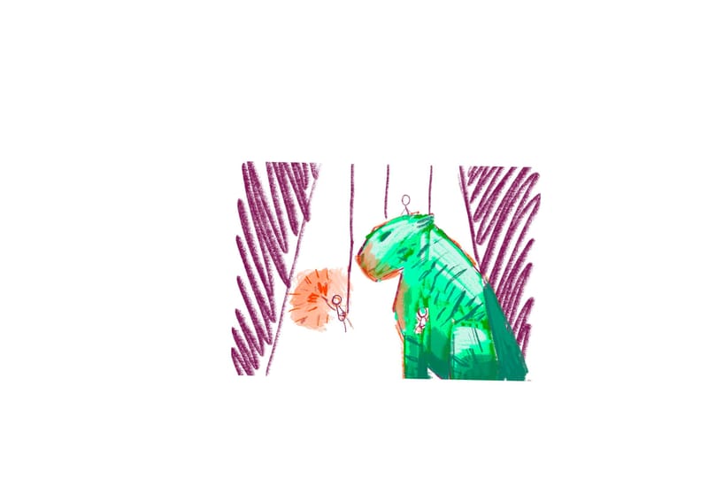
                                    If one part of the illustration ( the tiger ) is green, and absolutely everything else is sepia, I think that can work well to draw attention to that one part of the illustration. I'd choose this option if your intention is to highlight the one thing in a scene that is especially important for the viewer to see and look at first. In your current piece, the colors surrounding the characters but not on them makes them seem unfinished to me, and I don't think you need the tiger to contrast with them so much since it's in the foreground and we notice it easily anyway. If you haven't already, you could try making the image super tiny on the screen and look at the balance of the colors that way.

                                    Secondly, I'm wondering if the white area behind the tiger is a wall? If the wall is that bright, my mind sees the characters being illumined more since there's that much light hitting the wall.
                                    If the white area is a spotlight, I think you could have a lot of fun with that, pushing the highlights and shadows on the tiger. I know this is a wip, so maybe it's just not fleshed out yet, but if it is a spotlight, the light would stream down in front of the path as well... here are some examples showing how you might be able to play around with the softness of the edge of the light.

                                    ![alt text](B7DFFE00-4123-45B4-A7B6-85B296829AD4.jpeg

                                    D9D9C579-2E48-4326-BBC3-013FFEF128FD.jpeg image url)

                                    Looking forward to seeing how this turns out. I wouldn't be surprised to see one of your pieces in the top 16 this month or at least in the near future. 🙂

                                    Asyas_illos 1 Reply Last reply Reply Quote 1
                                    • Asyas_illos
                                      Asyas_illos @KathrynAdebayo last edited by

                                      @kathrynadebayo thank you for the feed back! And the spotlight images are very helpful, it is a spotlight from directly above and there’s no wall behind it they are still on a narrow path so I was unsure how that light would affect a background that is very far off. I have played with it since and I thunk after seeing your spotlight pics I can tweak it a tiny bit more, and be ready! Fingers crossed!

                                      Asyasewardillos@gmail.com
                                      www.Instagram.com/asyas_illos/
                                      https://asyasewardillos.wixsite.com/mysite

                                      1 Reply Last reply Reply Quote 0
                                      • Asyas_illos
                                        Asyas_illos last edited by

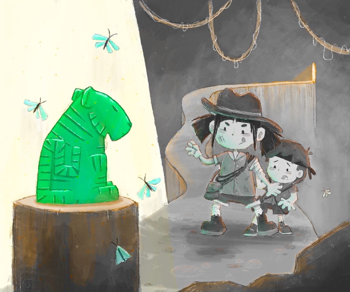
                                        After a few small tweaks…sealed the deal, thanks everyone who helped me out!
                                        F0502595-82D2-44FF-8598-7A8ACB1F855C.jpeg

                                        Asyasewardillos@gmail.com
                                        www.Instagram.com/asyas_illos/
                                        https://asyasewardillos.wixsite.com/mysite

                                        Kim Rosenlof 1 Reply Last reply Reply Quote 4
                                        • Kim Rosenlof
                                          Kim Rosenlof @Asyas_illos last edited by

                                          @asyas_illos This is looking good and I really like how you have a unique take on the theme of tiger. The path and the edge of the light are almost touching and looks like a tangent right now. Also, the composition is almost cut in half. I recommend shifting the tiger and light area to the left a little so it is more asymmetrical. Great job!

                                          Instagram: https://www.instagram.com/kiminyrose/

                                          1 Reply Last reply Reply Quote 2
                                          • lizardillo
                                            lizardillo last edited by

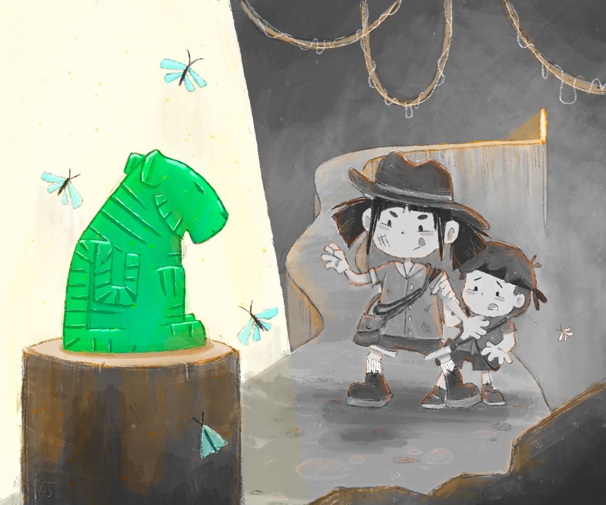
                                            This is great. I like the fact you've not just gone with an actual tiger and gone a different route.

                                            Website: lizardillo.co.uk
                                            IG: instagram.com/lizardillo

                                            Asyas_illos 1 Reply Last reply Reply Quote 1
                                            • First post
                                              Last post